Six Ways to
Picture Equity
Before a single color was locked, we put six distinct designs in front of the client, each one a different direction for the logo. Click through the round.
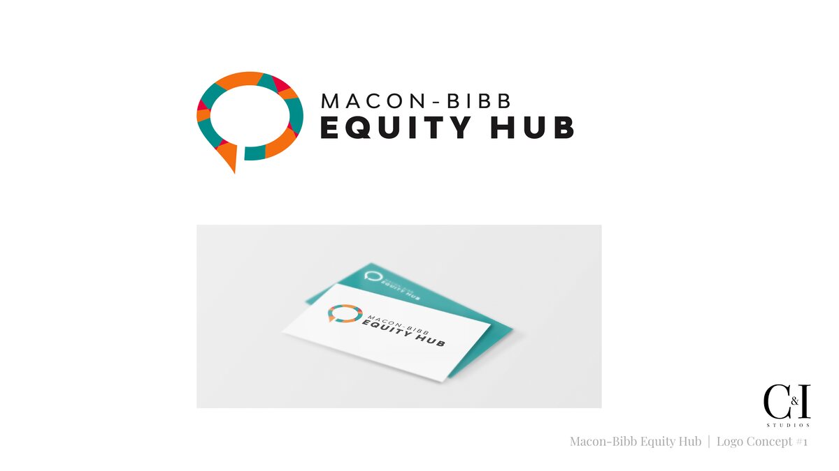
The graphics and brand identity designed for the Macon-Bibb Equity Hub: logo, color, type, and a complete visual system.
The Equity Hub unites Macon-Bibb County around the things that actually determine health: housing, education, economic mobility, and care. A mission that big needed a face people could rally behind.
Before a single color was locked, we put six distinct designs in front of the client, each one a different direction for the logo. Click through the round.
We tested dozens of colorways before settling on six. Color is one of the first things people register about a brand, and the right palette sets the tone before a single word is read. Every shade here was chosen to feel unmistakably like the Hub.

The final six
An identity has to stay legible wherever it appears, so we prepared the mark for each setting it would live on: light layouts, dark and photographic backgrounds, and the red the Hub uses most. Switch the stage to see it on light, dark, and full color.

Click to preview the logo on a different background
We designed an icon for each area the Hub works in, from healthcare and education to housing and economic development. Every one is drawn in the same line style and set inside a triangle, the shape the logo is built from, so the full set reads as one family and stays clearly part of the brand.
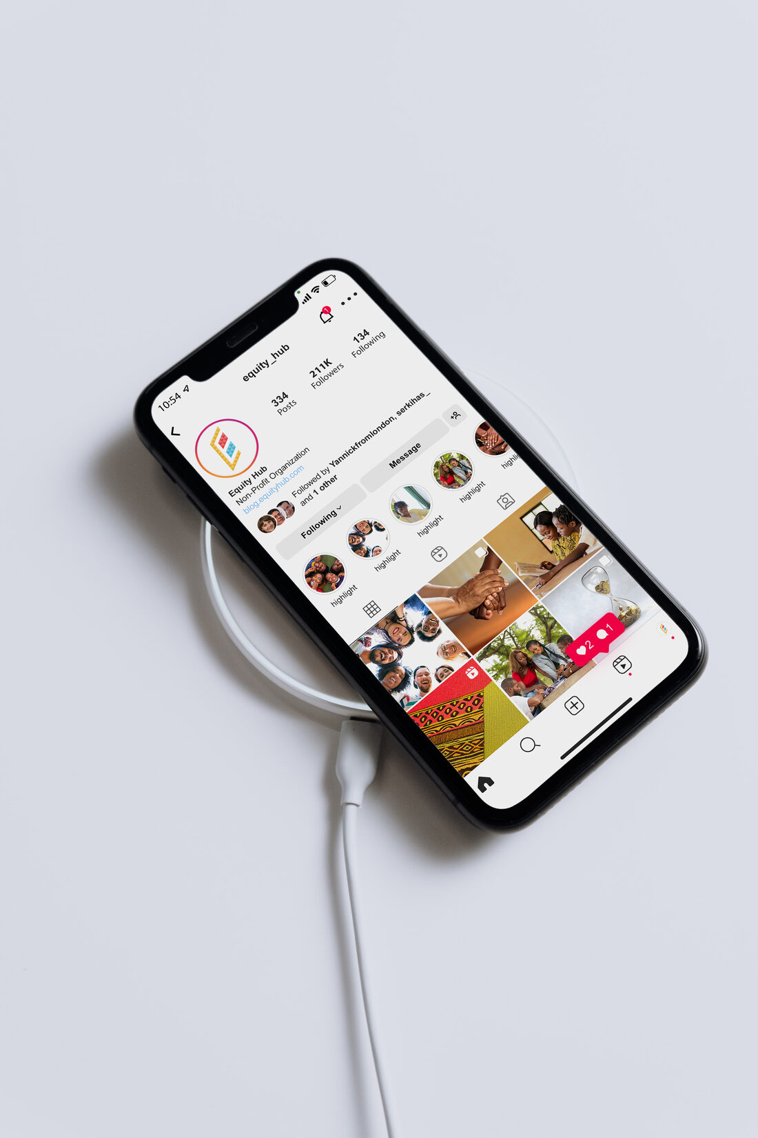
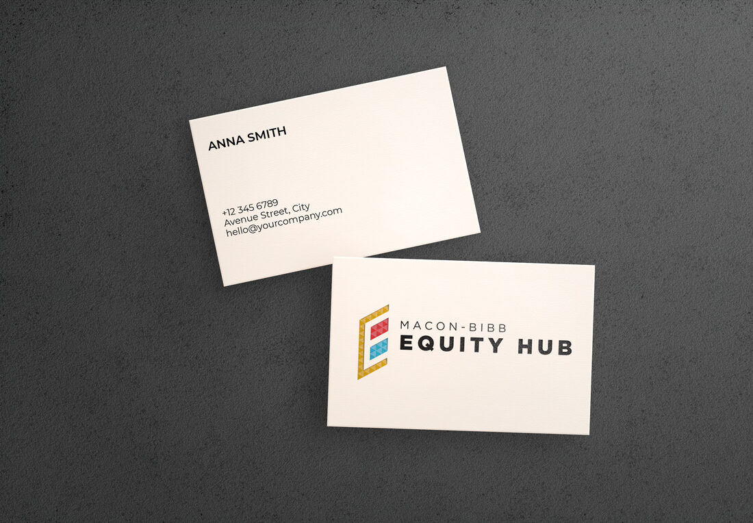
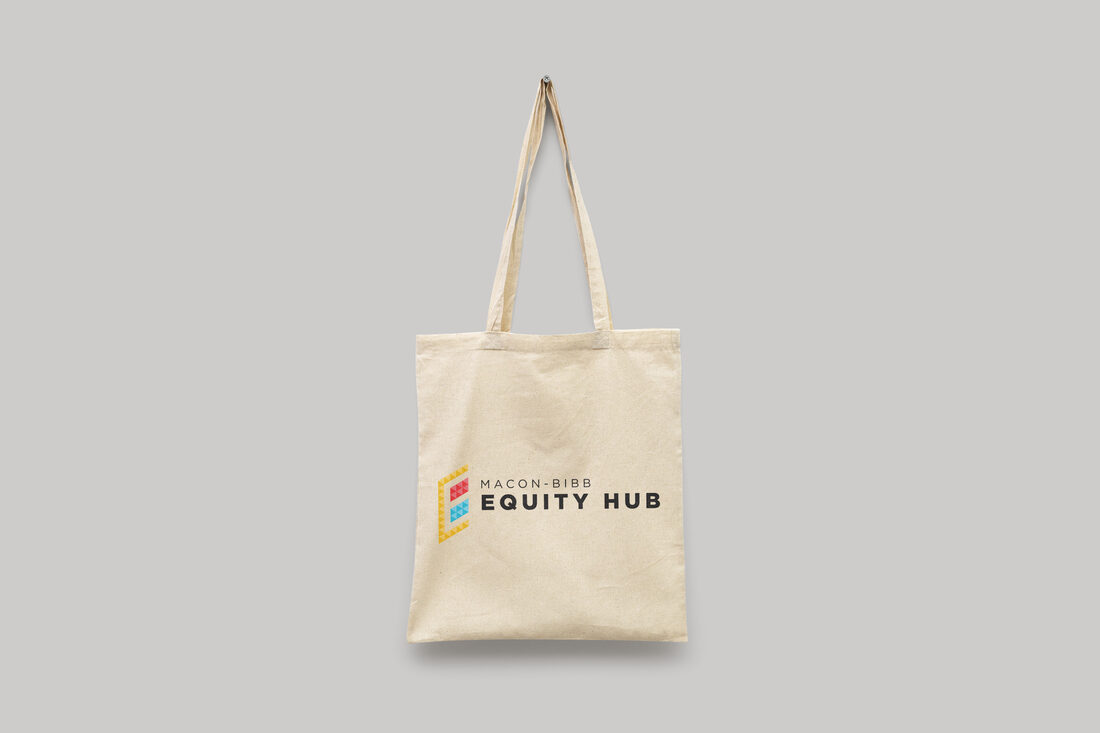
A logo is hard to judge in isolation, so we showed the client the identity in context: mockups of how it would read on social media, stationery, merchandise, and more. Seeing the brand in the places it will actually live makes the decision far easier and surfaces anything that needs adjusting before launch, not after.
We account for these uses from the very first sketches, so the identity works as well on a phone screen as it does on a printed banner. And because we handle social, print, and production in house, the client had a team ready to bring any of these pieces to life whenever they were ready, all under one roof.
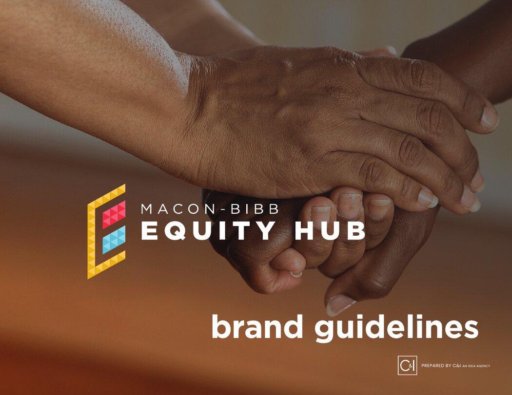
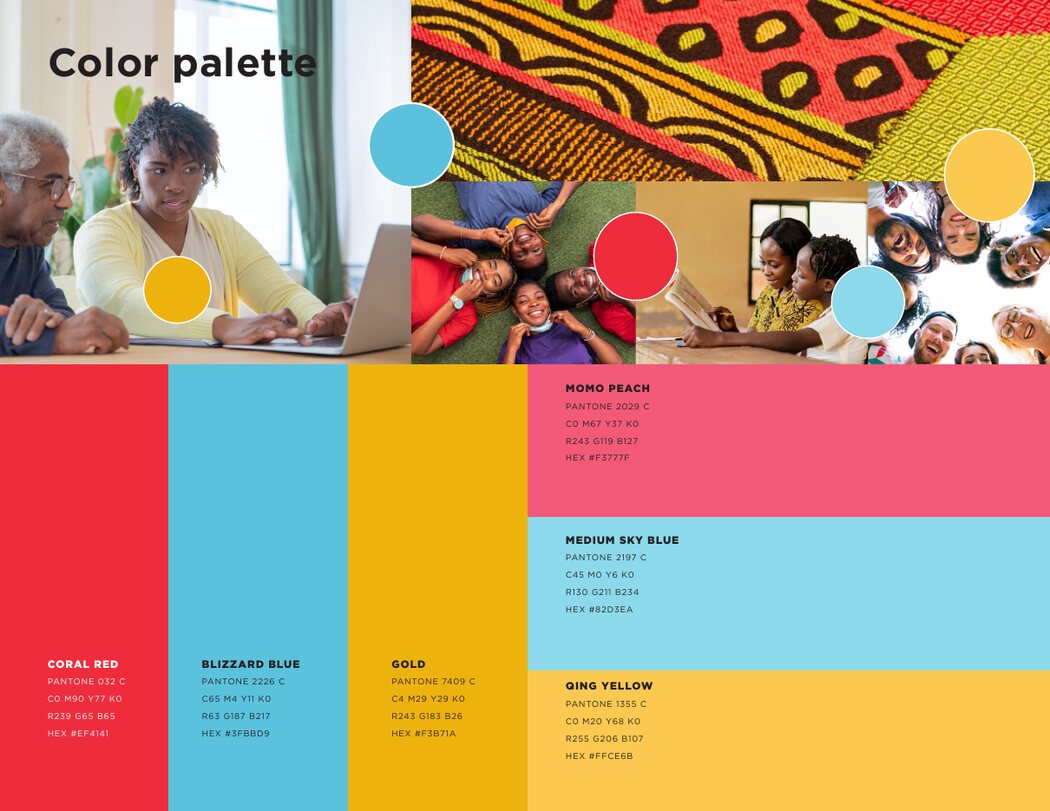
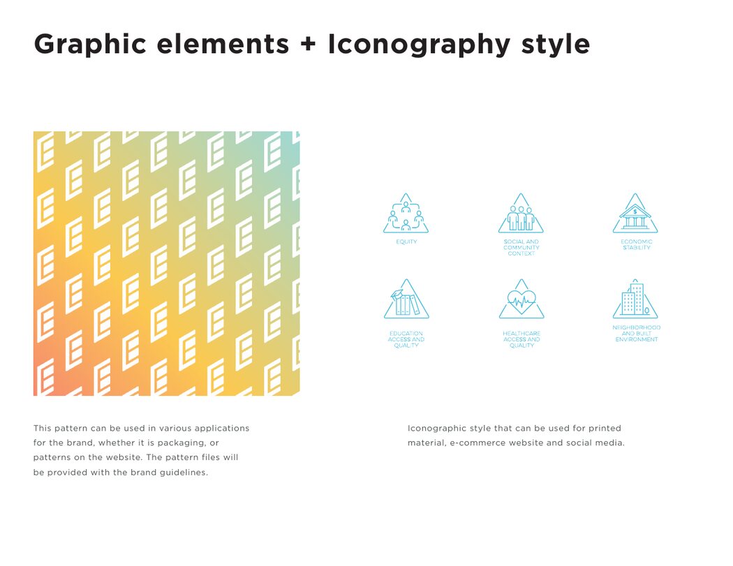
We packaged the entire identity into a complete brand guidelines book, so anyone can use it correctly long after we hand it off. Logo usage, the full color palette with Pantone values, type, the icon set, and the mosaic pattern are all documented in one place.
Every rule is shown, not just told: clear space and minimum sizes for the mark, dos and don'ts for the pattern, and real examples of the system in use so the guidance never feels abstract.
The palette section pairs each color with its Pantone, CMYK, RGB, and HEX values, so the Hub stays exactly on brand whether it is printed on a banner or posted to a feed.
It keeps the Hub speaking in one voice, whether we are in the room or not, and gives every future partner a single source of truth to build from.
We can help get your vision to where you need it to be.