Glavovic Studio
Glavovic Studio is an architecture, art, and urban design firm based in Fort Lauderdale. Their architectural contributions and unwavering commitment to designs that benefit both people and place have taken their influence internationally. Glavovic Studio has been published in more than 30 national and international publications and has won dozens of design awards since its founding, including multiple awards from the Urban Land Institute and the United States Green Building Council.
Despite their prestige and farreaching success, Glavovic Studio’s brand image had fallen out of sync with their name and what they represent. So, they came to us to reimagine their consumer-facing facade. When they hired us, their website was severely outdated. They had very little content, and that which they did possess was lacking conviction and quality.
After getting to know Margi Nothard, the founder, CEO, and lead designer at Glavovic Studio, we knew exactly how we would restyle their brand. This would ultimately call for a complete, top-to-bottom overhaul, a brand new website, video storytelling, professional photography, and a 12-month marketing strategy to back it up.
Reimagining Glavovic
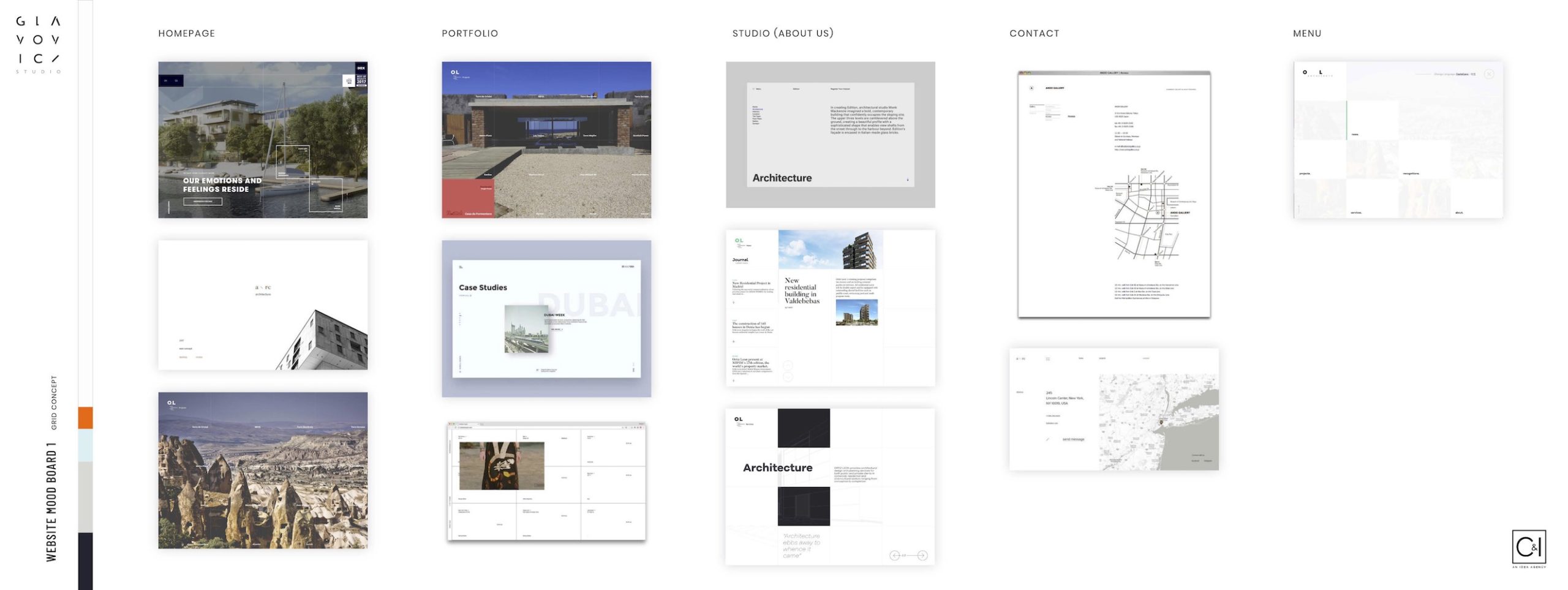
Perhaps the most needed service to Glavovic Studio’s rebranding was the design and development of a new website. Their former site was lacking in key areas, which dampened the user experience and, ultimately, weakened their first impression. The categorization of information was confusing. The structure of the site made it difficult to maneuver between important pages. The design did not match the studios potential as a design firm. And they were not showcasing their work in the best possible way.
We learned a lot during the website redevelopment phase, including the type of content that Glavovic Studio was missing and would benefit from most. This predominantly included video production and professional photography. The combination of the two would create a unified brushstroke, showing the commitment and integrity behind each Glavovic Studio design.
Ultimately, this decided what Glavovic Studio’s new consumer-facing gateway would look like. Their audience would immediately be able to identify a shift in the quality of the content and the storytelling therein. No matter where their audience would first interact with this new grade of media, they would learn that it is just a small piece in a fullscale rebranding initiative. That was our goal and our success.

Glavovic Studio Project Showcases
Glavovic Studio’s former website was lacking in pivotal areas but none more so than their portfolio. They were not showcasing their work properly. Aside from lackluster descriptions, they failed to include any decent media. Rather than showcase finished products in their natural environment, they used renderings that were created at the start of the endeavor. This was artificial — a stylistic approach that failed to connect with readers.
To remedy this, we brought their portfolio to life with real, crisp, authentic and informative media. This is where the bond between professional photography and video production shined brightest. Our video showcases of their work, such as this case study on The Mending Wall at the Boca Raton Museum of Art (left), explain the inspiration behind each project, the practical application, and the longterm benefits. They connect Glavovic Studio’s artwork, urban design, and architecture to a time and place. This would ultimately lay the new foundation for their brand’s narrative.
The video showcases often inform on the people and institutions that benefit from Glavovic Studio’s design. Whereas, the photographs highlight the artistic nuances. They are hyper-focused yet silent, which allows the viewer to invent their own interpretations. Together, they paint a detailed picture of each project.


Social Responsibility
A major part of Glavovic Studio’s ethos is their willingness and passion for helping those in need. They prize architecture that benefits the working class above all else. With Margi Nothard at the helm, they have spearheaded nationwide initiatives, such as the affordable housing campaign with AHF (featured left). Margi’s unwavering social responsibility has both guided Glavovic’s ever-evolving mission and been the catalyst to new architectural frontiers.
As is stated in their mission statement, “The studio explores architecture engaged in environmental stewardship and social value…” This phrase resonated with us. Given that this is one the areas Glavovic Studio would never compromise, we knew it needed to be a guiding theme to their new brand narrative. Their mission to use architecture and urban design for good is now at the forefront.


