KISS
One Team Across Every Brand
KISS is a household name in beauty, and they hired us for the whole family of brands rather than one product line. imPRESS and its flagship Press On Nails, KISS Colors and Care, JOAH Beauty, Falscara, and the KISS USA and KISS International retail lines. We had already worked with major fashion brands, which is why they called. What kept us on the account was being able to run six brands at once without the work looking like six different studios made it.
KISS
One Team Across Every Brand
KISS is a household name in beauty, and they hired us for the whole family of brands rather than one product line. imPRESS and its flagship Press On Nails, KISS Colors and Care, JOAH Beauty, Falscara, and the KISS USA and KISS International retail lines. We had already worked with major fashion brands, which is why they called. What kept us on the account was being able to run six brands at once without the work looking like six different studios made it.
KISS Colors and Care
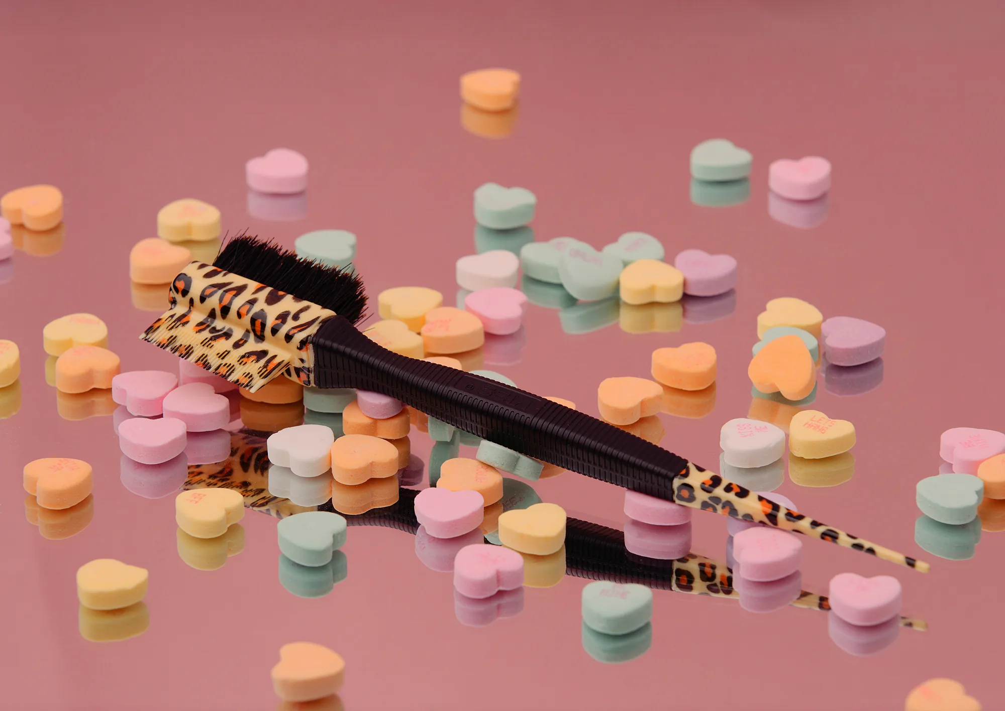
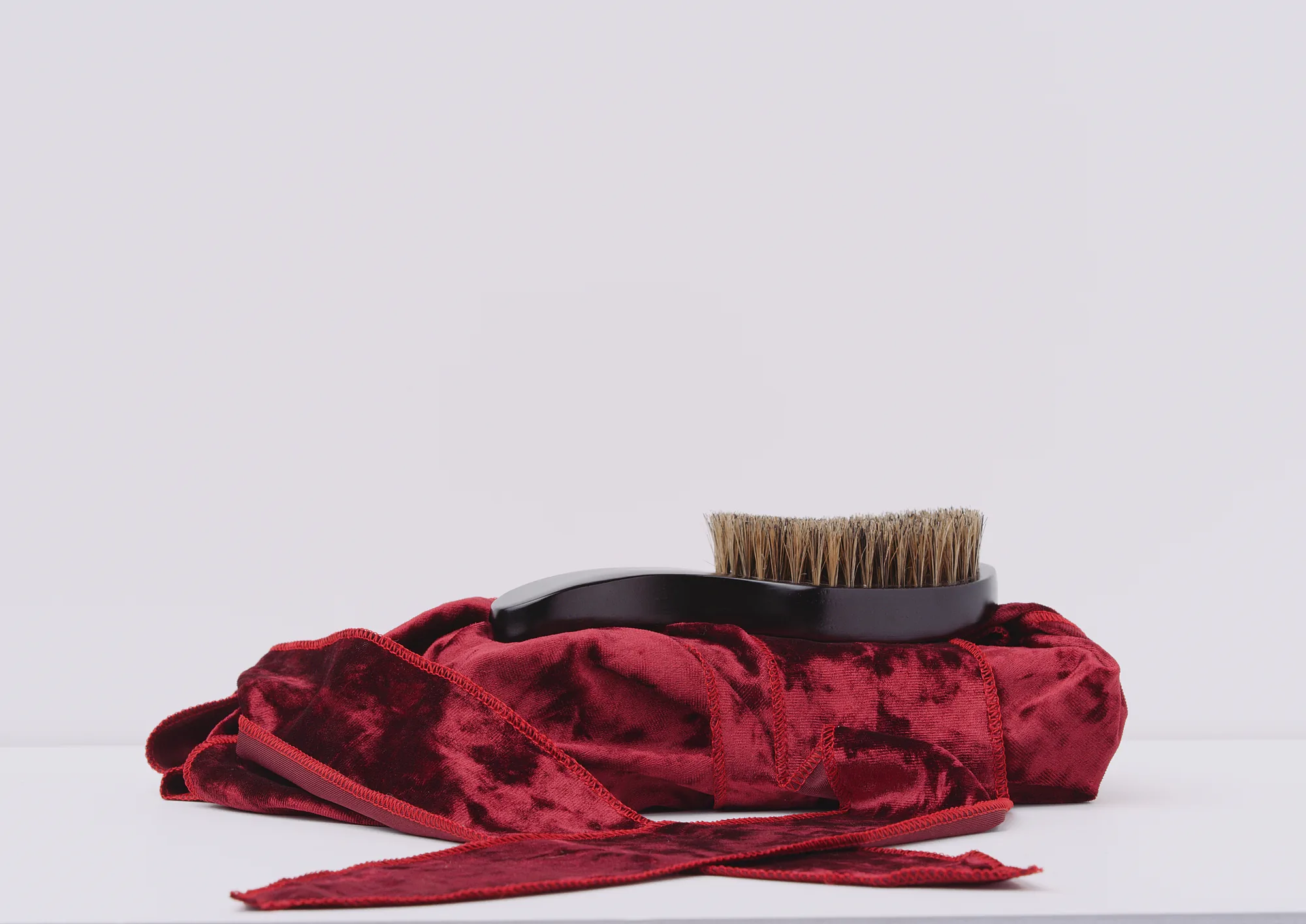
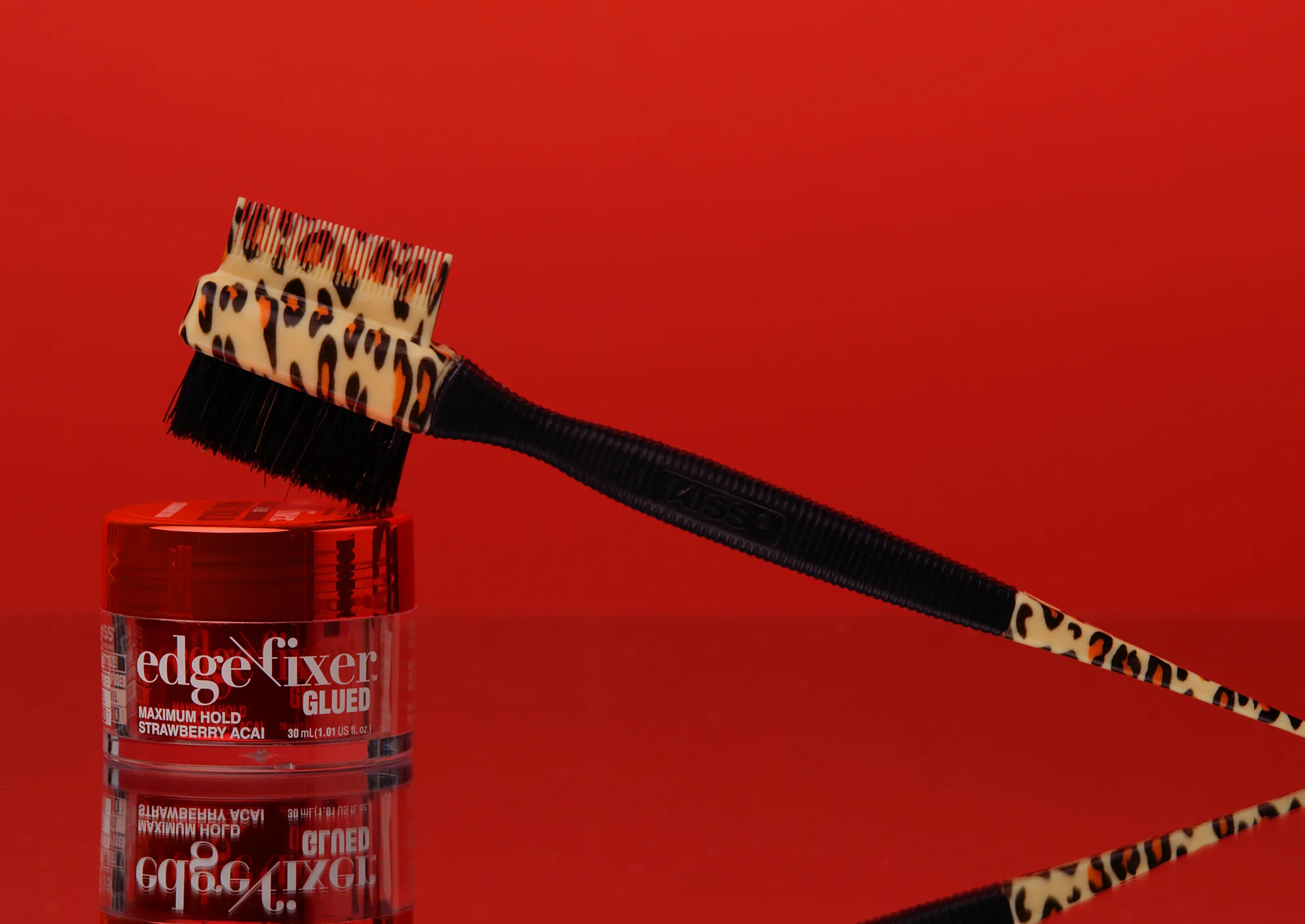
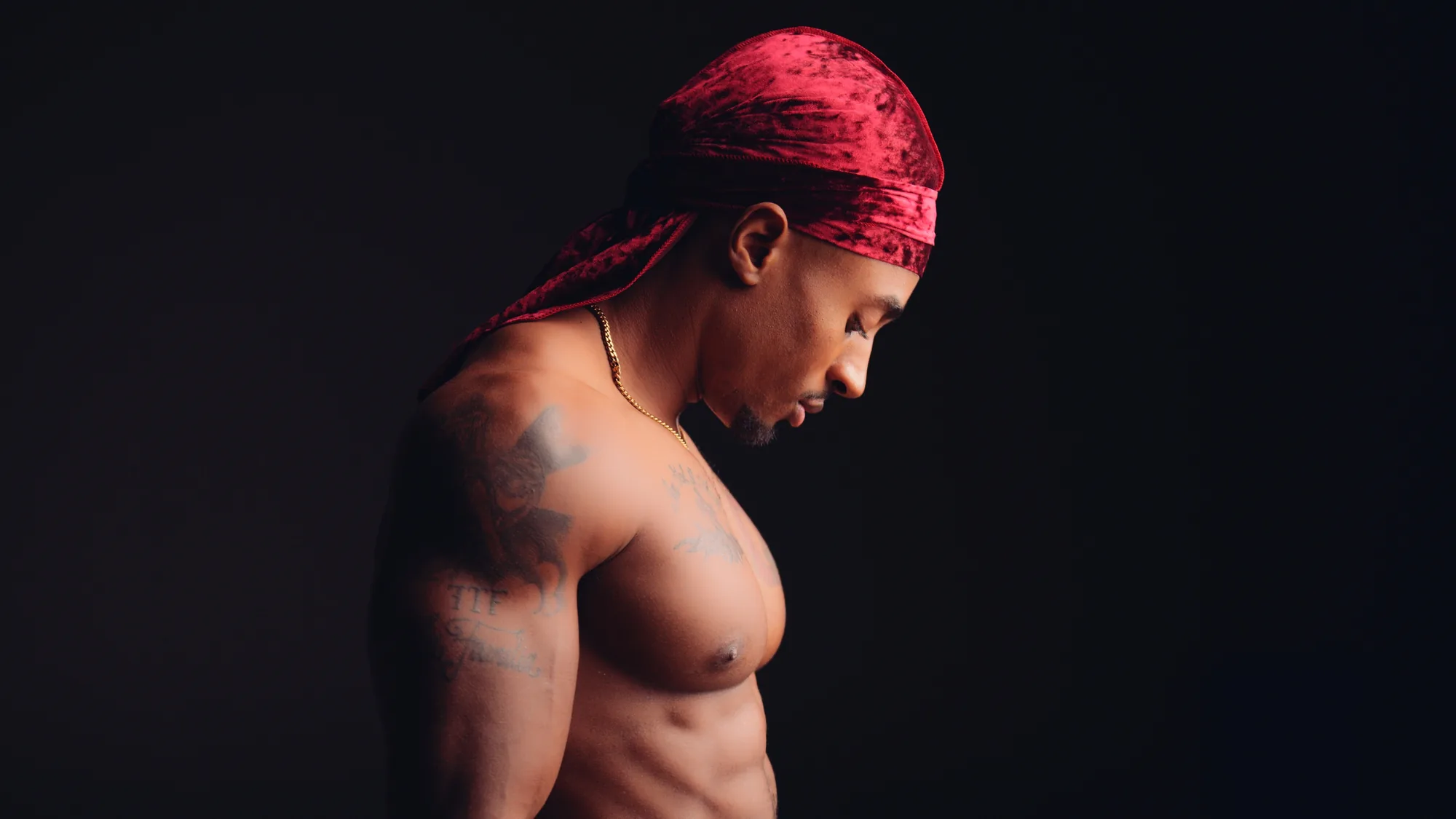
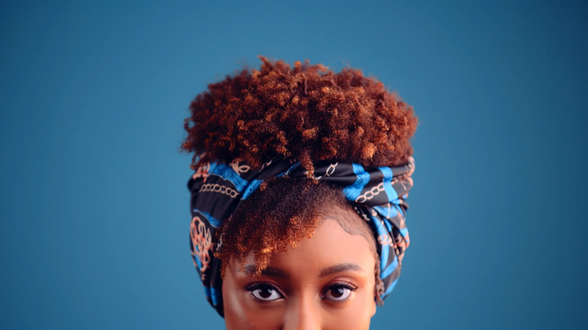
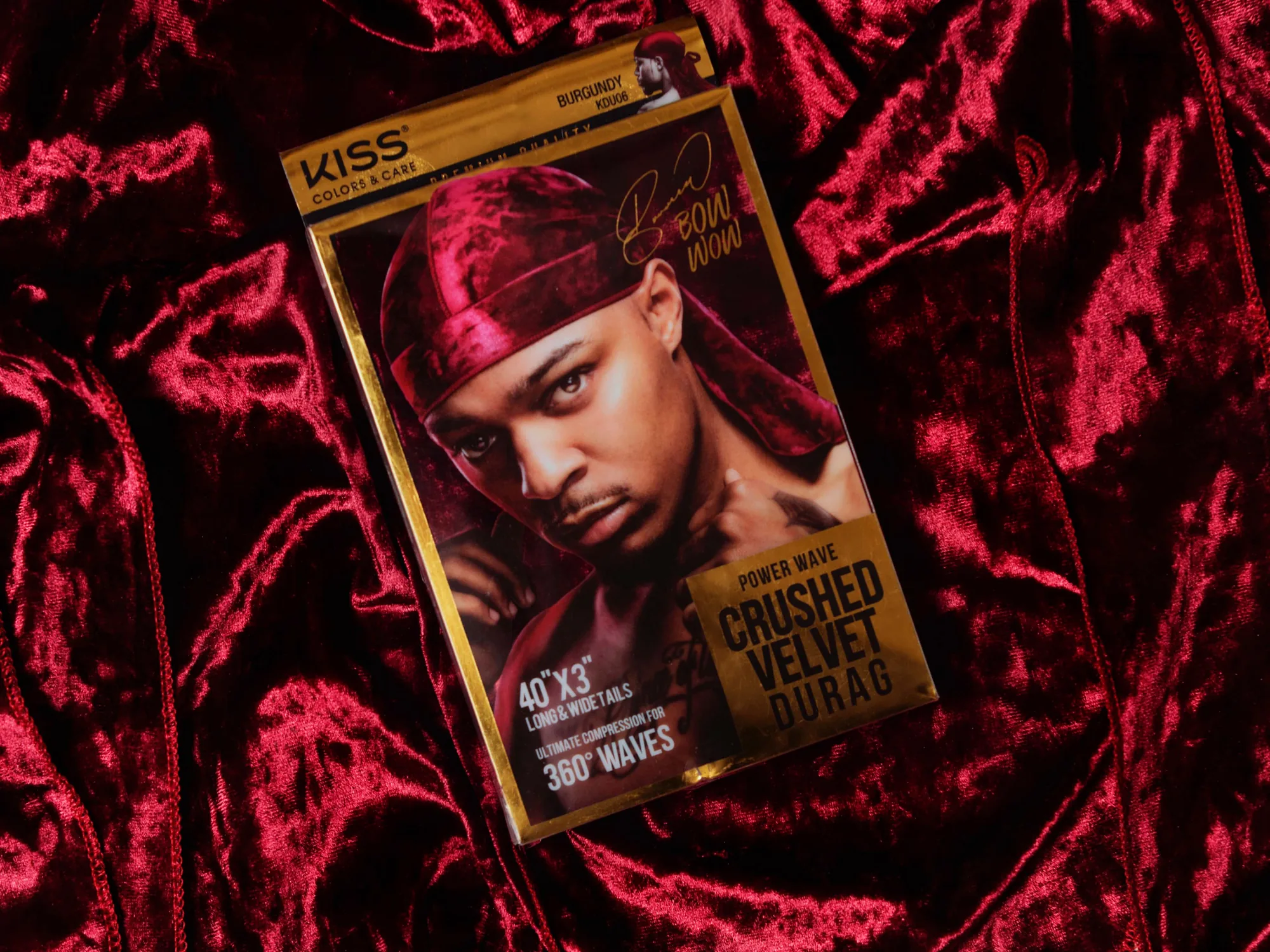
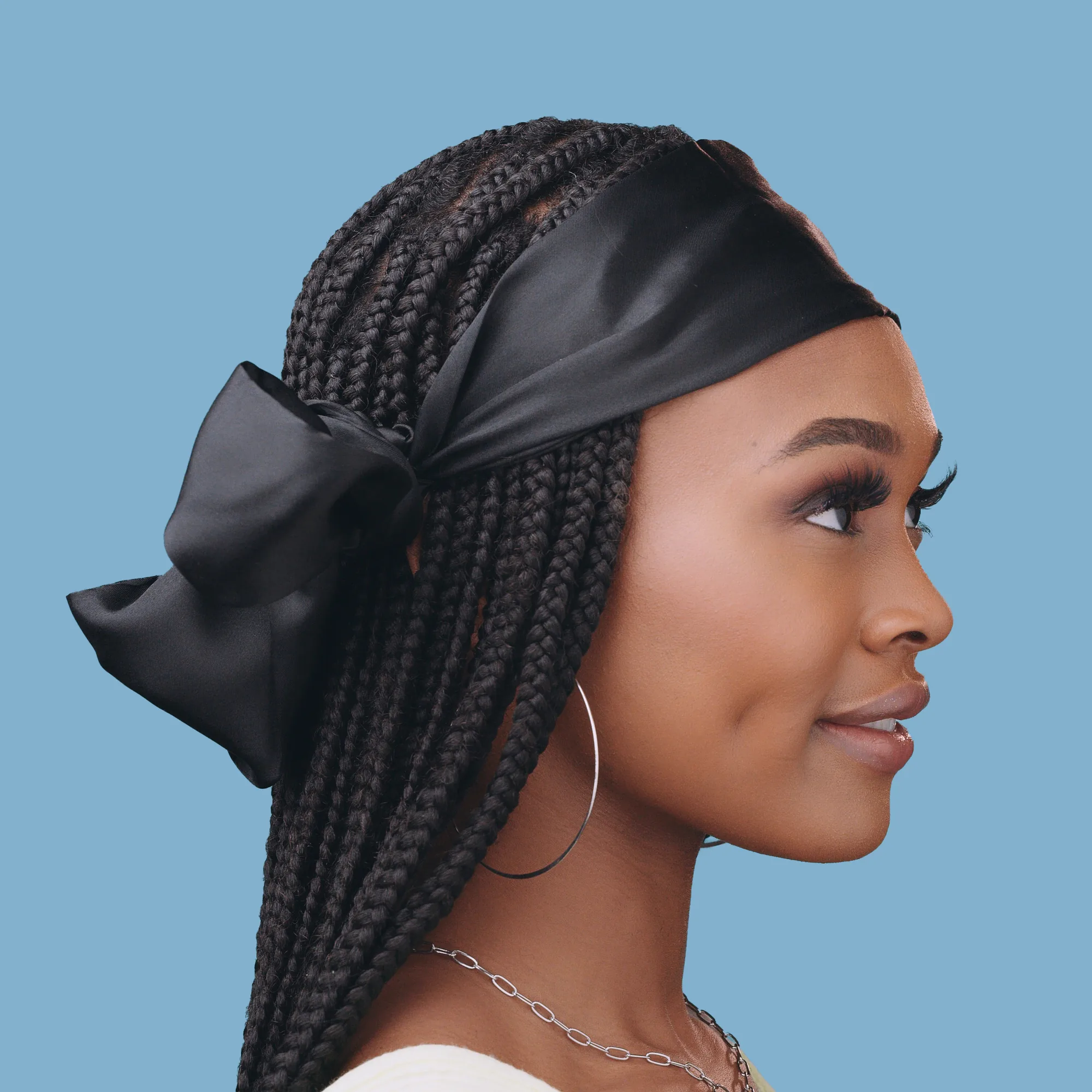
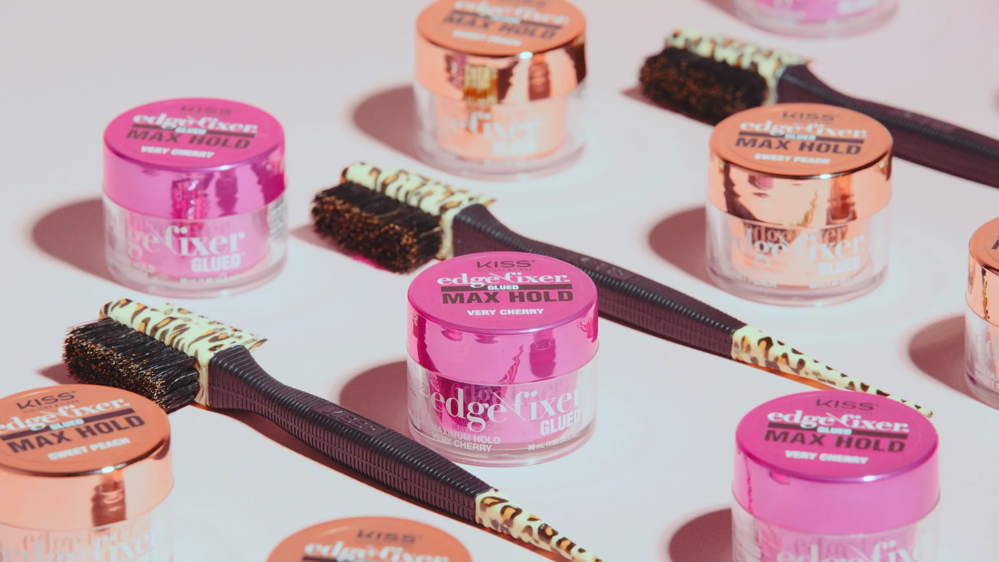
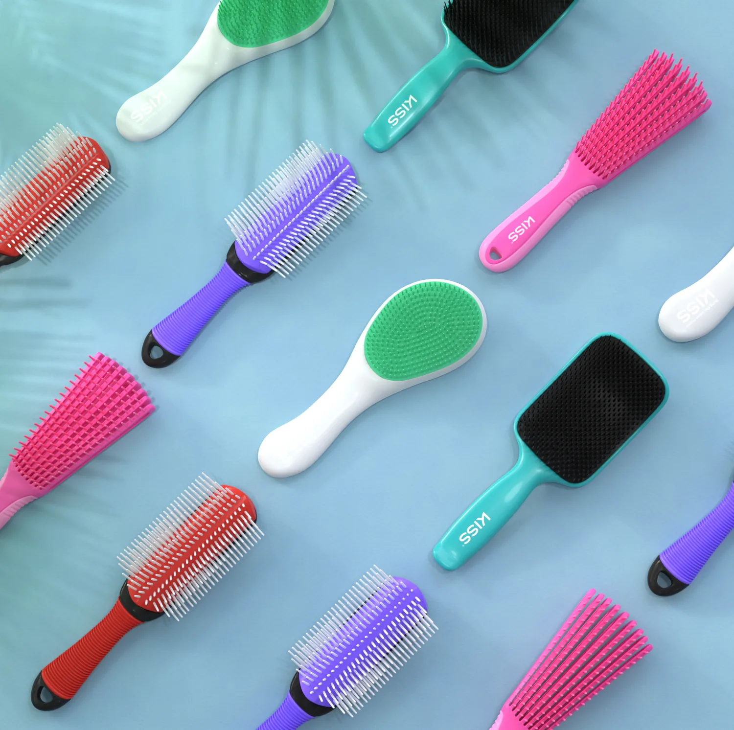
Edge brushes, bonnets, durags, and glitter caps. Shot on studio color, then rebuilt in 3D so the packaging matched the campaign.
Casting the Looks
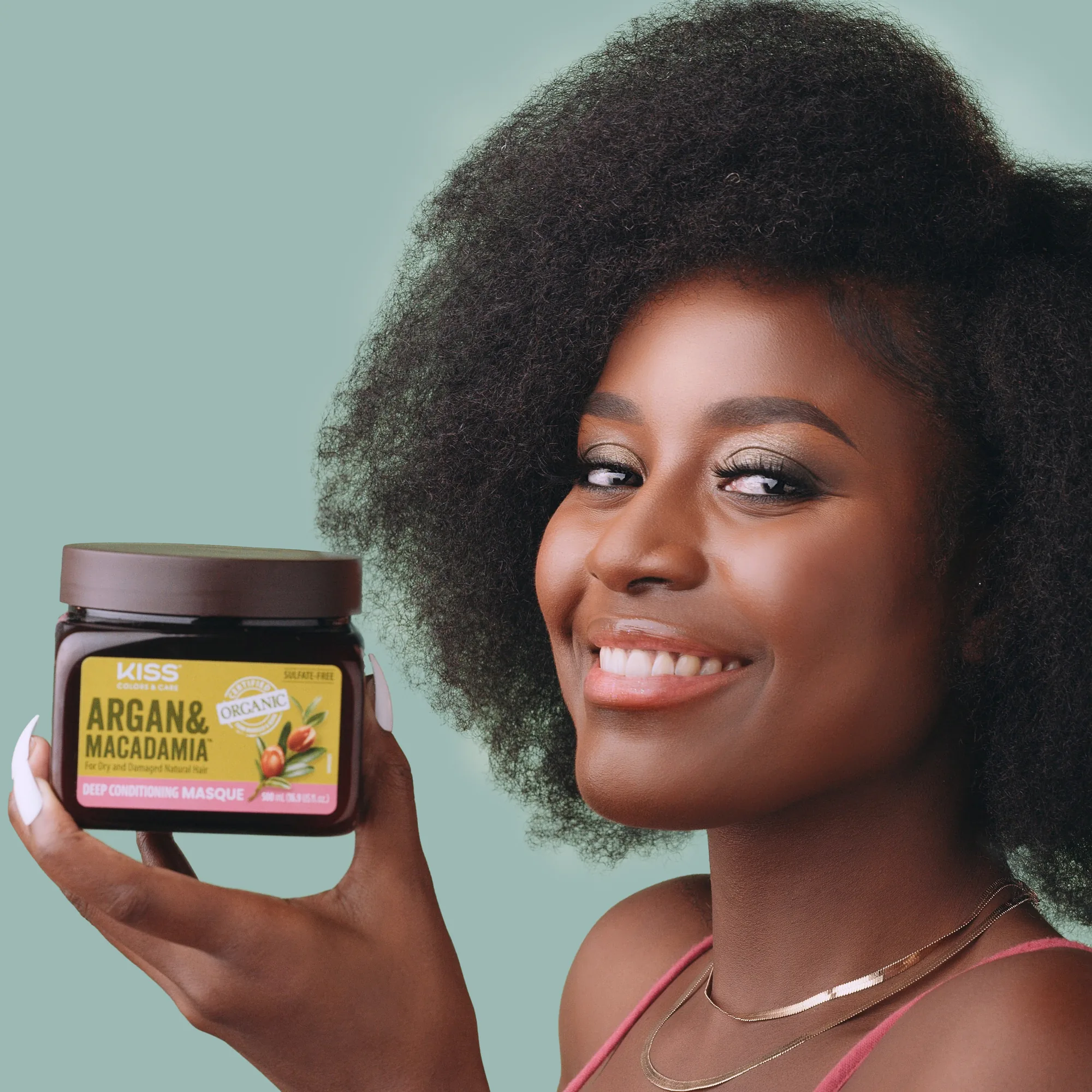
Colors and Care had to show specific hair textures. The claims on these packages are about styling hair, so the hair on camera has to align. That put casting ahead of almost everything else on this part of the account.
We cast out of our own database rather than going wide, and we looked for texture first. Every look on this page belongs to someone whose hair these products are actually made for.
The backdrops were built around the product colors instead of a house palette. Amber behind the gold glitter, deep red behind the crushed velvet durag, sea green behind the argan jar. It keeps a category with twenty different package colors from reading as twenty different campaigns.

Product Rendering
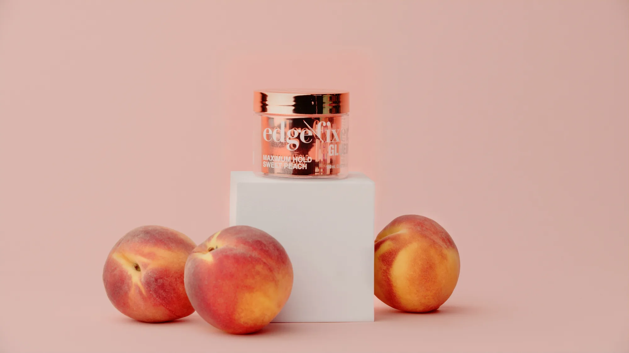
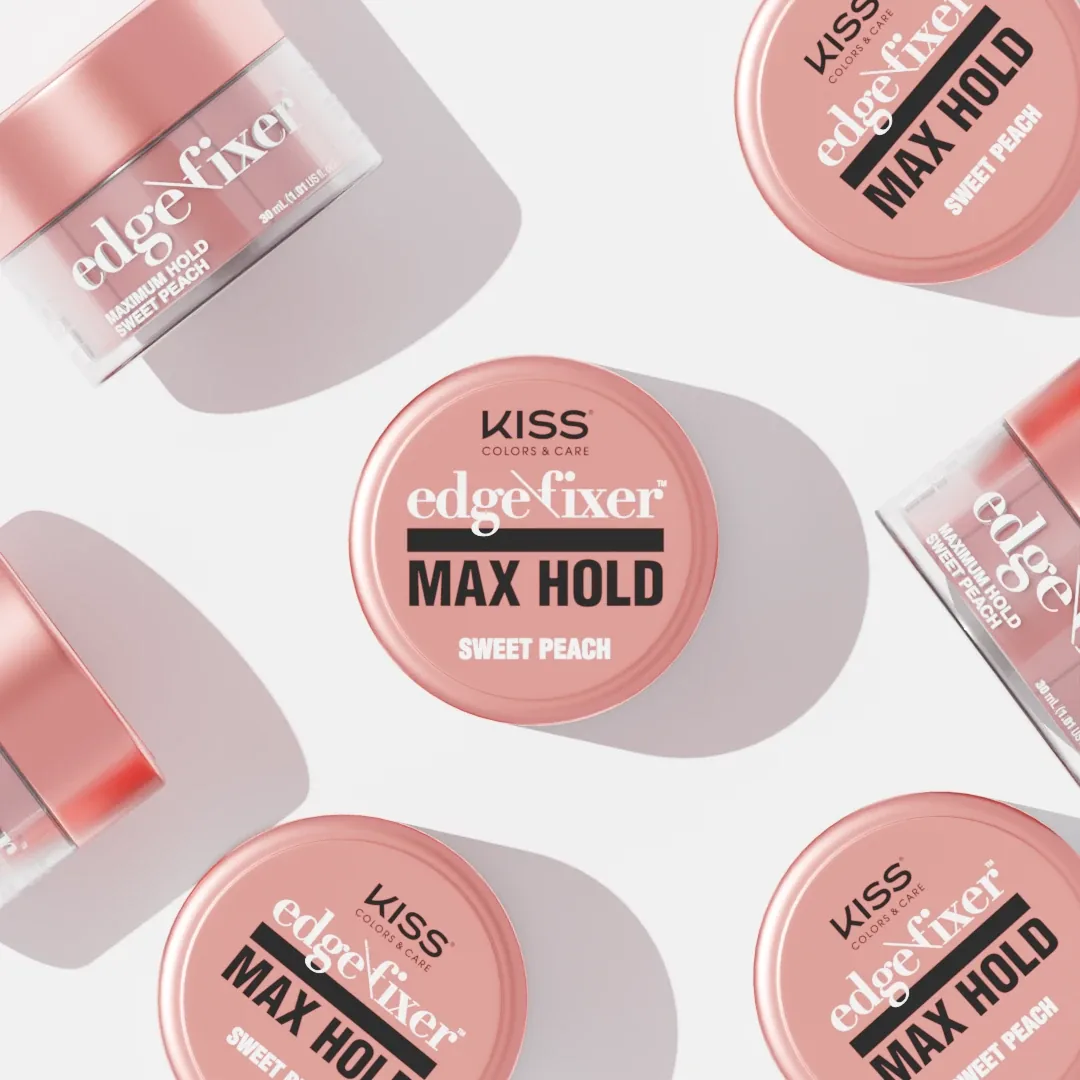
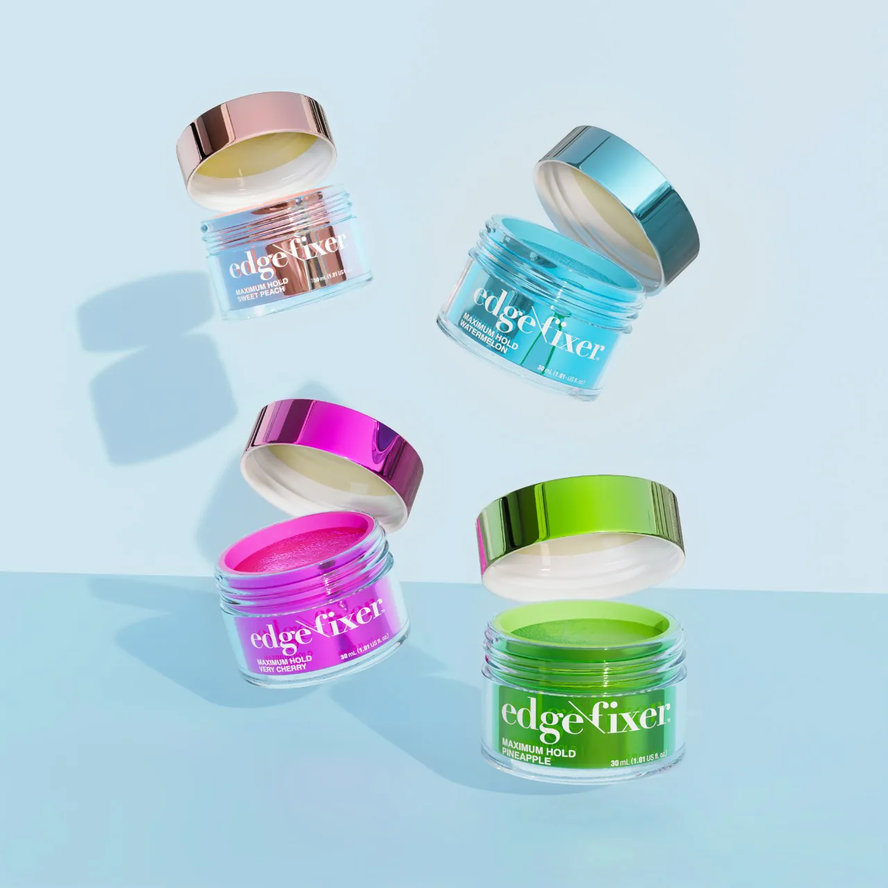
The packaging renders came after the shoot, built to match it rather than the other way around. Same color, same light direction, same surface finish.
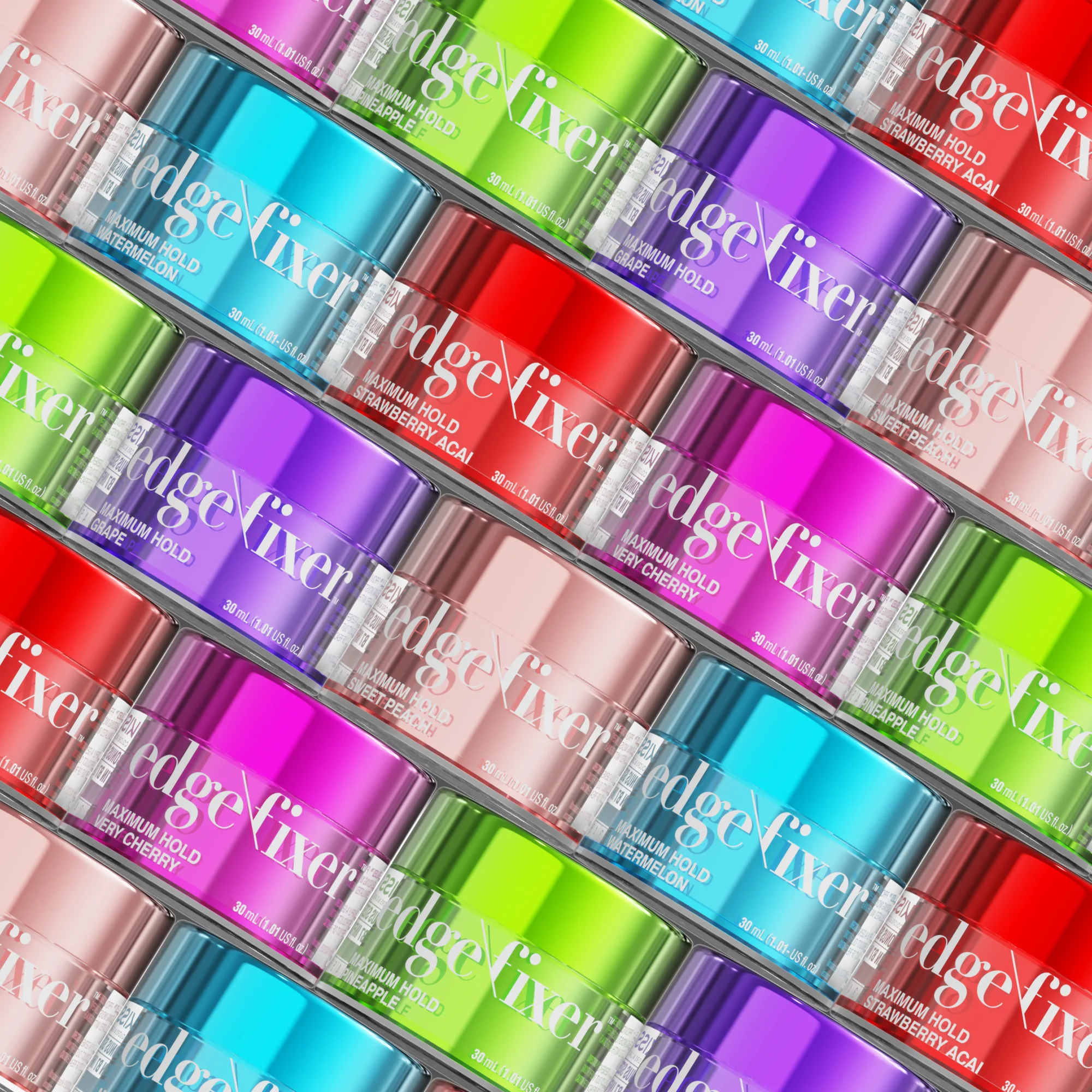
Every product on this side of the section was modeled from scratch. The jars, the lids, the bristles on the brushes, the satin on the bonnets. Then we built rooms to put them in. A tiled bathroom for the Edge Fixer jars, monstera and palm for the satin caps, a wall of color for the full shade range.
The reason to work this way is control. A flat lay of every shade means sourcing every shade, and one scuffed lid ruins the frame. In 3D a shade is a material swap and the set does not have to exist. It also meant KISS could put products in front of a camera before those products had been manufactured.
The hard part was never the modeling. It is getting a render to sit beside a photograph without either one looking wrong. Everything here had to survive that comparison, because on the page it lands directly under real skin and real hair.
JOAH Beauty
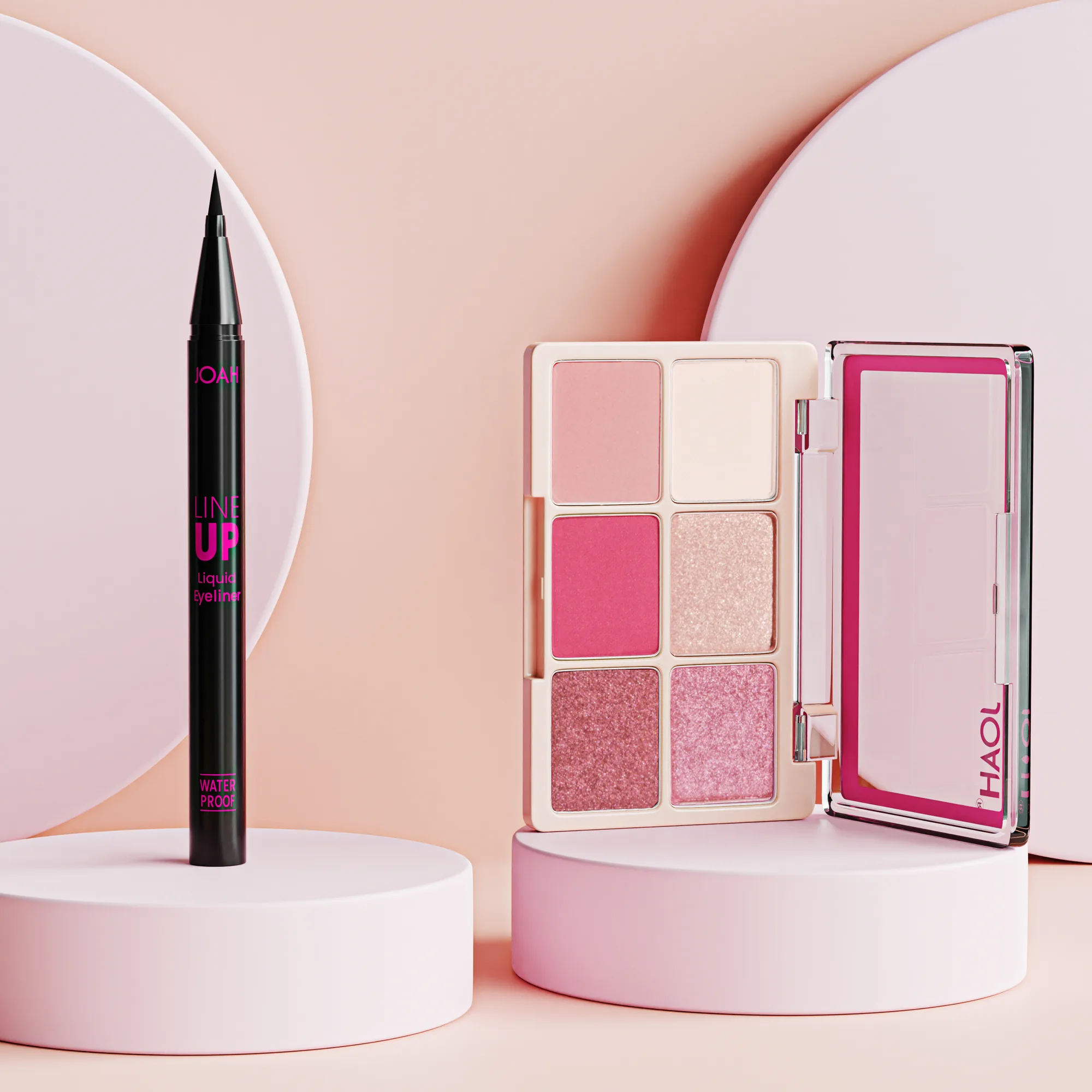
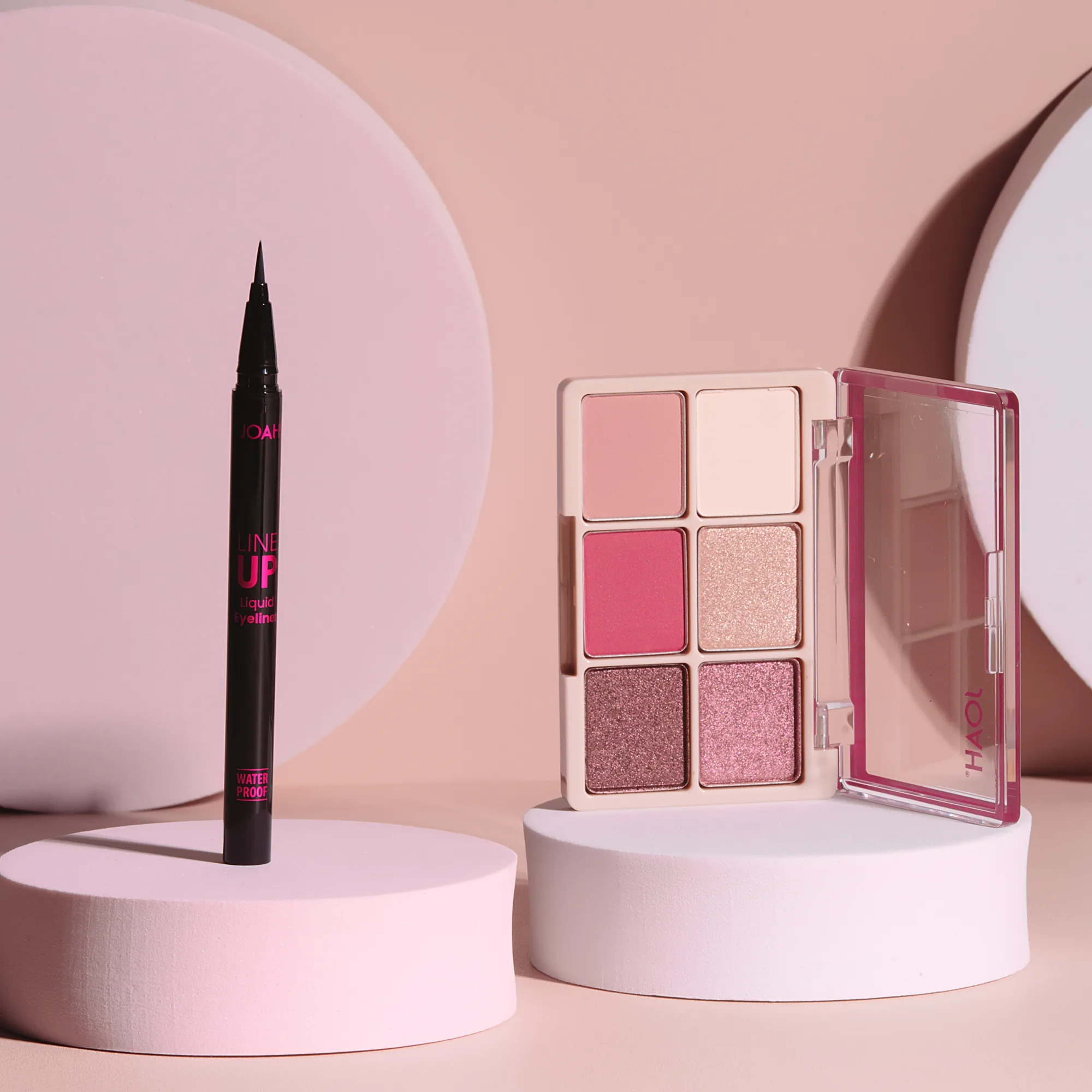
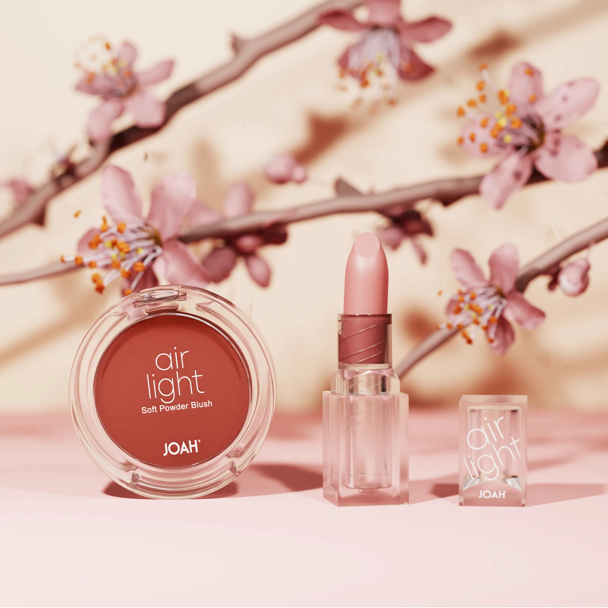
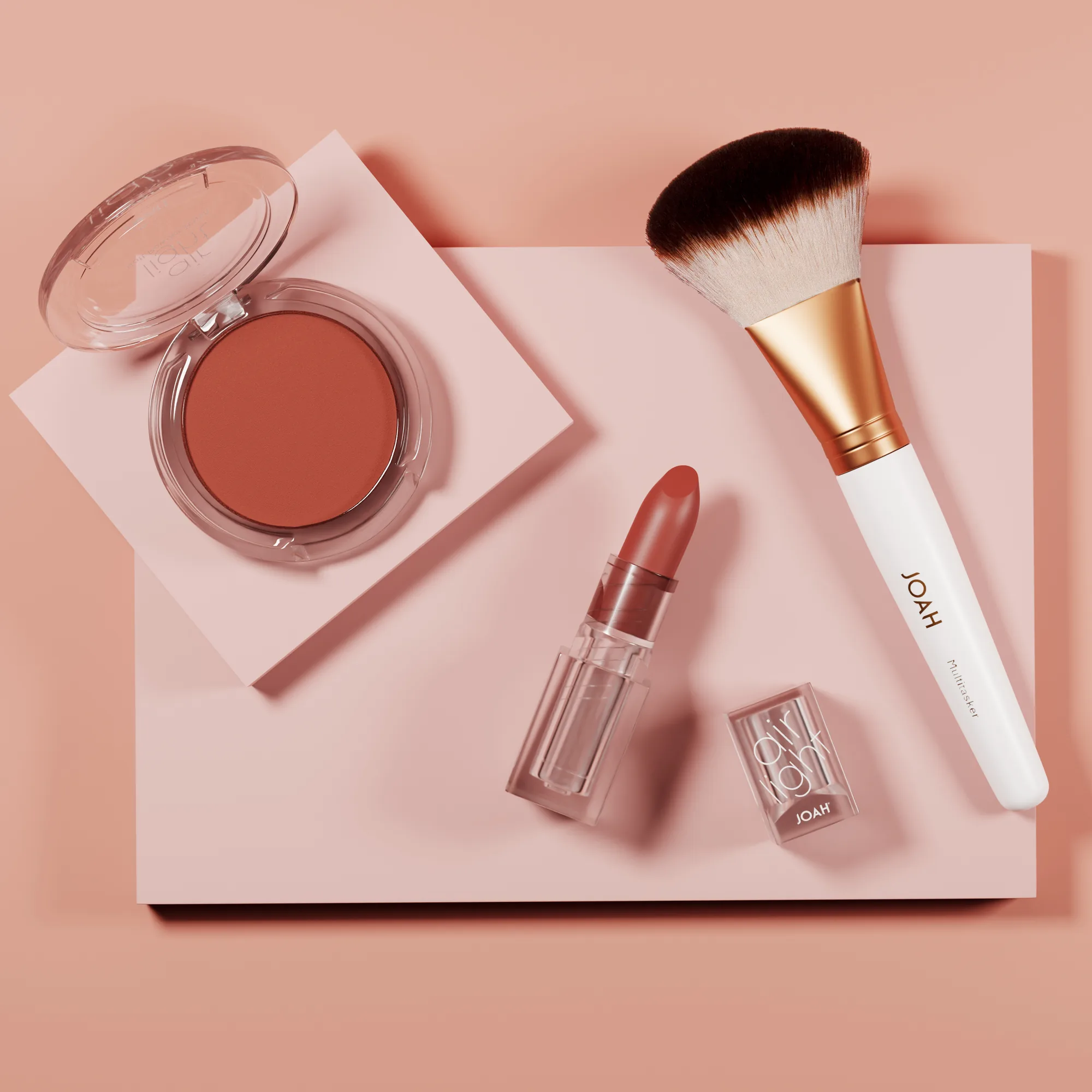
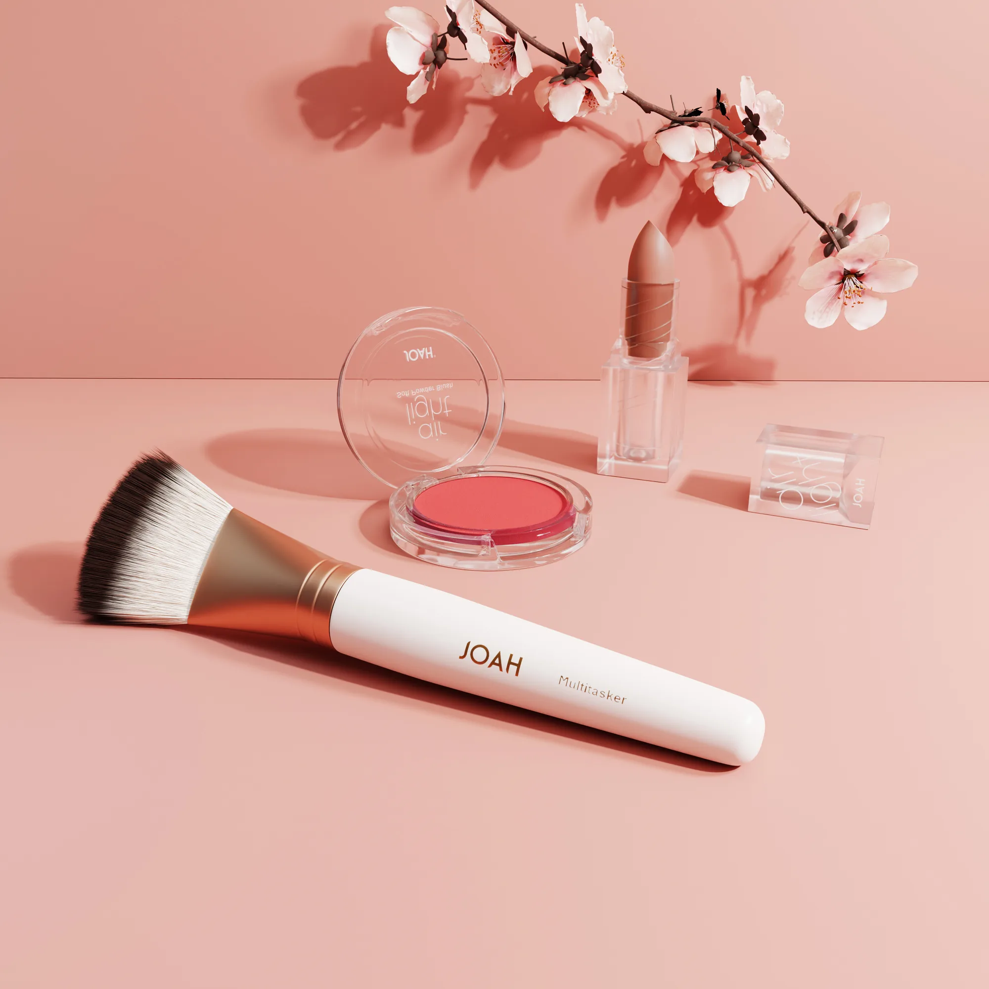
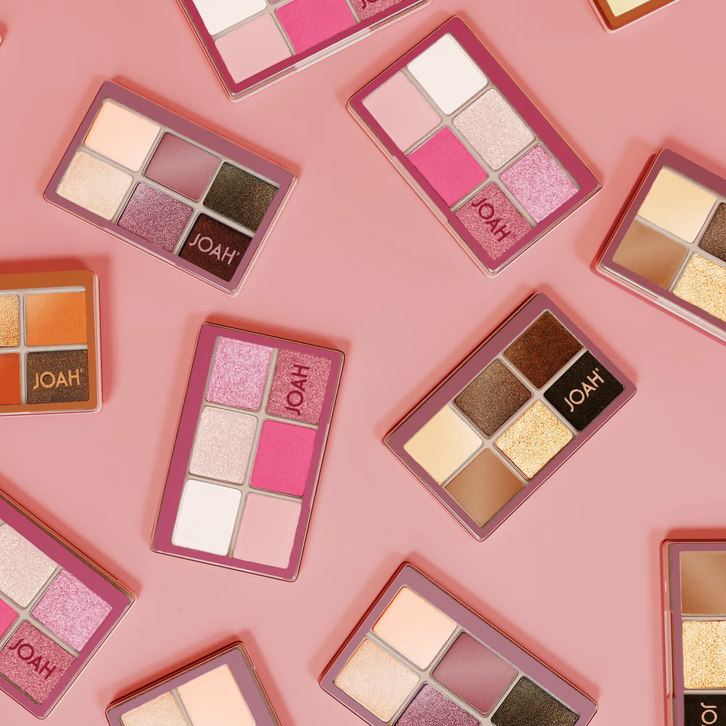
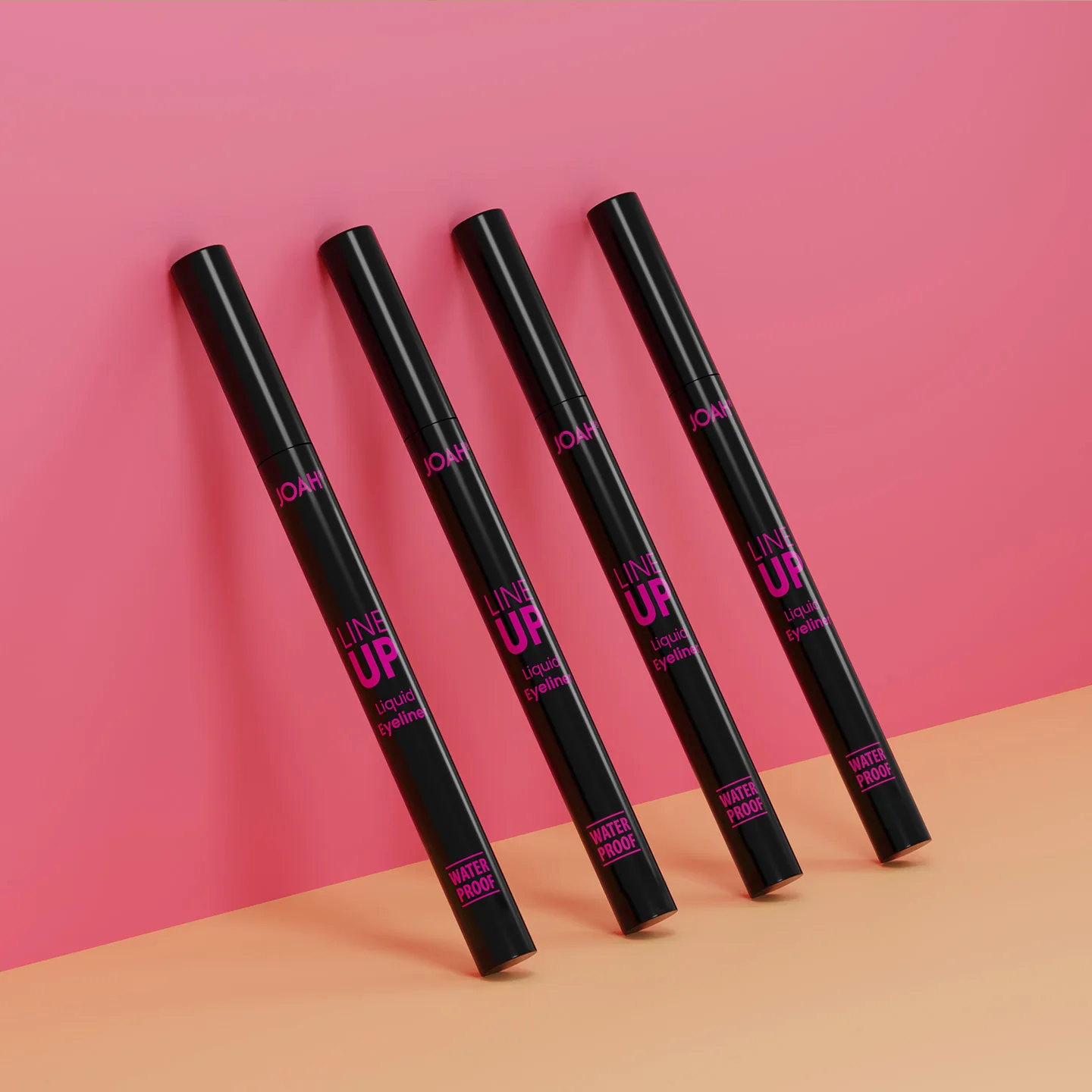
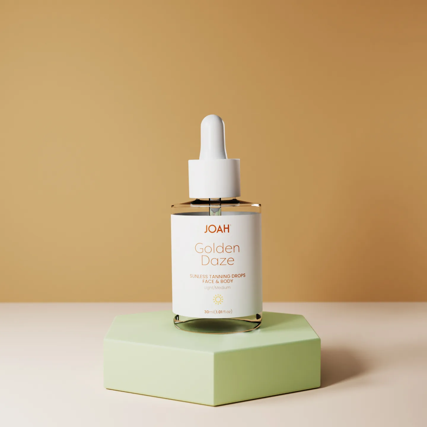
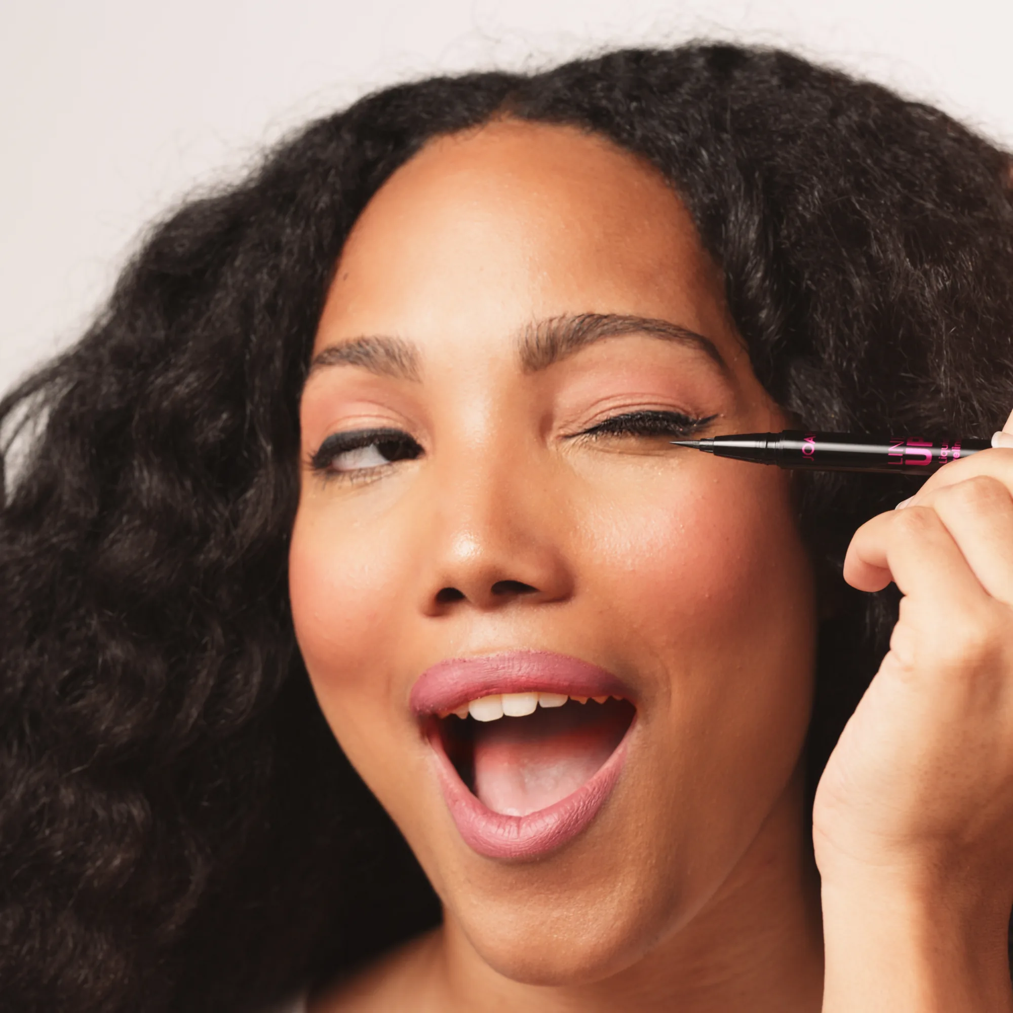
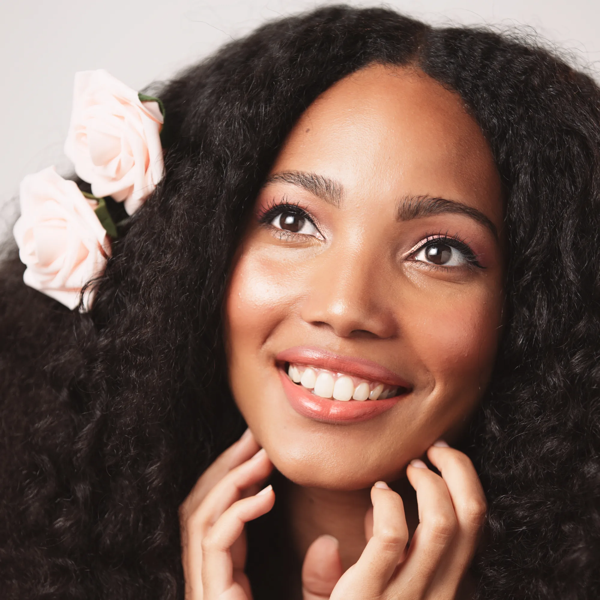
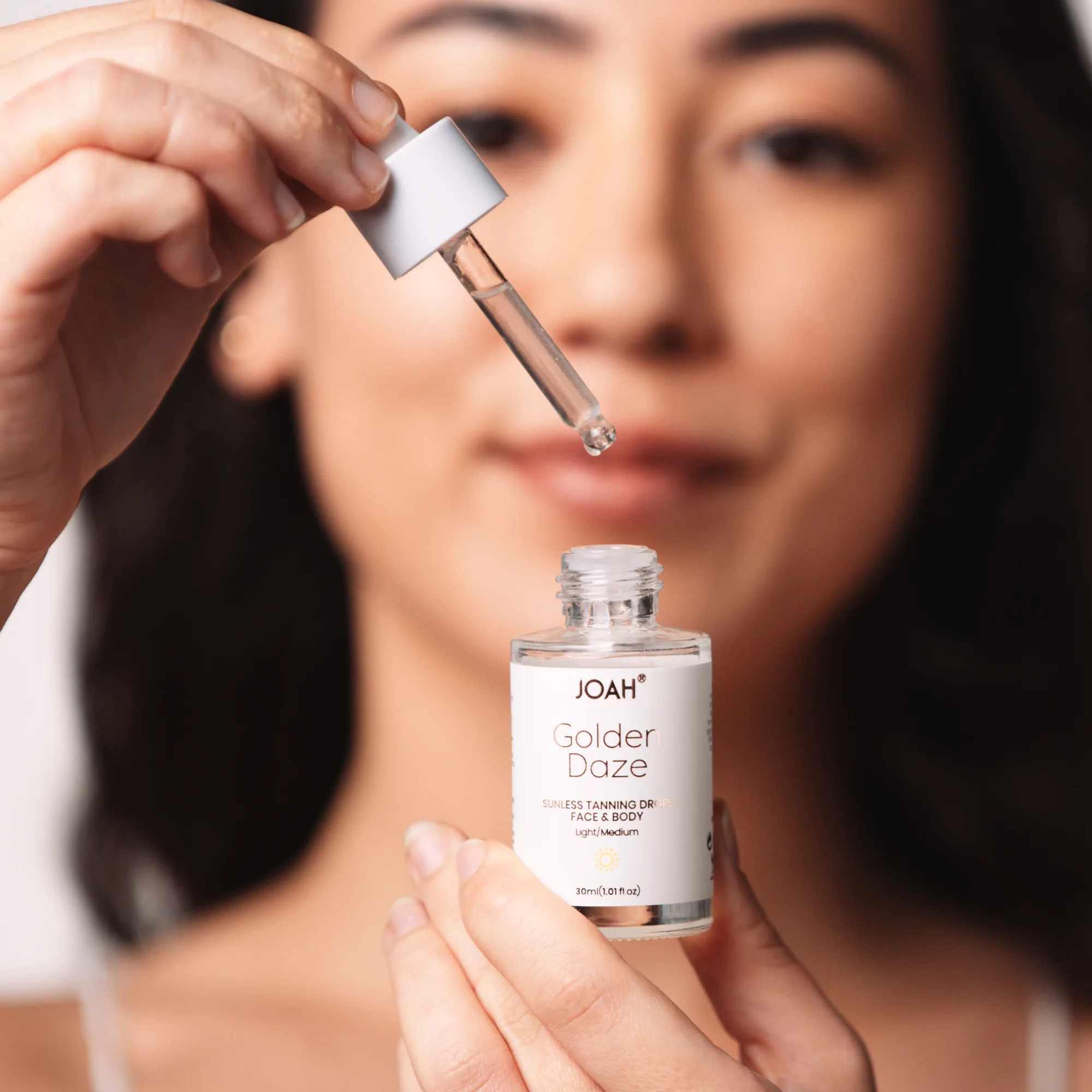
Palettes, liners, glosses, and the Golden Daze tanning drops. These images are a combination of photography and 3D rendering.
Color Matching
Color is the whole problem in cosmetics, because the product and the skin have to agree. A gloss that photographs half a step too warm stops matching the swatch on the box, and the customer sees it before the brand does.
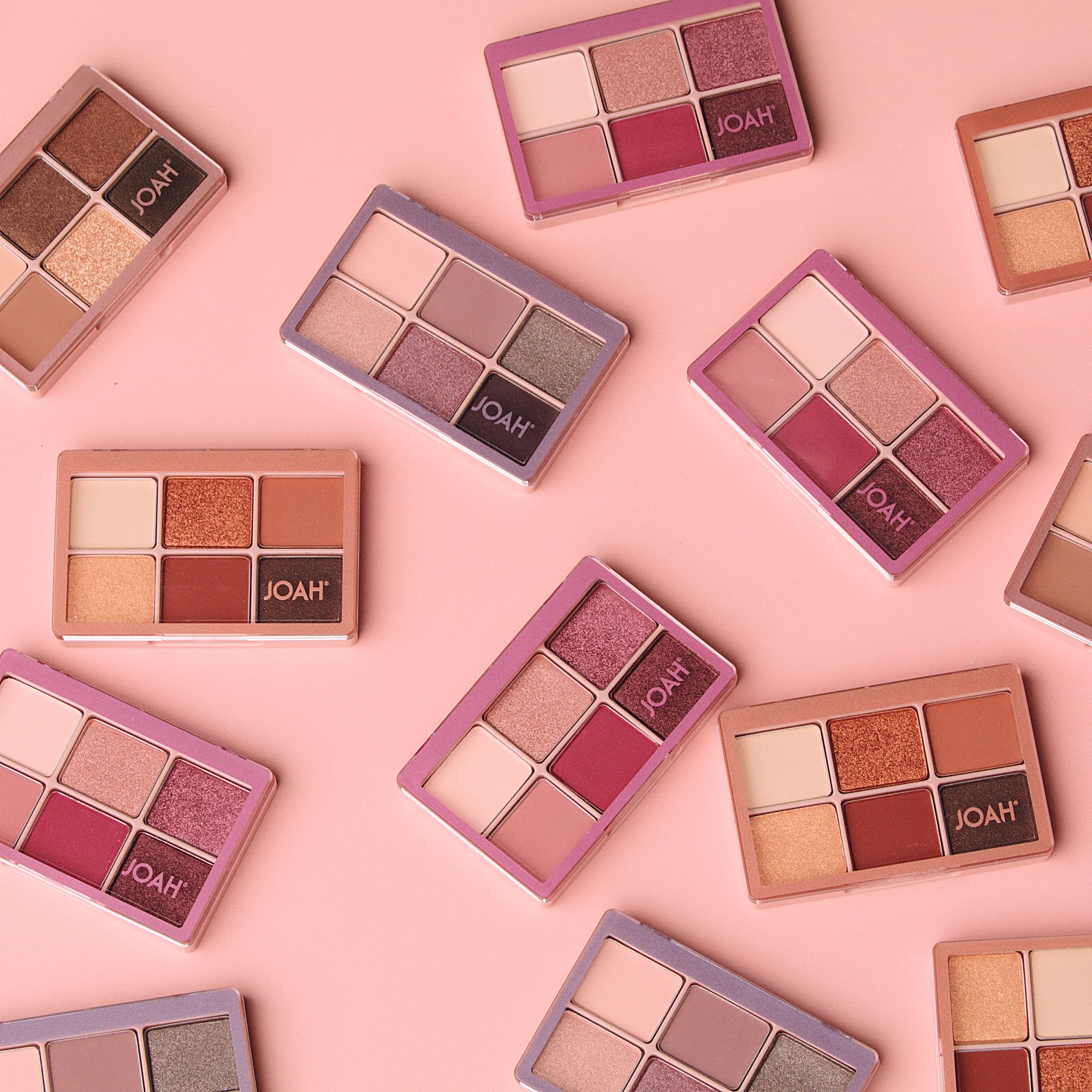
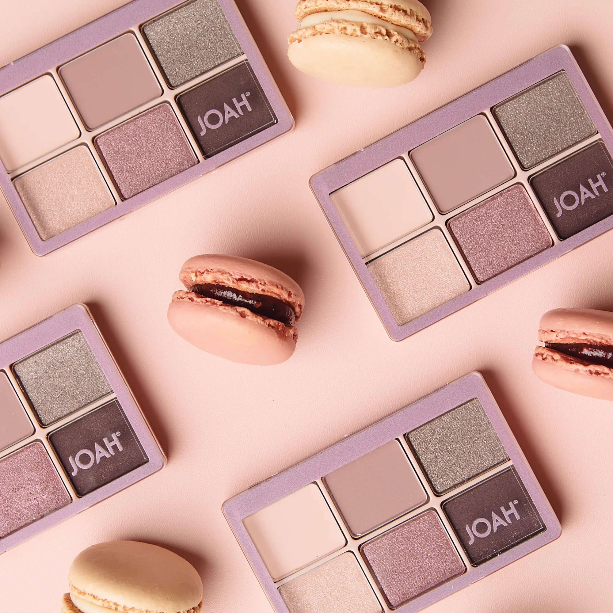
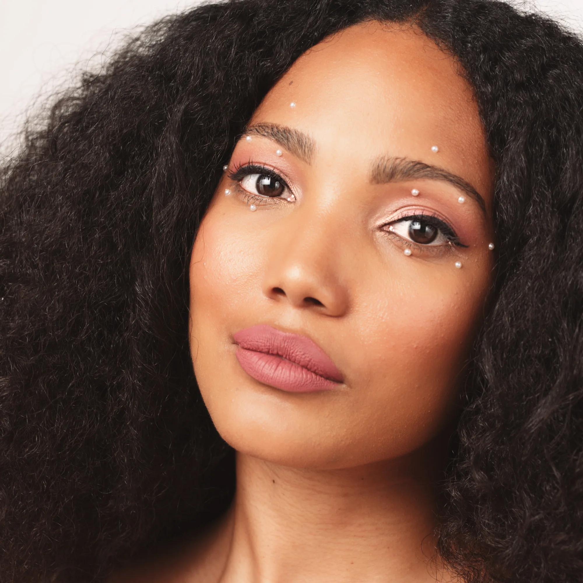
JOAH runs pink through almost everything. Powder pink sets, rose gold caps, macarons, cherry blossom, and warm neutrals sitting on top of all of it. Holding that across a photograph of a real face and a render of a plastic compact takes more than copying a hex value between the two.
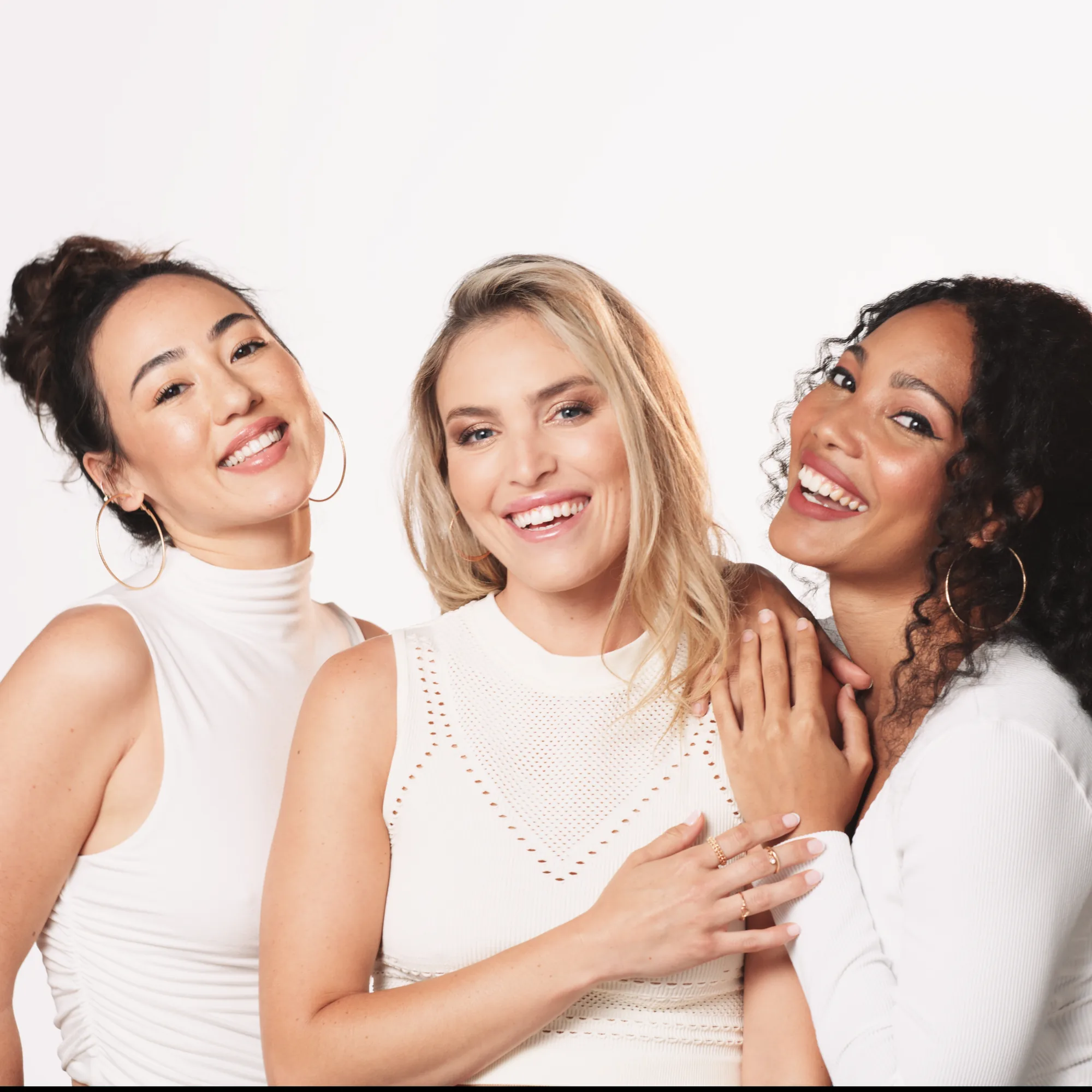
We shot the portraits first and graded them, then built the CG to that grade rather than to the packaging artwork. Every render in this section was lit with the same key direction and the same falloff we used on set, so the highlight on a lipstick bullet lands where the highlight on a cheekbone lands.
The test is simple. Put a render and a photograph beside each other in a feed and see whether the seam shows. That was the bar for every frame here.

Falscara
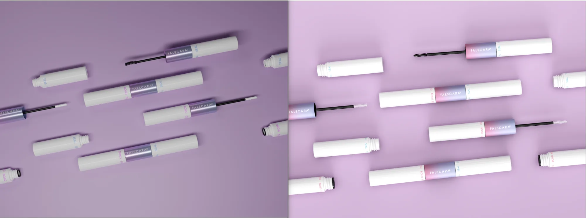
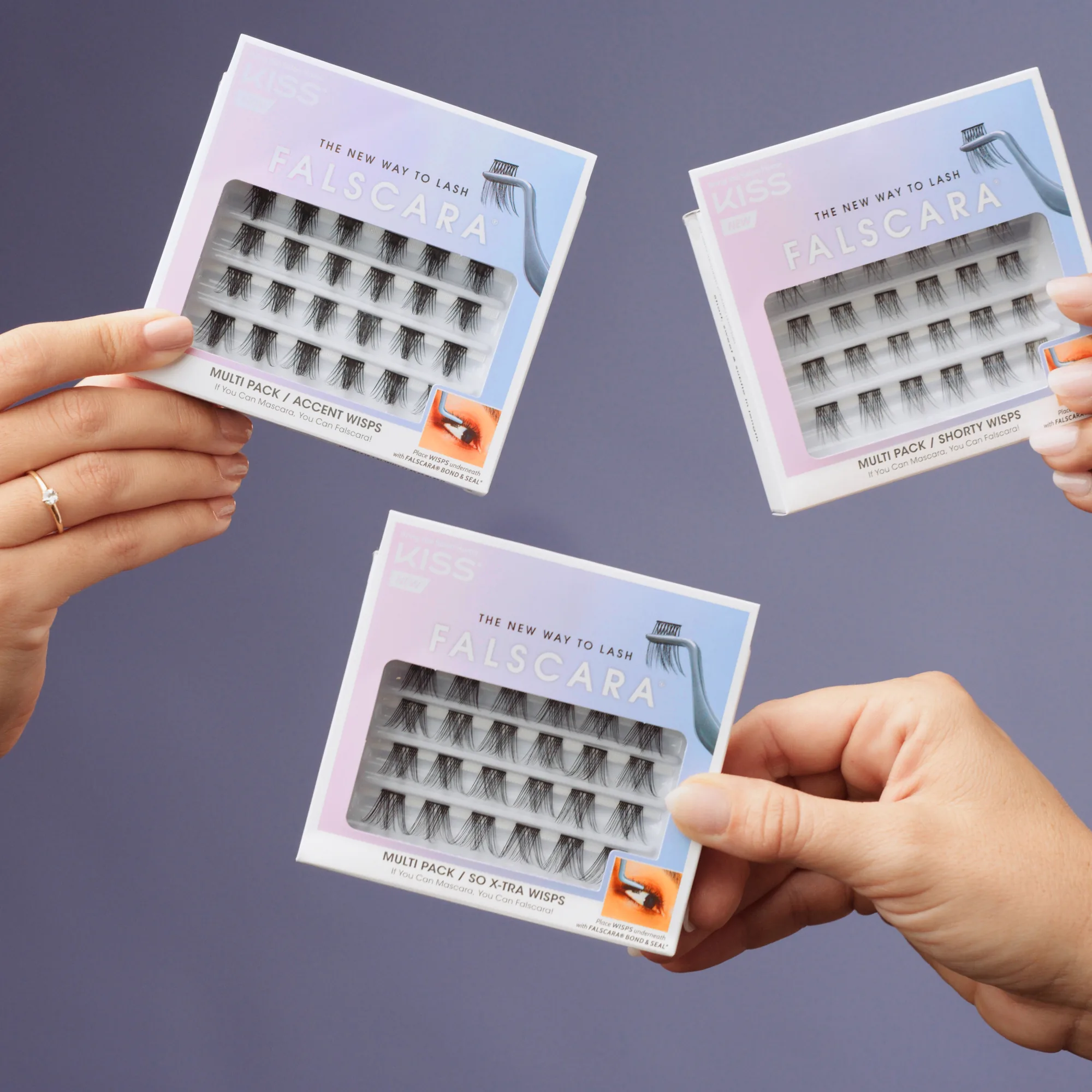
A product that only makes sense in close up, paired with 3D sets a camera was never going to reach.

Up Close and Personal
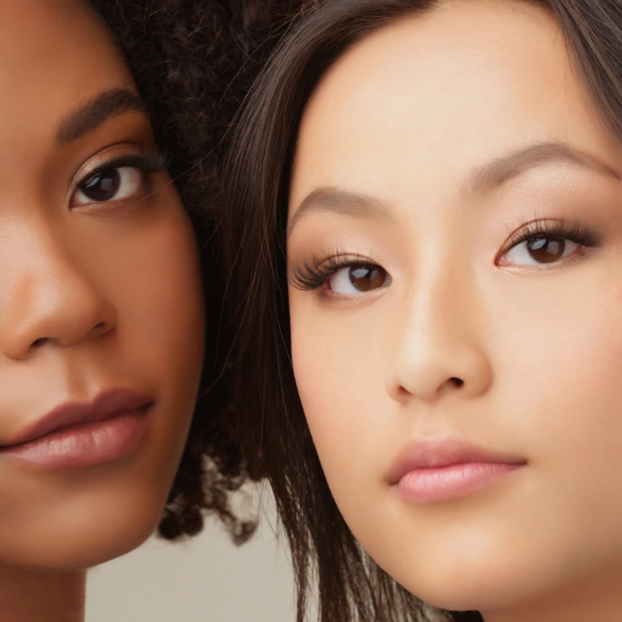
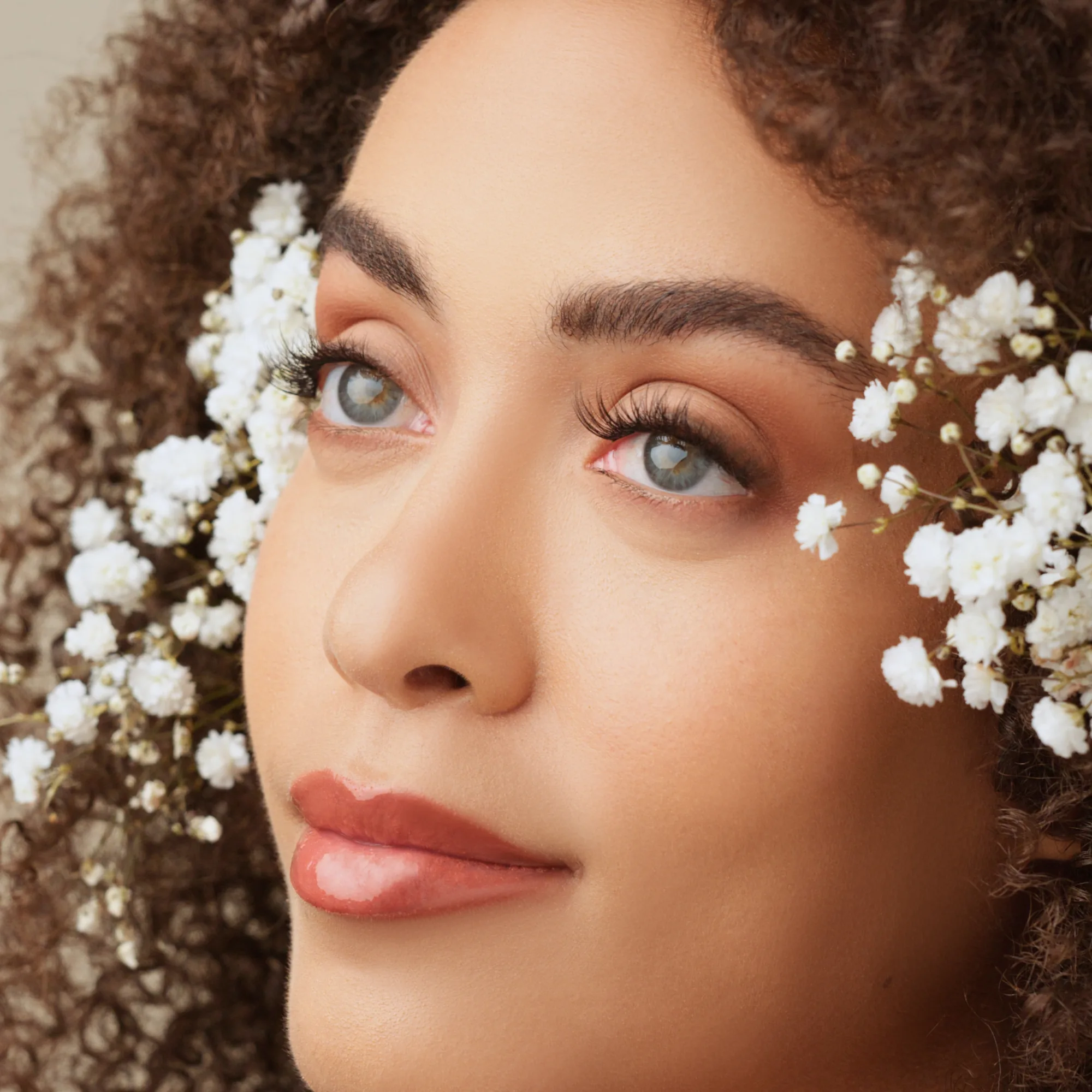
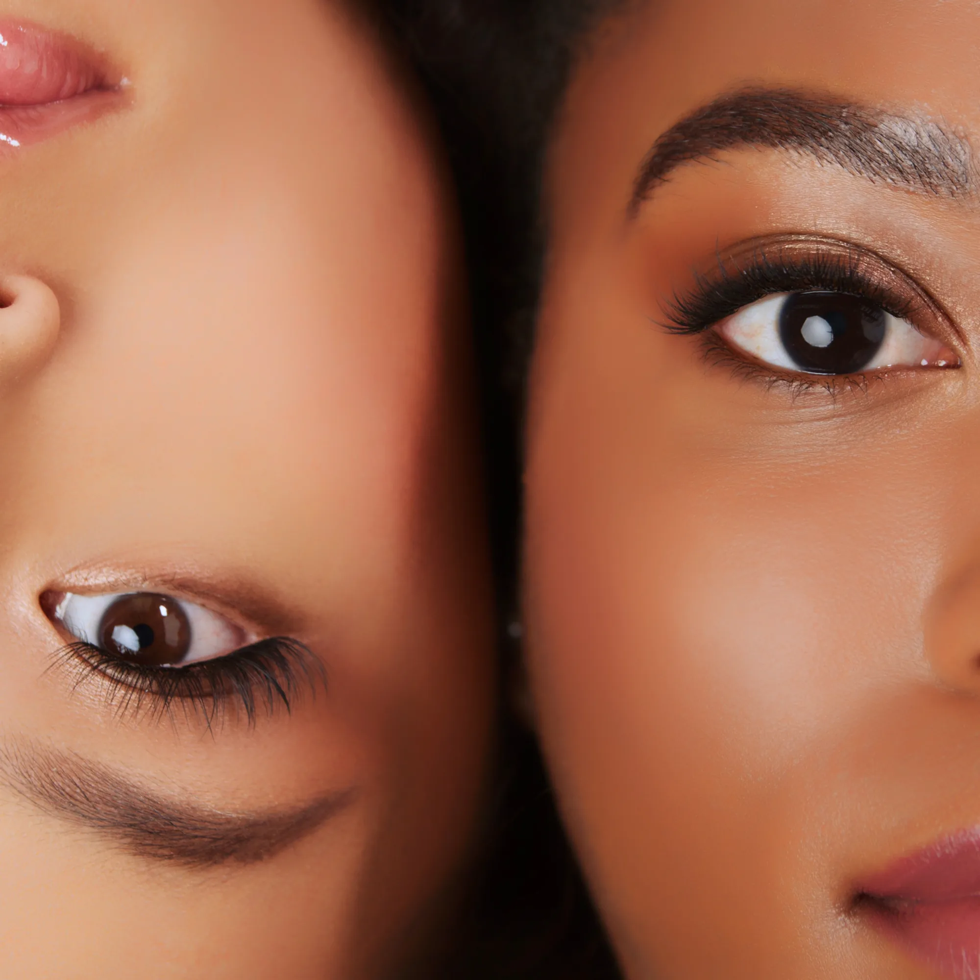
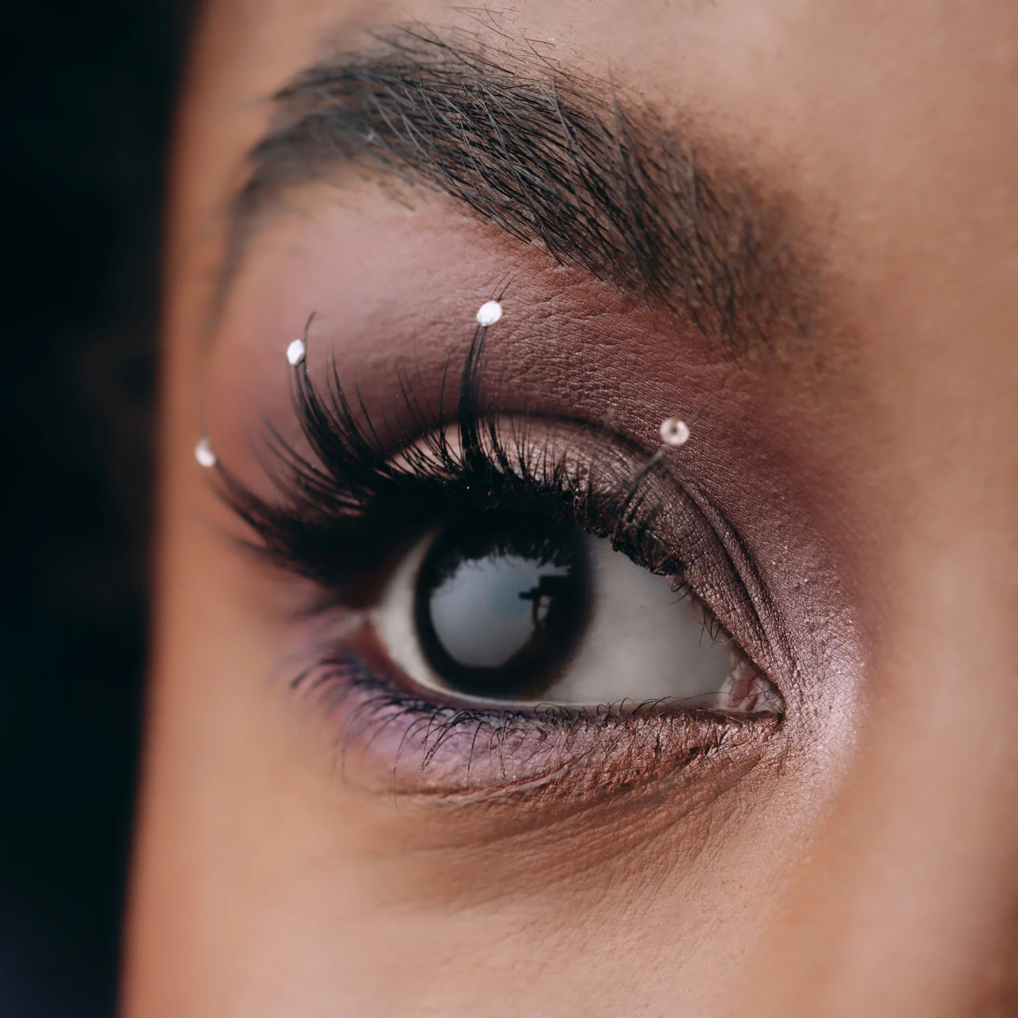
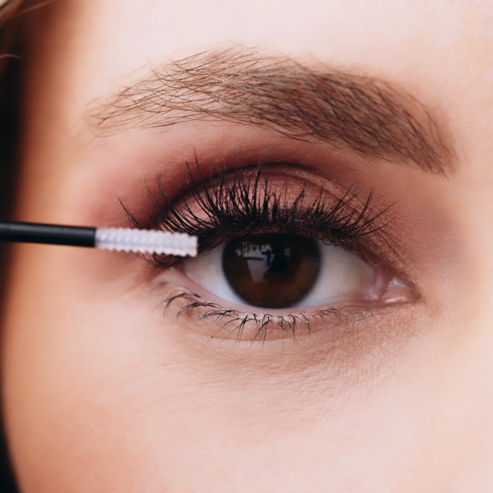
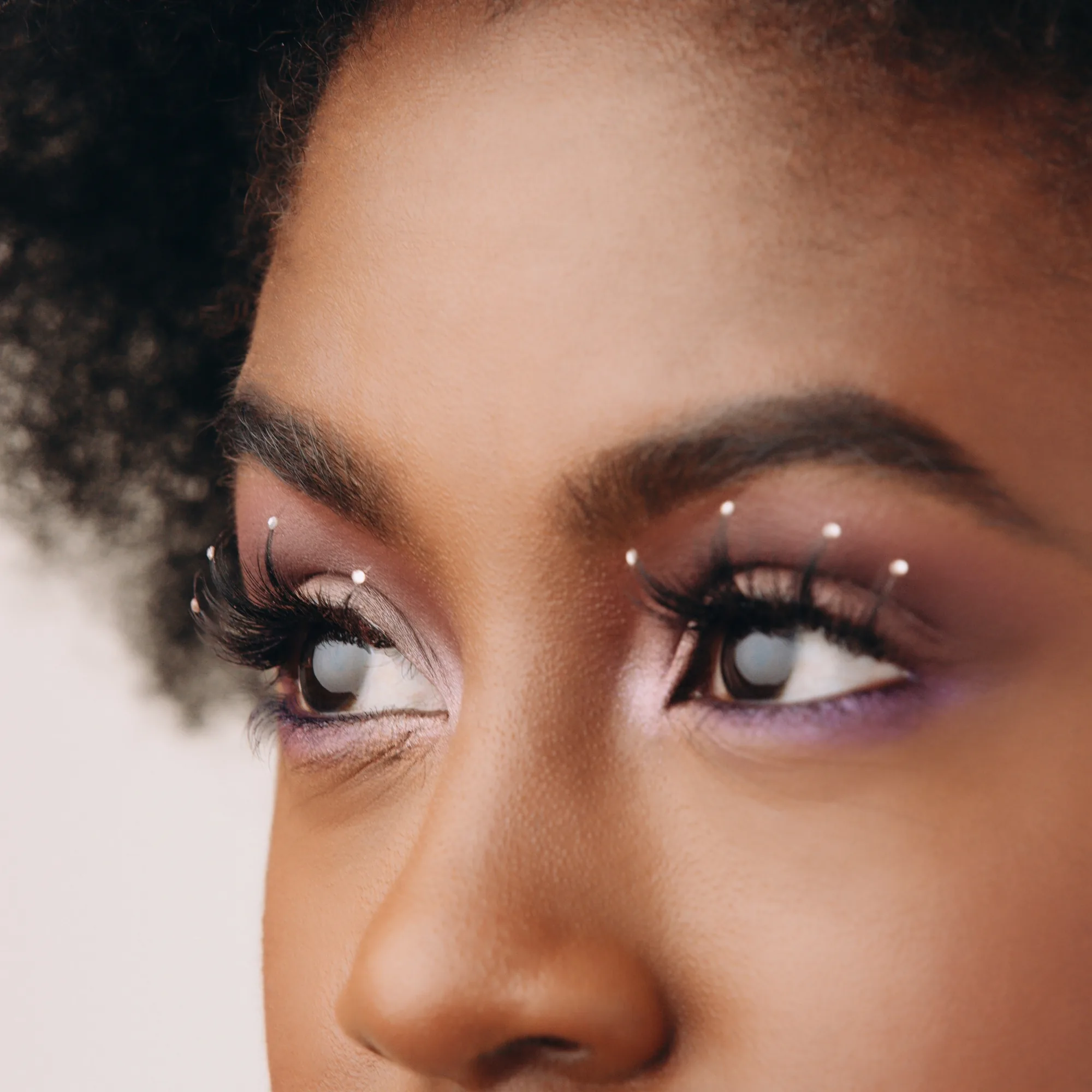
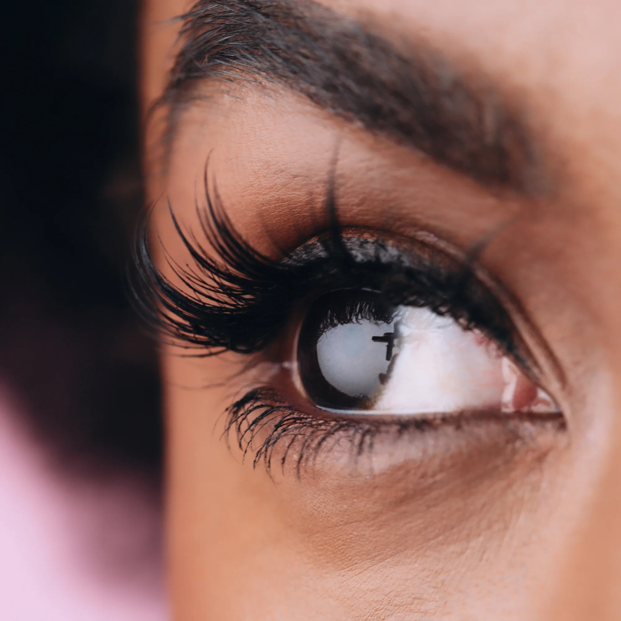
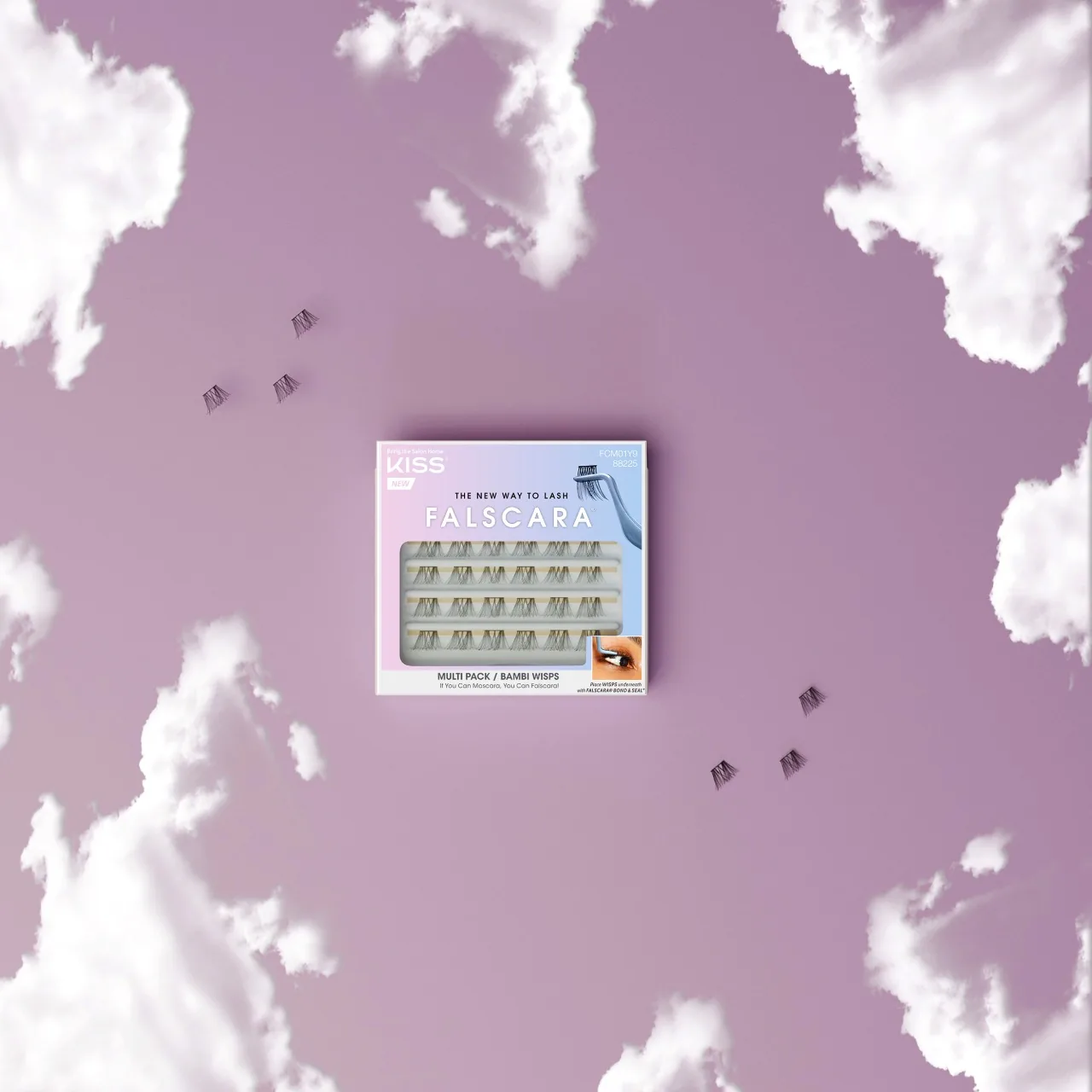
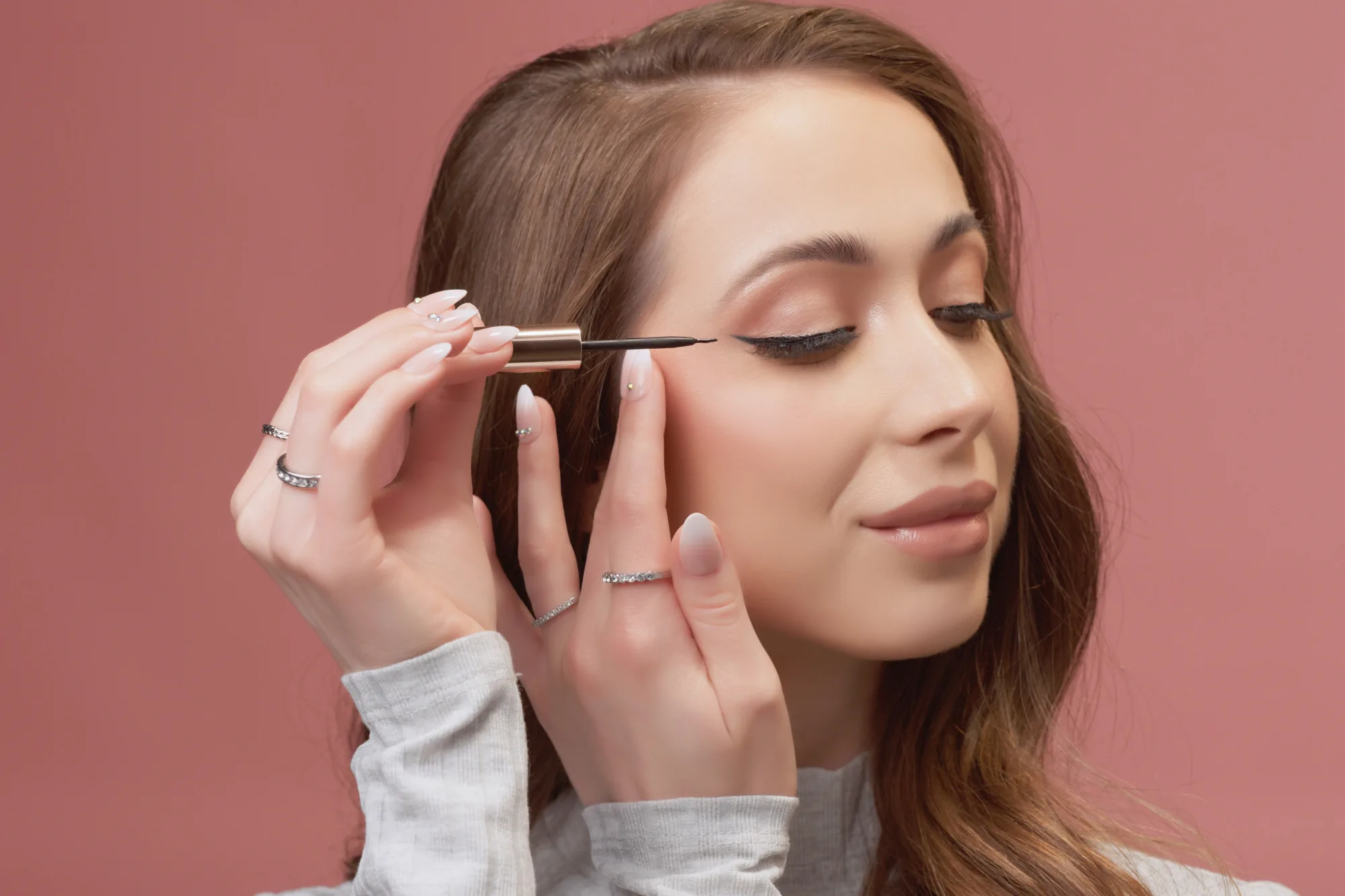
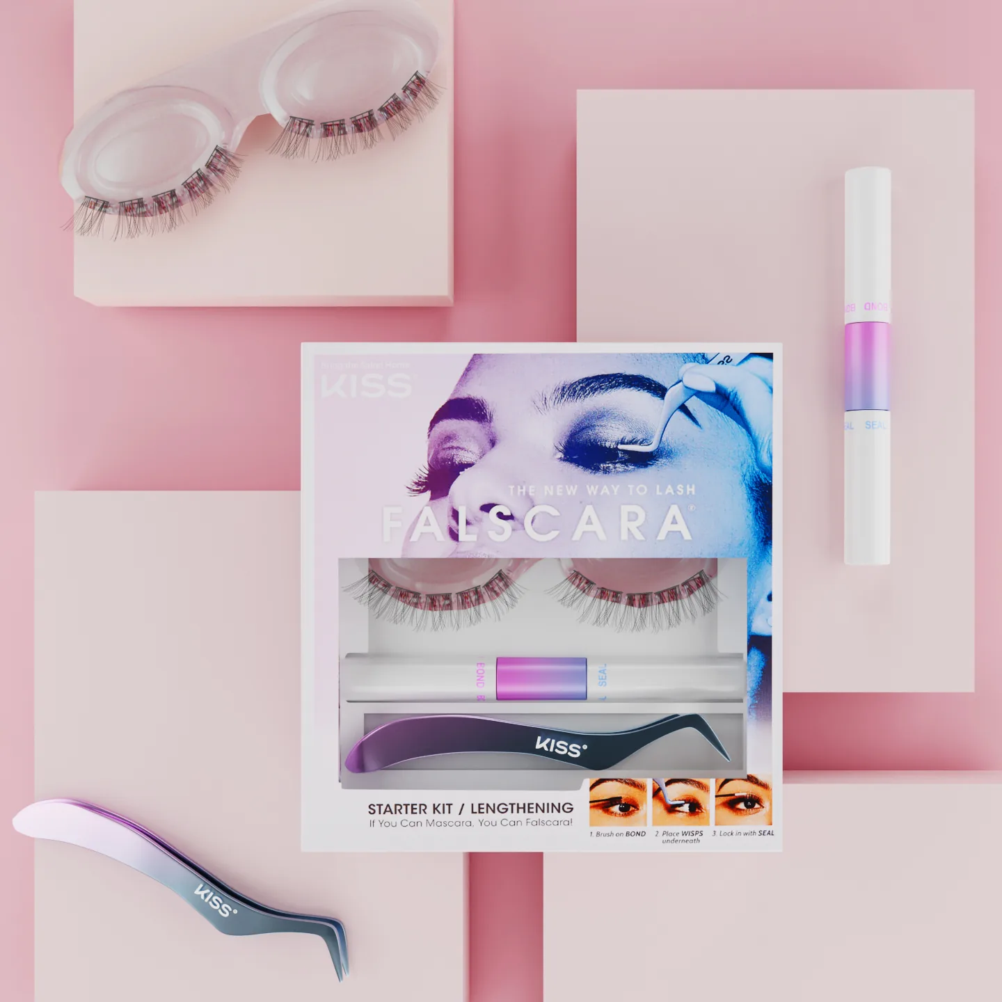
Falscara is applied under the lash rather than on top of it, which is the whole pitch and also the reason it is difficult to photograph. At normal portrait distance the product disappears. The work only reads up close, where the individual wisps and the band line are visible.
That distance is unforgiving. Depth of field collapses to a few millimeters, so the lash line, the inner corner, and the brow cannot all sit in focus at once and something has to be chosen. Any movement at all, including a blink held a beat too long, ends the take. Talent held position while we worked, and the sessions ran short on purpose.
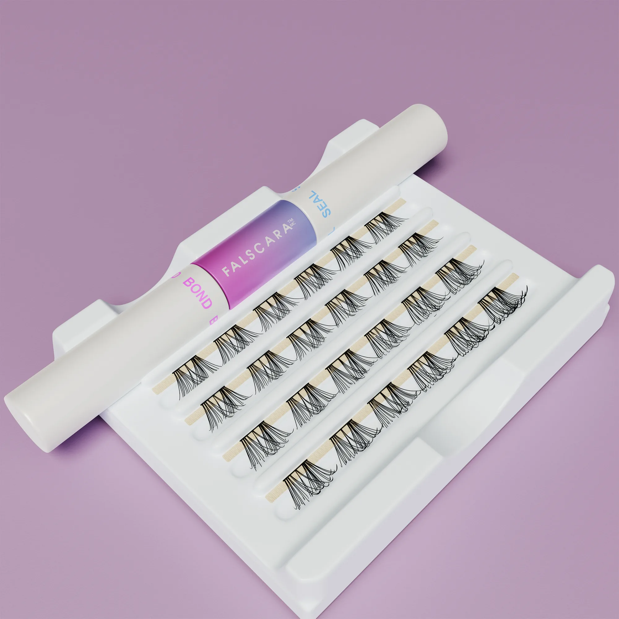
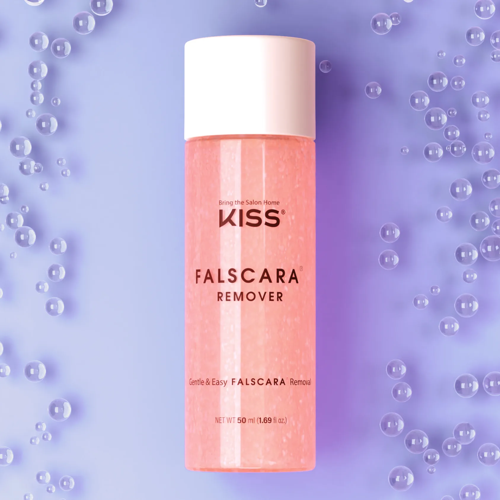
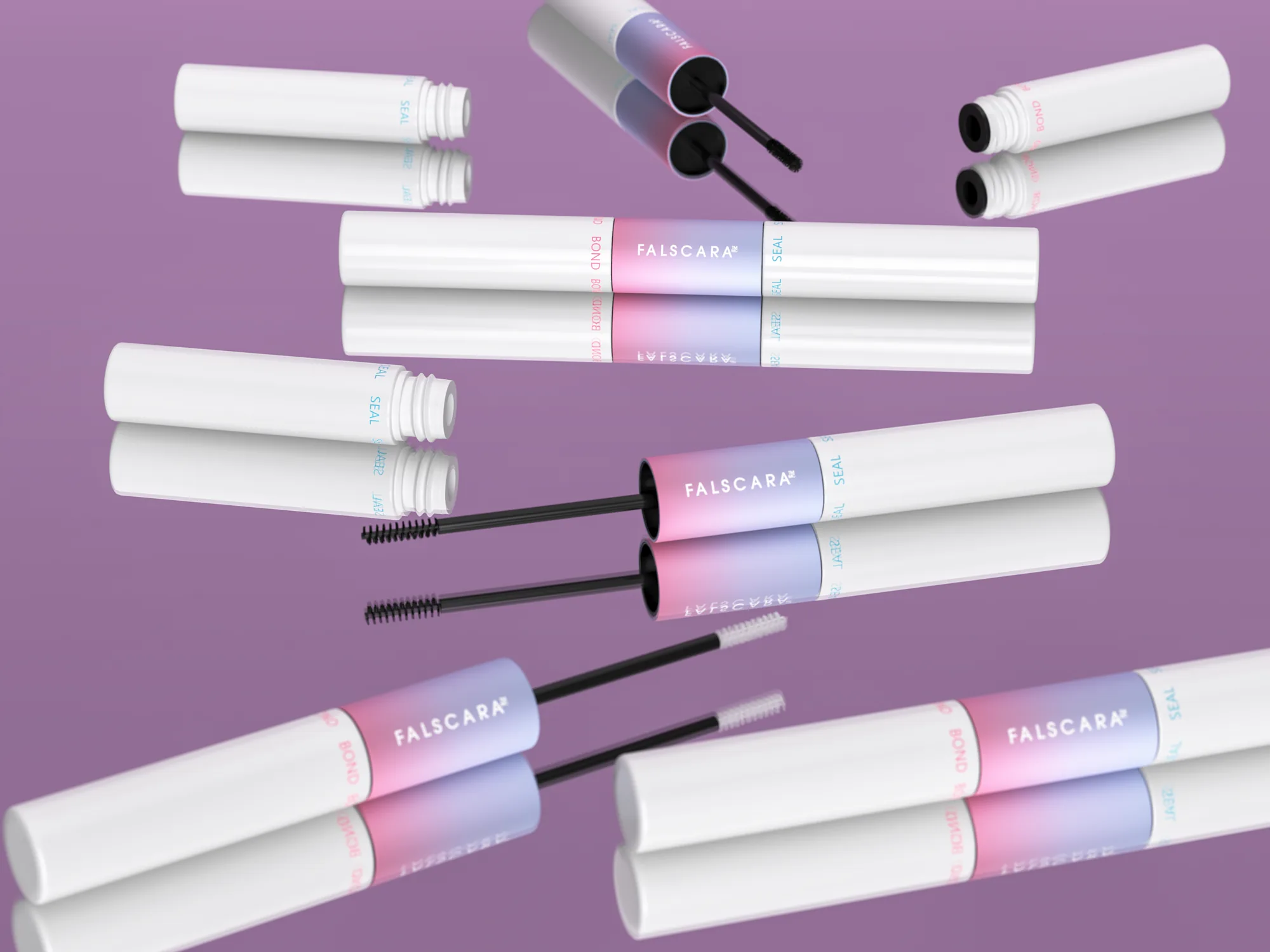
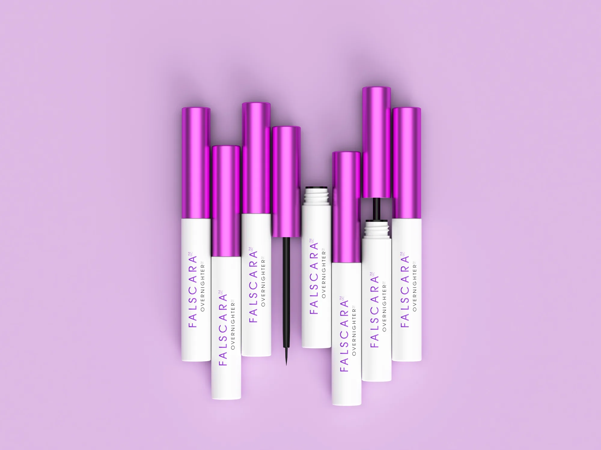
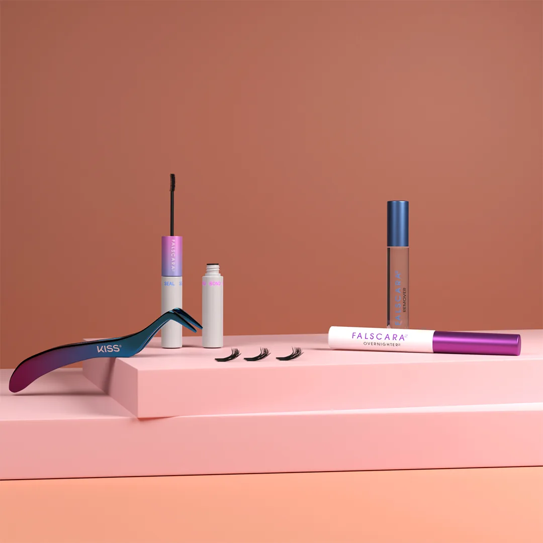
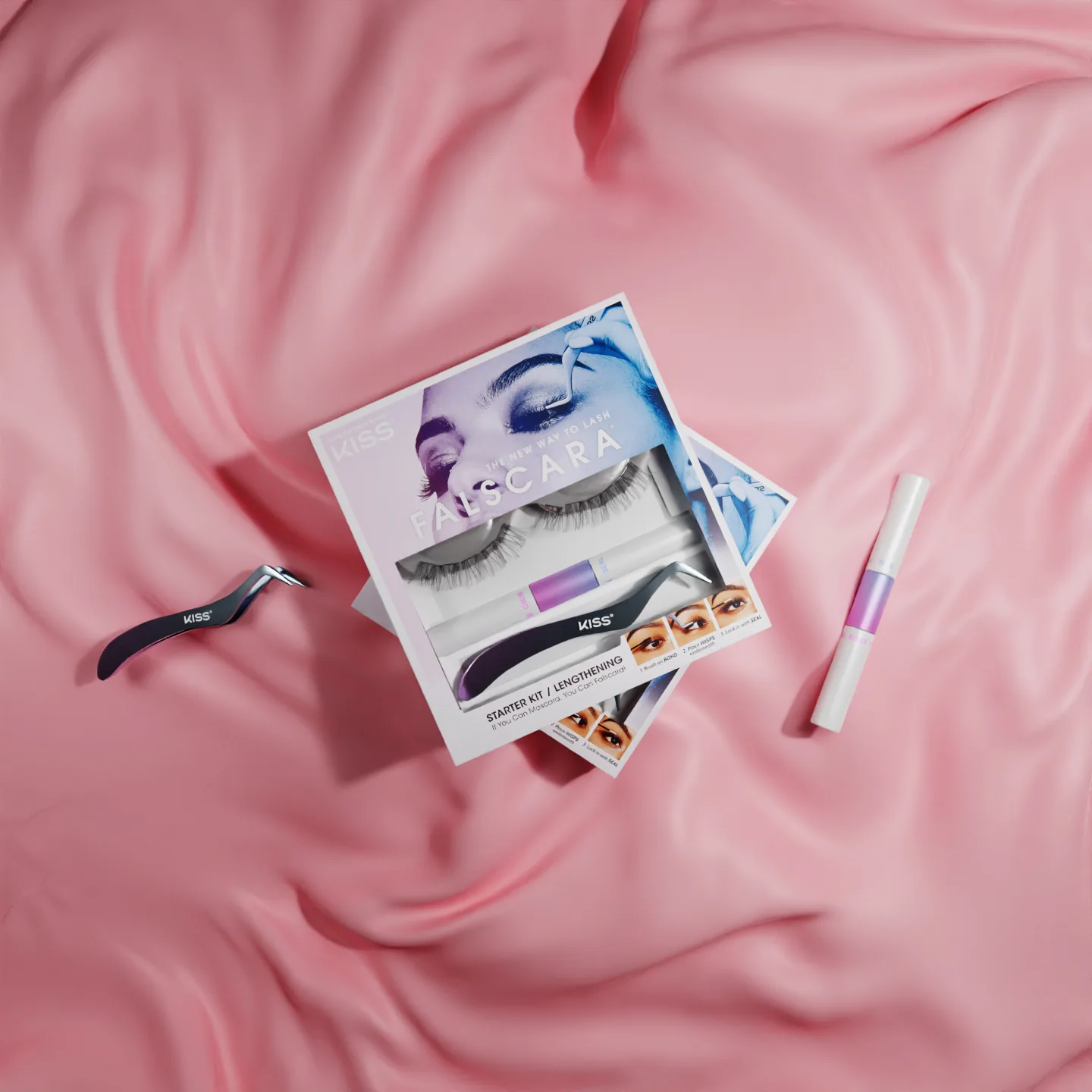
The renders cover what the camera could not. A cross section of the applicator, the bond and remover in mid pour, the wisps floating on cloud and cotton sets that do not exist. Those frames explain the product. The photography proves it.

KISS USA and KISS International
The widest product range on the account and the tightest packaging rules. Most of what you see here was never photographed.
One Asset for Every Market
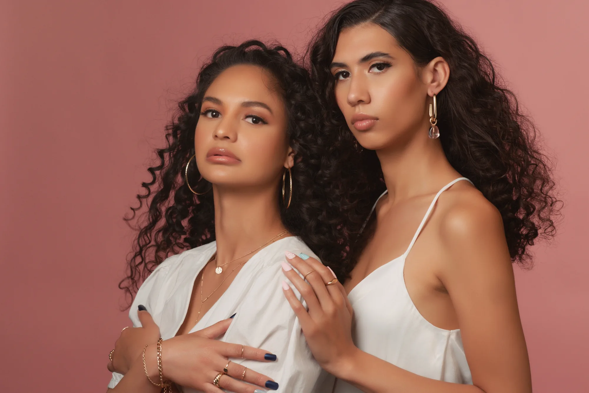
The retail lines carry hundreds of SKUs across markets that do not share a language, a shelf, or a season. Photographing that range is not a scheduling problem so much as an impossible one, because half the range is in a warehouse on another continent when the campaign is due.
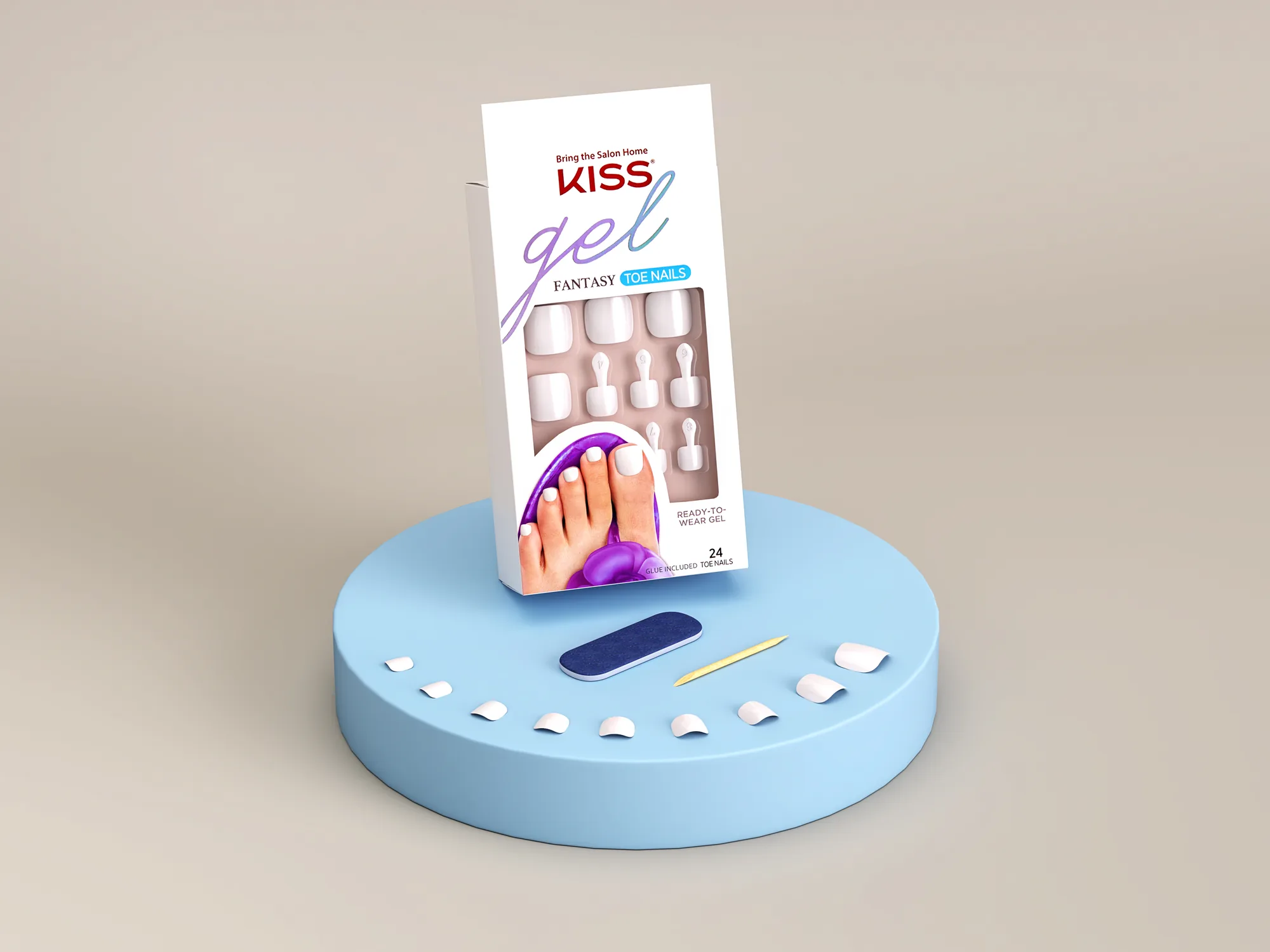
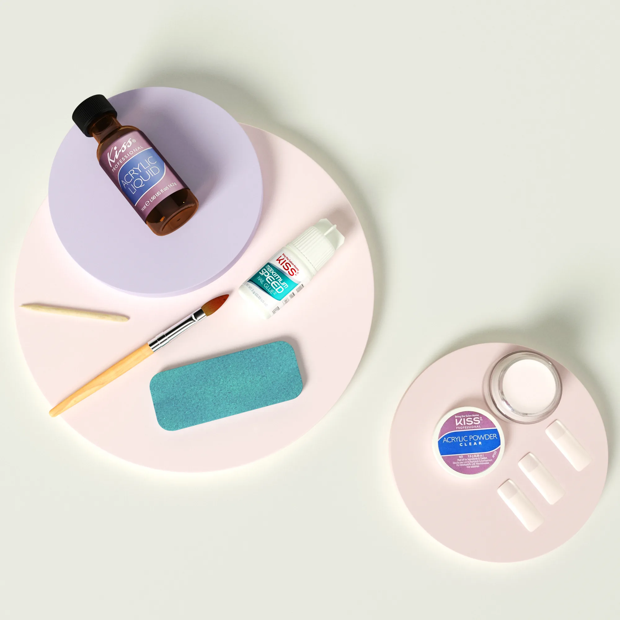
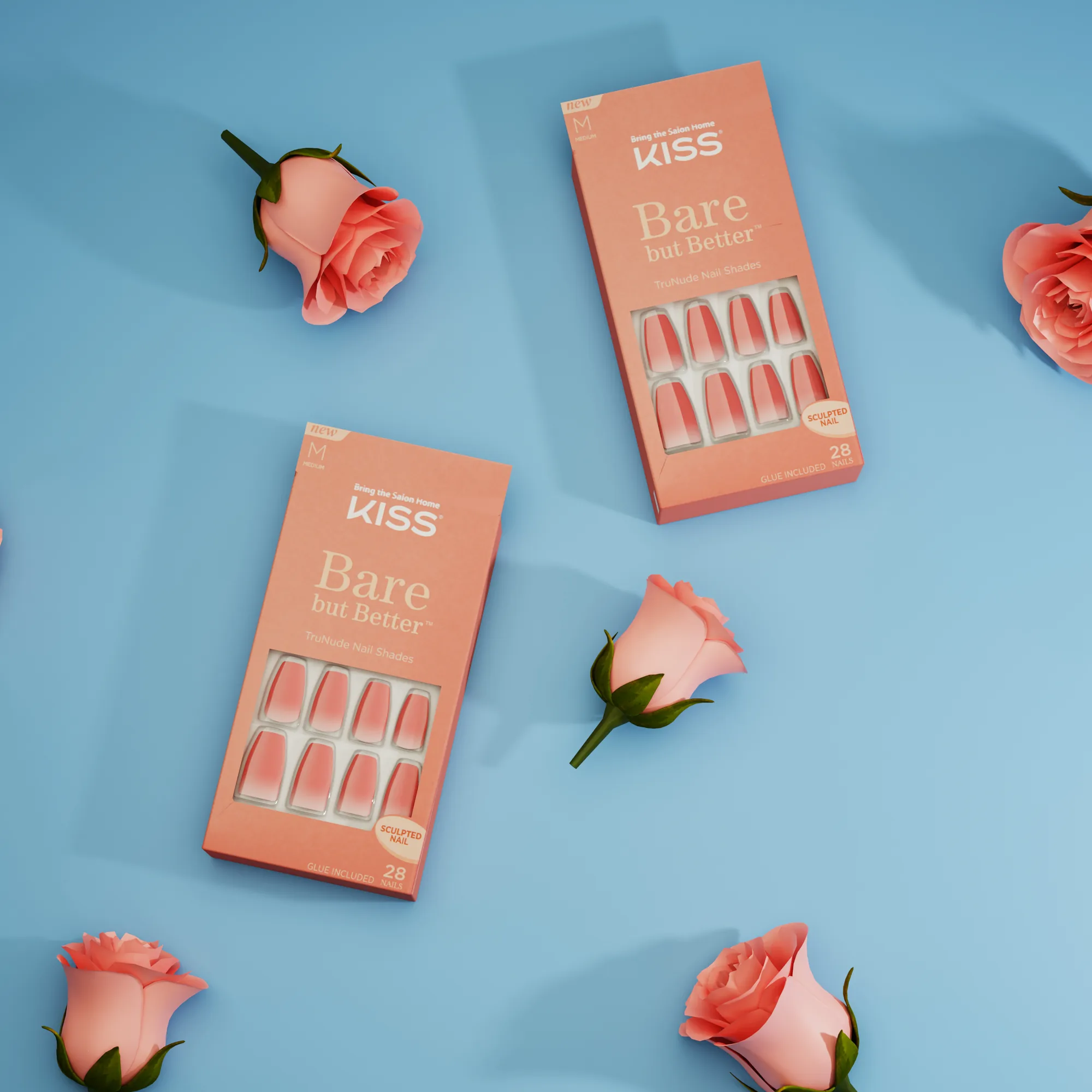
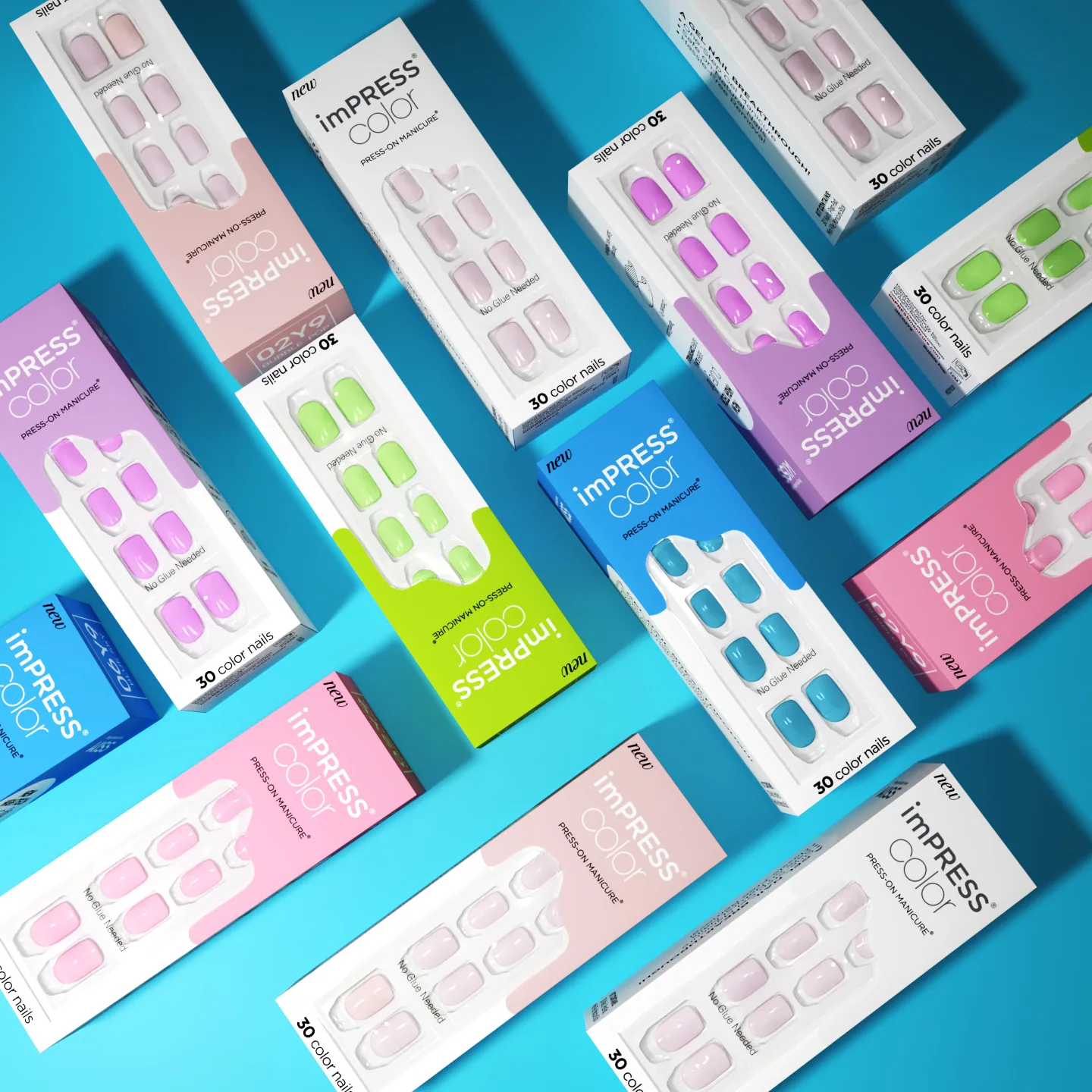
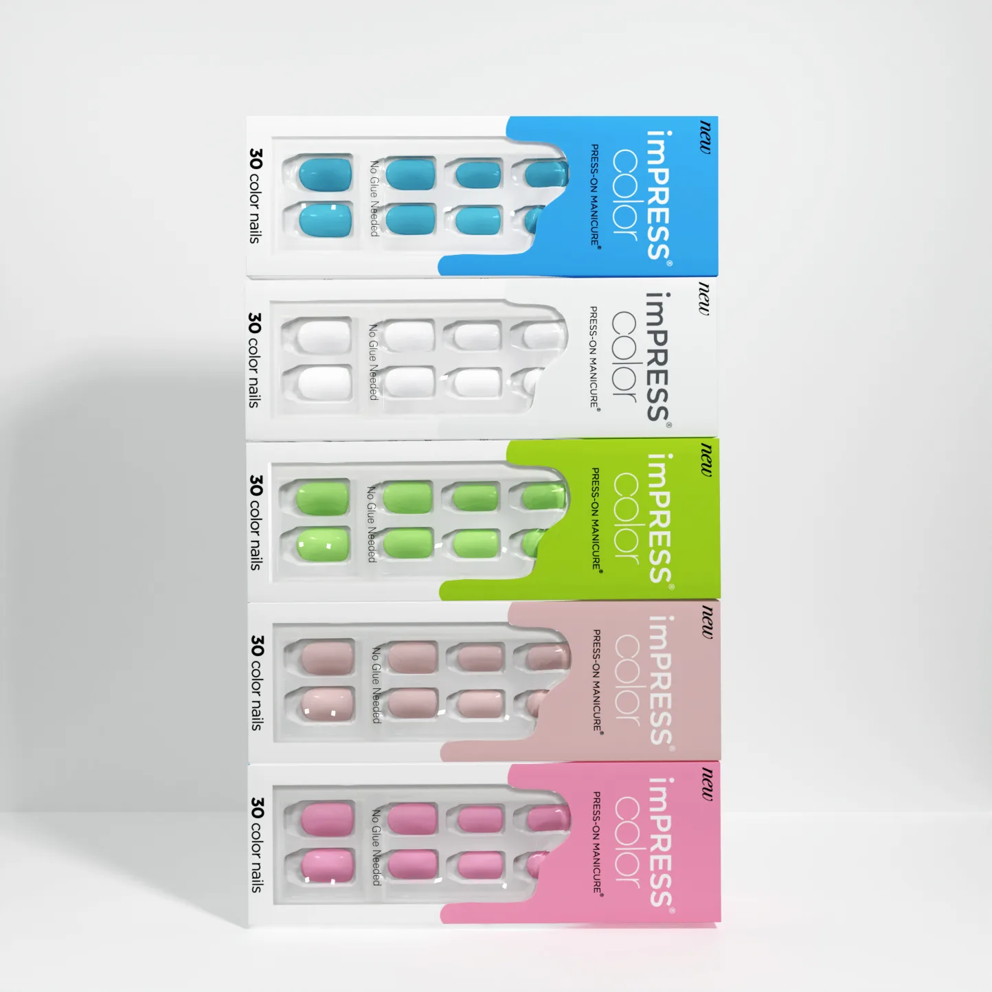
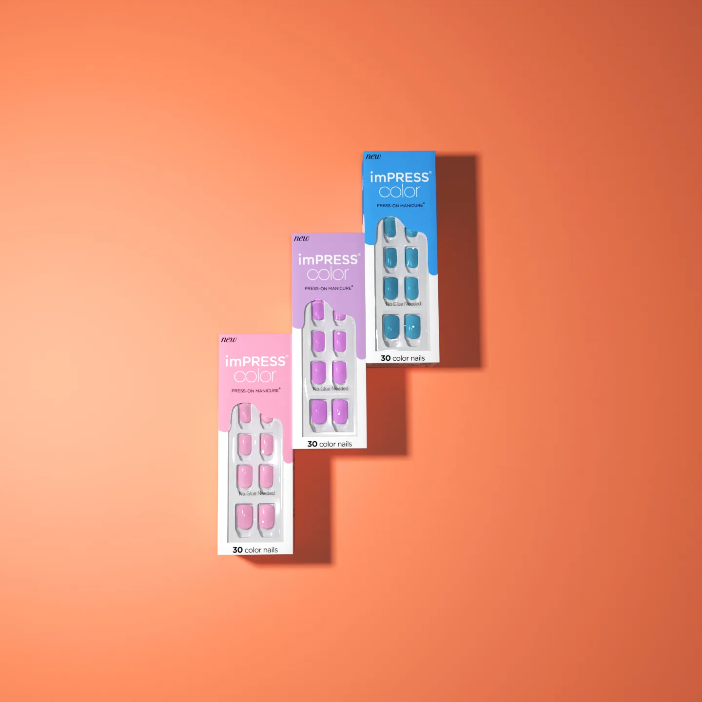
So we built it. Nail kits, lash adhesives, mascara, tweezers, and the seasonal sets were modeled once and then re-lit, re-staged, and re-colored per market. A shade change is a material swap. A new set is a new environment file. Nothing has to be shipped, unboxed, or reshot.
That is also what makes the packaging rules survivable. Print artwork sits on the model as a texture, so every render carries the correct approved layout instead of a photographer’s best guess at the box under studio glare. The photography anchors the section with talent work on a single color cyc, and the renders do the volume.

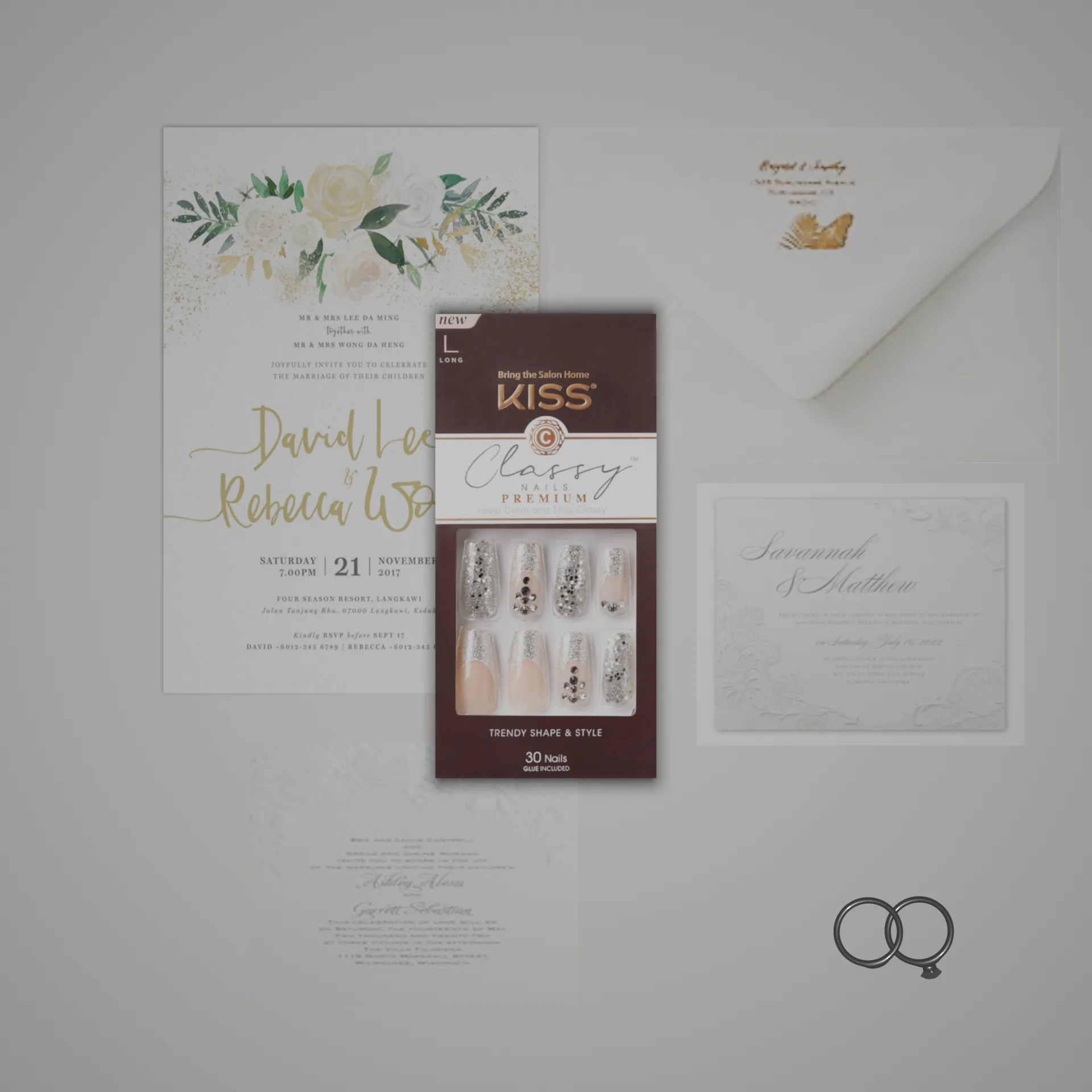
imPRESS
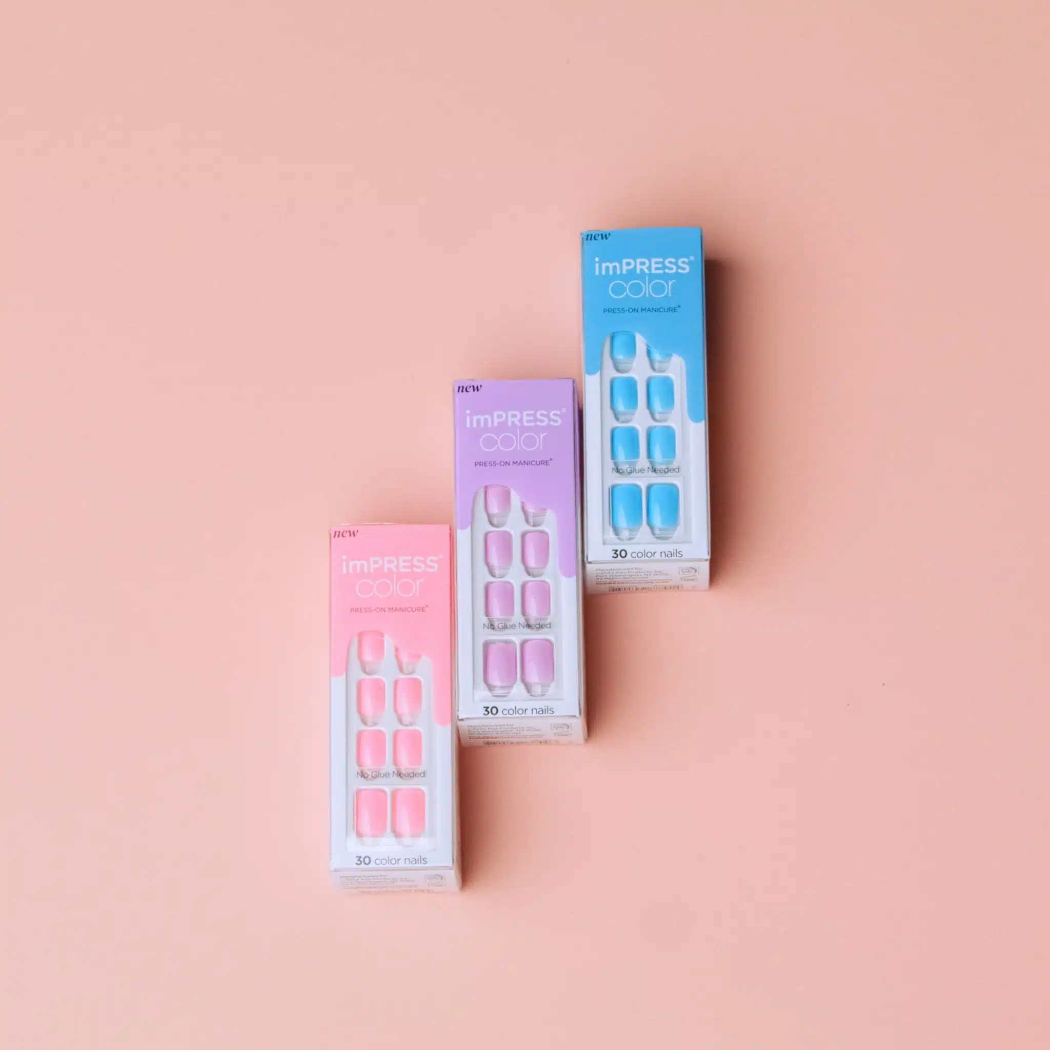
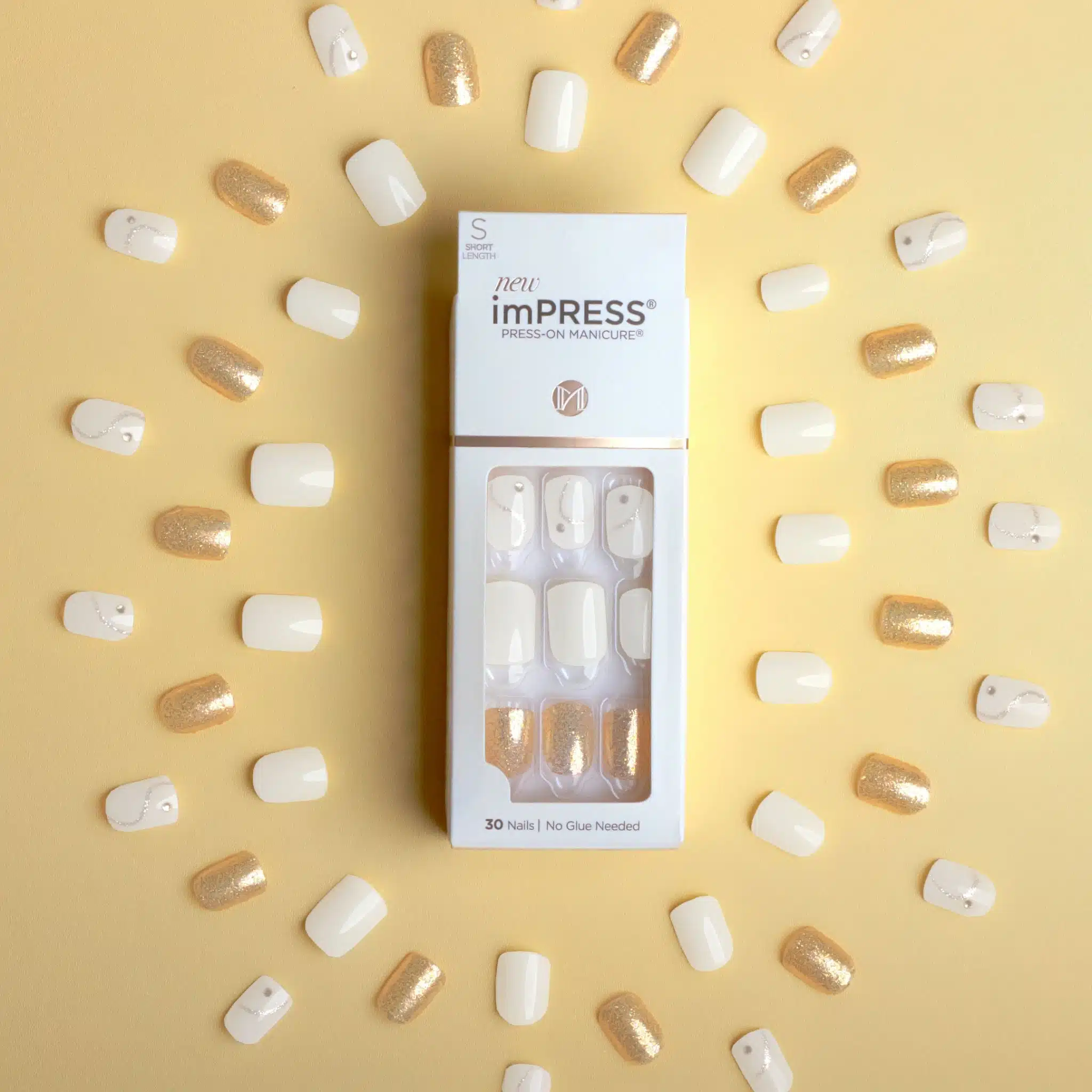
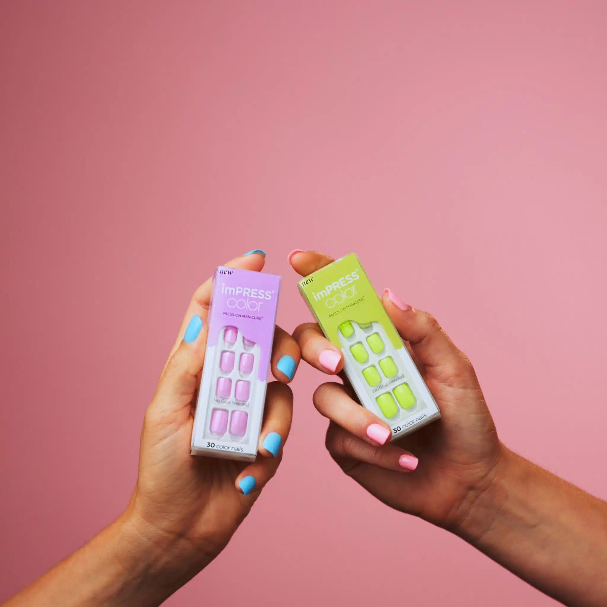
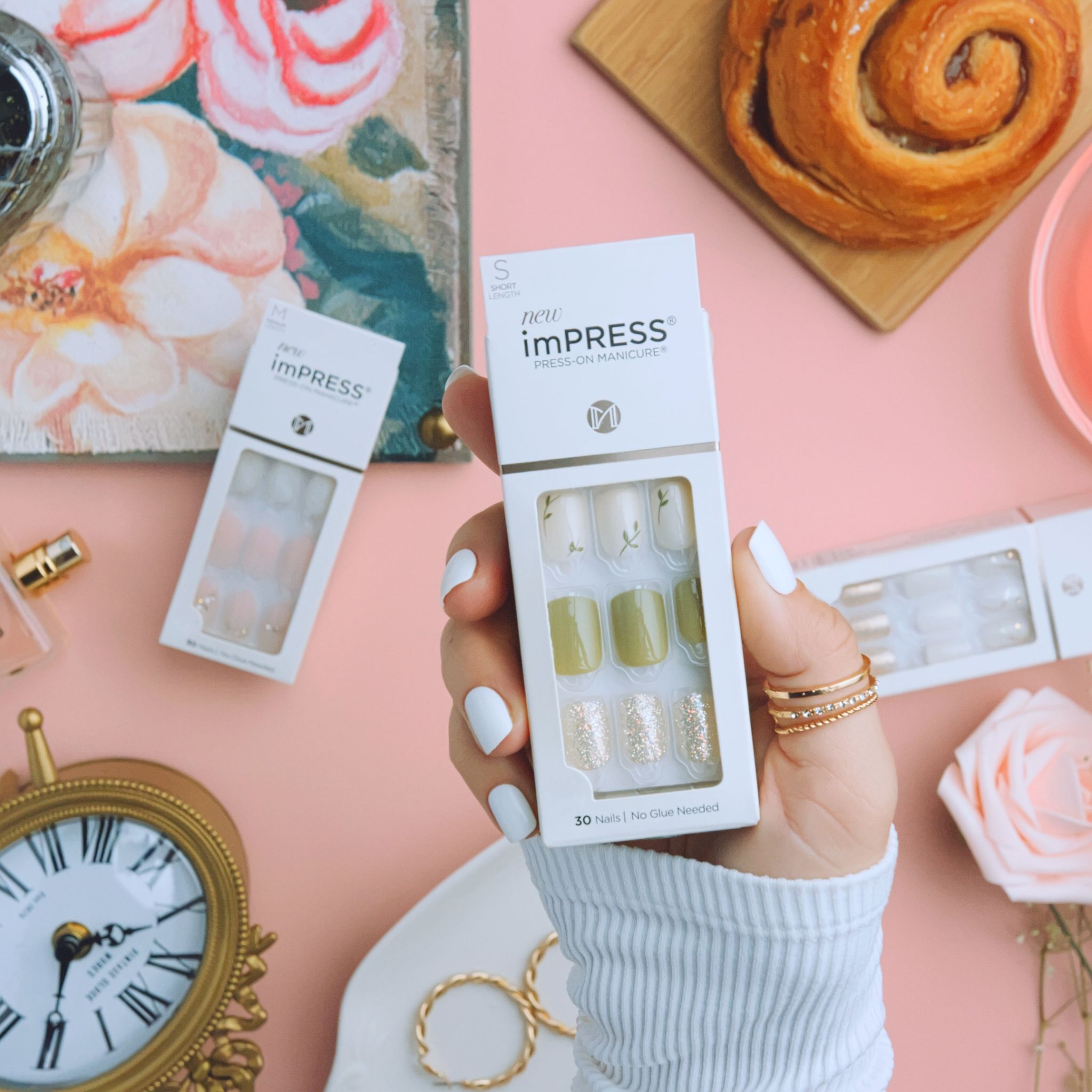
The flagship, and the reason KISS called us in the first place. Shot as product, rebuilt in 3D, and cut together as one campaign.
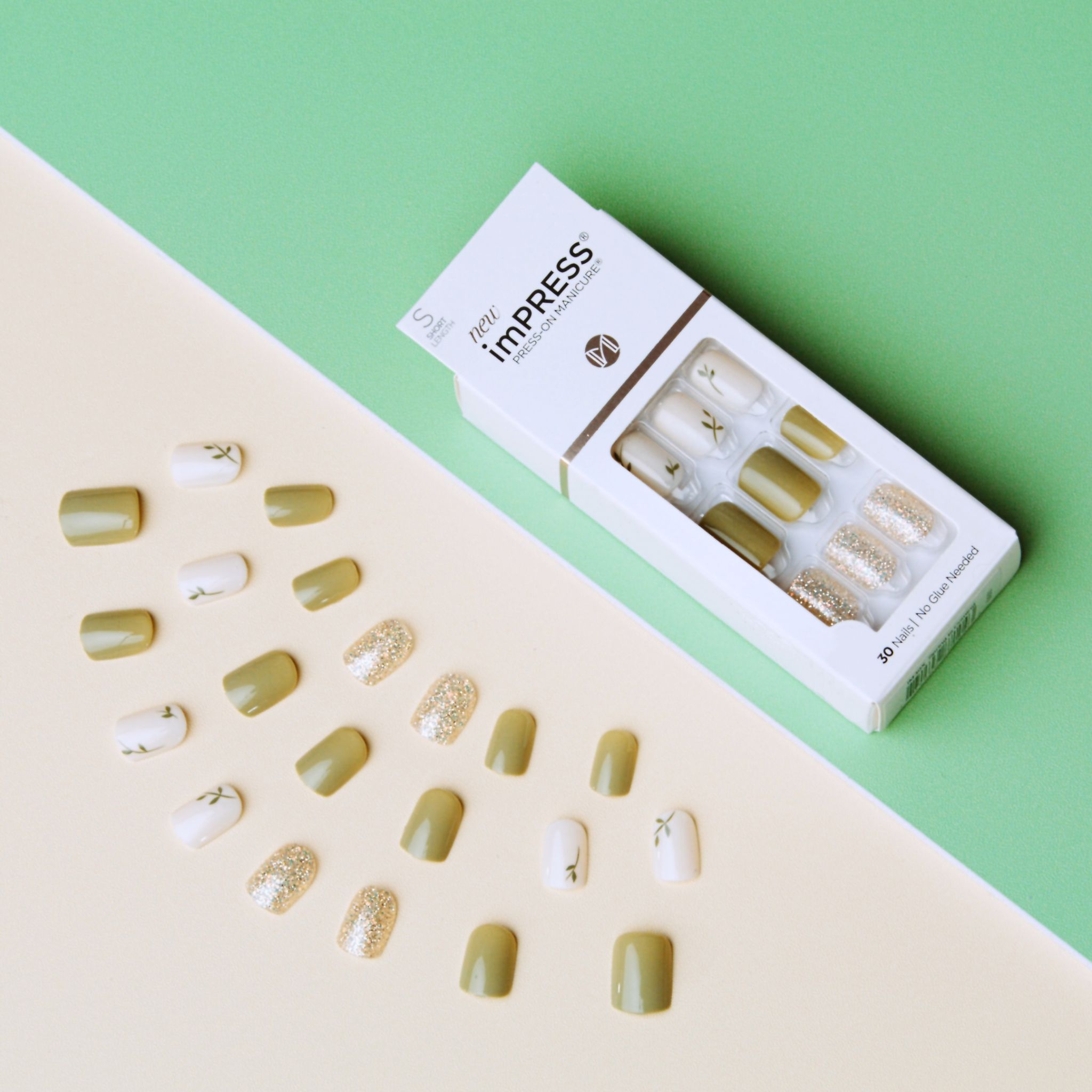
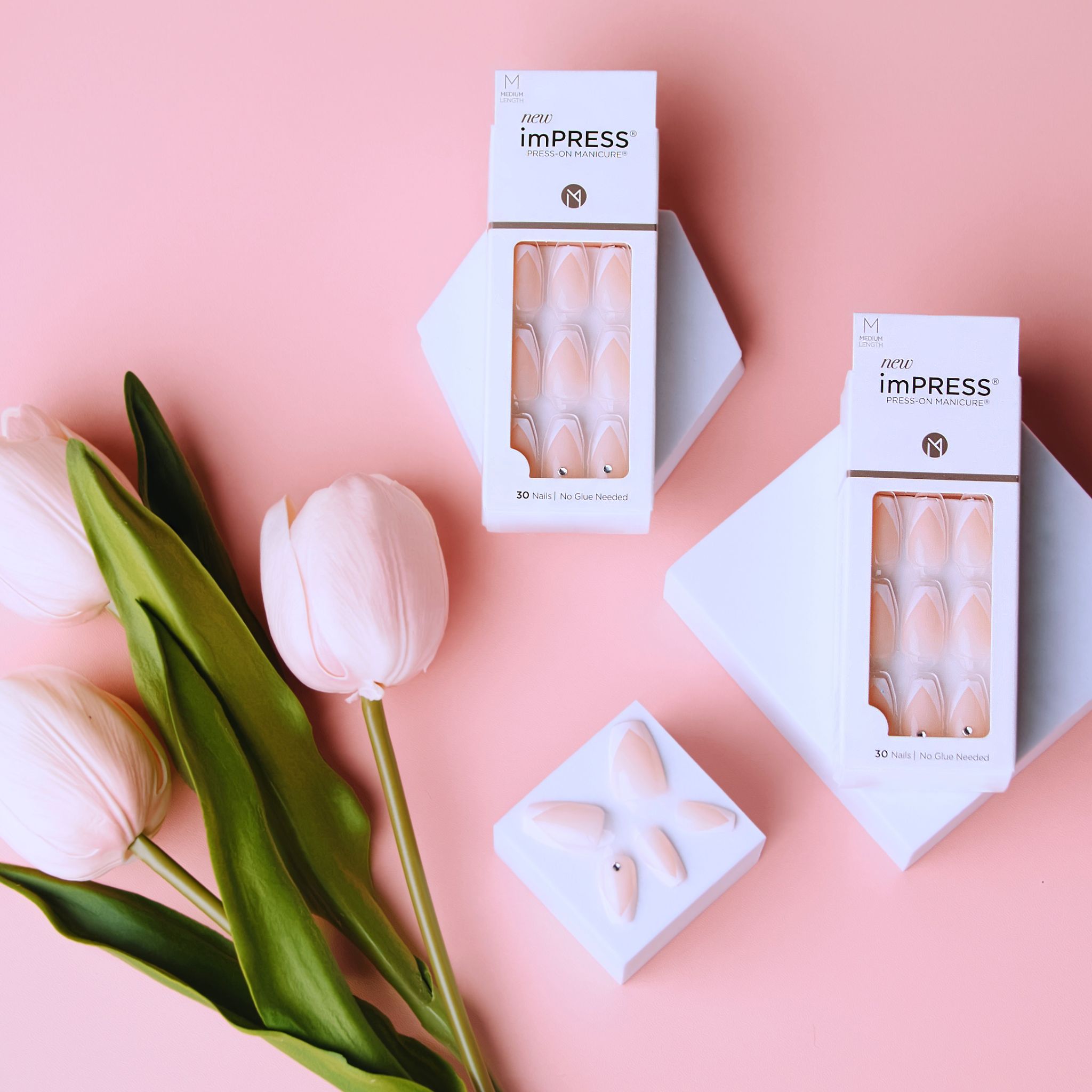
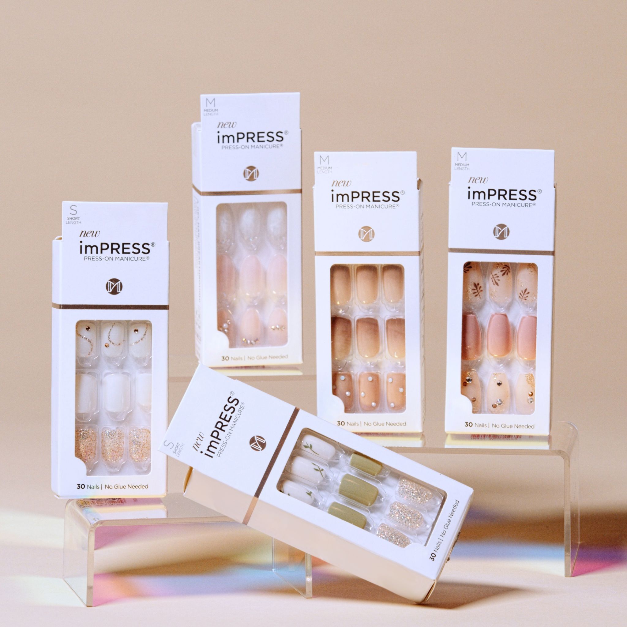
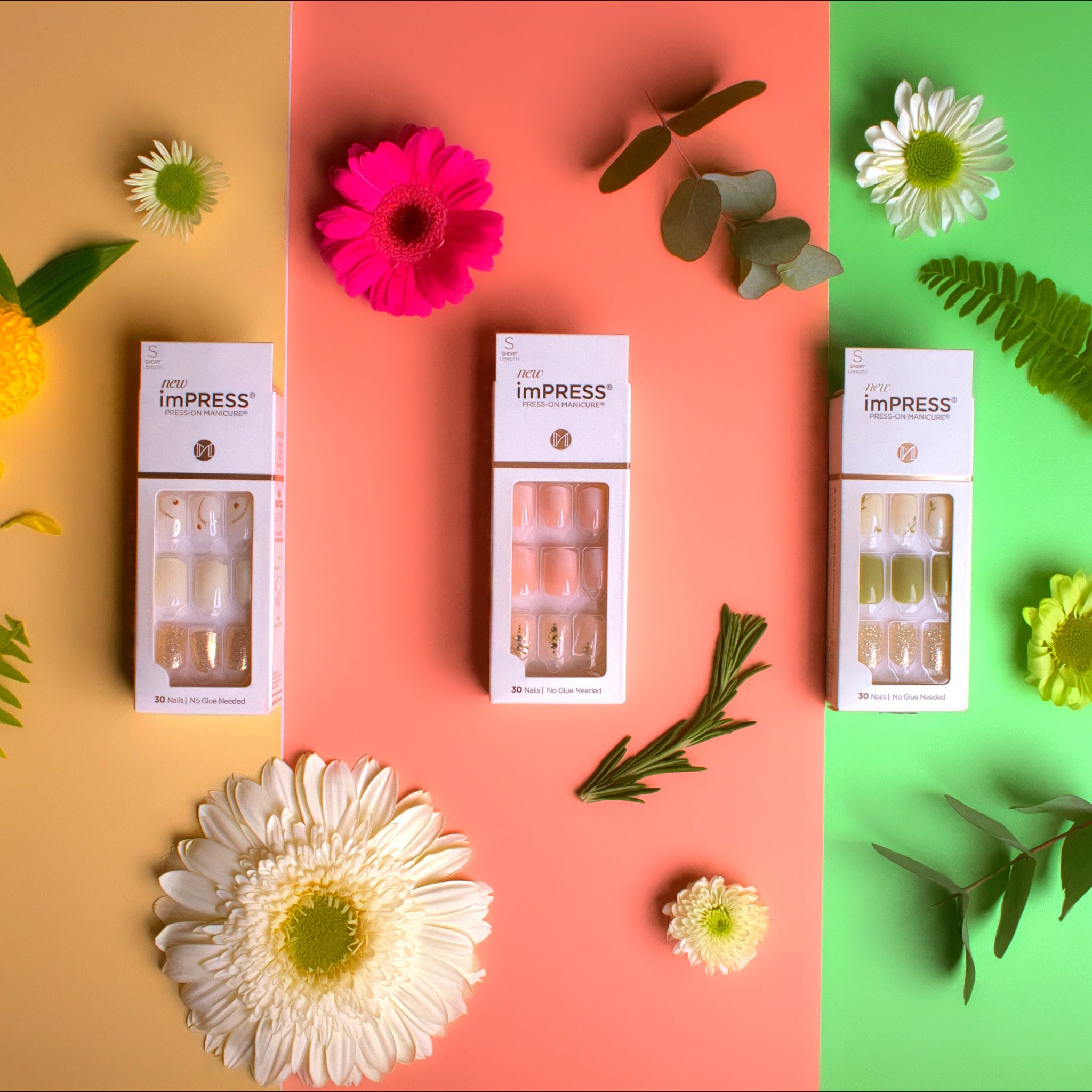
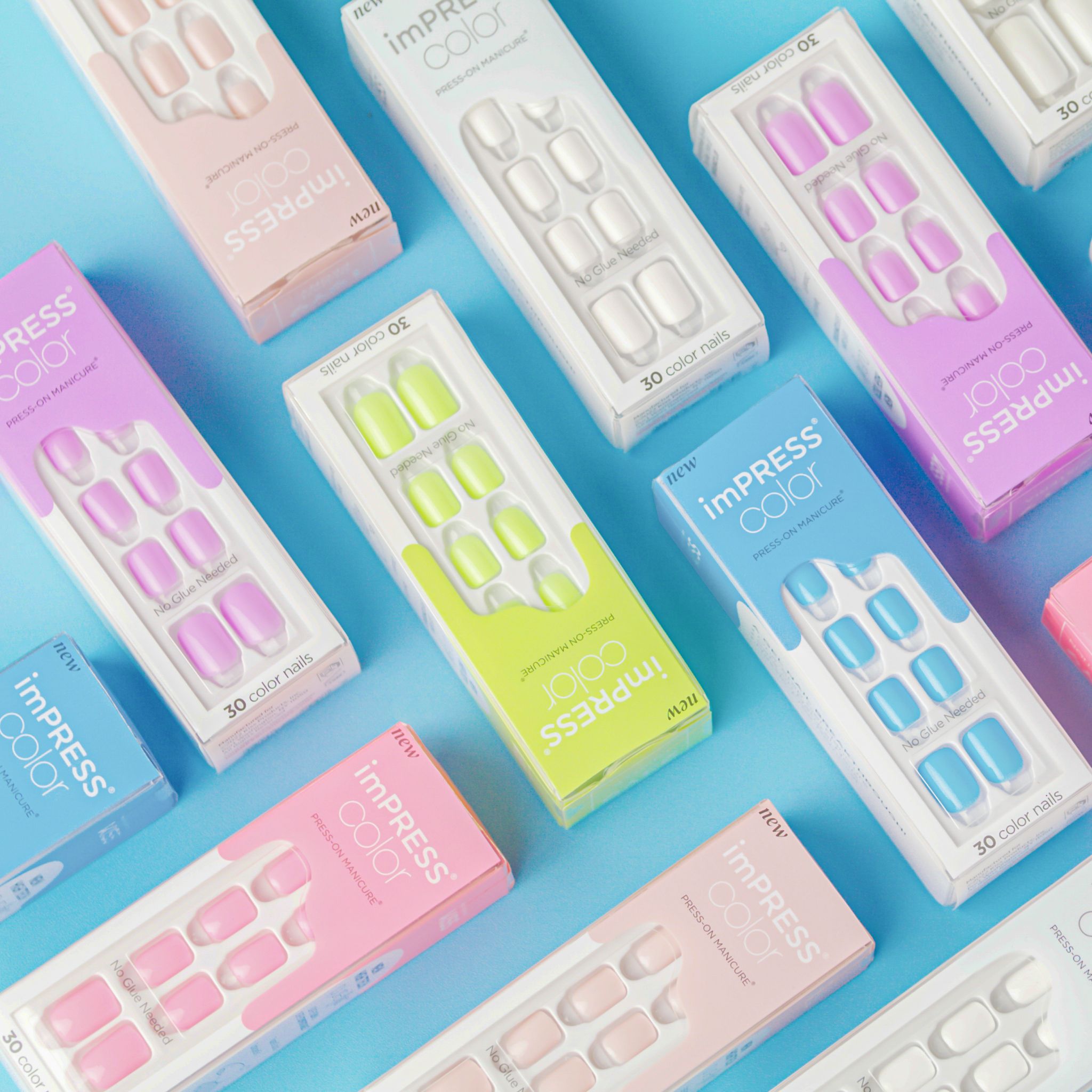
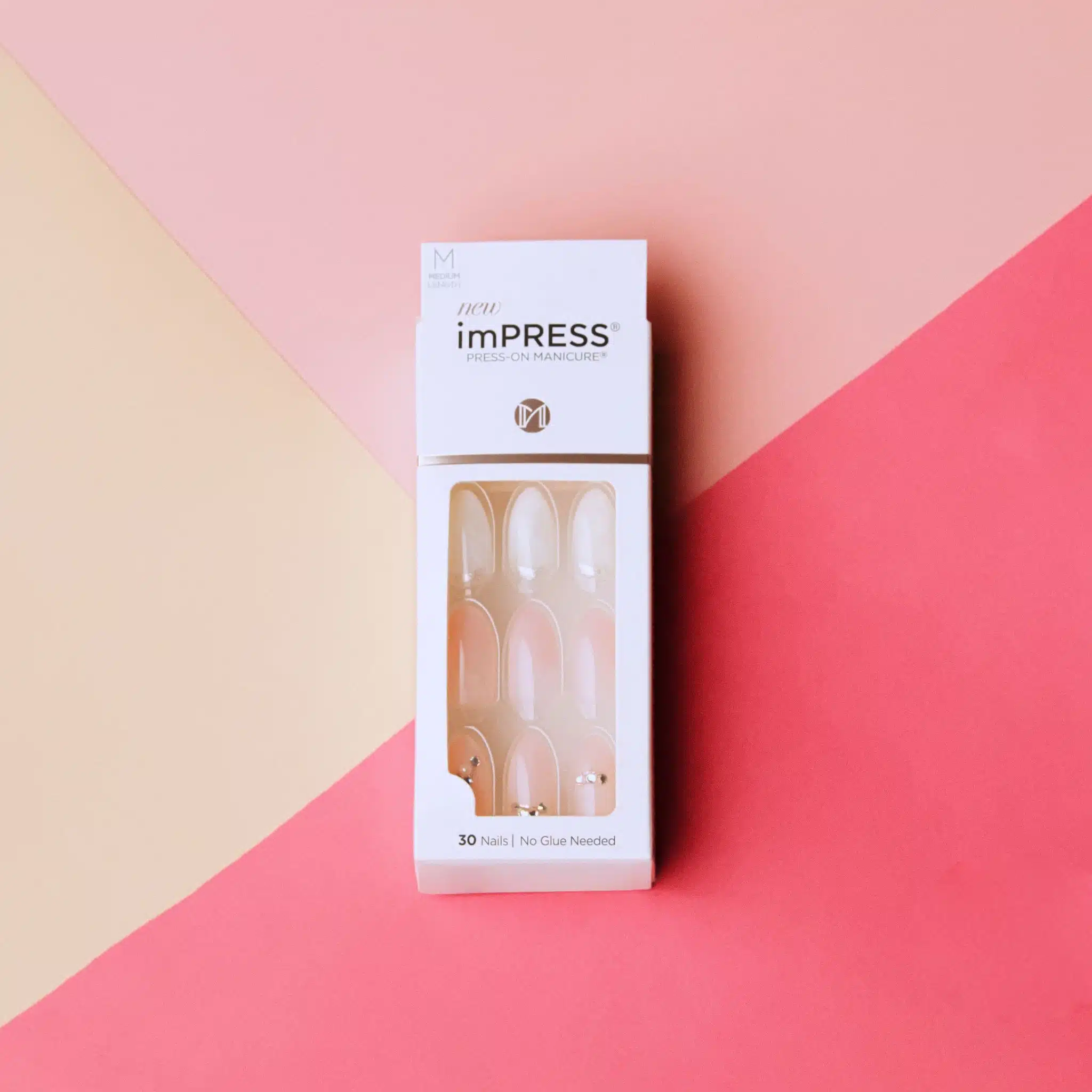

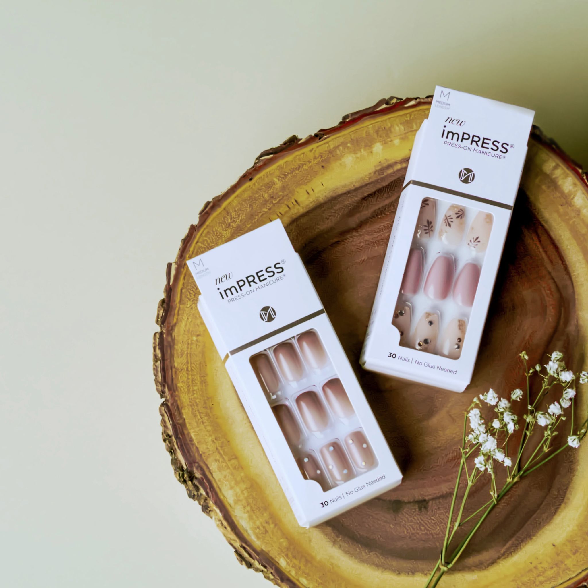
Building the Press On Range
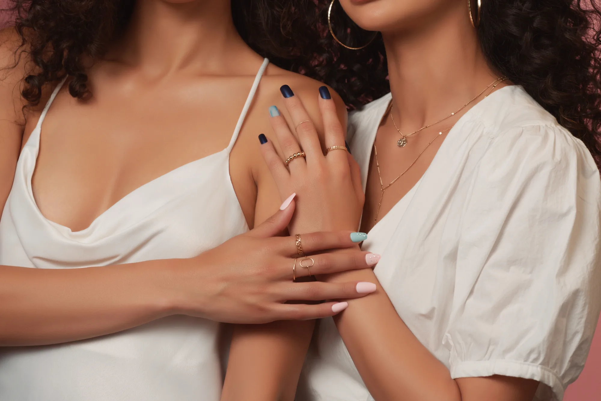
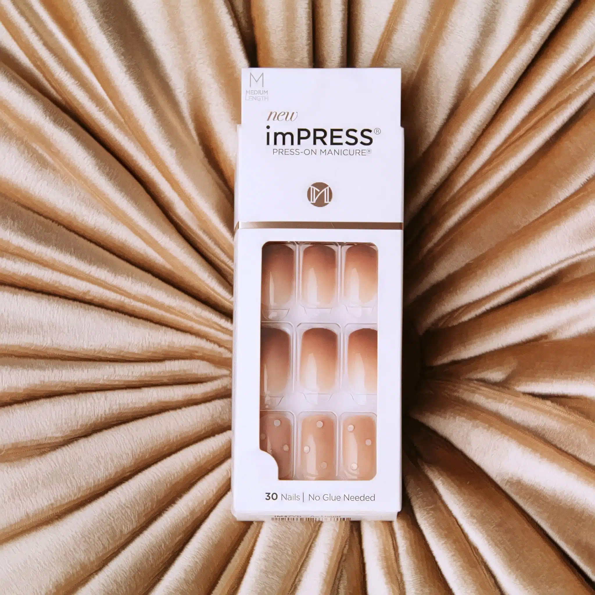
Press On Nails are a small object with a lot of surface, and surface is what a flat lay struggles with. Gloss, shimmer, and the curve across a nail all depend on where the light sits, and on a table you get one attempt at that per setup.
So the range got built twice. We photographed it, and we modeled it. Every nail, box, and prop in the rendered frames was built by hand and matched to the real product closely enough that the two cut together without a handoff. That is the whole test, and it is harder than either discipline is on its own.
The video came off the same shoot days with the same team, which is why the motion work looks like the photography instead of like a separate job. Short pieces for social and longer cuts for retail, all built to run as one campaign rather than three.
3D and VFX
Every render across this page started as untextured geometry in a grey viewport.
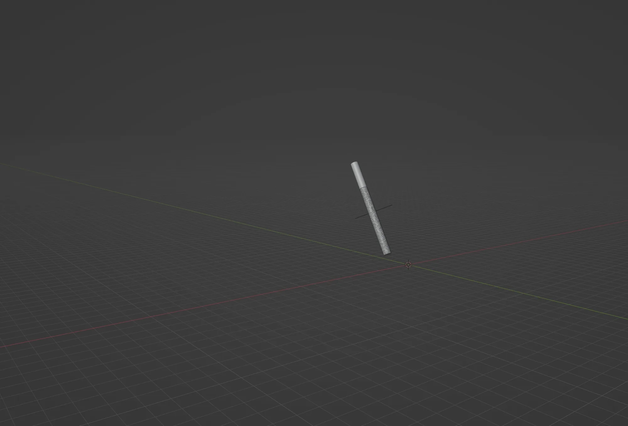
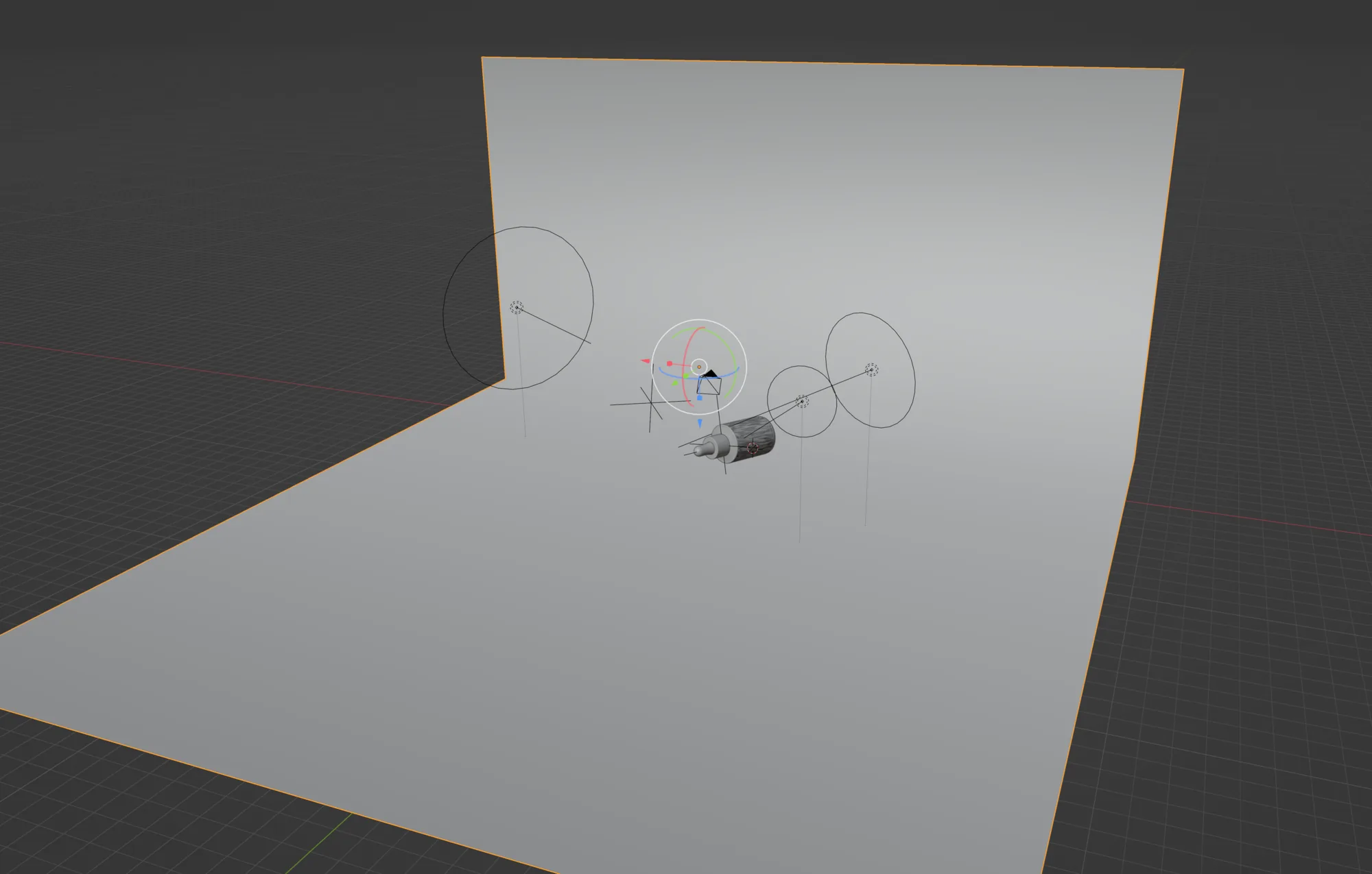
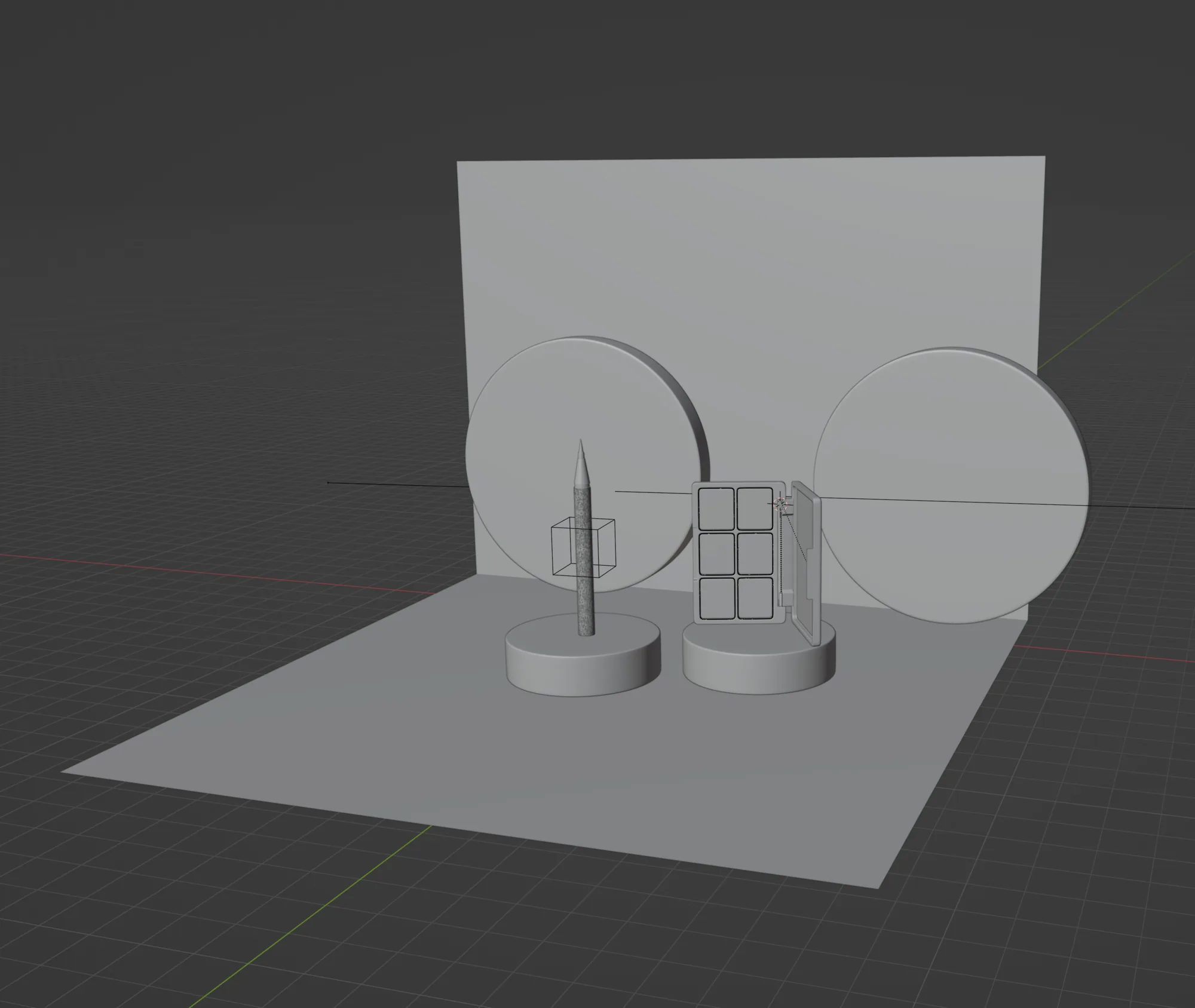
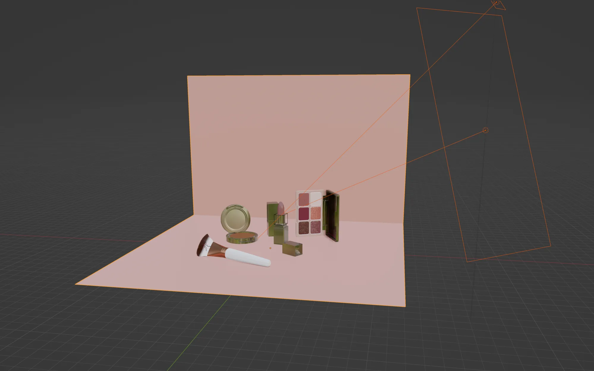
Grey Box to Final Frame
The strip above is one shot at four stages. It starts as blocking, a camera and a few primitives standing in for the product so the composition can be judged before anything is built. Then the real geometry replaces the blockout. Then materials. Then lighting, which is where most of the time goes.
Working this way is slower at the front and much faster at the end. Once a product exists as a model it can be relit, recolored, re-shot from a new angle, and dropped into a new set without touching the thing itself. That is the reason a campaign this size stayed consistent across six brands.
It also removed a real constraint for KISS. Products could be put in front of a camera before they had been manufactured, and shades that only existed as artwork could be shown next to shades already on shelf. Nothing in these frames was waiting on a sample to arrive.