
Macon-Bibb Equity Hub Brand Identity Design
C&I Studios designed the complete brand identity and visual system for the Macon-Bibb Equity Hub, a Macon-Bibb County, Georgia initiative built to address the social determinants of health — housing, education, economic mobility, and access to care. The engagement covered logo design, a six-direction logo concept exploration, a full color palette with Pantone specifications, typography, a line-icon system for the pillars of equity, a seamless brand pattern, real-world brand applications, and a complete brand guidelines document.
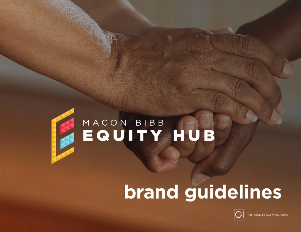
Brand Identity Design for a Public Health Initiative
Brand identity design for a public initiative has to work for many audiences at once. The Macon-Bibb Equity Hub speaks to residents, partners, funders and county leadership, so the identity needed to feel trustworthy, warm and clear. C&I Studios approached the work as a system rather than a single logo, so every piece could carry the same message across print, digital and signage.
Six Logo Directions
The brand identity design process started with a six direction logo concept exploration. Each direction tested a different idea about equity and community, from shapes that suggest connection to marks built around the pillars of the Hub. Presenting six directions let the client compare real options before committing, which is the most important step in any brand identity design project.
Color, Type and Iconography
Once a direction was chosen, the identity expanded into a full color palette with Pantone specifications, a typography system and a line icon set for each pillar of equity: housing, education, economic mobility and access to care. A seamless brand pattern gives the identity texture on banners, documents and social graphics. A good system makes these pieces feel like one family.
Guidelines That Keep the Brand Consistent
A brand identity design is only as strong as its guidelines. C&I Studios delivered a complete brand guidelines document so county staff and partners can apply the identity correctly, along with real world brand applications that show the system in use. Clear guidelines protect the brand long after launch.
Designing for the Community
The Equity Hub exists to address the social determinants of health in Macon-Bibb County, so the visual language had to feel welcoming to the residents it serves. Warm colors, open shapes and simple icons make the materials approachable for families visiting a clinic, students at a school event or neighbors reading a flyer at a community center. The same pieces also had to look credible in a report to funders or a presentation to county commissioners. Balancing those two needs shaped every choice, from the weight of the type to the spacing of the icons.
The case study above walks through the full system, including the concept boards, the palette, the icon set and the applications. Each section shows how one decision connects to the next, which is how a complete identity holds together across years of use.
Every asset was delivered in print and digital formats, with logo files, color values and icon files organized so county staff, partner agencies and outside vendors can find what they need quickly. That handoff matters as much as the design itself, because a public initiative is represented by many different people and teams.
A Brand Identity Design Partner
C&I Studios offers brand identity design for public agencies, nonprofits and companies. Our branding work covers research, logo concepts, color, type, iconography, patterns and guidelines. See our branding and graphic design services, more work, or contact us about brand identity design for your organization. Learn more about the county at Macon-Bibb County and about brand identity.
Start Your Project
Tell us about your video production project.