Therafit Shoe
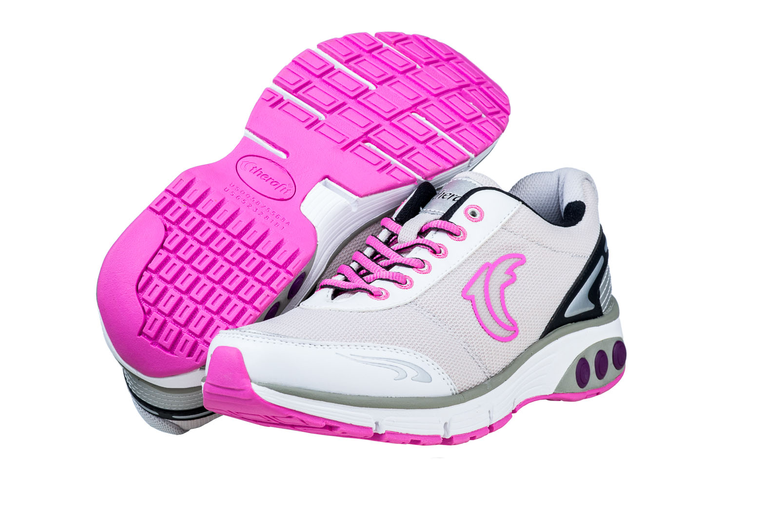
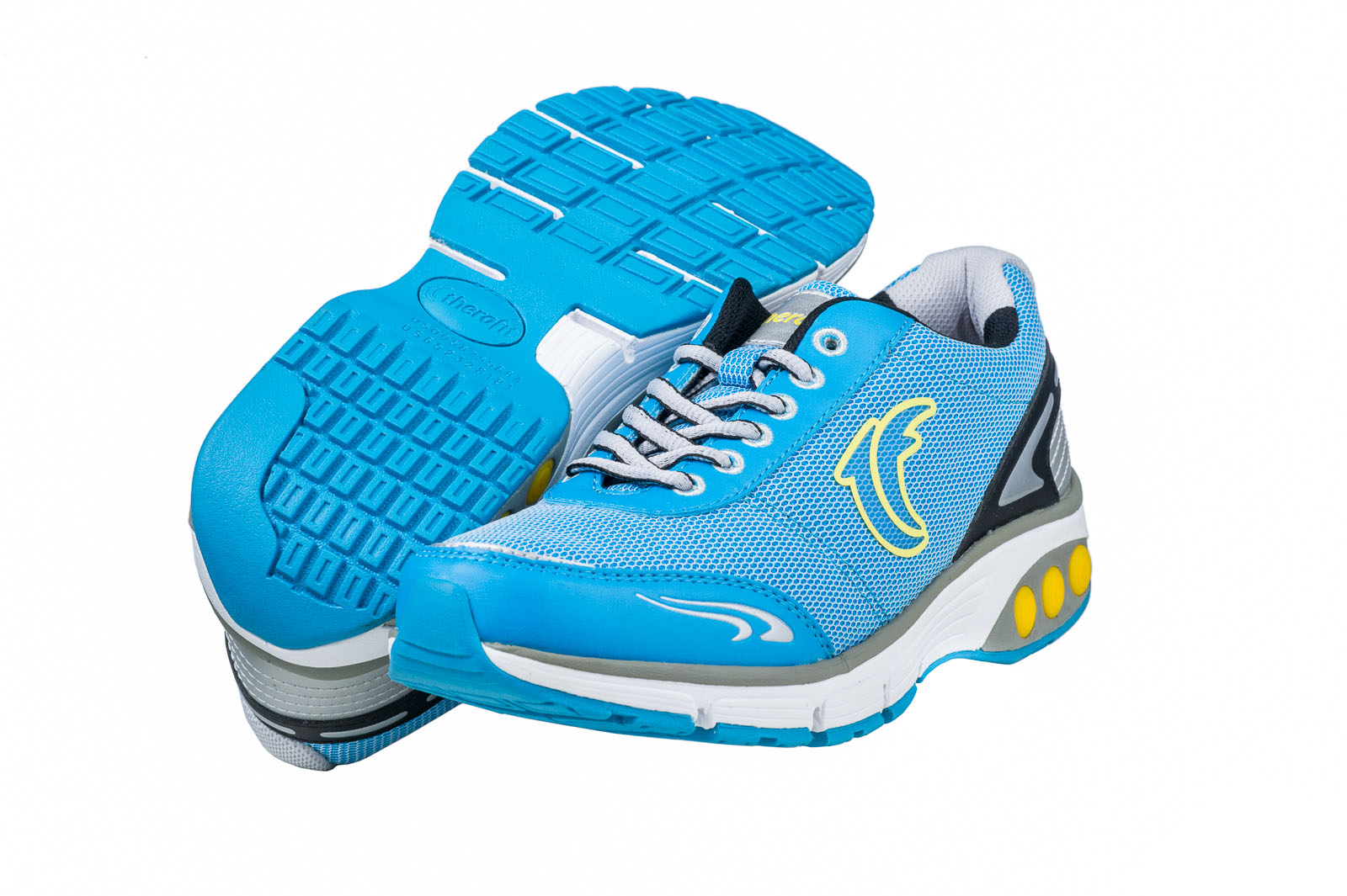
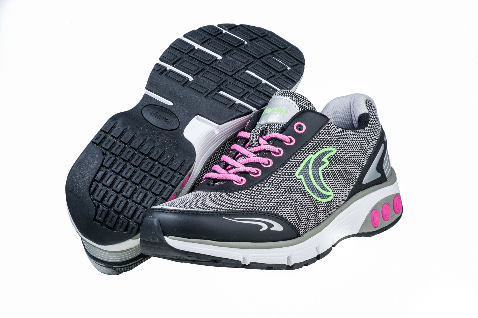
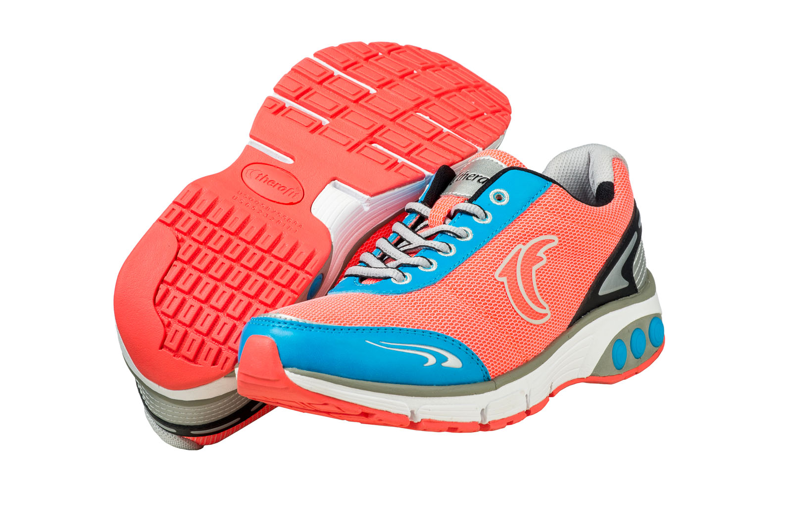
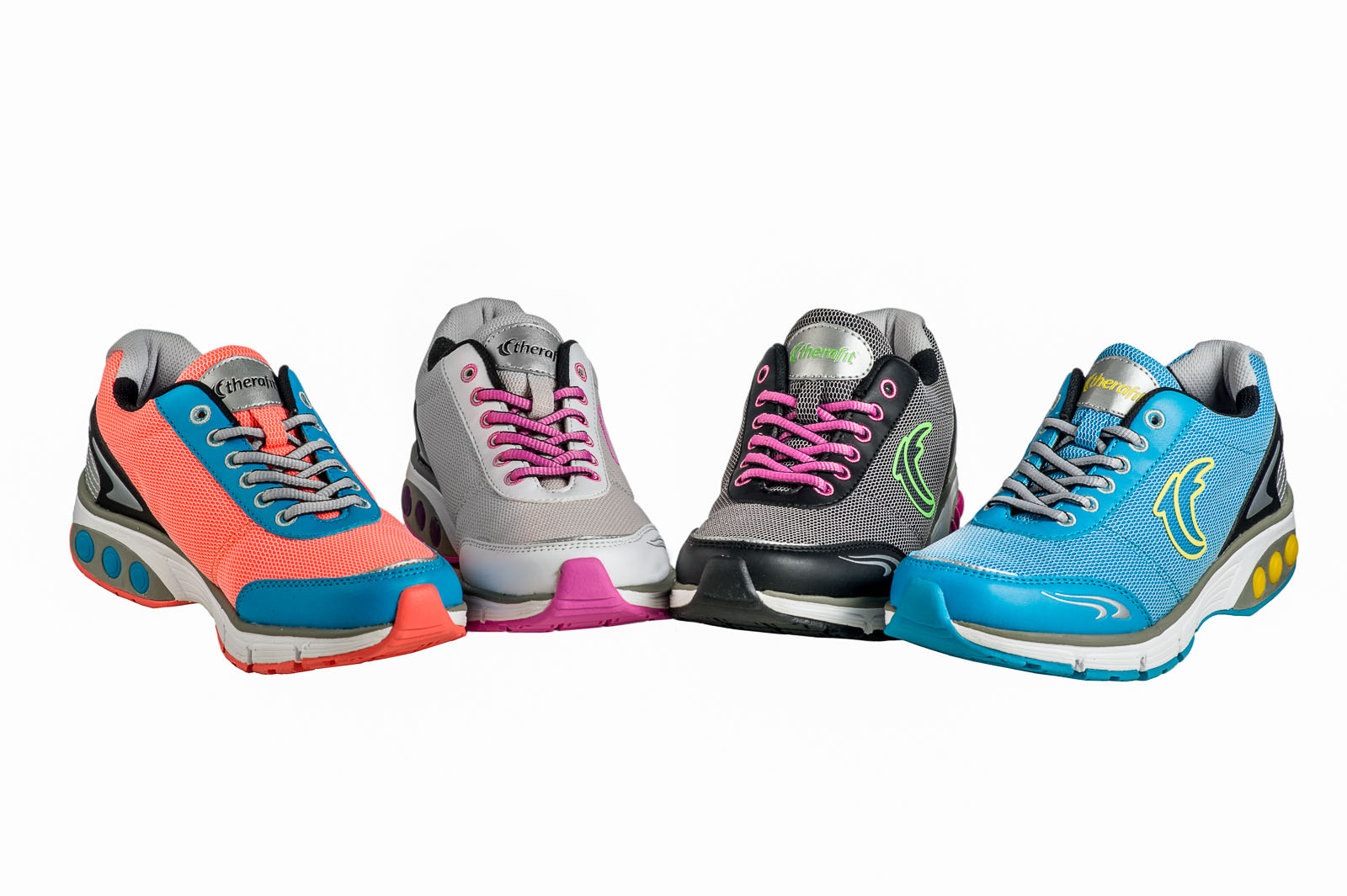
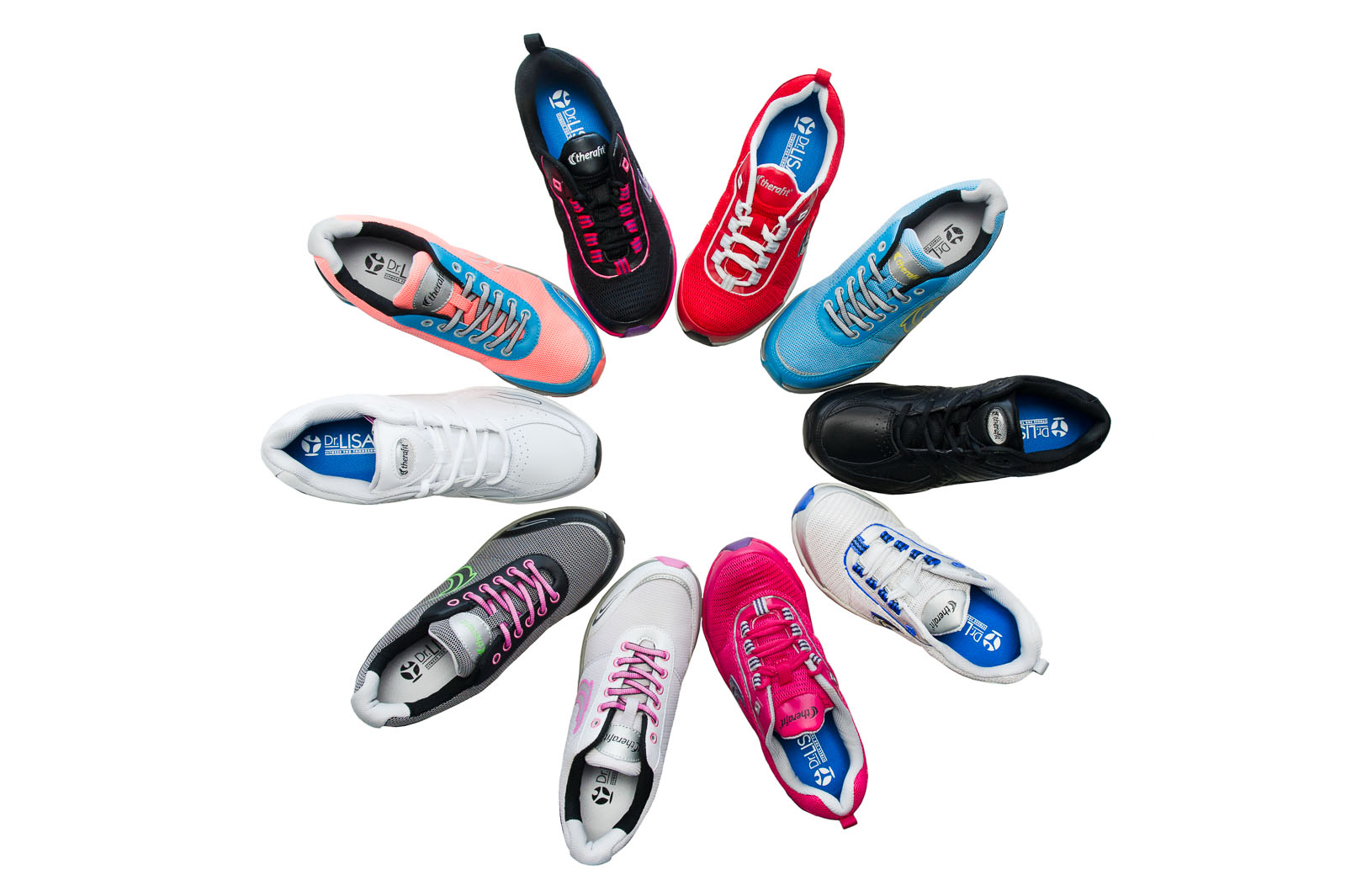
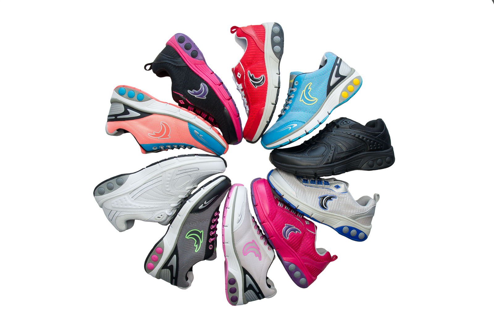
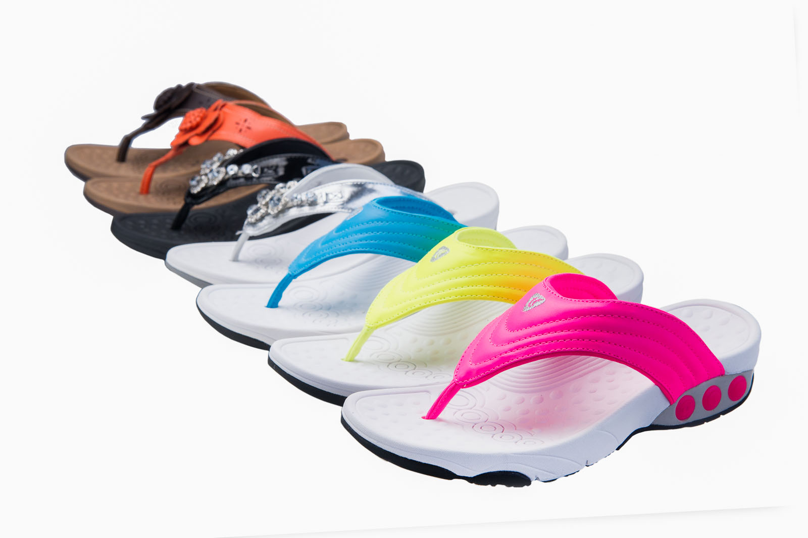
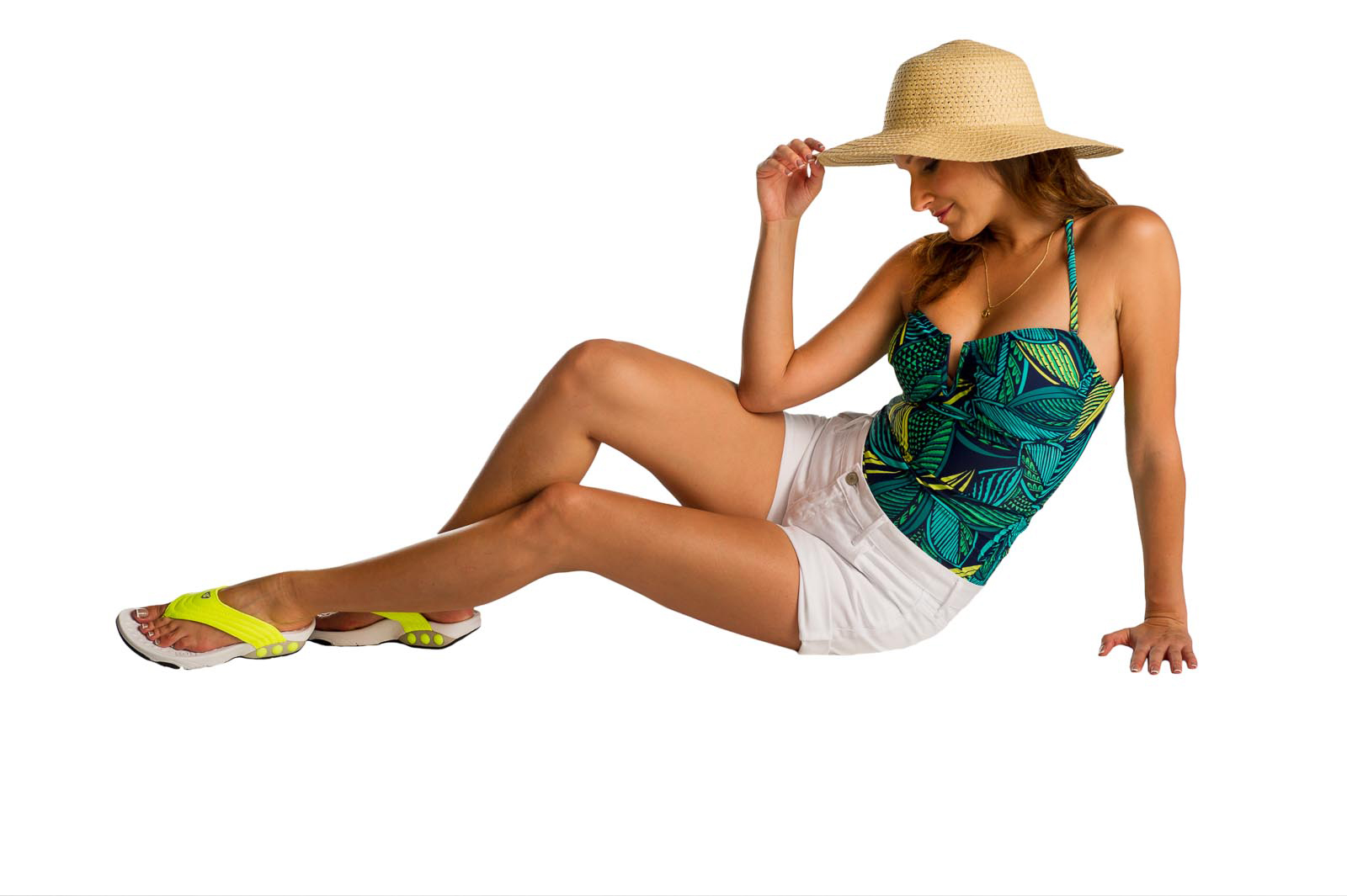
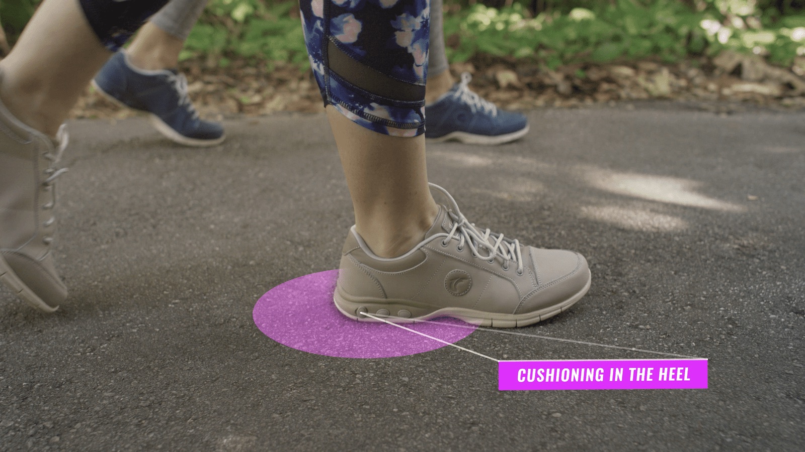
Therafit Shoe commissioned a set of product videos from us, as well as a commercial for advertisement purposes. Their philosophy is simple: Make Your Whole Body Happy. At Therafit, they stay focused on giving you a really comfortable shoe. Their patented technology provides unique cushioning and impact absorption to improve posture & support.
Samantha, Walk On
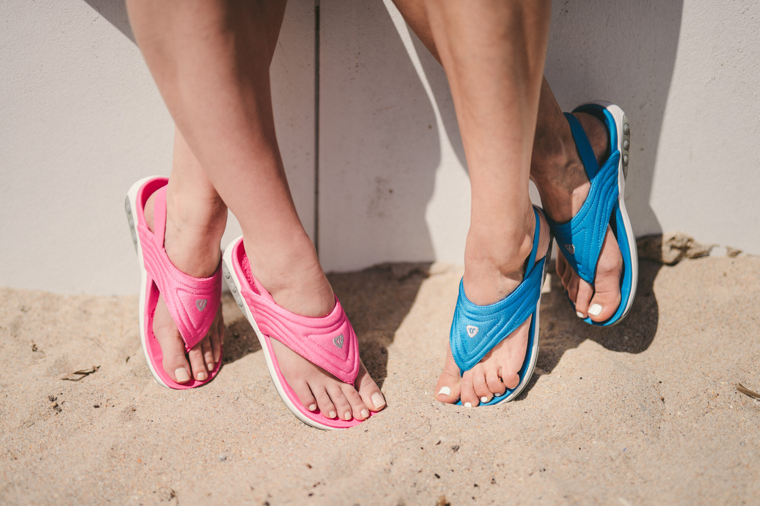
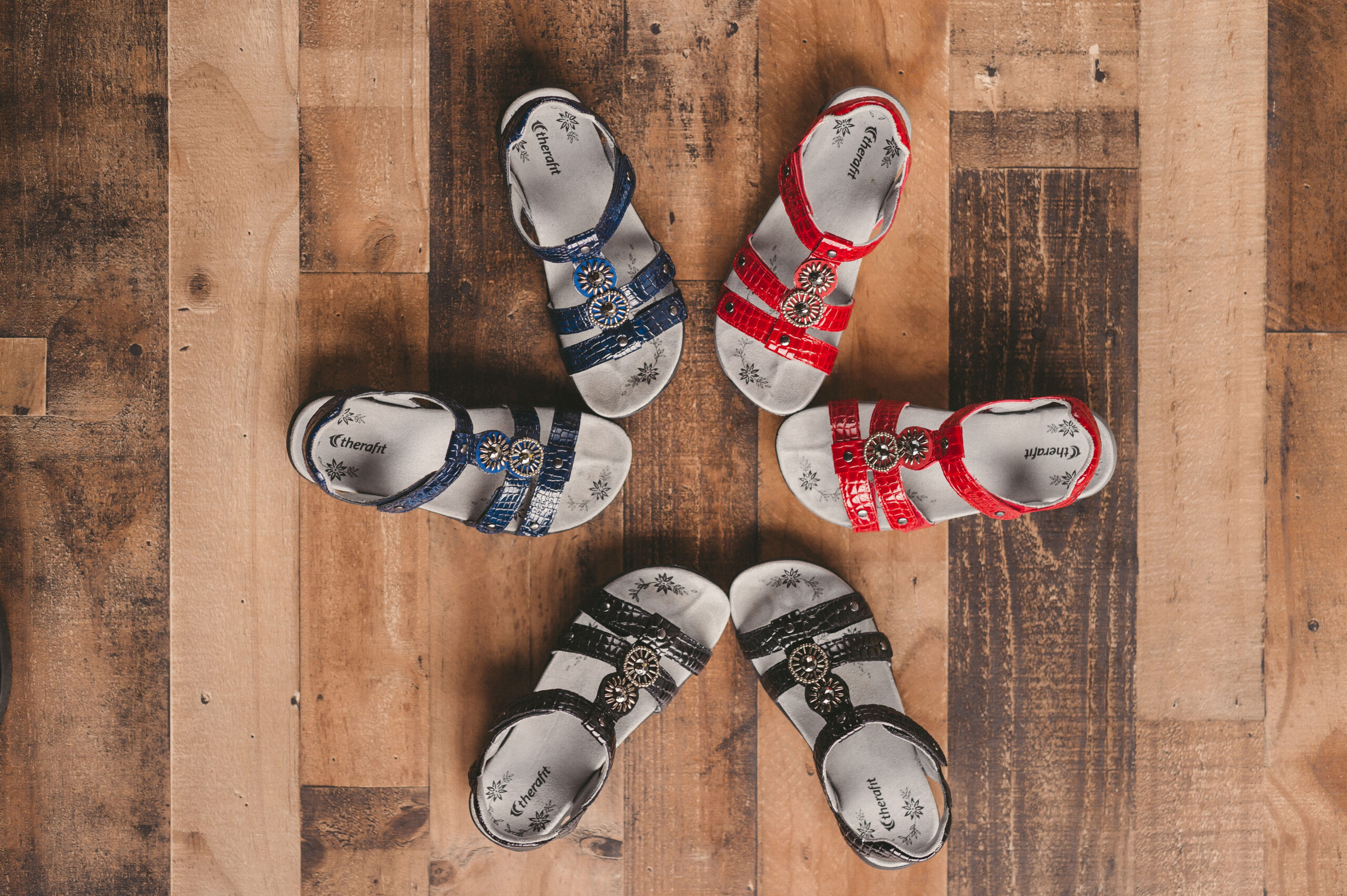
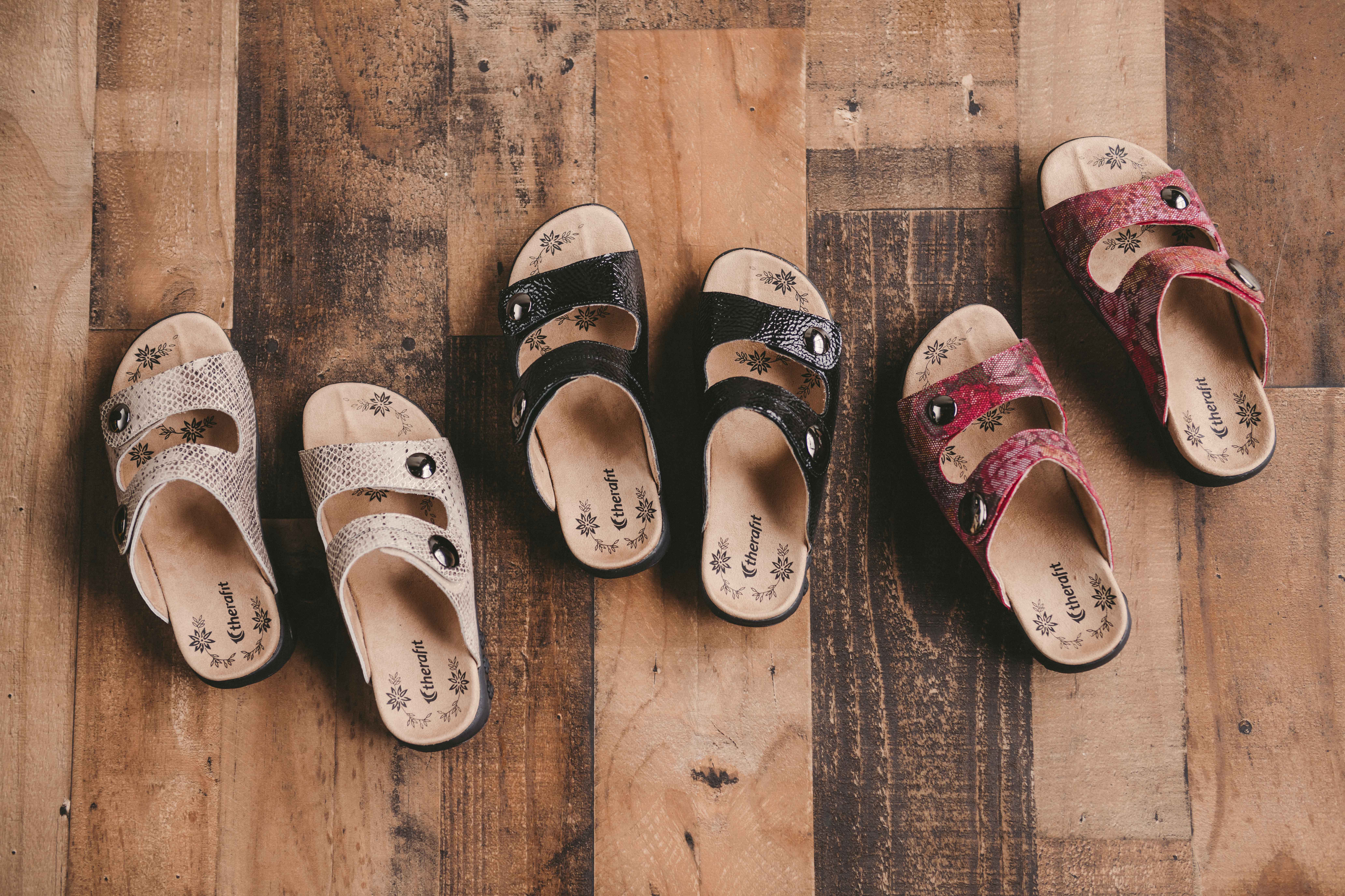
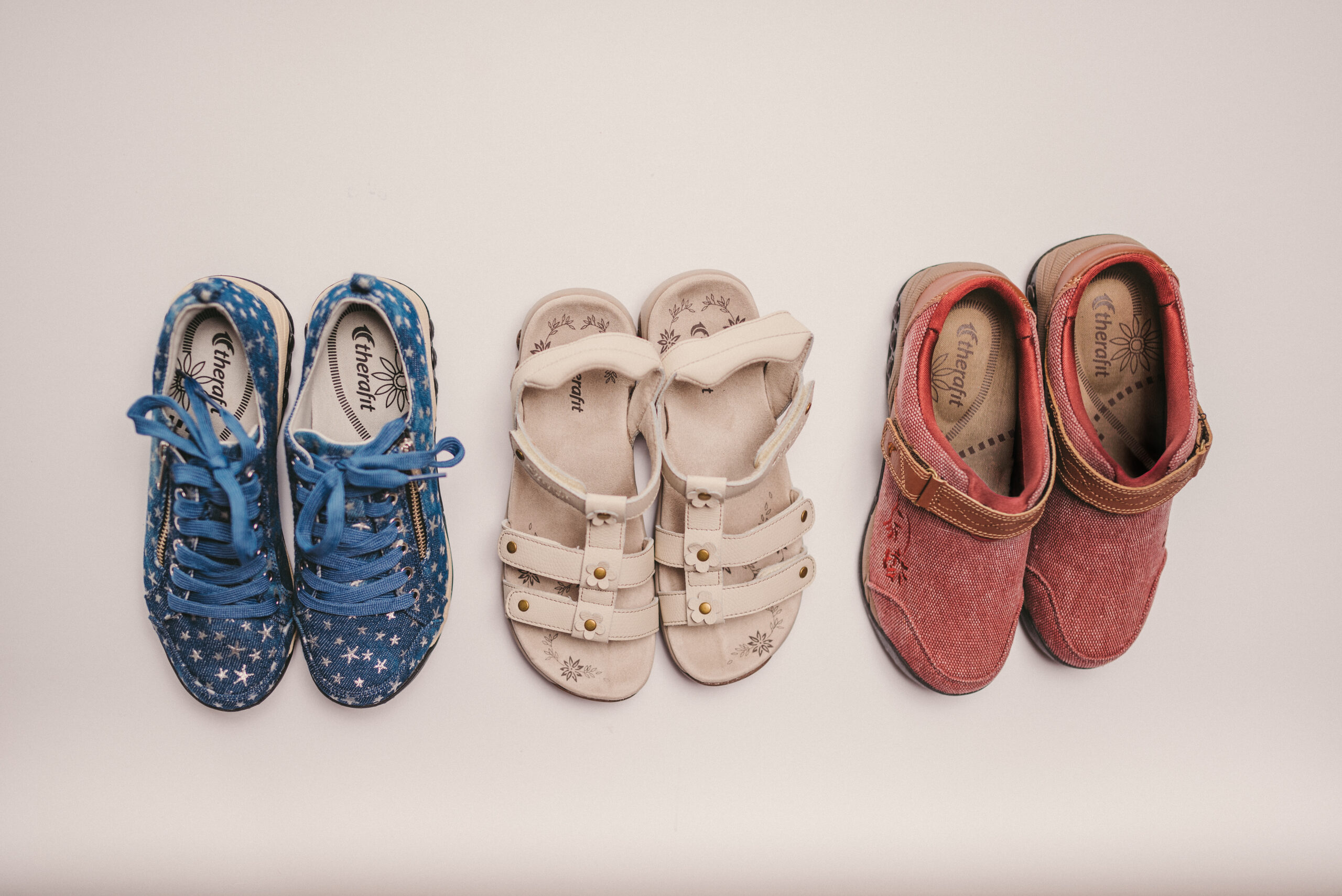
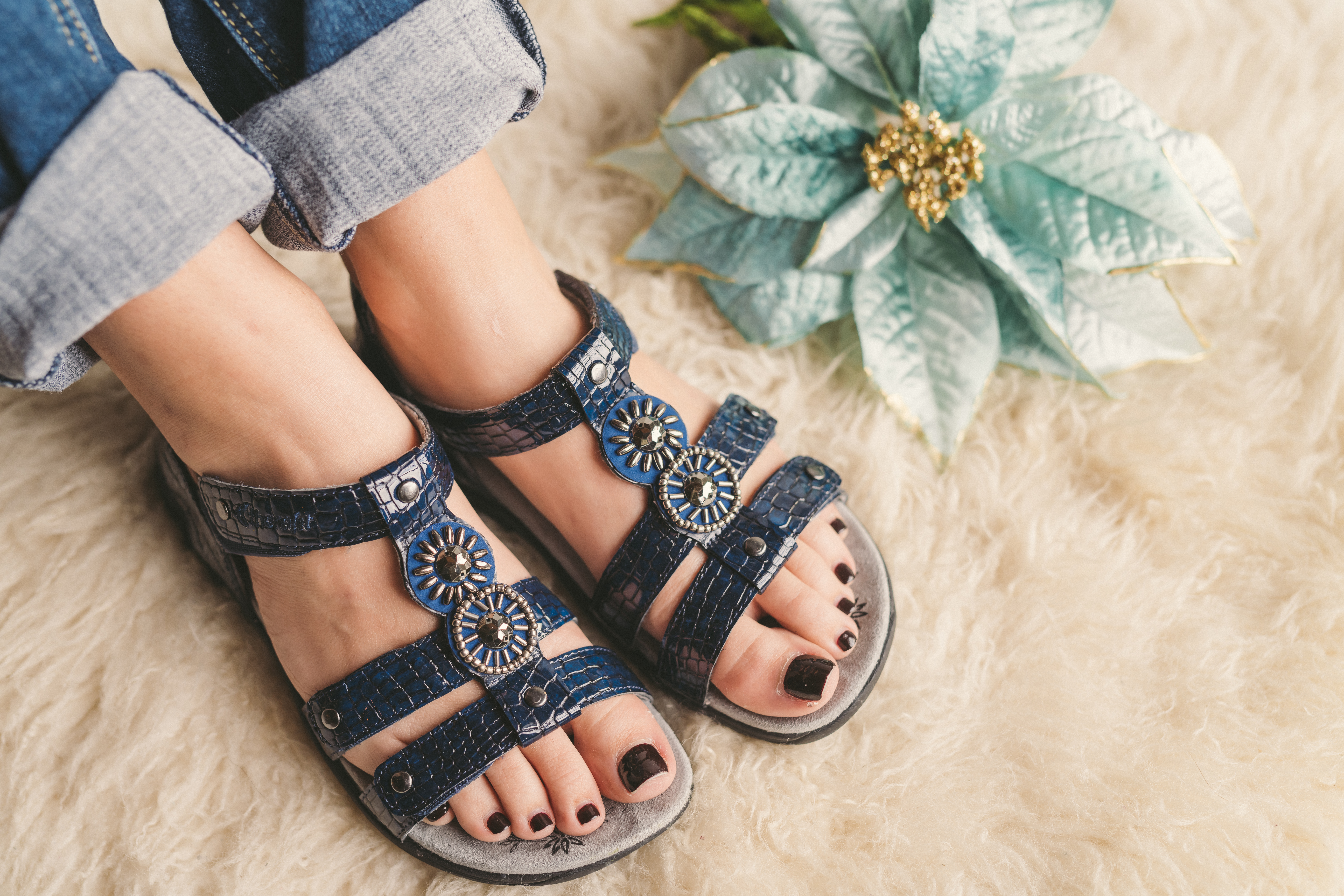
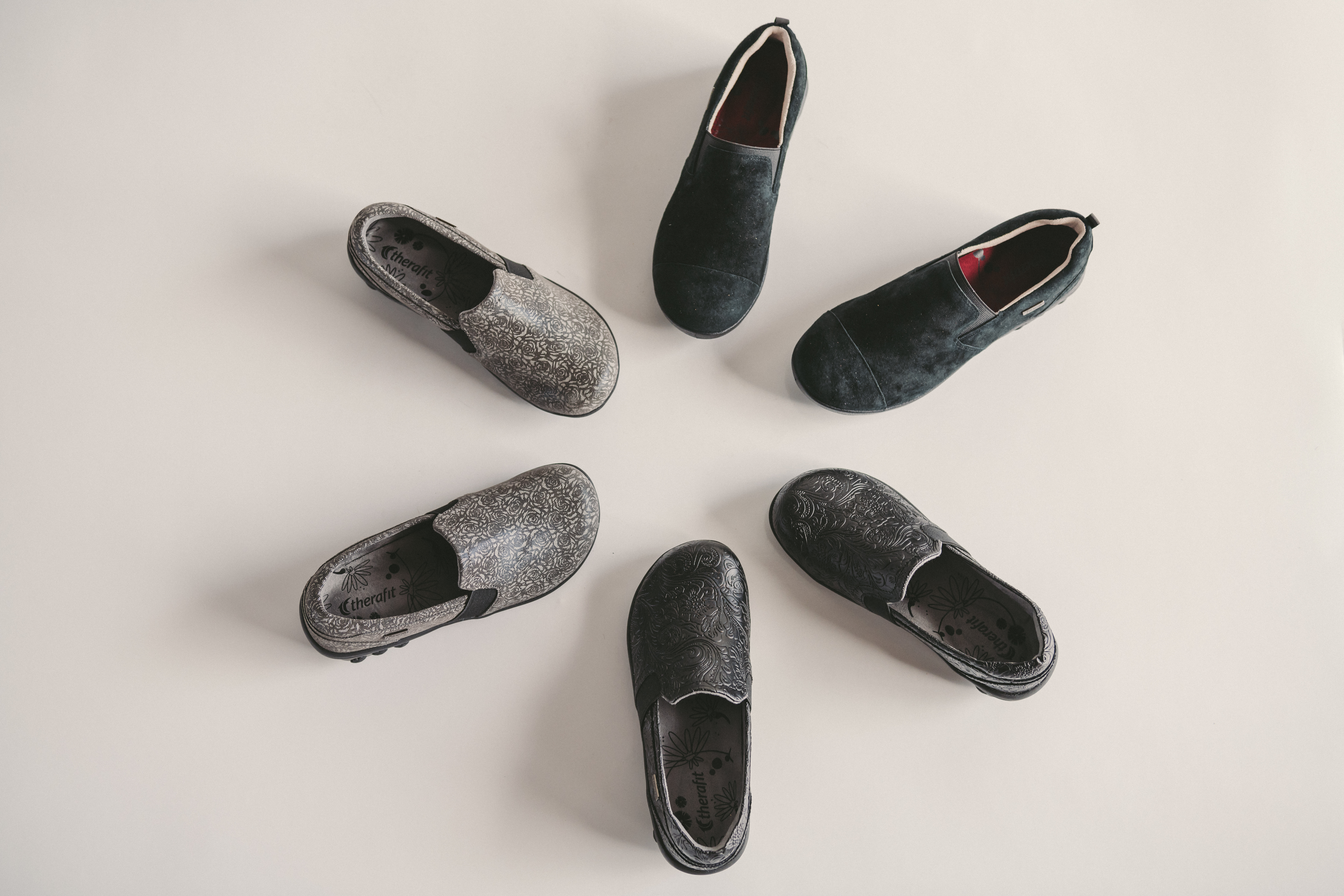
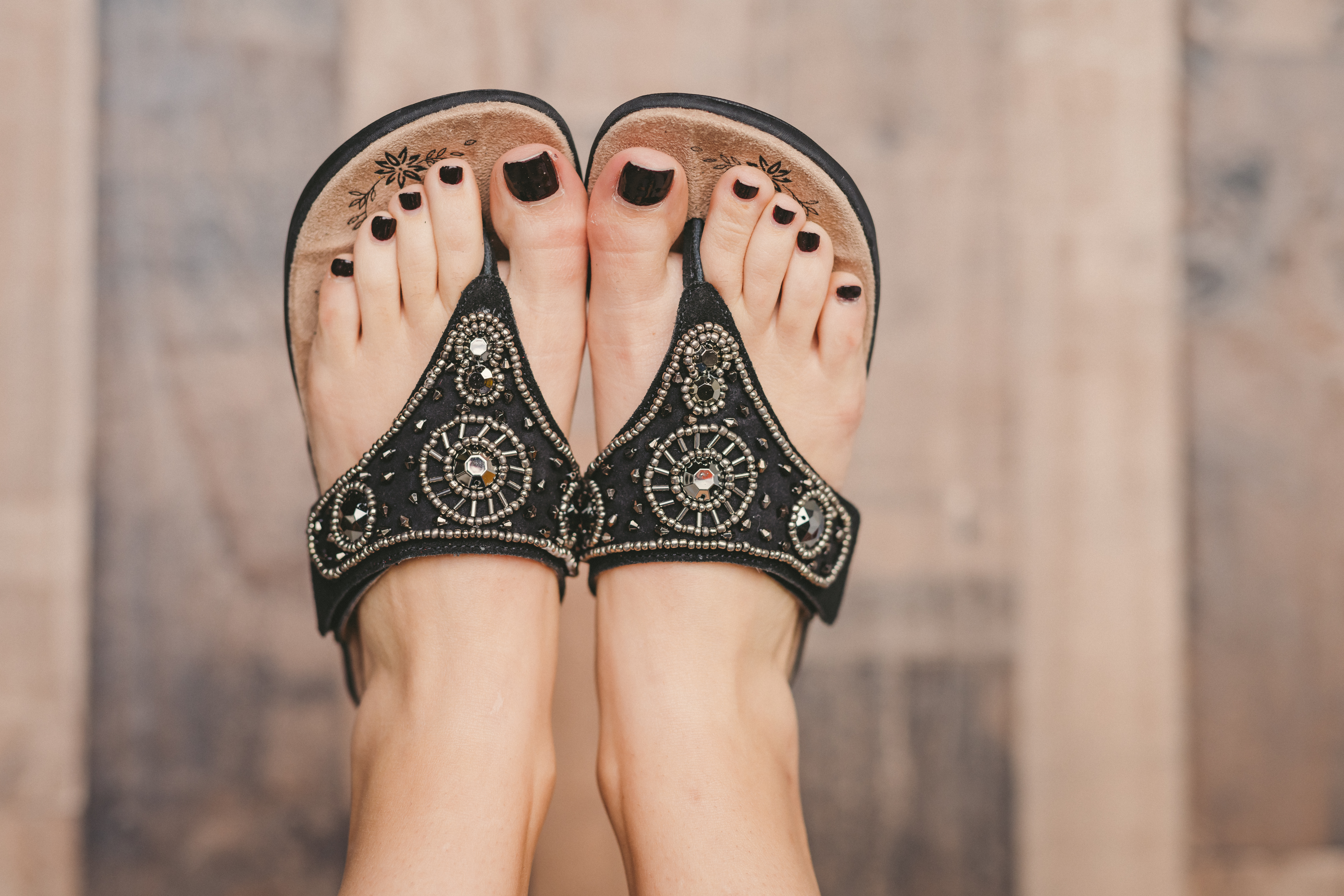
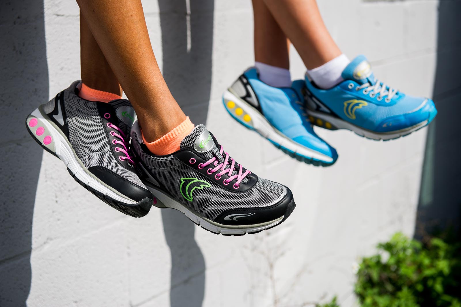
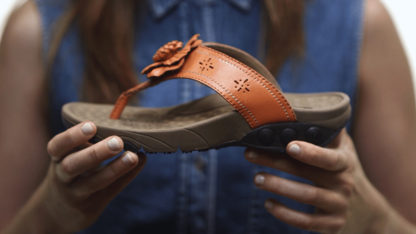
Geared towards a woman’s day-to-day life, Therafit tries to incorporate the comfort women so often covet, while maintaining a stylish aesthetic that can be worn up or down. Endorsed by the National Posture Institute, Therafit has worked very closely to with Cornell University Professor Dr. Richard Lennihan, to develop the technology behind its shoes.
We wanted to show the practical uses of the shoes while simultaneously highlighting the fashionable nature of the design.


Promoting their Expertise
For this project, our client, Therafit Shoe, needed us to develop a message on Plantar Fasciitis prevention in a fun, attractive way. A message is only as effective as the way in which it is communicated, so we needed to establish the best possible medium.
The Challenge
We needed to capture our audience’s attention and keep their focus long enough to drive our message home. To overcome those hurdles we needed to make a topic as unattractive as plantar fasciitis prevention fun. We are a full-service agency so we operate across a spectrum of creative practices and insights. Sensory overload can obscure the clarity of a message, though. We had to keep our approach basic, which meant aligning two of our best departments. In this case, graphic design and video production.


The Process
We use research to identify trends. We study data on where and how audiences gather information. If you do not know your audience you cannot expect to capture their attention. If you fail in that first step, you will most definitely fail in translating your message. We already know how the Therafit Shoe Community likes their information packaged, so we combined elements of graphic design and video production to market this content the best way possible.
The Design
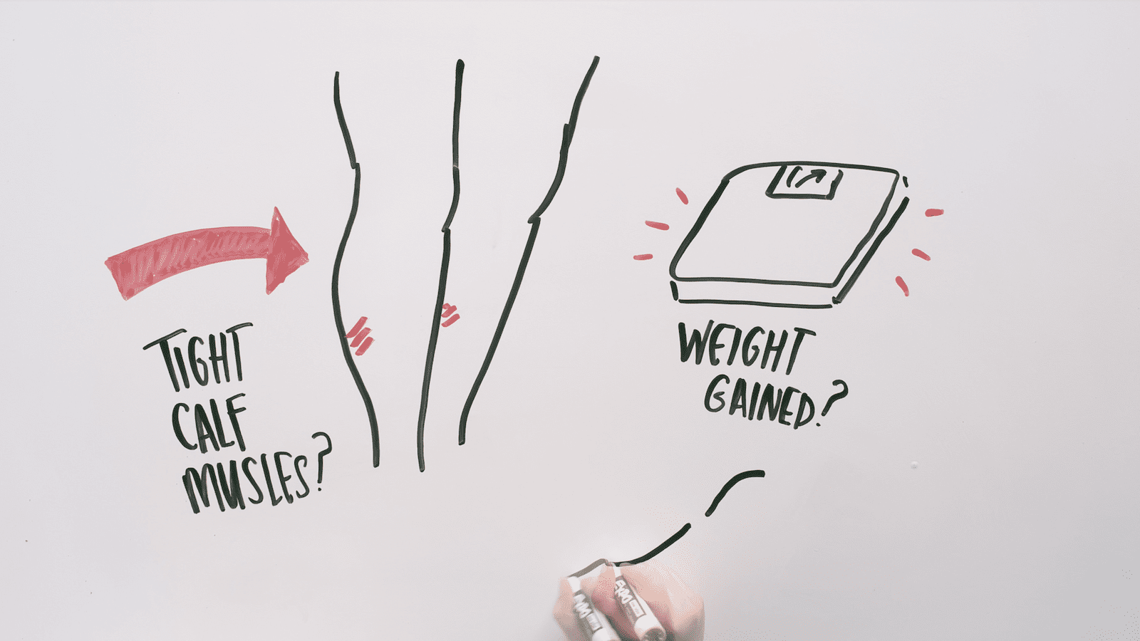
The graphic design elements were key in making our Therafit Shoe content approachable and engaging. We used hand-drawn frames, because it kept the style of the message on brand, and also added some really attractive motion to the design. Combining hand-drawn graphic design with hyper-lapse techniques from video production really situated this conversation in present time, as if it was being told from a classroom. The whiteboard approach solidified this appeal and helped translate the message effectively.


Results
We developed visuals with the narration in mind. By uniting visual and written rhetoric we delivered a cohesive message that was equal parts motion, message, and aesthetic. The narration could not overshadow or contradict the illustrations and vice-versa, otherwise, the translation of our message would have been muddled. It took a few takes, and a few different illustrations, to get the picture just right, but that is what was needed to say ‘bye, bye to plantar fasciitis.” ?

