TomboyX is an eco-friendly clothing and underwear brand designed to fit real people comfortably. There is no one body type. No one comfort zone. There is just you. That is the TomboyX agenda: giving you what you need to be yourself.
“Be who you were born to be. No apologies.”
That is our credence. We do not abide by labels because we do not live by labels. We act out. We’re loud. We’re spontaneous. We see people for who they are… and that is whoever the F*&% they want to be.
TOMBOY [TOM-BOI]
NOUN
1. An energetic, sometimes boisterous girl. 2. A girl who dresses and sometimes behaves the way boys are expected to. 3. A girl or a woman who DGAF about definitions 1 and 2. 4. A woman who is utterly, completely, and unapologetically herself, who is not afraid to stand up, stand out, be heard, be seen. On her terms. 5. A woman or a person who expresses and dresses in a way that feels authentic to her without worrying about what other people might say. 6. Is damn ok with who they are. 7. Not a phase. 8. You? 9. Me.
The Challenge
To market a rebellious brand like TomboyX we decided to disrupt the consumers’ expectations of fashion in advertising. We wanted to deliver a lasting piece of media that was completely unique and genuine to the TomboyX culture. To achieve this, we fused typography, graphic design, movement, and poetry.
The TomboyX brand is all about freedom. Their audience simply doesn’t like being told what to do. This made writing a commercial especially difficult. We couldn’t force or sugar-coat our message less risk our audience responding negatively. Additionally, we had to target a specific audience without labeling the individuals within that demographic. We dug deep into their brand, uncovering key elements that we felt personified TomboyX, not the people who wear it. This was a crucial step in the scriptwriting process and really allowed us to construct a voice that truly represents their core values. During the visual stage, we used the X as rhetorical support, which helped translate emotions and perceptions we otherwise would not have been able to describe.
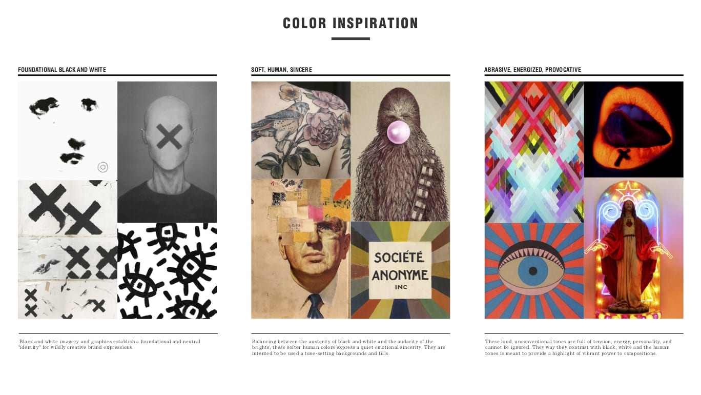
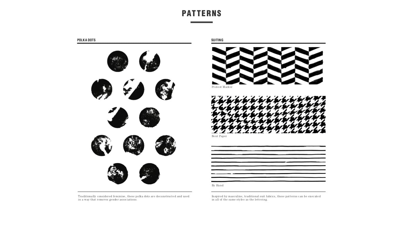
The TomboyX brand uses a chaotic series of patterns, colors, imagery, and bold language to represent the various voices of their community. Their message is sharp and immutable. It is many voices melded into one. Because of that, it was important to consolidate all the different identities within the TomboyX community – power, freedom, love, and individuality – as if they were a unified voice.
The Solution
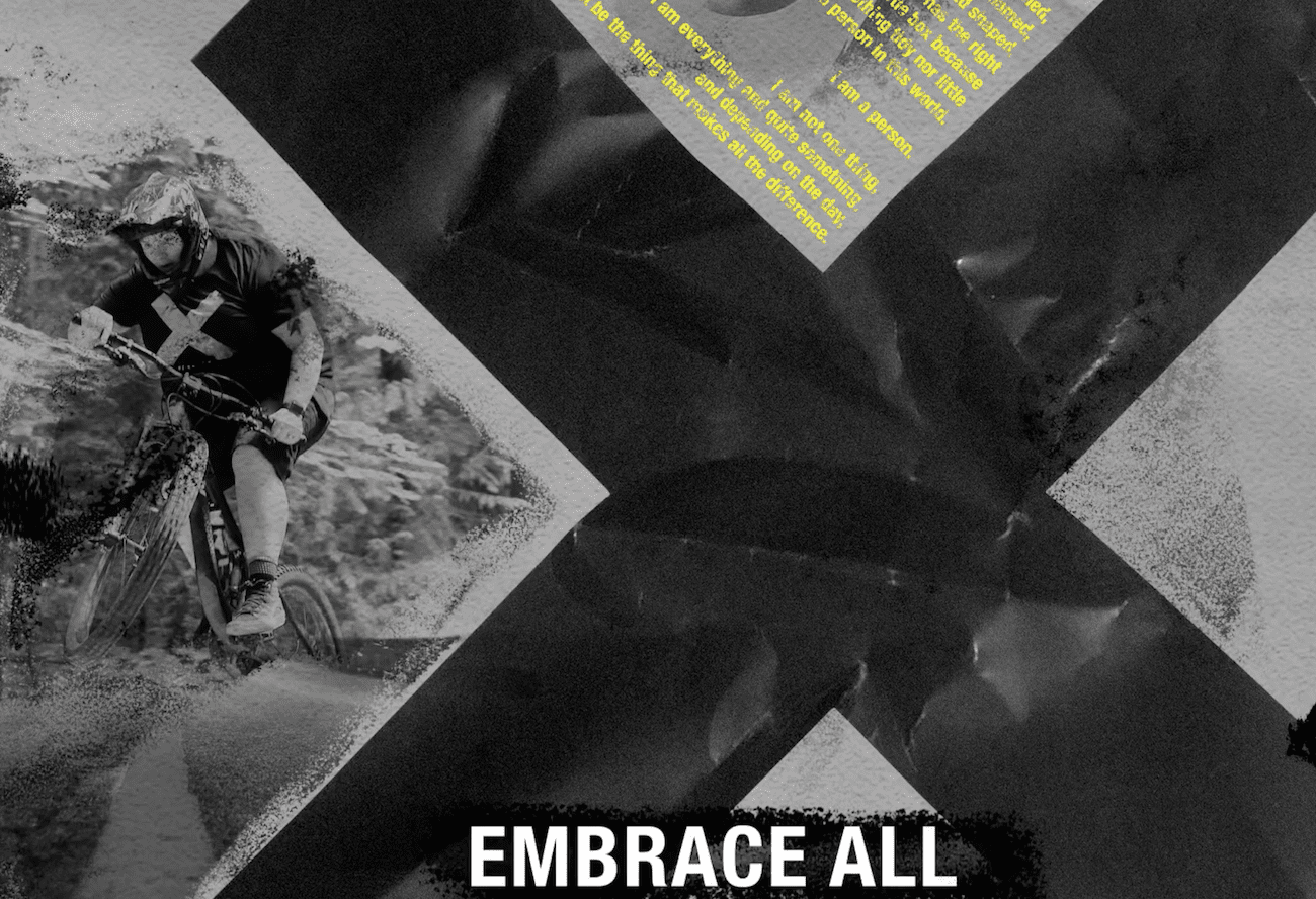
We used the X in TomboyX as an added source of visual and spoken communication, as well as an outlier for movement, structure and a spot to focus the eye during quick camera transitions. Rhetorically, the X represents the dichotomy of society and culture: acceptance and denial. Structural, the X is a statement: a stamp of rebellion and unity.
We used X as a means of cancellation. By eliminating judgemental labels at the beginning of the video we show our audience that they can be accepting of others by being bold in the face of false stereotypes. Next, we used X as a means of empowerment. We found it essential that the TomboyX brand has a strong, inspirational voice to propel the power of the individual. Showing that we are strong in the face of oppression established greater trust between the brand and the consumer. This trust equipped inspirational language with added sincerity.

“X is your mark; your identity.”
The X is the focus on the screen and allows us to say multiple messages at the same time without diluting or distracting from the others. This adds depth to the brand. We tucked a personal testimonial into the upright crevice of the X to spotlight the positivity of the TomboyX agenda: be yourself. When reading the testimonial, consumers can apply it to the changing portraits above, and (possibly) to themselves. That connection is what converts audiences into loyal consumers.


