
What Color Grading Does to Your Brand Video
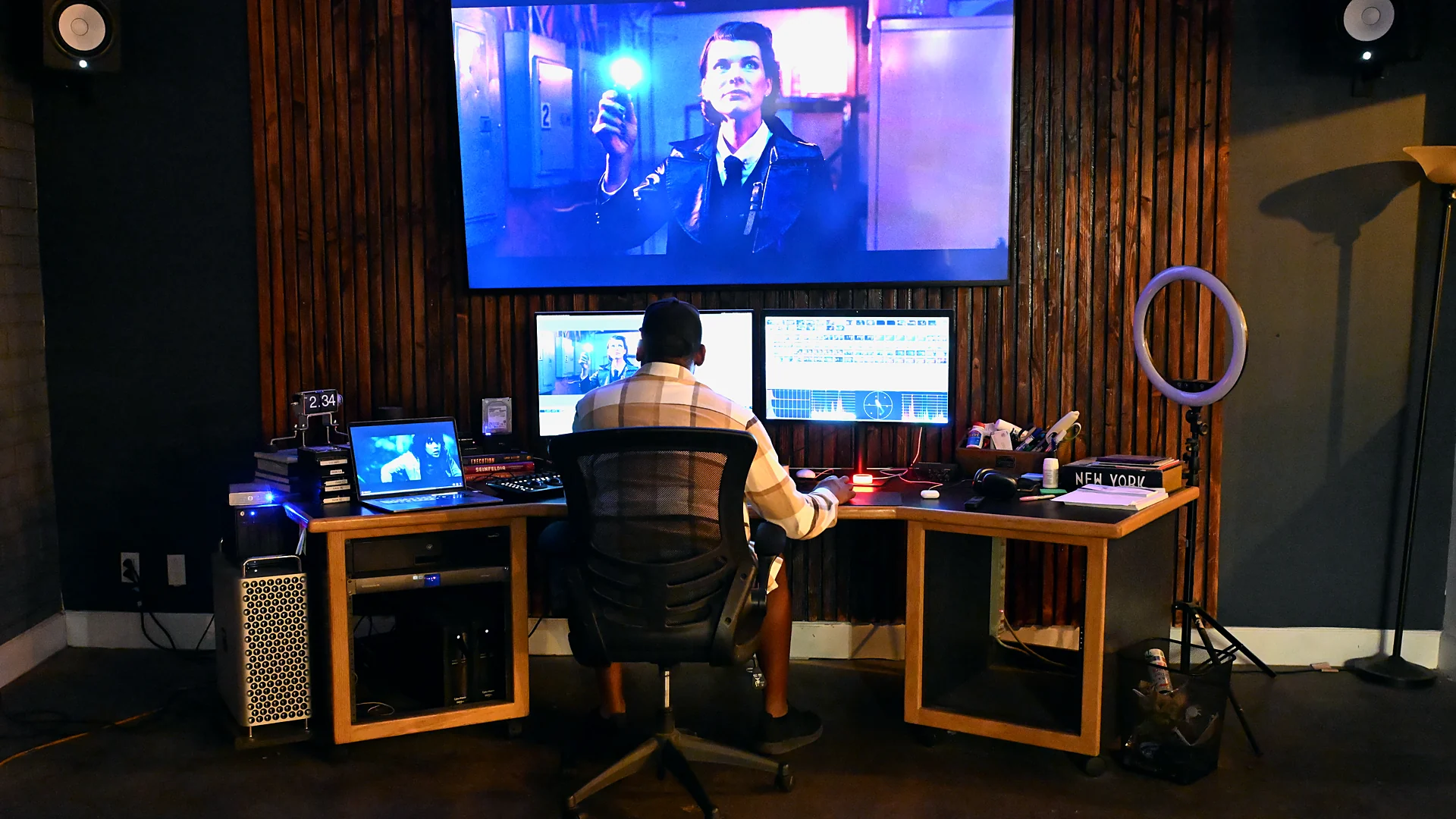
Nobody watching your brand video thinks about color grading. They think the product looks expensive, or they think the whole thing looks like an internal training video, and they decide it somewhere in the first three seconds. That reaction is the grade doing its job or failing at it.
Color grading is the last real creative pass on a film and the one clients understand least. It gets described as a filter, budgeted as a rounding error, and reviewed on a phone at half brightness. Then the video goes out and something about it feels cheap in a way nobody can name. We finish work for brands out of our Los Angeles studio every week, and the gap between a video that looks like money and one that does not is almost never the camera. It is what happened after the edit.
What color grading actually does to a brand video
Color grading bundles two different jobs under one word, and separating them is the fastest way to stop overpaying for one and under-buying the other.
Color correction is repair and consistency. Footage comes off a camera flat, or slightly green under office fluorescents, or a stop under where it should have been because the sun moved. Correction pulls every shot back to neutral so a face reads as a face and white reads as white. It is technical work with a right answer, and you can tell when it has been skipped because the cut jumps in brightness every time the angle changes.
Color grading is the part with an opinion. Once the footage is neutral, the colorist decides what the film should feel like. Cooler and cleaner for a software company. Warm with soft highlight roll-off for food. Deep blacks and controlled saturation for luxury. The look gets applied across the whole piece so the video reads as one film shot by one crew with one point of view, which is the entire point of hiring a crew in the first place.
Both passes live in the same color grading session, and both are part of our post-production work. The difference matters when you are reading a quote. A bid that includes correction and calls it grading is not lying to you exactly, but it is selling a repair job as a creative one.
The look is a brand asset, not a taste call
Most brands lock their fonts to the pixel. They have hex codes, clear space rules, a logo lockup nobody is allowed to stretch. Then video shows up and the look gets decided by whoever happened to edit it that quarter. Six films later there are six looks, and none of them belong to the same company.
A defined color look does the same work as a typeface. It makes the next video recognizable before the logo appears. Color grading is where that consistency gets enforced. It also settles arguments, because once a look is documented as a starting node tree and a reference still, the discussion moves from what people like to whether this cut matches the last one.
The demands change with what you sell. Jewelry work like our Chaumet pieces lives in the highlights, where metal and stone either hold detail or turn into white blobs. A beverage brand like Celsius needs the can to be the exact color of the can, in every light, in every shot, because that color is trademarked recognition. Food needs warmth that stops short of orange. Skin has to survive all of it, because a viewer will forgive a strange sky and will not forgive a talent who looks ill.
Where the grade starts. On set, not in post
The colorist does not start with your video. They start with whatever the camera actually recorded, and half the ceiling on the color grading is set on the shoot day by people who are not thinking about color at all.
We shoot log or raw on brand work for exactly this reason. A log file looks washed out and wrong on set, which alarms clients who wander past the monitor, but it holds the shadow and highlight information a grade needs later. That is why the monitor gets a viewing LUT applied, so the room sees a rough version of the finished look while the camera keeps recording the flat file underneath.
The decisions that show up as extra hours in post are boring ones. Mixed lighting, where a window and an LED panel and an overhead fluorescent all hit the same face at three different color temperatures. Wardrobe in a color that fights the product. A conference room with a lime green accent wall bouncing onto everyone. Exposure that drifted between setups because nobody was watching false color. None of that is unfixable. All of it is slower and more expensive to fix than it was to prevent.
| What happens on the shoot day | What it costs in color grading |
|---|---|
| Log or raw capture with a viewing LUT on the monitor | Full latitude to build a look. This is the cheap path. |
| Baked-in camera picture profile | The look is already locked. Changing it means fighting the file. |
| Two cameras from different manufacturers | An extra matching pass before any creative work starts. |
| Mixed daylight and practicals on one face | Secondary keys and windows, shot by shot, instead of one primary. |
| Underexposed interviews | Noise reduction, which softens the image before you gain anything back. |
| Product color checked against a real sample on set | Almost nothing. The reference is already correct. |
The three color grading passes we run on every brand video
Color grading looks like someone dragging color wheels around. It is closer to a sequence of passes, each one finished before the next begins, because working out of order means redoing everything twice.
Balance the footage first
Every shot gets pulled to a neutral, consistent starting point. Black point set so shadows sit on the floor without crushing, white point set so highlights stop short of clipping, white balance corrected against something in frame that is genuinely neutral. This pass happens on scopes, not on instinct. A waveform and a vectorscope tell you where skin tone actually sits, which matters because a room with warm lamps will convince your eyes that badly orange faces look fine after twenty minutes.
Build the look
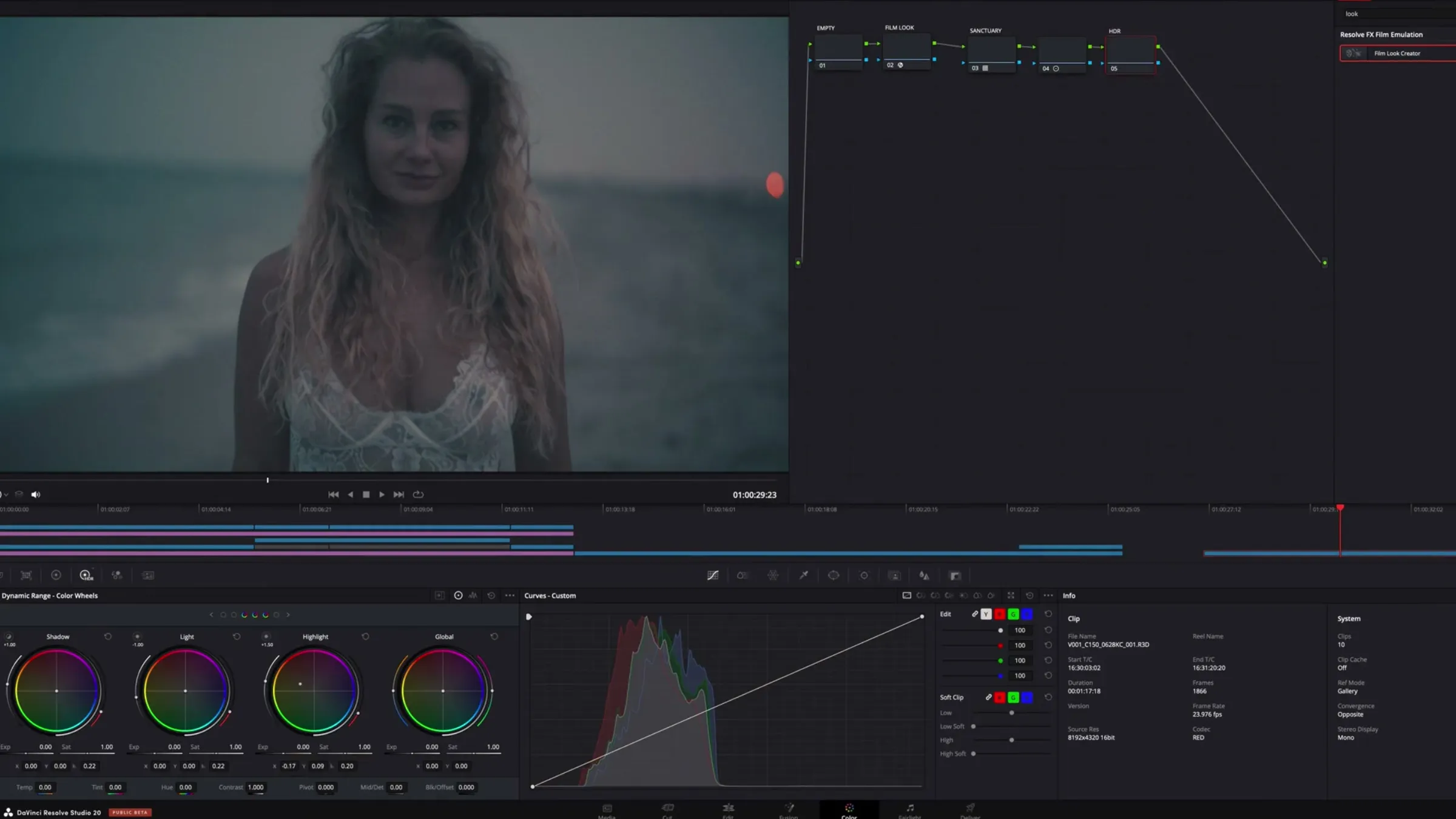
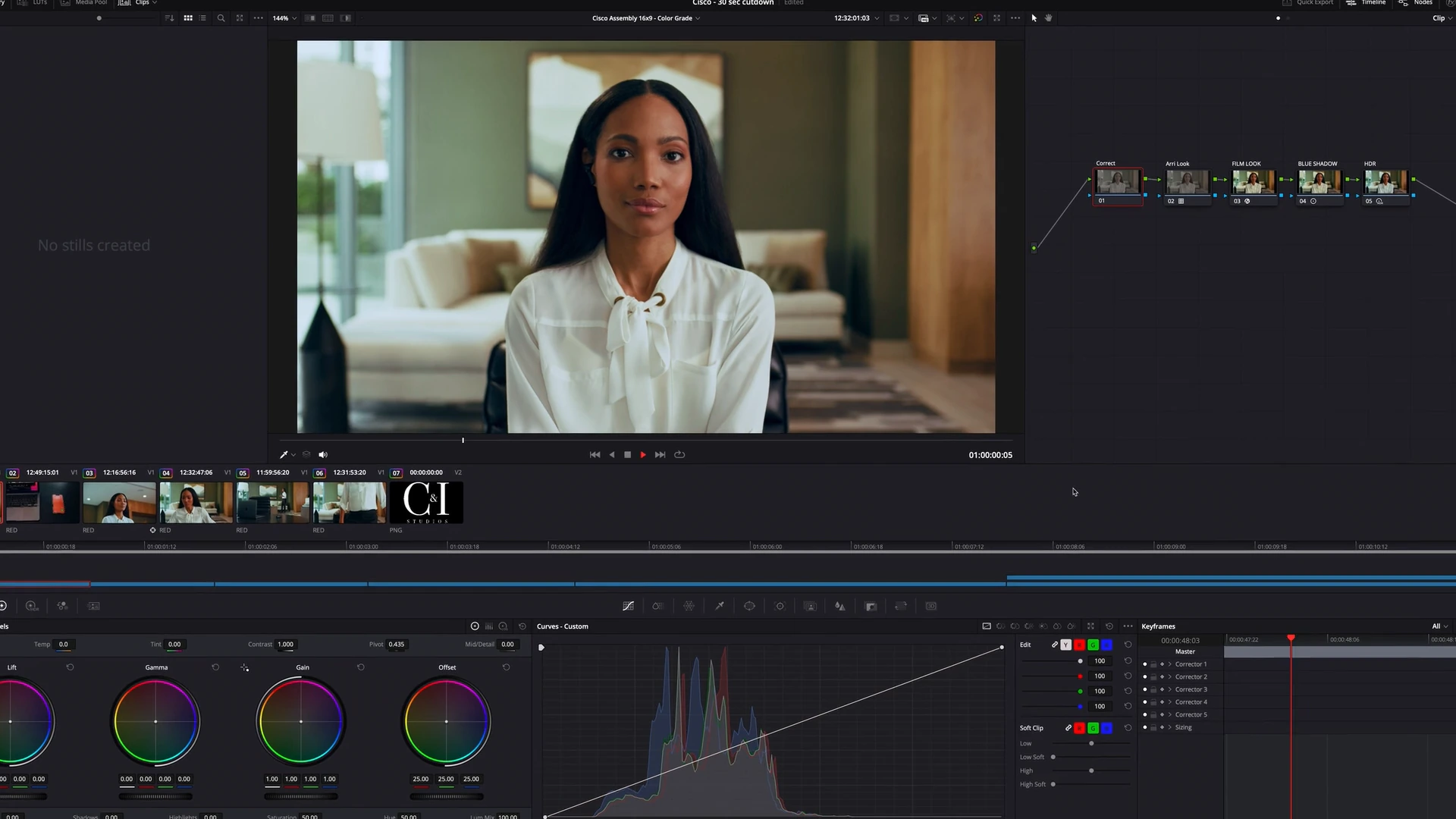
The creative pass is where the film gets its point of view. Contrast curve, highlight roll-off, how far saturation goes and where it gets pulled back, whether the shadows carry a tint. We build it in DaVinci Resolve as a node tree so each decision stays separate and adjustable, rather than as one flattened effect that has to be rebuilt every time a client asks to see it slightly warmer.
Film emulation goes here too when the piece calls for it. Grain, halation and the way real stock handles a hot highlight are the difference between a video that feels made and one that feels rendered. Used carelessly it is a costume. Used well nobody notices it and everybody says the video feels expensive.
Match every shot in the cut
The last color grading pass is the unglamorous one that separates finished work from a decent first attempt. Shot by shot, the colorist matches every angle so nothing shifts when the edit cuts. Interviews recorded four hours apart under a window that clouded over. Product shots from a second camera. B roll from a different day entirely. Skin gets isolated with keys so a face can be adjusted without dragging the whole frame with it, and windows track a subject across the frame so a highlight does not bloom every time they move.
A campaign that skips this pass reads as a collection of clips. That is usually what a client means when they say a video feels unprofessional but cannot point at a specific shot.
What the grade cannot fix
Color grading gets treated as a safety net, and it is a generous one, but a few things are genuinely gone by the time the footage lands.
Clipped highlights are gone. When a window or a white shirt hits the top of the sensor, there is no detail underneath to recover, only a smooth gray patch where the information used to be. Focus is gone. Sharpening makes a soft shot look like a sharpened soft shot. Heavy noise from underexposure can be reduced, and every reduction costs you texture, so a face gets waxy exactly when you needed it to look real.
Product color that was wrong on set is the expensive one. If a package photographed under a bulb with a spiky green output, correcting the package pulls the rest of the frame with it, and now the colorist is building a mask around the product on every shot. Bring the physical product and a printed brand sheet to the shoot. It costs nothing and it removes an entire class of problem.
Keeping color consistent across a whole campaign
One video is a single grade. A campaign is a color grading system. The hero film gets the attention, then the same footage becomes vertical cutdowns, a fifteen second pre-roll, stills pulled for social, a loop for a trade show wall, and somewhere in that chain the color quietly stops matching.
The fix is to do the color grading once, properly, and then manage what each destination does to that master. Platforms re-encode aggressively. A file that looked right in the suite can come back from a social upload with crushed shadows and shifted saturation, which is why we check deliverables after they land rather than assuming the export was the end of the job.
| Deliverable | Where color drifts | What we do about it |
|---|---|---|
| Hero film for the site | Player compression on dark scenes | Lift the deepest shadows slightly so banding does not appear |
| Vertical social cutdowns | Platform re-encode and auto contrast | Check the graded file on the live post, not only the export |
| Stills pulled from video | Video color space against sRGB for web and print | Convert deliberately instead of screen grabbing the timeline |
| Trade show or LED wall | Wall brightness blows out the look | A separate pass with reduced contrast for the room |
| Broadcast or agency handoff | Delivery specs the agency will reject on | Grade to the spec sheet before the deadline, not after |
If the work has to survive a network or a studio pipeline, this is where standards stop being academic. The Academy maintains ACES as a common color management framework for exactly this reason, and agency delivery sheets increasingly assume something like it. Most brand work does not need that much machinery. Knowing whether yours does is worth one conversation before the shoot rather than a re-grade after.
How long color grading takes and what drives the schedule
There is no useful hourly figure for color grading because the same runtime can be a two hour session or a three day one. What moves the number is not length, it is how much of the frame has to be treated separately.
A single interview shot on one camera under controlled light is fast. Balance it, build the look, match the angles, done. A product film with hero shots, a talent key, a package that has to be trademark accurate, graphics that need to sit inside the same world, and eleven cutdowns is a different job entirely, even if the hero film is only ninety seconds.
The drivers worth knowing before you budget are the number of camera systems in the cut, whether anything needs isolating shot by shot, how many separate deliverables the grade has to serve, and how many rounds of review the approval chain will realistically take. Rounds are the one clients control directly. For where grading sits inside a total budget, we broke the whole picture down in what corporate video production actually costs and in what a thirty second commercial costs.
How to review a grade without burning a round
Most wasted revision rounds come from how the review happened, not from the work. A few habits fix nearly all of it.
- Watch it once all the way through before writing anything. Notes taken shot by shot on a first pass are usually notes about the edit, not the color.
- Watch on a real screen. A laptop at forty percent brightness in a bright room makes every grade look muddy, and a phone with auto contrast is actively lying to you.
- Describe the intent, not the instruction. Telling a colorist the room feels too clinical is useful. Telling them to take out ten points of red is a guess that costs a round.
- Give notes with timecode. A comment about the third interview is ambiguous when there are four.
- Collect everyone into one list. Three stakeholders sending separate notes on separate days is three rounds masquerading as one.
- Send the brand guide and a physical product sample before the session, not after the first review.
Two rounds is normal on brand work. Five means something upstream is unresolved, and it is almost always that nobody agreed on what the film should feel like before the grade started.
Color grading questions brands ask us
Is color grading included in video production?
With us, yes. Correction and a finishing color grading pass are part of the post schedule on any film we shoot, and we say so on the line item rather than burying it. It is worth asking any company directly, because some quotes cover a correction pass only. We answered the longer version of this in whether a video production company handles editing and color grading.
What is the difference between color correction and color grading?
Correction makes footage accurate and consistent. Color grading gives it a look. Correction has a right answer that scopes can confirm. Grading is a creative decision that should be signed off before the colorist spends a day on it.
Can you match footage from two different cameras?
Usually, and it is easier when both cameras recorded in a log format and someone shot a reference chart at the head of each setup. Sensors render color differently, so matching is a real color grading pass with real hours attached, not a checkbox. Mixing a cinema camera with phone footage is possible and it will never be invisible in the highlights.
Can you re-grade a video we already have?
If the original camera files still exist, yes, and that is the version worth doing. Re-grading a finished export means working on a compressed file that has already thrown away most of the range, so the ceiling is low. Before anyone deletes a drive, that is the thing to keep.
Do we need a documented look for our brand?
If you make more than two or three videos a year, it pays for itself. A reference still, a color grading node tree and a short note on what the look is doing takes an hour to produce at the end of a project you are already paying for, and it stops the next film from starting the argument over. You can see what a look does across a body of work in these before and after grades.
How much footage should we keep after delivery?
Keep the camera originals, the project file and the graded master. Those three let us re-cut, re-grade or re-deliver later without a reshoot. Everything else is optional.
Bring your next brand video to C&I Studios
We shoot and finish brand work nationally from a thirty thousand square foot stage in Los Angeles and offices in Fort Lauderdale and New York, which means the people doing the color grading are usually the people who watched it get lit. If a look matters to you, that continuity is most of the value. Start with post-production if you already have footage sitting on a drive, or full production if the film has not been shot yet. Our color grading services page covers the finishing side on its own, and the LA stage is available if you are producing in house and only need the room. For the craft side of the same subject, how we give films their final look and the role of color grading in film and TV go deeper on narrative work. When you are ready to talk about a specific film, tell us what you are making.