
What Motion Graphics Add to a Brand Video
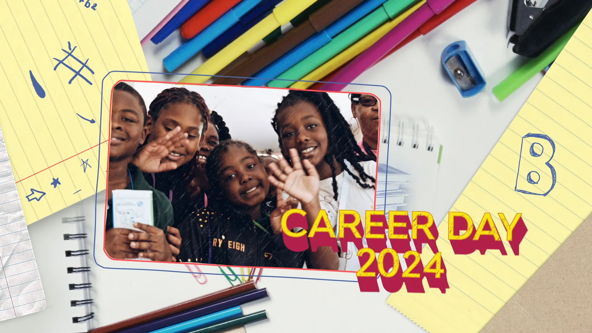
A brand video can be shot beautifully and still feel flat. The footage is there, the color looks right, the audio is clean, and yet the thing reads as generic. Often the missing piece is motion design. Motion graphics services add a layer of animated type, graphics, and timing that turns raw footage into something that looks like it belongs to your brand and no one else. This is where a logo breathes, where a statistic lands, where a product feature gets a clear callout instead of a mumbled voiceover. The question most marketers wrestle with is not whether motion graphics look good. It is where they earn their cost and where they are just noise. That is what this post is about.
What motion graphics actually are
Motion graphics are animated design elements laid over or between your footage. Think of anything on screen that moves but was not captured by a camera. A logo that assembles itself in the opening frame. A name and title that slide in when someone starts talking. A number that counts up while a narrator talks about growth. Arrows, lines, icons, and text that guide the eye. These are not special effects meant to trick you into thinking something is real. They are design decisions in motion.
The craft sits between graphic design and animation. A good motion designer is making the same type, color, and spacing choices a brand designer makes on a static page, then deciding how those elements enter, hold, and leave. Timing is the part most people underestimate. The difference between a title that feels expensive and one that feels like a template is usually a quarter second of easing, not the font.
The core use cases and the job each one handles
Most brand video work pulls from a short list of motion graphics building blocks. Knowing what each one is for helps you ask for the right thing instead of asking for “some graphics” and hoping.
Animated logos and brand idents
Your logo should not just appear. It should resolve in a way that feels intentional. An animated ident at the top or tail of a video is the motion equivalent of a signature. Done well, it sets the tone in two seconds and makes the whole piece feel like part of a larger brand system. Done lazily, it is a logo that fades in and sits there. The idents that work tend to carry a small piece of brand DNA in the movement itself, a snap, a wipe, a build that matches how the brand talks.
Lower thirds and titles
Lower thirds are the name and title cards that identify a speaker. Titles are the chapter markers and section headers that organize a longer piece. These are the workhorses of brand video. They appear constantly, which means they are also the fastest way to make a video look consistent or cheap. When the lower third uses your brand type, your brand color, and the same entrance every time, the viewer stops noticing the mechanics and starts trusting the content.

Kinetic typography
Kinetic typography is text that moves and animates as the primary visual, often synced to a voiceover or music. It is useful when the words themselves are the message and you do not have strong footage to carry it. A punchy brand manifesto, a quote, a set of value statements. Kinetic type can make a thirty second spot out of a single sentence. The risk is that it gets overused as a crutch when there is nothing to show. If you have great footage, do not bury it under flying words.
Data and product feature callouts
This is where motion graphics quietly earn their keep in B2B and product marketing. A number that animates up feels different from a static stat. A product shot with clean callout lines pointing to three features reads in a glance. A short animated chart can explain a trend that a sentence of voiceover would blur. The goal is comprehension, not decoration. If the graphic makes the viewer understand something faster, it is doing its job.
Transitions
Transitions are the moves between shots or sections. A branded transition, a wipe shaped like your logo mark, a color sweep in your palette, ties a video together and hides the seams between scenes that were shot at different times or places. Overdone, transitions become the thing people remember instead of the message. The best ones you barely register.
Explainer-style sequences
Sometimes the whole video is motion graphics. A 2D animated explainer walks through how a service works, how a process flows, or how an abstract idea fits together. This is the right call when there is nothing physical to film, when you need to show a concept rather than a place, or when the subject is too technical to shoot. Animation also lets you control every frame, which matters when the message has to be exact.
How motion design carries brand identity
Here is the part marketers miss. Motion graphics are not just a polish pass. They are one of the strongest ways a brand shows up on screen. Three things do most of the work.
Type is the first. Your brand typeface, used consistently in every title and lower third, is a signature the viewer reads without thinking. Swap it for a generic font and the video stops feeling like yours. Color is the second. The palette in your callouts, backgrounds, and accents should match your brand system exactly, not approximately. The third is timing, and it is the one that separates a brand that feels premium from one that feels stock. How fast things move, how they ease in and out, how long a title holds before it leaves. That rhythm becomes recognizable across a whole library of videos.
When those three hold steady across everything you publish, a viewer can tell a video is yours before the logo ever appears. That consistency is the real return on good motion design, and it is why the work belongs next to the rest of your branding and graphic design rather than treated as an afterthought in the edit.
Where motion graphics earn their cost and where they are overkill
Not every video needs heavy motion work. Spending on animation that the piece does not need is a common way to blow a budget with nothing to show for it. A rough guide helps.
| Worth it | Usually overkill |
|---|---|
| Product or feature videos where callouts aid comprehension | A simple testimonial that just needs a clean lower third |
| Data and results pieces where numbers carry the story | A quick social cut where speed matters more than polish |
| Brand idents and titles reused across a whole video library | A one-off internal video no customer will see |
| Explainers for abstract or technical concepts with nothing to film | Footage that is already strong and tells the story on its own |
The honest version of this is that motion graphics should solve a problem. If the problem is comprehension, callouts and charts solve it. If the problem is consistency across many videos, a title and ident system solves it. If the problem is that there is nothing to show, an explainer solves it. If the footage already carries the message and you just want it to look busier, that is the moment to stop.
What good motion work looks like in practice
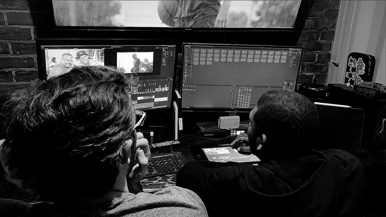
C&I Studios is a full-service production company based in Los Angeles, and motion design sits inside a larger post pipeline that runs through DaVinci Resolve alongside color, VFX, and the original video production. That matters because motion graphics rarely live alone. The titles have to match the color grade. The callouts have to sit on footage that was shot and cut with those graphics in mind. We have produced work for brands like Celsius, Crayola, Hawaiian Bros, and Columbia PFG, and the common thread is that the motion design is built to carry each brand’s own look rather than a house style stamped on top.
The practical takeaway for a marketer briefing a project is to treat motion graphics as a system, not a sprinkle. Decide once what your titles, idents, and callouts look like, then reuse that system across everything. The first video costs the most because you are building the kit. Every video after that gets faster and more consistent.
Do I need motion graphics if my footage is already good
Maybe not much. Strong footage can carry a video on its own. In that case motion graphics should be light, a clean lower third, a branded ident, and nothing that competes with the image. Save the heavy animation for the pieces that genuinely need it.
How long does motion design take
It depends on the type. A set of branded titles and lower thirds is quick once the look is approved. A full 2D explainer is a project of its own with scripting, design, and animation stages. The honest answer is that the design and approval of the look takes longer than people expect, and the animation itself goes faster once that look is locked.
Can motion graphics be added to footage I already have
Yes, and that is the most common case. Lower thirds, callouts, titles, and idents are added in post. The only caution is that some graphics, like a callout pointing at a product, work far better when the shot was framed with room for them. Planning the graphics before the shoot is cheaper than fighting a tight frame later.
Bring your project to C&I Studios
If you are planning a brand video and you want the motion design to look like it belongs to your brand instead of a template, that is the kind of work we do every day. Motion graphics, color, VFX, and the production itself all live under one roof, which means the titles match the grade and the callouts match the footage because the same team built them together.
Take a look at some of what we have made over on our work, or reach out through our branding and graphic design services and tell us what you are building. We will help you figure out where motion graphics earn their place in your video and where your budget is better spent elsewhere.