
How We Light a Product for Advertising
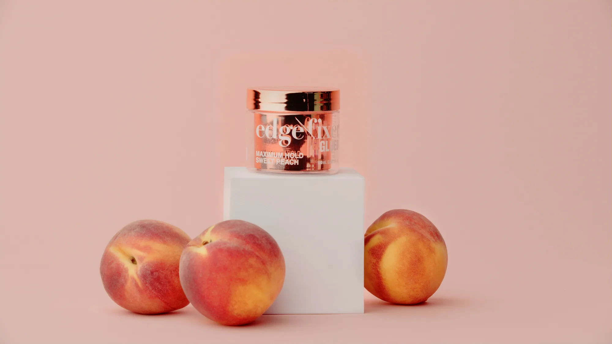
Good product lighting for advertising is not about making a thing bright. It is about deciding what the eye lands on first, what it believes about the surface, and what mood the brand wants to leave behind. We build that one light at a time, and we do it on a stage where we can control every reflection instead of fighting the room.
Most of our product work runs through our Los Angeles studio, thirty thousand square feet with the blackout control and rigging that advertising demands. You can read more about that space on our studio rentals page, but the short version is that a controlled room is the real first light. Before a single head is switched on, we have already removed every stray bounce that would show up on a glossy label or a chrome cap.
We start with the shape before the fixture
A new photographer reaches for a light. We reach for the shape of the light first. Key, fill, and rim are not three buttons. They are three decisions about where the shadow falls, how deep it goes, and where the edge of the product separates from the background.
The key sets the story. We place it where the main shadow tells the viewer which way the form turns. For a tall slim bottle the key usually lives high and slightly behind the three quarter line, so the shadow runs down the body and gives it length. For something low and wide, a can or a compact, we drop the key closer to the product height so the top stays open and readable.
Fill is not a second key turned down. Fill is a decision about contrast. A luxury fragrance wants deep shadow and a slow ramp into black, so we barely fill. A friendly consumer product wants to feel approachable, so we open the shadows until the dark side still reads but never hides detail. Rim, or the separation light, is the one most people skip and the one that makes a product look like it was shot on purpose. A hard edge of light along the back contour lifts the subject off the set and gives the frame depth. A larger source wraps the product and softens the shadow edge, and how fast that light falls off is set by the inverse square law, which is why moving a head a few inches changes the frame so much.
This is the same thinking our team brings to a professional photography brief and to the lighting plots behind a video production spot. The physics do not change when the camera starts rolling. Only the discipline tightens.

Controlling reflections on glass and metal
Every hard product surface is a mirror. That is the whole problem and the whole opportunity. A glossy label, liquid in a clear bottle, a brushed metal cap, each one reflects the room back at the lens, and the room includes the crew, the stands, and the ceiling. Our job is to choose what those surfaces reflect.
For glass and liquid we light the shape of the reflection, not the object. A tall white card placed just out of frame becomes the long clean highlight that runs down the side of a bottle and tells the eye it is glass. Flip that card to black and the same edge reads as a crisp dark line, which is how we carve the silhouette of a dark spirit against a dark set. Liquid gets its glow from behind. We push a soft source through the back of the bottle so the color lights up from the inside, then we flag the front so the label stays rich instead of washing out.
Metal is the strictest surface of all. Chrome and polished aluminum do not have a color of their own. They only show what you put in front of them. So we surround the product with shaped sources and black cutters until the metal reads as a gradient from bright to dark, because a smooth gradient is what the brain reads as clean metal. A flat even wash makes chrome look like gray plastic. The trick is restraint. Fewer, larger, carefully placed sources beat a pile of small lights every time.
You can see that restraint on our BeatBot shoot. Three pool robots, shot for their launch films in a backyard pool, where the water itself was the mirror. A large black solid kept the sky and the house out of the surface, a white frame on a stand shaped the sun, a fresnel up on a high stand added one controlled edge, and the dolly track sat on the deck so the same light carried into the motion takes. None of it looks like effort in the final frame, and that is the point.
Hero angles and the one frame that sells
A campaign needs a hero. The hero is the single angle that carries the billboard, the hero shot on the landing page, the frame the brand sees in its head before the shoot. We find it by shooting the product from the angles a buyer actually sees it, then choosing the one that flatters the form and respects the logo.
Most products have a natural hero line a few degrees above eye level and slightly off dead center. That angle keeps verticals from falling over, shows the top of a cap or lid without going full overhead, and gives the label room to sit square. For a slim energy can, we tilt just enough to catch a highlight on the top rim so the can reads cold and ready, then lock that angle and light into it for the entire hero set.
Once the hero is set, everything else serves it. Detail crops, texture shots, and lifestyle frames all get lit to match the hero so the campaign feels like one shoot and not five. That consistency turns a folder of images into a brand library you can actually use, the same way our post production team keeps grade and color continuous across a delivery.
Matching the light to the brand mood
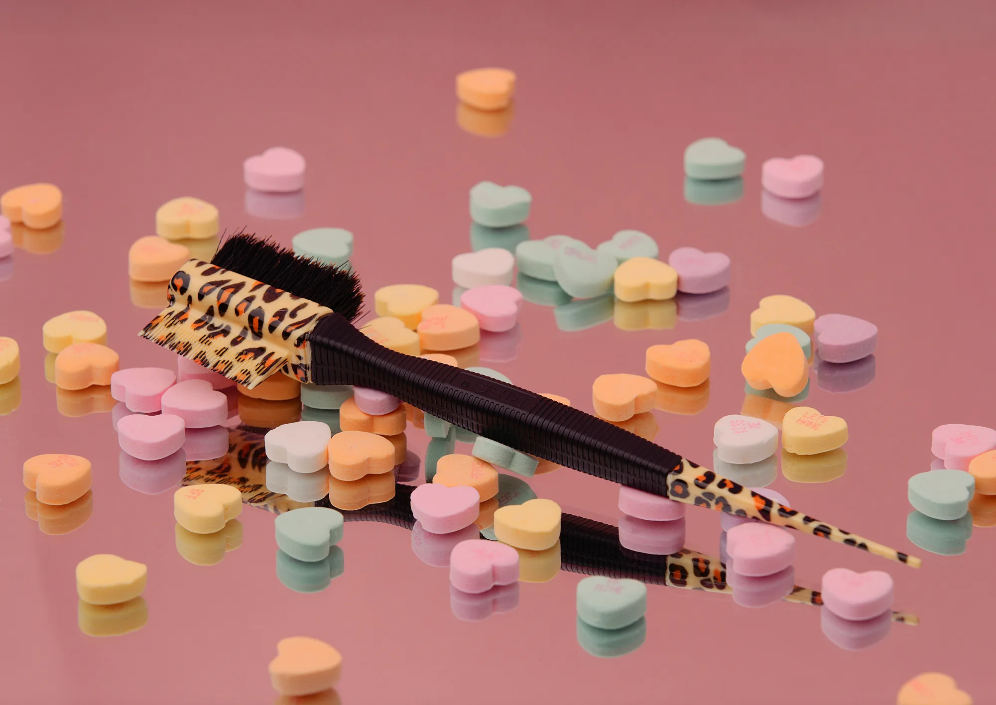
Lighting is tone of voice. The same bottle can feel clinical, warm, premium, or playful depending entirely on how we shape and color the light. Before we set a single stand we ask what the brand wants the viewer to feel, because that answer decides contrast, color temperature, and how hard the shadows land.
A premium mood runs on contrast and negative fill. We let the dark side go deep, keep the color honest and slightly cool, and give the product a lot of empty space. A beauty brand like KISS leans the other way, with softer transitions, a touch warmer, and highlights that wrap gently so skin and packaging both look kind. A fast fashion label like H&M wants energy, so we push cleaner whites and crisp edges that read well small on a phone.
We pin the mood down early with the client because the lighting decision is also a branding decision. If you are still shaping that look, our branding and content team works the visual language first so the shoot has a target. Lighting without a mood is just exposure.
Stills and motion on the same setup
Here is where a real studio earns its keep. A single well built product lighting setup can feed both the campaign stills and the motion assets in one session, as long as we plan it that way from the first stand. We do, because shooting them separately doubles the cost and never quite matches.
The lighting that flatters a still photograph almost always flatters a slow product move on camera. So we build the key, fill, and rim for the hero still, then hand that exact setup to the motion unit for the push ins, the slow rotations, and the pour shots. The grade carries across because the color temperature and contrast never changed.
One lighting plan, reused everywhere it honestly can be. For the moving side of the same room, our piece on how premium product advertising video gets made walks through it.
What a product lighting day actually looks like
People picture a product shoot as a quick point and click. The real day is slow on purpose. The speed shows up later, when the brand has a library it can run for a year.
| Phase | What happens on set |
|---|---|
| Pre light | Set the sweep, block the hero angle, build key and rim before the product arrives |
| Reflection pass | Add cards and flags, kill the camera and crew reflections off glass and metal |
| Hero lock | Final tweaks on the one frame the campaign lives on, then shoot it clean |
| Coverage | Detail crops and texture, all lit to match the hero |
| Motion handoff | Same heads, same grade, roll the push ins and pours |
If you want to see this thinking applied to a full set, our walk through of a brand photo shoot behind the scenes shows the same muscles at work across a day.
Questions we get asked
How many lights does a product shot really need
Fewer than most people think. Good product lighting rarely needs a big kit, and a great many of our hero frames run on one large key, a bounce for fill, and one shaped rim. Extra heads usually mean the first three were not placed well. We add light only when the surface demands it, like a wide spread of metal that needs a gradient the key alone cannot paint.
Can you light glossy and matte products the same way
No, and that is why we test both before the client arrives. Matte packaging eats light and wants a brighter softer key to hold detail. Glossy and metal packaging reflects everything, so it wants shaped sources and black cutters. A mixed kit, say a matte box with a foil window, gets lit for the hardest surface first, then softened for the rest.
Do you need a studio or can this happen on location
Both work, but a controlled room wins for anything with glass or metal. On location we bring our own negative fill and blackout to build a clean box around the product. In our LA studio that control is already in the walls, which is why most of the reflective work lives there. Learn how we handle a shoot that travels in our overview of video production services.
Bring your product to C&I
If you have a product and a campaign to feed, we would rather talk through the look before we talk gear. Tell us the mood, the surfaces, and where the images have to run, and we will build the lighting plan that serves all of it in one studio day. Start the conversation on our contact page and we will take it from there. You can also see the range of product and brand work on our photography services page.