Skip to content

Index Template

WellOff

WellOff

Wellness Made Simple

At C&I, we were challenged with how we could shed the light on WellOff elixirs. We had a detailed product photography session with the aim of leaving nothing hidden from the lens. No doubt, people love what they understand, and what better way to introduce your brand than perfect publicity.


We took pictures of all the WellOff combinations available, and also had a video recording session. You should check it out.

Well Off

The WellOff elixir is a reusable organic Keurig pod with healing effects for the body and the psyche. These coffee and tea pods provide the nutrition needed to get through the day while spreading a positive message. Health and well-being come first.


WellOff pods are produced with the highest quality certified organic ingredients. These amped-up drinks promise to provide plenty of health benefits in a delicious and easy-to-consume form.


Just like the creators of WellOff had taken their time to craft such a magnificent drink, we also took our time to display them in all their glory. Our sessions included product photography where we captured all the combinations available. We also highlighted some of the benefits of the products in a well-detailed video.

video
play-sharp-fill
video
play-sharp-fill
video
play-sharp-fill
video
play-sharp-fill
Benefits

These elixirs have proven to be an excellent complement to our morning routine throughout the years. Some of the benefits of starting your day with a cup are as follows:

A caffeine-free substitute for coffee
A healthy meal or snack (when prepared with healthy and balanced ingredients)
A delectable option for herbs, vitamins, or supplements.
It aids with inflammation reduction.
A useful complement to your weight-loss quest.
Improves skin health in general and increases vitality and alertness throughout the day

WellOff seeks to improve people’s lives by providing them with a handy and healthy functional beverage tailored to fuel their lifestyle in their unique way. We are excited to teach our community that the energy we use to greet the world comes from the nutrition we consume to nourish our body, mind, and spirit.

“We are dedicated to sourcing the best quality ingredients and packaging them in sustainable, green-conscious pods. We have spent countless hours perfecting our recipes and crafting our elixirs so that they taste refreshing, calming, and delicious.”– WellOff

Headshot of woman with long blond hair standing by water smiling wearing a white outfit
Man wearing a reddish pink t shirt and gray shorts walking with woman wearing a white top and jean shorts walking along the water on a beach
Woman wearing white top and jean shorts posing for camera in sand dunes on a beach looking off to the side
Well Off

At C&I, we believe that health is wealth, and as such, we keep energized while creating mind-blowing content.

Product

WellOff elixirs are available in eight different combinations. The most well-known are:


  • Butter Me Up: Keto Coffee
  • Celery me: Juice Cleanse
  • Tumeric me: Immunity Tea
  • Beautify me: White Tea
  • Master Thin Me: Maple Lemon Cayenne Pepper Tea
  • Wake Me Up: Lemon Ginger Tea

A cup of any blend will give you an energy boost while suppressing your appetite and relieving bloat, increasing your mental clarity, and eliminating hunger for hours. It will also reduce inflammation, cleanse your body and boost your immunity as your body naturally detoxes. Courtney, the founder, has spent the last 25 years of her life researching and self-evaluating. She’d always wanted to create a product that would make everyone feel good in their skin. Feeling better leads to a better appearance, and vice versa.

video
play-sharp-fill
video
play-sharp-fill

Everglades Holiday Park

Green, white and black Everglades Holiday Park Logo
video
play-sharp-fill

EVERGLADES HOLIDAY PARK

Everglades Holiday Park is a wildlife education and entertainment experience in the Florida Everglades.

The mission of the park is to protect Florida’s most prized ecosystem while educating and exciting guests from all around the world through immersive activities, wildlife shows, interviews, and more.


When we first started working with Everglades Holiday Park, they were working to build authority in their profession and establish their name among the top wildlife parks in the region. With these business goals in mind, we created and executed annual marketing strategies designed to showcase their unique involvement with local wildlife, the guest experience, their attention to environmental stewardship and preservation, and the vibrant personalities that create such a welcoming and memorable adventure.


To achieve these goals, we created a strategy that involved detailed social media marketing complete with monthly video production, graphic design, and photography. Our team planned Everglade Holiday Park’s social media campaigns and managed tens of thousands of engagements from all over the world.

Aerial view of airboats by a dock in the water
Aerial view of a buildings with cars in parking lots surrounded by palm trees and water
View from behind of an airboat cruising on the water
Aerial of an airboat on the water

SOCIAL MEDIA MARKETING

When we identified the impact that social media marketing would have on Everglades Holiday Park’s overall business strategy, we made this our number one priority. 

Our strategy focused on organic marketing and a playful menu of media content (video, graphic design, and photo) to drive user participation and followership. By treating Everglades Holiday Park’s social media as an extension of the guest experience, we were able to reengage social media users who had recently visited the park, as well as excite and pique the interests of users who lived in or were visiting Florida.


One of the key elements in the overall strategy was sharing fun and educational media to establish Everglades Holiday Park as a thought leader in wildlife preservation. This greatly increased audience participation on Instagram and Facebook and allowed us to discuss the function of the park and the involvement of the staff in more detail.


One of the great benefits of our strategy was the ability to teach Everglades Holiday Park’s audiences about the many areas in which they cater to the local environment. There is much more to the park than alligator shows and airboat tours. We chose to bring this to the very forefront of communication. Sharing fun and engaging content like this created the foundation for EHP’s online community, who regularly engage one another and act as brand ambassadors to the park.

Digital Platforms connected tv video ads
video
play-sharp-fill
video
play-sharp-fill
Two men posing with alligators along with woman posing with an albino alligator posing in a sand pit

THE GATOR BOYS (AND GAL)

The Gator Boys are the main attraction at Everglades Holiday Park.

There are often misconceptions associated with alligators. Many people who have never interacted with them fear them because they simply don’t understand their nature.


The Gator Boys seek to change the public’s perception and to teach Florida locals and visitors not to fear alligators but to respect them and their environment. Their shows are a balancing act between adventure, suspense, and education. Daring maneuvers are performed with live alligators to show the majesty of these creatures and to teach the general public more about them.


Once The Gator Boys became the face of the park, we chose to keep them at the forefront of EHP’s social media. Over time, as their reputation became more widespread and the content associated with them increased in popularity, we were able to incorporate more species of wildlife into the content structure, such as information about snakes, birds, and mammals.

video
play-sharp-fill
video
play-sharp-fill
video
play-sharp-fill
video
play-sharp-fill
video
play-sharp-fill
video
play-sharp-fill
TEASING THE LIVE SHOWS

Everglades Holiday Park interacts with a massive community through social media. Many of their most loyal audience members have visited their park, but there are a ton of people who are following their accounts that have yet to visit. These consumers are still in the consideration phase of EHP’s marketing funnel, so sharing content that will appeal to and interest them is a major focus in our overall strategy. To convert these warm leads, we often share sneak previews of the live gator shows performed by The Gator Boys. This type of content leads to a few different outcomes, which are crucial for driving sales: 1) it sparks conversations amongst our followers, who in turn advocate on behalf of EHP; 2) it encourages warm leads to seek out additional information about the park or book tickets outright; 3) it helps to reinforce the love our online community has for the brand; 4) it increases the recognition of The Gator Boys (essentially bolstering the power of this marketing funnel).


Below are some of the snapshots we’ve shared on social media to keep The Gator Boys in the limelight and to help increase foot traffic to the park and loyalty amongst our most dedicated fanbase.

Woman with long blond hair sitting on an alligator holding its mouth open in a sand pit
Side profile of man holding a stick and raw chicken drumstick in a sand pit while the alligator looks on
Man wearing black cap holding stick posing behind an alligator
Woman tossing chicken drumstick to man while alligator looks on
Man wearing a black cap holding a stick feeding a raw chicken drumstick to an alligator from behind
Woman with long blond hair posing with an alligator on a grass turf holding it's tail with another alligator nearby
Muscular man and woman posing with alligators in a sand pit
Man wearing a necklace with alligator teeth with eyes closed laying in the sand pit with an alligator who also has its eyes closed
Two men with one carrying an alligator with a woman carrying a small albino alligator posing in the sand pit
Man wearing black cap and shades standing in water holding an alligator
Woman with long blond hair posing with an alligator in water
Woman with long blond hair laying on top of an alligator on grass turf with another alligator behind her
THE EVEGLATORS

Everglades Holiday Park has a diverse online following, but, as you would expect, many of their followers are younger. To appeal to EHP’s younger following, we created goofy comics that personified their mascot. These comics received a ton of engagement and were essential in showing the family-friendly atmosphere and lighthearted personality signature to the park.

Frame one of drawing of alligator in the bathroom brushing his teeth
Frame two drawing of alligator holding a briefcase standing in line in a coffee shop
Frame three drawing of alligator picking up food in a drive thru
Frame four drawing of an alligator whistling walking a dog
The Everglators Morning Sunshine Comic
The Everglators Commute Comic
The Everglators Sunbath Comic
The Everglators Alligators vs Croc Comic
CREATING VIRAL CONTENT

We grew Everglades Holiday Park’s Instagram to over 50k followers since taking over.

Our success can be attributed to the type of content we shared with their audience. In addition to the educational content featuring The Gator Boys and other staff, we included goofy media that coincided with seasonal themes and social themes to give our audience more reason to follow EHP’s account.


These were often done through graphic design and leaned heavily on pop culture and cult fiction. 


These messaging segments greatly increased user participation, raising engagement across the board. With more likes and comments on every post, we had a rare opportunity to create hilarious graphics and videos. Ultimately, this new collection of media showed EHP’s audience that the guest experience was enjoyable for adventurers of all ages and that EHP offered a totally unique journey through the Florida Everglades.


All in all, the inclusion of this media provided our audience playful breaks between realistic media, which helped diversity our content structure and the type of engagement we received from our audience.

video
play-sharp-fill
video
play-sharp-fill
video
play-sharp-fill
video
play-sharp-fill

THE GUEST EXPERIENCE

Another significant focus in our content structure was showcasing the guest experience. 

This type of content was purposed to encourage user participation in social media. By showcasing the guest experience, we found that users were more likely to comment on our social media content and share their adventures with the community. Not only did this increase traffic to Everglades Holiday Park, but it also helped to market their attractions, like airboat tours, the petting zoo, and gator shows.


The involvement we received from EHP’s audience also helped with our online customer service. With tens of thousands of questions and comments to answer weekly, having users answer guest inquiries became a major advantage.


This level of community building also aided in increasing the amount of 5-star Google and Yelp! reviews, which led to EHP ranking higher on Google.

Below are some examples of the media we created to showcase some fan favorites, like airboat tours, wildlife encounters, and EHP’s beloved petting zoo.

Father and son on an airboat looking out on the water
Closeup of an orange fox
Closeup of raccoon looking at camera standing in a pan of water with the caretaker nearby
Everglades Holiday Park Two boys and a girl on an airboat looking at an alligator in the water amongst lilypads
Muscular man wearing black cap and mirror shades posing with an albino alligator in a sand pit
View from behind of man showing a snake to children
Closeup of a white raccoon
Closeup of boy looking through hole of a cutout of someone holding an alligator in his arms over his shoulders
Girl petting a raccoon with handler wearing a Nike gray cap holding it with a leash
Closeup of selfie of woman smiling holding a skunk in her hand next to her face
Boy and girl on an airboat looking out on the water
Side profile of an animal caretaker with a raccoon on her back
Side profile closeup of woman with long blond hair kissing a white raccoon wearing a blue leash collar
Closeup of girl looking through hole of a cutout of someone holding an alligator in her arms
Closeup of child enjoying an airboat ride with tongue out with his dad on a boat ride
Social Media Marketing with man wearing blue cap holding small alligator showing it to children
Closeup of an orange fox animal
Closeup of a black and white fox animal

PERETTI ITALY

White Peretti Italy logo

PERETTI ITALY

Peretti Italy is an up and coming Italian fashion brand that we developed and positioned for international success.

The designer, Analisa Perretti, hired our team to design a chic brand image and lead the debut of her first fashion line: a collection of Italian summer dresses. The main challenge here was launching a brand with enough appeal to compete with the most popular high-end fashion brands in the industry, like Luis Vuitton, Prada, Dulce & Gabbana, and so on. This was a major challenge as Peretti Italy was entirely unknown and, therefore, did not have any standing in the fashion industry leading up to launch. But that wouldn’t stop us. We put our brains together and came up with a brand image that emits luxury.


Of the collection of branding and promotional materials we delivered for Peretti Italy, the most valuable were:

  • A fully developed brand guideline (left)
  • A thorough and thoughtful TOV document informing all aspects of brand communication
  • Branded packaging with playful inserts for community development
  • Branded business cards
  • Original Photography (for social media)
  • Original Videography (for social media)
  • A detailed marketing strategy (with comprehensive industry and competitive analyses)


All of these services played an essential role in our overall launch strategy. With each successive piece of content in place, we were able to steadily build momentum and scale Annalisa Peretti’s social media following while positioning her audience to become first-time buyers at launch.

Black Peretti Italy Boxes and Bags
Display of Anna Lisa White Peretti boxes and bags
Peretti box and bag Concepts
Black and white Peretti Fabric tags
White Cropped Peretti Italy Tags

BRAND EVOLUTION

The evolution of the Peretti Italy brand was one of the more exciting developments.


We presented many options to the client, showing various applications of the brand in action to provide a realistic real-world point of view. After narrowing down our top 3 logos, we applied the favorited logos to multiple frontiers from storefront mockups to packaging, stationery, and more.


Our all-inclusive approach presents all of the necessary information for the client to make the best decision for their business. Furthermore, this level of detail provides rare insights into the evolution of the brand following launch.


No matter the project, we approach everything with one mindset: this brand is going to make it big! Because of this, we plan the brand’s growth years down the road. This forward-thinking snapshot shows what we expect the brand to achieve.


Check out the document to the right to see the evolution of the Peretti Italy brand and why we landed on the branding presented above.

video
play-sharp-fill

SOCIAL MEDIA CONTENT

We handled every aspect of Annalisa Peretti’s social media accounts in the months leading up to launch.


In an effort to position Annalisa Peretti, the chief designer of Peretti Italy fashion, as a thought leader in her industry, we created a diverse menu of media showcasing her luxurious lifestyle.


The media we created is all set in Los Angeles and aims to connect the designer’s personality with her profession: fashion. We photographed Annalisa Peretti wearing beautiful outfits from other top designers and walked the city with her to get these amazing shots.


Overall, this was used to tease the launch of her fashion line and begin conditioning her audience to receive ads and interact with intake forms for use in further marketing efforts.


We managed thousands of engagements, interacting with social media users around the world. It was our mission to elevate Annalisa’s audience’s perception of her and win over their trust before marketing her fashion line. To this end, we accomplished our mission.

Building with palm trees at intersection of Rodeo Drive and Brighton Way with cars driving along the way and a man with a scroller in the crosswalk
Side profile of a woman with long blond hair wearing a white dress and shades holding a purse looking out over the beach at the water
Closeup of front of a gray Mercedes car on a street near buildings with palm trees in the background
Woman with long blond hair wearing a short gray dress holding a small purse standing on a patio with green artificial turf by water
Side view of a white sports car by a building with a yellow box truck in the background
Closeup of Beverly Drive sign in Beverly Hills
Closeup of Beverly Hill sign by a building
Woman with long blond hair wearing a black and white dress and black high heeled shoes as well as carrying a black purse and leather jacket looking off to the side
Beverly Hills sign in a park
Woman with long blond hair wearing a white pantsuit and white high heeled shoes reading a magazine sitting on an armrest of a white chair
Closeup view from behind of woman with long blond hair wearing a patterned dress and jewelry looking off to the side
Closeup of Rodeo Street sign at intersection
Woman with long blond hair wearing a short gray dress looking over a counter with her purse sitting on it
Colorful flower art in a park
Aluminum statue with aluminum containers on his head on a street corner
Woman with long blond hair wearing a short gray dress holding a small purse walking by the water
Closeup of Rodeo Collection store
Woman with long blond hair wearing mirror shades as well as a black and white with yellow stripes short skirt and black and white sports bra as well as carrying a white purse and black leather jacket
Woman with long blond hair wearing mirror shades and a white with black stripes top and bottom dress as well as carrying a white purse and jewelry
Closeup of a multicolored mannequin in a store window
Side profile of woman wearing short white skirt, patterned top, and shades standing by the beach holding a red hat
View looking down a city street surrounded by buildings with some people walking around
View of Versace building on a city street with people walking
Woman with long blond hair wearing a knitted white dress and a beige hat smiling for the camera on a beach barefoot
Closeup of Ralph Lauren storefront with palm tree near it
Woman with long blond hair wearing mirror shades smiling and crossing a street in a black dress

Kali Boxes

White Kali Boxes Logo

Kali Boxes

Bring Wellness Full Cycle

Kali Boxes was started by our close friend Sara Shake of ExposedPR and her partner Joanna Piira to help ease that time of the month for women in a healthier and wholesome way.


Kali Boxes are a subscription box service intended to raise awareness of what women are putting in their bodies. As health-conscious individuals, Sarah and Joanna wanted to make the option of choosing organic an easy one. In doing so, every purchase also donates a $1 of the cost to Girl Up, the United Nations Foundation’s Adolescent Girl Campaign.

video
play-sharp-fill

Kali Boxes Product Photography

Photography was an essential factor in Kali Boxes quick growth.

One of the chief reasons photography was so necessary is because of the honesty we employed. Nothing is embellished or misleading. We showcased the exact products that would be delivered in each box.


This also helped ease conumsers into this new style of shopping.


As with anything new, consumers are often apprehensive. That’s why honest photography such as this was so effective. Consumers needed to know what they were committing to. They needed to see the real products, the real packaging… all of it. We believe that that is how brands should operate. Nothing is more attractive than honesty in marekting. So, we made sure our content was accurate across the board.

Five demo graphics
Person holding picked balls of cotton in white gloves with black dots
Closeup of two tampons laying on pile of picked balls of cotton
The Mist spray on display surrounded by ring of pink roses
View of October Calendar with Kali Day entry with lipstick and pink roses
Display of tampons, wipettes, sugar scrub, and The Mist spray
View from above of woman with opened box containing tampons and wipette
Box with light brown colored name and web address next to various contents consisting of tampons, wipettes and spray
Aerial display of bath salts, wake up oil, spray, wipettes, tampons and body scrub and exfoliator
Closeup of tampons
Closeup of The Mist Spray the Meh Away bottle
Closeup view of tampon with white flower
Closeup of pink rose in a sanitary pad
Closeup of underside of sanitary pads and pink rose in a container
Closeup of tampons
Closeup of Lavender Infused Bath Salts
Three pink flowers and tampon on display
Display with Bath Salts, Body Scrub and Exfoliator, Wake Up Oil, spray and wipette
Closeup of tampons, wipettes and spray in a box
Closeup of tampons and spray with wipette
Closeup of two wipette packages on display
Closeup of the Wipette wipes
Display of container of Body Scrub and Exfoliator
Display of container of Wake Up Oil by cups
Display of eight super tampons and four regular tampons stacked
Three boxes with top box having light brown colored name and web address
Display of regular and super tampons
Display of eight super tampons

Freebird

White Freebird Real Estate Branding logo
video
play-sharp-fill

Freebird Real Estate Fort Lauderdale

Freebird is an exciting new real estate concept debuting in East Fort Lauderdale.

Freebird real estate agents focus on the unique lifestyle needs of their clientele to find them a home that best suits their way of living. Before beginning the home buying process, they take the time to get to know their clients personally. If you’re a yogi, an outdoorsman, a business person, a boater, a foodie (you get the point), they’ll learn about your interests and passions until they have a firm understanding of how you live. Then they’ll find you a perfect home in a neighborhood that exemplifies your lifestyle.

Freebird’s personalized program represents a massive paradigm for real estate in East Fort Lauderdale.

Freebird believes that how you live is the first step in deciding where you should live. They inject the home buying experience with a social-centric, no-pressure vibe, which provides their agents with the intel needed to locate your dream home in East Fort Lauderdale. This intimate process creates a positive and relaxed atmosphere in which their clients can experience life in East Fort Lauderdale before committing to a move.

Smiling man with short hair headshot
Smiling woman with long curly blond hair headshot
Smiling woman with long brown hair wearing bright red lipstick headshot

Freebird has invented a new style of community building.

They are unlike any other real estate firm in the profession. And we are confident they will enrich the quality of life in East Fort Lauderdale for residents interested in buying, selling, or renting a beautiful home.

Man and woman walking holding hands with dog past picnic tables in a park
Two women wearing dresses facing each other on a balcony with green foliage overlooking a city
Young man wearing blue swimming trunks and young woman wearing a black bikini sitting on a white boat smiling in a harbor
Group of men sitting at a wooden table with some toasting drinks and smiling in a restaurant
African American man wearing black cap, shades, salt and pepper goatee, red shirt and black shorts walking down steps holding a water bottle
Two women in colorful yoga outfits striking yoga poses on the side of a swimming pool with a yacht and buildings behind them
View from behind of man and woman paddle surfing with many yachts and city in the background
Two men both wearing t shirts and shorts, holding hands and walking down a path in the woods looking at each other

Branding Freebird

The first step in branding Freebird was creating an image that would welcome home buyers, sellers, and those interested in the East Fort Lauderdale lifestyle.

Our image had to excite consumers by breathing life into real estate. Boring wouldn’t do. Ordinary wouldn’t do. Their real estate process contradicts the status quo, therefore, their branding had to be completely unique for the industry.


First, we created a color palette that was iconic to South Florida scenery yet unique to the Freebird brand. One important difference here is how it distinguishes the company from other real estate agencies. The client wanted to avoid mimicking the realtor aesthetic that has completely saturated the market. This decision inspired us to incorporate people into the branding collateral. Rather than showcase homes and realtors in suits, we chose to showcase real people living and enjoying the East Fort Lauderdale lifestyle.


Given that Freebird is redefining the real estate process for home buyers and sellers by making the entire experience more social and laidback in nature, we avoided using imagery or language that denoted hard sales. We want users to feel comfortable every time they interact with the Freebird brand. If we did not achieve this, then we risked devaluing the Freebird program, which would, ultimately, cast the brand in the same shade as generic real estate agencies.


The final product is a distinguished and easily identifiable brand image that we are confident will become an icon to real estate in East Fort Lauderdale. No other company embodies the same values, energy, or process as Freebird, which is why the branding is so effective.

View Freebird’s Branding
Freebird Real Estate Fort Lauderdale Branding on Facebook

Freebird cultivates the most experienced professionals in the industry. Their leadership has been serving the East Fort Lauderdale markets in various capacities for the past 30 years. They know everything there is to know about Fort Lauderdale and will use their insights to guide you to your dream home.


More importantly, once you do find your new home in East Fort Lauderdale, Freebird invites you to join their community permanently. They host monthly Happy Hour occasions throughout Fort Lauderdale, so you can embrace your new home and start building your social network.

Freebird Real Estate Facebook Website

Designing & Developing Freebird's Website

The crown jewel of Freebird’s branding and marketing is their website.

We designed and developed a digital home that exemplifies the Freebird program. The entire website is built around the user experience. It is designed to excite consumers, inform them of the benefits of Freebird’s unique program, show them the validity of their process and encourage them to reach out to schedule a tour with a Freebird agent.


The greatest challenge we faced in the creation of the website was the interactive map for the Areas East page. This custom design provides an overview of East Fort Lauderdale, showing major points of interest and the locations of the most iconic and livable neighborhoods in the city. Our interactive map allows users to embark on a digital tour of East Fort Lauderdale. Each icon leads to a unique page that provides lifestyle information and pictures of the neighborhood, the most recent real estate statistics, and a few Freebird favorites.


To exemplify the laidback, social-centric appeal of Freebird real estate in Fort Lauderdale, we created a custom lifestyle quiz. This casual intake form preps users for the program and provides Freebird agents with a few talking points to get to know their clients on a personal level. A major function of the site is to ease consumers into this new real estate process while gently feeding them information on the Freebird brand and what awaits their new life in East Fort Lauderdale.

Freebird Real Estate Post Card

Jedidiah Learning Steps

White Jedidiah Learning Steps logo
video
play-sharp-fill

Jedidiah Learning Steps Video Documentary

Jedidiah Learning Steps is a nonprofit school on the outskirts of Lusaka, Zambia that offers children and teens free schooling and educational services. Their vision for united and prosperous Zambia begins with the children. They trust in the power of knowledge and have pledged to instill likeminded respect for schooling in their students. Jedidiah Learning Steps was started by Sifelani Mwale in 2010. At first, her school had 25 students. It has since grown to well over 300 students! They are in the process of building a fully functioning school building to give the children more comfort and space to grow.


We filmed the following video documentary for Jedidiah Learning Steps through our 501c(3) nonprofit organization, C&I Reach. We wanted to shed light on their ongoing mission and inform viewers about life in Zambia. We filmed this video documentary during our first trip to Jedidiah Learning Steps so it plays much like an origin story. Being there, getting to know and experience life in Zambia firsthand, added a lot of authenticity and accuracy to our documentary.


We used this video documentary production to help Jedidiah Learning Steps market their brand. To succeed they need to attract the global spotlight. This video is a great start in achieving just that. If you’d like to help Jedidiah Learning Steps build their brand new school, please visit our website and donate.

Group of African American children in a classroom
Group of African American children standing in line
View of many children and adults
Two African American boys playing bongo drums in front of a lot of children and adults
Two African American boys and a girl in a classroom with a teacher showing them something on a computer
Group of African American children sitting in chairs posing for the camera

Laguna Blends

Laguna Blends

video
play-sharp-fill

Laguna Blends

While we love to join a creative project at any step in the process, we especially love being able to flex our pre-production muscles.


This project with Laguna Blends required a lot of front-end planning, brainstorming, and production meetings. We developed 10 concepts for them to choose from in order to produce 4 different videos, and then we developed still photography concepts that vibed with the video in order to put together a cohesive social campaign.


We chose to use video production and CBD product photography to create a narrative that would educate average consumers on the benefits of hemp.


This shoot required a crew of 8 from our team: we produced, directed, styled, casted, filmed, and photographed each production from start to finish. In the end, we heard “thanks again for an amazing shoot” from Laguna Blends.

Hemp Is Healthy

Our social media campaign aimed to educate the general public on the nutritional value of hemp, as well as the types of people who use it. Considering Laguna Blends incorporates hemp and CBD into a number of products ranging from smoothie blends and coffee to face masks and beauty supplies, we needed to show the versatility of their primary ingredient. Furthermore, given the connotation of hemp, it was important to educate new audiences about hemp users by showing who they truly are.


Our social media videos are quick and playful. They rely on bright colors and a hint of mystery to keep viewers engaged until the end. The message: “Trust in plants.”


All in all, our media hints at the hemp lifestyle by showing those who utilize it and benefit from it. We do not engage in hard sells but, rather, pique the viewers curiosity so they actively seek out more information. This strategy allowed the Laguna Blends brand to branch out from its niche audience and reach consumers in untapped markets. The results showed in the conversion of cold leads and the maintenance of loyal consumers.

video
play-sharp-fill
video
play-sharp-fill
video
play-sharp-fill
Display of rejuvenating, regenerating, resurfacing, and restoring serum, cleanser, and cream products with two white flowers
Closeup of woman posing for camera looking down and holding hand to her face
Woman wearing a head towel and body towel spraying her face with product by a sink
Woman using CannaCeuticals facial cleanser product in the shower
Woman splashing water on her face by a sink with a mirror showing her reflection
Laguna Blends instant coffee box next to light blue cup of coffee on display
Display of pro369 protein pack with glass of smoothie and fruit
Side profile of woman wearing white sports bra and black pants drinking a smoothie in a kitchen by a mixer on a counter
African American woman with black and green dreads enjoying a white cup of coffee on a patio
Woman with long blond hair reading a book with a white cup of coffee sitting on a patio chair
Side profile through double doors of a woman with long brown hair standing on a patio with a cup of coffee wearing short jeans, white top and leather high heels
Woman wearing white sport bra and black yoga pants doing a yoga pose for the camera
Three women wearing sport bras talking and enjoying smoothies walking

Frederique Constant Watches

White Frederique Constant Geneve logo with mark
Closeup of Frederique Constant Watch with black band

Frederique Constant Watches

At the mercy of time, Alpina Frederique Constant Watches hired our team of photographers to photograph, edit and deliver six product shots, because our commitment to delivering quality work is not limited by a tight schedule. With a 24-hour turnaround from inception to creation, our team needed to maintain a detailed consistency in approach and appeal that highlighted the luxurious qualities of Alpina Frederique Constant Watches without sacrificing the cohesive aesthetic of the product line.


Our process required the utmost precision and accuracy. The placement of each watch in each photograph needed to be exact and consistent across the board. Furthermore, each image had to capture subtle idiosyncrasies of the varying styles of watched without diminishing the collective appeal of the entire product line. The lighting was the hardest (and most important) element to tame. Not only did the radiance have to remain consistent across each product showcase, but we could not sacrifice highlighting the ornate designs to compensate for clarity.

Closeup of Frederique Constant Watch with beige band
Closeup of Frederique Constant Watch with black band

Blue Nun

White Blue Nun logo
video
play-sharp-fill

Blue Nun

Blue Nun commissioned us to create a TV advert showcasing their delicious Riesling wine. They requested that the framework for the ad and the atmosphere therein be within the context of a “girls night out.” We were asked to come up with the concept and locations, organize the talent, and create a licensed song for the ad.


We decided that an industrial loft space, which was a renovated warehouse building, would be perfect for the theme. The setting is mysterious and can easily be interpreted as an underground, speakeasy-esque bar scene. The talent we hired fit Blue Nun’s targeted demographic perfectly. They also helped to make the scene believable, which was essential for their marketing goals.


Blue Nun also hired us to photograph their Riesling and Merlot varietals.

We wanted to show that their wines are not simply alcoholic beverages, but that they represent one’s mood. This is why the collection of photography is so drastically different. The images portraying the Merlot varietal are moody and romantic. They are lustful and that sells. Whereas, the product photography for the Riesling varietal is bright and playful. The imagery leans on innocence and wholesomeness.

Bottle of Riesling wine on display with various flowers in the background
Cabernet Sauvignon bottle amongst red decorations
Purple wine bottle surrounded by flowers
Woman with long blond hair and wearing a flower headdress posing for the camera holding a bottle of Riesling wine
Woman with blond hair posing for camera looking over her shoulder holding a bottle of Authentic White wine
Three women wearing flower headdresses posing for the camera wearing white dressing gowns with one holding a bottle of Riesling wine
Woman with blond hair posing for camera looking over her shoulder holding a bouquet of flowers
Cabernet Sauvignon bottle being held by a woman wearing a black hat and red lipstick smiling
Cabernet Sauvignon bottle being held from a woman wearing red lipstick and smiling holding the bottle amongst red decorations
Women being filmed by a video cameraman
Four women standing in a doorway being filmed by a video cameraman
Women enjoying a party being filmed by a video cameraman
Women being filmed walking away from a video cameraman

Glavovic Studio

White Glavovic Studio Architecture Art & Urban Design logo
Headshot of woman with short blond hair and glasses wearing a black dress shirt posing for camera in front of yellow wall looking off to the side

Glavovic Studio

Glavovic Studio is an architecture, art, and urban design firm based in Fort Lauderdale. Their architectural contributions and unwavering commitment to designs that benefit both people and place have taken their influence internationally. Glavovic Studio has been published in more than 30 national and international publications and has won dozens of design awards since its founding, including multiple awards from the Urban Land Institute and the United States Green Building Council.


Despite their prestige and farreaching success, Glavovic Studio’s brand image had fallen out of sync with their name and what they represent. So, they came to us to reimagine their consumer-facing facade. When they hired us, their website was severely outdated. They had very little content, and that which they did possess was lacking conviction and quality.


After getting to know Margi Nothard, the founder, CEO, and lead designer at Glavovic Studio, we knew exactly how we would restyle their brand. This would ultimately call for a complete, top-to-bottom overhaul, a brand new website, video storytelling, professional photography, and a 12-month marketing strategy to back it up.

Side profile of three men and three women posing for the camera with the sun shining on them
Group of four men and three women posing for camera with yellow wall in background

Reimagining Glavovic

Perhaps the most needed service to Glavovic Studio’s rebranding was the design and development of a new website. Their former site was lacking in key areas, which dampened the user experience and, ultimately, weakened their first impression. The categorization of information was confusing. The structure of the site made it difficult to maneuver between important pages. The design did not match the studios potential as a design firm. And they were not showcasing their work in the best possible way.


We learned a lot during the website redevelopment phase, including the type of content that Glavovic Studio was missing and would benefit from most. This predominantly included video production and professional photography. The combination of the two would create a unified brushstroke, showing the commitment and integrity behind each Glavovic Studio design.


Ultimately, this decided what Glavovic Studio’s new consumer-facing gateway would look like. Their audience would immediately be able to identify a shift in the quality of the content and the storytelling therein. No matter where their audience would first interact with this new grade of media, they would learn that it is just a small piece in a fullscale rebranding initiative. That was our goal and our success.

Glavovic Website Mood Board One Website sitemap with images
video
play-sharp-fill

Glavovic Studio Project Showcases

Glavovic Studio’s former website was lacking in pivotal areas but none more so than their portfolio. They were not showcasing their work properly. Aside from lackluster descriptions, they failed to include any decent media. Rather than showcase finished products in their natural environment, they used renderings that were created at the start of the endeavor. This was artificial — a stylistic approach that failed to connect with readers.


To remedy this, we brought their portfolio to life with real, crisp, authentic and informative media. This is where the bond between professional photography and video production shined brightest. Our video showcases of their work, such as this case study on The Mending Wall at the Boca Raton Museum of Art (left), explain the inspiration behind each project, the practical application, and the longterm benefits. They connect Glavovic Studio’s artwork, urban design, and architecture to a time and place. This would ultimately lay the new foundation for their brand’s narrative.


The video showcases often inform on the people and institutions that benefit from Glavovic Studio’s design. Whereas, the photographs highlight the artistic nuances. They are hyper-focused yet silent, which allows the viewer to invent their own interpretations. Together, they paint a detailed picture of each project.

Closeup of red artwork on display
video
play-sharp-fill
video
play-sharp-fill

Social Responsibility

A major part of Glavovic Studio’s ethos is their willingness and passion for helping those in need. They prize architecture that benefits the working class above all else. With Margi Nothard at the helm, they have spearheaded nationwide initiatives, such as the affordable housing campaign with AHF (featured left). Margi’s unwavering social responsibility has both guided Glavovic’s ever-evolving mission and been the catalyst to new architectural frontiers.


As is stated in their mission statement, “The studio explores architecture engaged in environmental stewardship and social value…” This phrase resonated with us. Given that this is one the areas Glavovic Studio would never compromise, we knew it needed to be a guiding theme to their new brand narrative. Their mission to use architecture and urban design for good is now at the forefront.

video
play-sharp-fill
Woman speaking to audience at Healthy Housing Foundation event
Two women talking about city model to others present
Woman with blond hair talking about a city model to others
Two women with blond hair going over papers at a Healthy Housing Foundation event
Group of two men and five women smiling and posing for the camera behind a model of the city

Sammy C

White Sammy C DC Fella logo
video
play-sharp-fill

Sammy C

Also known as the OC Fella, Sammy C was first discovered on season 5 of NBC’s “The Voice.” Sammy is a budding rapper, singer, and lyricist from Southern California currently building a name in the national local music scene.


Sammy focuses on inspiring others using a positive message with every rhyme he drops. He is slowly becoming a voice for anti-bullying as well as for the National Alopecia Areata Foundation, a condition with which he was diagnosed at a very young age.


The first video is the official “OC Fella” music video for his first hit single. The second video is part of a small acoustic set we shot at our LA loft of Sammy performing his soon-to-drop single “Bump That.


The second video is for his single “OC Fella.” We decided to go big in this video. Aerial shots, lovely ladies, beautiful beaches, and cars you’ve only dreamed of driving; All the things Southern California is notorious for.


Make sure to follow Sammy on Instagram, twitter, and keep an eye out for his future releases on iTunes.

video
play-sharp-fill
Bald Sammy C sitting on a green plastic chair facing the camera sideways. He is wearing a blue and white striped tank top with metal necklace along with leather workman's boots.
Bald Sammy C wearing blue and white striped tank top, blue jeans, red glasses and beige work shoes sitting in the grass with palm trees and cars in the background
Side profile of Sammy C wearing camouflage shirt, black jeans, black cap and black military boots posing for the camera crouching under the pier on wooden beams
Sammy C wearing camouflage shirt, black jeans, black cap and a silver chain posing for the camera standing under a pier
Side profile of Sammy C standing under a pier wearing a camo shirt, black pants and military boots, black cap with LEGIT written on it in gold and sunglasses posing for the camera
Side profile of Sammy C standing under a dock wearing a camo shirt, black pants and military boots, black cap with LEGIT written on it in gold and sunglasses posing for the camera looking off screen

Hippie Organics by Alpine Fresh

White Hippie Organics logo with a bee graphic
video
play-sharp-fill

Hippie Organics by Alpine Fresh

Hippie Organics grows organic non-GMO fruits and vegetables. Their philosophy conveys a love for nature and deep respect for healthy eating. Their core values are equally wholesome. Unlike many food providers, Hippie Organics inspires creativity at every level of the food chain. Their brand art is bright, playful, and authentic — a testament to the food they provide.


Hippie Organics by Alpine Fresh hired us to film their company’s brand video, which introduces the founders, farmers, and branding artists while educating users about their pure growing methodology. To properly present their brand, we needed to take the video out of the studio to their farmland. The natural setting was not only essential in setting the tone, but it was also a crucial means of delivering the dialogue in a captivating and true fashion.

video
play-sharp-fill

We knew that Hippie Organics’ video would be significantly more meaningful if each member of the team had an opportunity to share their craft and their passion for organic growing in their own words. Since healthy eating is a commitment that a consumer chooses to make, it was even more important that the people most passionate about the brand be the ones to sell the lifestyle.

video
play-sharp-fill

Mouth-watering Photography

A major selling point for Hippie Organics is the quality of their food. All of the fruit and produce harvested on their land is a labor of love. Their berries are rich in flavor and nutrition without the need for added chemicals or artificial growing methodologies. This richness is iconic for their brand and something we felt was absolutely necessary to convey in their photography.


Another standout element of Hippie Organics is their cover art. Their labels are groovy and playful, and so obviously genuine. They are not using art to sell their products. They are using art to illustrate the personality of their products and their farmers. We think that’s really powerful, so we chose to give their packaging and branding the attention it deserved.

Aerial closeup view of two packages of organic blackberries and two packages of organic blueberries surrounded by flowers
Aerial closeup view of package of organic blueberries surrounded by flowers
Aerial closeup view of package of organic blackberries surrounded by flowers
Aerial closeup view of package of organic blueberries surrounded by flowers

Outside of this setting, we also photographed their fruits and vegetables on the farm and in a very clean studio environment. The photos taken at the studio are super crisp. They have white backgrounds so the natural colors of the fruit pop! The vegetables were treated slightly differently. In many of the photos they are being cradled, almost cherish. This denotes the purity of the product.

All in all, the photography we produced for Hippie Organics is a very real showcase of their brand. The fruit is deeply colorful. The labels play to this and make it abundantly clear that they practice what they preach. Though the photographs are staged, they appear natural. That’s the magic of creative marketing.

Bag of Alpine Fresh Brussel Sprouts from Mexico
Bag of Alpine Fresh asparagus from Peru
Bag of Alpine Fresh French Green Beans from Guatemala
Closeup of bunches of asparagus held by someone wearing a blue jean shirt
Stalks of asparagus on display on a wooden board as well as two bunches of asparagus
Headshot of male Hippee Organics employee with brown short hair and beard wearing green uniform
Hippee Organics female employee wearing a turquoise sweater smiling and posing for the camera
Headshot of male Hippee Organics employee with brown short hair and beard wearing blue uniform
Headshot of male Hippee Organics employee with short hair and beard wearing glasses wearing beige uniform
Headshot of male Hippee Organics employee with brown short hair and beard wearing beige uniform
video
play-sharp-fill

Roya Zangoui

ROYA

Model Profile

video
play-sharp-fill

Roya Zangoui

Roya Zangoui is a Miami-born, Brooklyn-based CPC certified life coach and professional model. Her perception of femininity, sexuality, and the self truly distinguish her from other models we’ve worked with.


We’ve worked with Roya on a number of productions over the years. She starred in both our #UNCREATIVE clothing launch promotion as well as select advertisements we produced for Archives — a hip clothing brand located on Las Olas Boulevard in Downtown Fort Lauderdale.


If you want to work with us to elevate your personal image then click the button below to get in contact with our management team.


From her caring personality to working with children with autism, Roya uses her creativity to help people every single day. She is passionate about the world, using her platform as a model to send out a message of love and find new ways to fight for real change. We photographed and filmed this model profile for Roya Zangoui before she left for New York City.

video
play-sharp-fill

Uncreative Shop & Archives

#UNCREATIVE has evolved from this t-shirt into a full-on creative mission.

The Uncreative Blog highlight artists, like Roya, Mercedes, Sabela and those using their art to connect with the world. We shed light on undergound artists breaking out into the industry through our Freestyle Friday series (we recommend starting the series with the debut episode featuring South Florida rapper, Sam Stan, and go from there). And we also host Uncreative Radio, a podcast series that explores politics, pop culture, modern art, activism and more with well-known creative professionals who are making waves in their industry, such as 103.5 The Beat radio personality, Stichiz.


Within this creative umbrella exists the Uncreative Shop. This is the artist’s calling card. We design and sell limited apparel (hoodies, hats, t-shirts, shoes, headphones, etc.) to further our creative mission. Our morals are grounded in artistic expression — no matter the art form. Our style is clean, simple, and comfortable. Look out for the Uncreative X.


Roya Zangoui helped to bring the Uncreative brand to life. Her involvement in our first marketing campaign showed the world who wears Uncreative apparel and why the Uncreative lifestyle belongs to you and us.

video
play-sharp-fill
video
play-sharp-fill
Roya headshot posing for camera
Side profile of Roya posing for camera wearing a red, lacy bra and off white colored thong
Black and white of Roya posing for the camera sitting on a bench surrounded my visual equipment
Roya headshot posing for camera
Side profile of Roya posing for camera wearing ripped jeans and white top
Roya posing for camera with her head tilted wearing red, lacy bra
Side profile of Roya posing for camera wearing a red, lacy bra and off white colored thong
Roya headshot posing for camera looking down and smiling wearing an orange sweater
Roya posing for camera looking offsides wearing a white top
Side profile of Roya headshot posing for camera wearing an orange sweater
Roya posing for camera

Corey James Bost

COREY JAMES BOST

video
play-sharp-fill
Graphic of person wearing cattle skull

Brew Next Door

White Brew Next Door logo

Next Door

Brew Next Door is a unique social frontier founded by the creatives at C&I Studios. Literally, next door to C&I Studios’ Fort Lauderdale location, this bar is a haven for local artists, musicians, business professionals, influencers, and anyone who loves great art, intimate moments, and handmade cocktails. Throughout the month, the space hosts live bands, art shows, open mic nights, improv shows, and more. It is known locally as ‘The Hidden Gem’ of Fort Lauderdale, due to its speakeasy-esque atmosphere, private location, and word-of-mouth presence.


One of the most notable characteristics of Brew Next Door is the attention to books and vintage furniture.  They link guests to the culture of the 20th century, which this space embodies to the fullest. All cocktails are named and modeled after the most notable American artists of the last century, such as Ernest Hemingway and Emily Dickens to name a few. A floor-to-ceiling bookshelf bar area and secret bookshelf door, behind which private events are often hosted, add to the atmosphere and virtually teleport guests to the heyday of American culture. The aging books also add a soft note of vanilla to the air, which increases cravings for premium bourbon, of which Brew Next Door offers a grand selection.

video
play-sharp-fill

Rebranding Brew Next Door

Brew Next Door has changed significantly since its opening. The already vibrant atmosphere has been energized with new seating areas, lighting fixtures, lounge spaces, cocktail selections, and social activations. We recreated our brand image to introduce this newly reimagined nightlife scene.

video
play-sharp-fill

A Better Way To Sell Cocktails

Brew Next Door is a nightlife concept from the minds at C&I Studios, so it is only natural that they use video to sell cocktails.

Video can articulate emotion more strongly than any other visual medium. Even with a soundtrack masking the sounds at the bar, one can hear ice clinking against the glass, they can smell the aroma of citrus and mint, they can feel the shaking of their cocktail before it is poured from the frosted shaker. Even though these sensory details are imagined, they are very real.


Video also ads a secondary visual cue to the aesthetic at Next Door. It brings the vintage environment of books into the present, essentially connecting the brand to their founding fathers in C&I Studios. Using video to sell also enables Brew Next Door’s versatility. They can promote rotating and promotional artisan cocktails without needing to redesign and reprint menus. These are also extremely valuable assets to use on social media and other digital promotions. Rather than relying on a flyer and spelling out a drink’s ingredients, which is tacky and unattractive, they can show their audience what they’re offering. And that brings people through the doors.

video
play-sharp-fill
video
play-sharp-fill
video
play-sharp-fill
video
play-sharp-fill
video
play-sharp-fill
video
play-sharp-fill
Two women posing for the camera carrying purses walking down a dim hallway
Side profile of woman posing for camera with short black hair wearing black turtleneck and patterned pants leaning against the wall holding a glass drink in one hand and an bottle of alcohol in the other
Woman with long blond hair posing by a bookcase with books and holding two books in her arm
Closeup of woman with long blond hair holding a stack of books with a bookshelf of books behind her
Woman with blond hair posing for camera from behind a book
video
play-sharp-fill

Next Door Rebranding

During the day, Brew Next Door curates locally roasted coffees. Though the appreciation for literature remains a notable characteristic during the day, the atmosphere is completely different from its after-hours counterpart. Glass bay doors, often left open when the weather permits, floods the interior with natural light.


At night, when the bar comes to life, the setting reverses. Dim lighting perpetuates the mood. Soft music injects a romance. And the patrons who come to drink do so to embrace intimate moments; to relish in great art and deep conversation; to savor complex wines and unique cocktails; to escape the ordinary Fort Lauderdale bar scene. Brew Next Door does not associate with other bars in the area. Instead, it caters to a crowd that goes at their own pace, who drink because they enjoy the flavors and aromas of handcrafted cocktails, and who like to reflect on their day in a setting that invokes deeper thoughts.


That is what this photoshoot seeks to capture. Not only did we want to excite the viewer with stunning photos of these two beautiful models, but we also wanted to show them who they can expect to run into on any given night. Rather than focus on cocktails and the bar area, we chose to accentuate the lifestyle aspect offered at Brew Next Door. You see, there is a freedom of expression available at Brew Next Door that is not afforded any place else. They allow their guests to immerse themselves in the setting and the culture in the ways that speak to them most deeply. If they want to pull a book from the shelf or recommend a vinyl record to the bartender, they may do so. If they want to shoot some awesome photographs for their blog or Instagram, then Next Door is their creative playground. If they want to invite their friends to a private event hidden behind the secret bookshelf door, all they have to do is ask.

The Neighborhood Hangout

As we mentioned above, during the day Brew Next Door is a cafe. It is one of the most popular neighborhood hangouts in downtown Fort Lauderdale, having catering to the interests of creatives, business professionals, coffee enthusiasts, and locals for nearly a decade.


The vibe is brighter and warmer during the day. It is a space that promotes creativity and neighborly connectivity. For these reasons, the media we use to promote the space (and daytime atmosphere) is different from our after-hours aesthetic.


Whereas the branding for Brew Next Door at night is moody and appeals to one’s curiosity, during the day it appeals to one’s senses. You can smell the espresso wafting in the air. You can imagine the soft, buttery texture of our pastries. You can hear the pitter-patter of rain on the glass bay doors. You can sense that it is one of the rare places in Fort Lauderdale where people connect on a deeper level.

Brew Barista Social Media Shoot Closeup of tattooed woman making a cappuccino
Closeup of cappuccino machine
Side profile of a woman enjoying a cappuccino in a red cup
Side profile of coffee pouring in a red cup
Tattooed woman with long hair pouring something out of a paper bag at a bar
Side profile of a bar with alcohol bottles and books on bookshelves
video
play-sharp-fill
video
play-sharp-fill
Display from above of six different flavors of muffins
Side profile display of three ingredients to make iced mocha
Creamy coffee drink being made in a glass cup sitting on coffee beans
Cappuccino on display with muffin and pastry nearby
Picture of a heart shape being formed by human hands with the caption Our Heart is Home
Closeup of tattooed woman holding coffee beans in her hands
Cappuccino in red cup on display sitting on a leather couch
Glass cup of coffee with a muffin next to it on a wooden plate

K I D S

KIDS

video
play-sharp-fill

Kids

Kids is a six-piece American Indie-rock band formed in 2012 by Josiah Sampson (guitar), Joshua Diaz (lead vocals, bass), Matthew Barrios (drums) and Christian Gonzalez (guitar). Kids is licensed by C&I Studios and Hard Rock Energy, who featured “The Standoff” from Rich Coast and guitarist, Josiah Sampson, in their debut commercial.


Kids released their debut EP Sink or Swim in 2013 and quickly established themselves as local heroes in South Florida before securing fame nationwide. Kids’ thrilling performance at Florida’s Coastline Music Festival, where they shared the stage with St. Lucia, Surfer Blood, The Neighbourhood, and indie-icons Passion Pit, Matt & Kim, and Capital Cities, started a new chapter in the musical career.


Our collaboration with Kids marked their insurgence into the national music scene. We helped them film a number of music videos and teasers leading up to the debut of their latest LP release Rich Coast.


The following video (featured left) is a live recording we shot in our recording studio in Fort Lauderdale, known locally as The Barn. The setting shows the soul that keeps the band together, as well as providing great insight into the recording process and the band members’ skills as musical performers.

Rich Coast

Kids are not just musicians, they’re storytellers. We wanted to give their second album, Rich Coast, the debut it deserved, so we created the following video series to tease the release.


Each video is a glimpse inside the album and the artists’ inspirations for writing it. It is a blending of their literal and spiritual journey — the sacrifices they made and their reason for making them. The series is about abandoning conventional living in pursuit of something greater. It’s about being lost and being found; of knowing your place and knowing when to move on. It’s about solitude and the lessons we can learn from being alone.


Our video series received great success. Each week, thousands of viewers tuned in for the next chapter of the saga. Each teaser was paired with a musical soundpiece from Rich Coast. The combination excited Kids’ audience. It allowed them to embrace their music in unique ways, which led to a successful album release.


Ultimately, this journey was the impetus for the theatrical music video of “Second Star On The Right” featured below.

video
play-sharp-fill
video
play-sharp-fill
video
play-sharp-fill
Four men-two without shirts and have tattoos on arms and chest.
Four men in the forest by a creek. Two are shirtless and are standing on a log and two are sitting sideways on a log facing each other with one holding a stick.
Four males walking across a log on a sunny day in the forest. Two males are shirtless with tattoos on their arms and chest.
Four males walking in a creek on a sunny day in the forest. Two males are shirtless with tattoos on their arms and chest.
Four males walking in the forest on a sunny day. One is shirtless with tattoos on arms and chest. Two males are looking ahead into the distance while the other two are looking to their left.
Four men walking in a forest with one shirtless with tattoos and one holding a stick

"Second Star On The Right"

When working with Kids, each production injects the song and the purpose of their performance with new meaning.  They are such a colorful, vibrant and expressive band. Their lyrics contain unheard messages and their instrumental evoke uplifting, energized feelings. Their ability to bend emotion and understanding like this make them an incredibly fun band to work with. So much so, that we filmed two music videos for Kids’ single “Second Star on the Right.”


The artistic version of “Second Star on the Right” shows what inspires Kids’ music. Their lyrics lean on fairytales, such as Peter Pan. We used similar elements to drive this story. For instance, the attic setting, and peering into (or rather inviting) an unknown world into one’s reality, is a play on Jumanji. Using popular culture, such as this, created the framework for this story and those shown below. It was really amazing to see how the same song impacts the listener differently when the setting and context changes.


The following photos were captured at For The Love Music Festival, hosted by us in Fort Lauderdale. You can see more from the artists headlining For The Love here.

video
play-sharp-fill
Male guitarist with black hair and beard jamming with yellow guitar with fellow male musicians and guitarists around him.
Male guitarist with black hair and beard jamming with yellow guitar with fellow male musician and guitarist behind him.
Closeup of male guitarist
Closeup side profile of man playing xylophone in front of audience in a bluish light
Male drummer playing the drums
Black and white of a short haired with a beard flute player posing for the camera holding the flute in his hand in front of an audience
Tattooed short haired with beard flute player playing the flute in a band with another flute player in the background and a guitarist next to him
Closeup of man playing xylophone with two guitarists in the background
Male guitarist with black hair and beard holding a yellow guitar with fellow male guitarist next to him performing in front of an audience.
A band onstage with a musician and a guitarist with a yellow guitar singing.

Magic Leap

MAGIC LEAP

A flagship enterprise in augmented reality
White Magic Leap Logo

Magic Leap is an American startup company that superimposes 3D computer-generated imagery over real-world objects. By projecting a digital light field into the user’s eye, they achieve an augmented reality experience that is wildly beautiful and useful for both entertainment and practical purposes. When we started working with Magic Leap their product was still in development. This posed an interesting challenge for us: we had to teach the general public about their technology while they were still mastering it themselves! With these obstacles in mind, our initial strategy was to simplify their amazing product to make it more approachable.


It’s clear to say that Magic Leap has entered into a new era of technology. As they started navigating uncharted territory it became clear that they needed a skilled team of marketers and content creators to introduce their product and company to everyday consumers. As with any new technological development, educating the general public of its many uses and benefits is a key challenge. Simply put, people don’t like change. Fortunately, today more than ever, consumers are more receptive to game-changing technologies. Even still, Magic Leap faced a serious hurdle in the race to market: they needed to simplify a seriously complex tool to appeal to the mass market. So, they hired us to create media that would educate the world on their innovations in augmented reality.

video
play-sharp-fill

The Minds Behind Magic Leap One

New technology is always a tricky subject to present but people always understand tech better if there is a human connection that can be made. To help build such a connection to the Magic Leap One, we created one of the strongest videos in our overall marketing campaign. It begins by introducing the engineers leading the development of Magic Leap One. Hearing their stories and the path that led them to Magic Leap humanized their rather mysterious brand.


Creating this video involved an intensive production schedule involving 14 days of travel to 12 destinations to show Magic Leap’s global presence. We traveled to multiple countries, from San Francisco, New Zealand, and Switzerland, to film interviews with chief engineers who shared their inspirations and aspirations. This unscripted take not only made the brand and product more approachable, but it made Magic Leap’s company culture relatable to people involved in the company and those hearing about it for the first time.

video
play-sharp-fill
Marketing Magic Leap Lightwear equipment on display with two men in the background
video
play-sharp-fill
video
play-sharp-fill
video
play-sharp-fill
video
play-sharp-fill

TONANDI and Magic Leap

Magic Leap’s flagship product, the Magic Leap One, was initially designed as an entertainment and gaming tech product. We created several videos that showcased some of the developers and media partners that created applications on the Magic Leap One platform. We interviewed members from, Insomniac, Funomena, and even the critically acclaimed Icelandic post-rock band Sigur Rós, with whom the team at Magic Leap developed Tonandi, an interactive audio-visual exploration of the sounds and spirit of the band.

LUNA'S GARDEN

video
play-sharp-fill

INSOMNIAC

video
play-sharp-fill
video
play-sharp-fill

User Video Guides

Launch day brought with it a large amount of new media to create. To help properly execute the product launch, we created a series of user video guides to teach users how to use and master their Magic Leap One device. We knew this educational series would live for as long as the product was in the market, so we had to make sure everything was perfectly accurate so users would receive the ideal experience.


Our intro series is a step-by-step explanation on how to get the most out of every Magic Leap experience. These videos live on Magic Leap’s website and are delivered with each product that is purchased.

video
play-sharp-fill
video
play-sharp-fill
video
play-sharp-fill
video
play-sharp-fill
video
play-sharp-fill
video
play-sharp-fill
video
play-sharp-fill
video
play-sharp-fill

L.E.A.P. Conference

The many videos we filmed for Magic Leap — both the creative and educational — led up to this moment. The world’s most influential techies gathered in L.A. to learn and play with the new Magic Leap One. We photographed the event and used this media to further Magic Leap’s influence in the exciting world of gaming innovation.

View from drone of LEAP Conference billboard on display near road with cars parked and driving by
LEAP Conference Magic Leap and Free Your Mind banners on display on side of a building in city
LEAP Conference billboard on display by a parking lot in city near road with cars parked and driving by at night
LEAP Conference Magic Leap and Free Your Mind banners on display on side of a building
LEAP Conference billboard on display by a parking lot in city near road with cars parked and driving by at night
Man using Lightwear equipment using a remote in a room with paintings on the wall

L.E.A.P. Conference was a colossal event and our team needed to be in many places at one to capture it all. From keynote presentations to tech demos, panels, attendee interactions, and the show floor itself, we navigated the event and successfully documented an accurate picture of this monumental, one-in-a-lifetime event.


Our experience with these kinds of events really showcased itself here. This was no small task and there were no second chances to capture this content as it happened over the course of 2 days. This required a knowledgeable and nimble team that knows how to be in the right place, with the right gear, at all the right times. Needless to say, we absolutely nailed it.

Two people in a futuristic simulator in reddish and bluish lights
Outdoor setting with tables and chairs
Man standing on stage surrounded by audience at a Free Your Mind event
Side profile of man wearing glasses standing on stage at a Free Your Mind event
Side profile of woman with pink body movement sensors doing moves while man views a monitor with characters mimicking her moves in The Imaginarium Studios
Side profile of woman using a console wearing Lightwear equipment in a bluish and reddish lights
Woman with pink body movement sensors smiling in front of The Imaginarium Studios sign
Side profile of man with bushy beard and woman with short hair on stage for Free Your Mind talking to audience
Man with short gray beard on stage at a Free Your Mind event talking to the audience surrounding him with him projected on a screen above him
Closeup of man with short gray beard on stage at a Free Your Mind event talking to the audience
Man and woman on stage at a Feed Your Mind event with big screen above them showing a graphic
Woman with pink body movement sensors smiling and posing doing a salute in front of The Imaginarium Studios signs
Closeup of three men sitting in chairs on stage talking to an audience
Closeup of audience at a Free Your Mind event
Three men sitting in chairs on stage talking to an audience at a Free Your Mind event
Man wearing Lightwear equipment talking to another man in front of a map model
Woman with pink body movement sensors doing moves while man views a monitor with character mimicking her moves in The Imaginarium Studios
View from behind of people wearing Lightwear equipment with laptop and tablet showing building graphics
Woman with pink body movement sensors posing with arms outstretched in front of The Imaginarium Studios sign
Two men and a woman wearing Lightwear equipment and a man with a beard talks with them
Man with grey beard talking to audience gesturing at a Free Your Mind event
Three men sitting in chairs on stage talking to an audience at a Free Your Mind event

Triumph Motorcycles

White Triumph Logo

Triumph Motorcycles Euro Bike Photography

Edward Turner, the designer of Triumph’s Bonneville T120 and arguably the most famous name in motorcycles, created the iconic British classic in 1958. The T120 inspired a new generation of teenage cafe racers and established a proud reputation for action and performance. It has remained a beacon of British motorcycle engineering, finding a resurgence in 2006 after the launch of its successor the Bonneville T100.


In part, the Bonneville T120 gave rise to the Bonneville T100, which launched in 2002 and quickly earned acclaim as a modern vintage ride with stylish appeal and all-performance handling. The T100 played a pivotal role in the birth of the modern custom scene, bringing the classic Bonneville into the modern era and instigating the rebirth of the T120 four years later.


Though the Triumph Bonneville T100 is only 13 years old, its reputation is bound to the vintage classics of the 1950s and 1960s. It is a young piece of machinery from a brand with a rich history, and is styled as such. The T100 is bound to both the past and present, tying modern motorcyclists to the heyday of 1950s engineering and vice-versa. At the time of its creation, the T100 was already acclaimed alongside the classics, which has emboldened motorcyclists to follow in the tracks of the earliest roadwarriors. For these reasons, we chose the Bonneville T100 to be the centerpiece of this Euro Bike photography concept.


In a word, Triumph Motorcycles represent freedom. It is a means to venture beyond limitations; to bypass roadways and barriers and claim the liberty of the open road and unbeaten path in the most exciting way we can think of. The Triumph lifestyle is only made possible through its products. Therefore, we paired lifestyle alongside the product to show they are dependent on one another. Our media is intentionally commercial, casual and candid. Nothing is random, but it feels so. Sudden pitstops along the side of the road, obvious product shots, inviting lifestyle shots… they all share in telling the narrative.

Rider pushing the Bonneville T100 up a bend on the side of the road.
Black and white closeup of the motorcycle rider on his motorcycle

Motorcycle rider restarting the road trip after a brief pitstop
Motorcycle rider adjusts Ray-Ban Clubmaster sunglasses on his motorcycle before resuming the road trip.
Motorcycle rider overlooking the canyon, standing above the clouds with yellow wildflowers in the background.
Bell Bullitt Helmet, Bilt Drago Leather Jacket, and Street & Steel fingerless gloves.

Triumph Motorcycles Euro Bike Artistic Vision

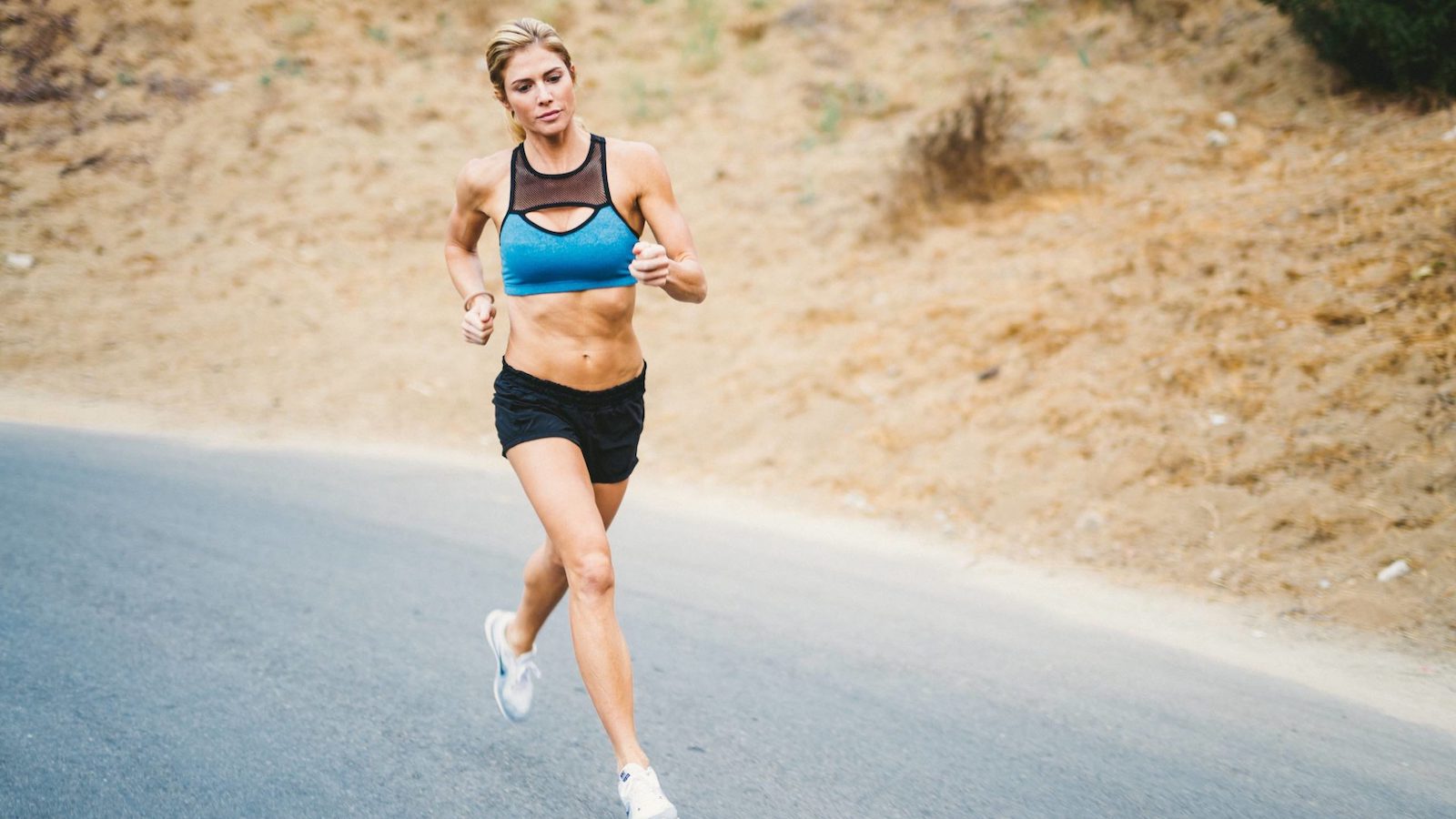
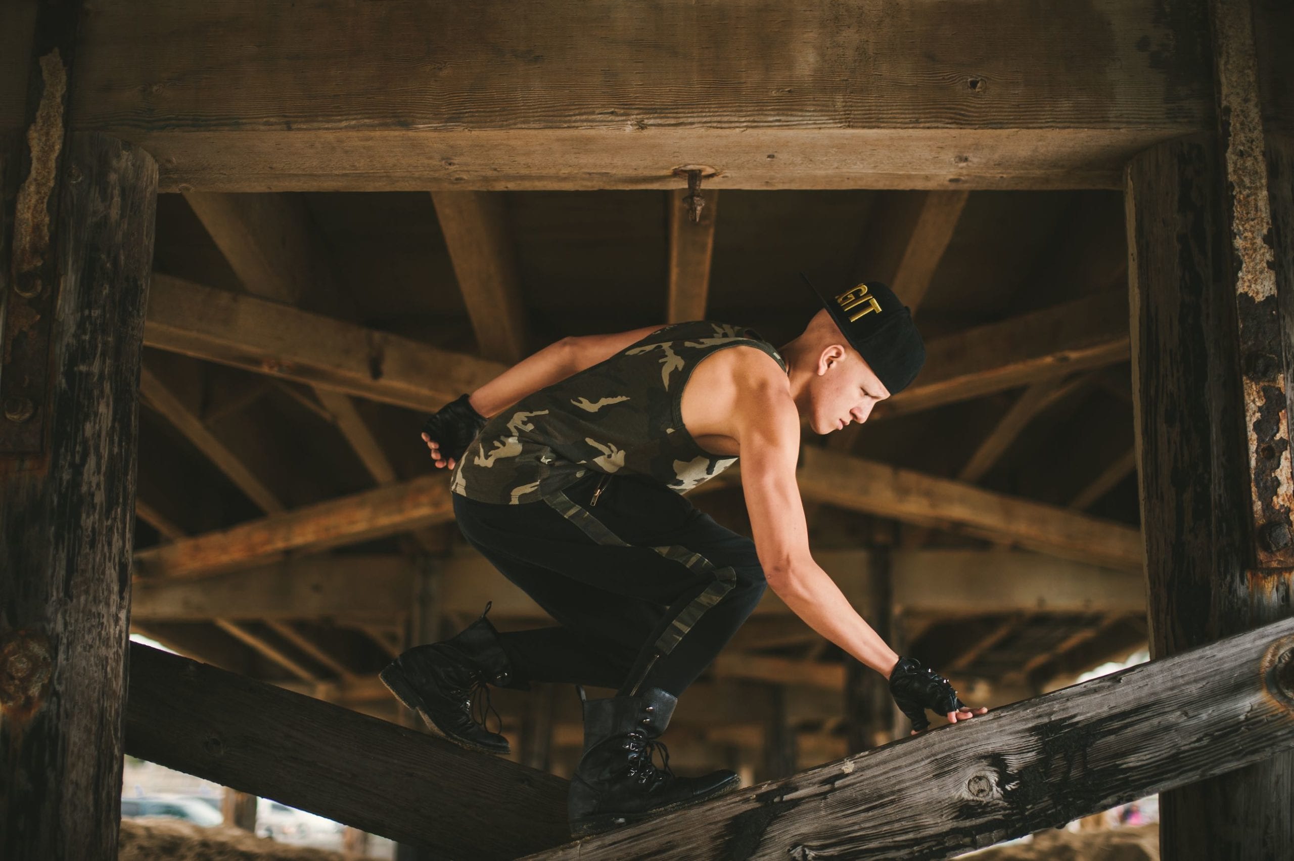
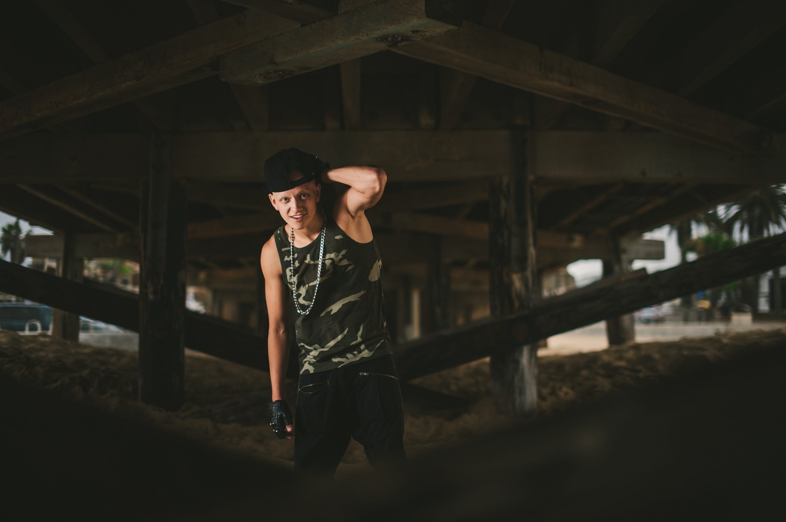
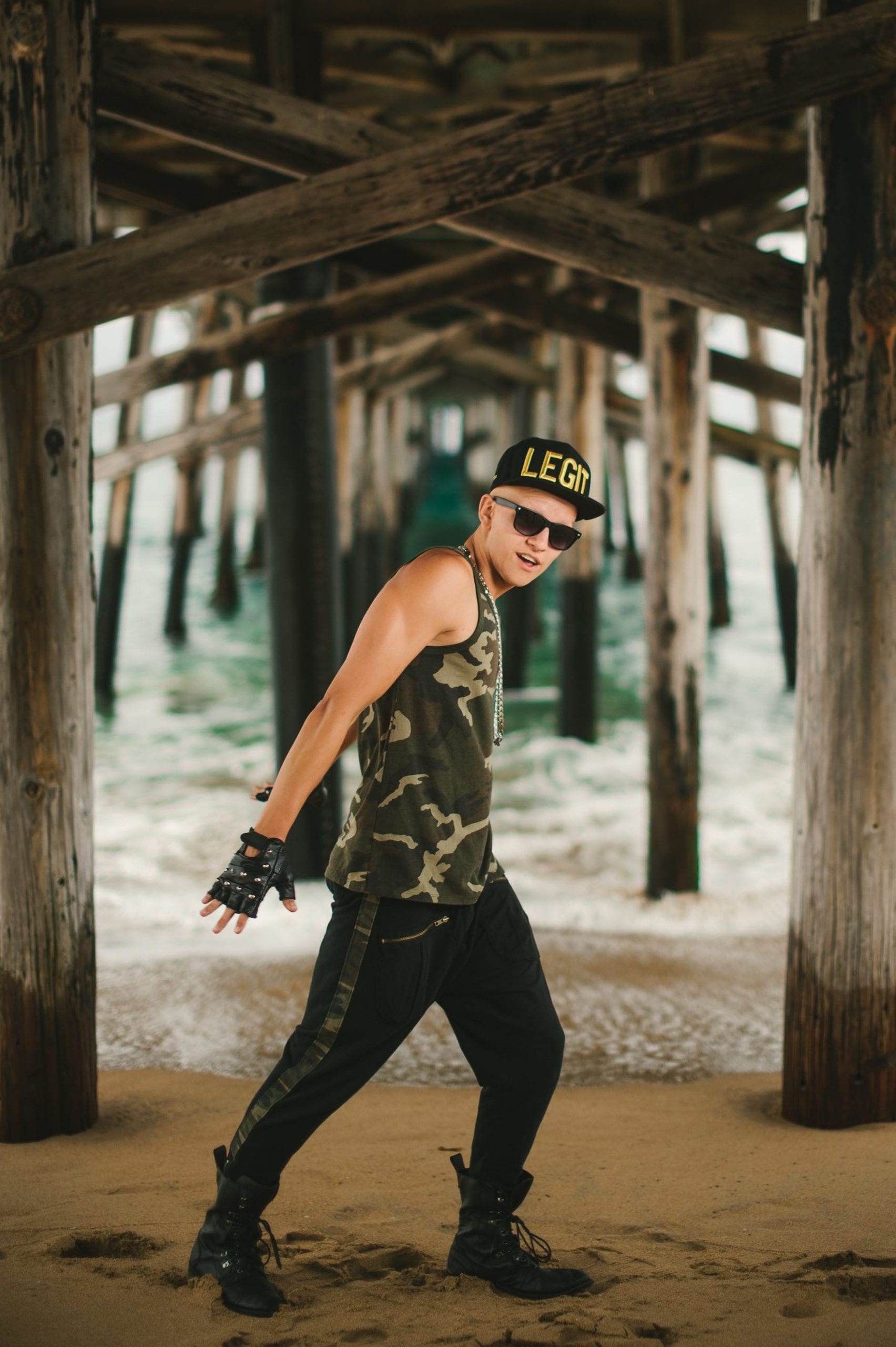
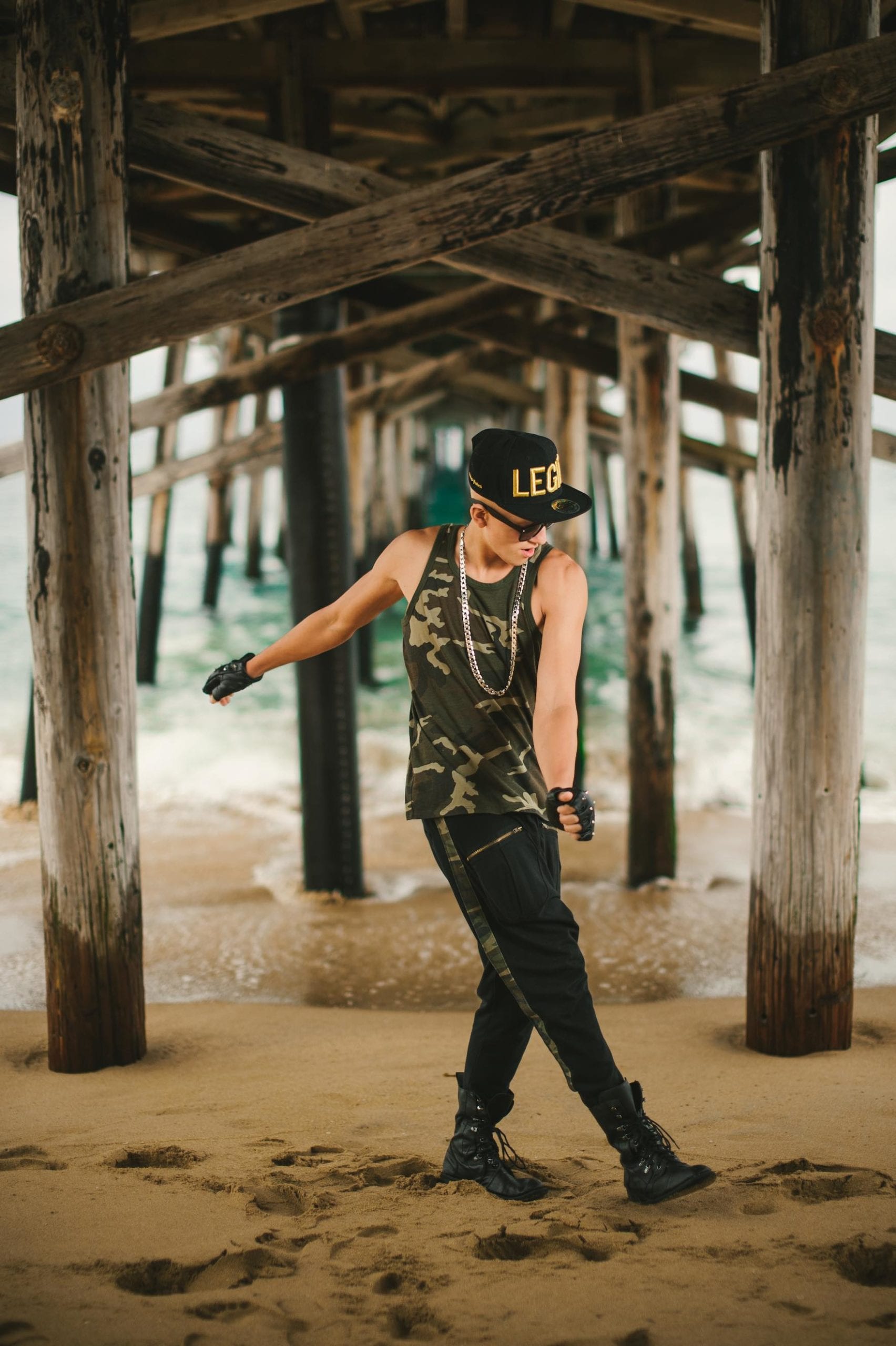
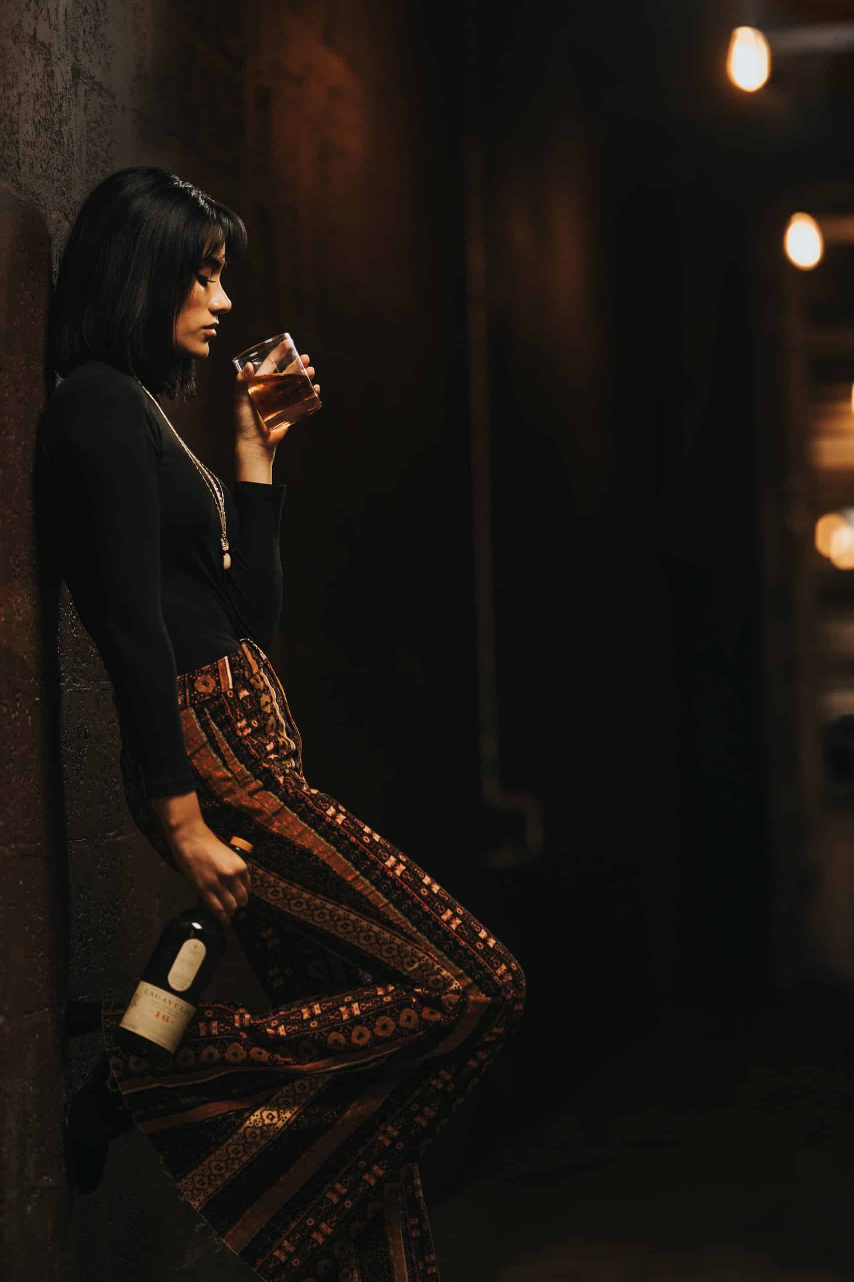
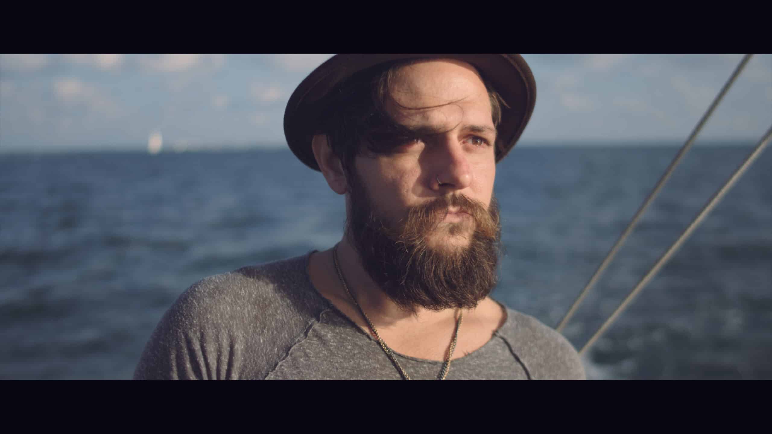
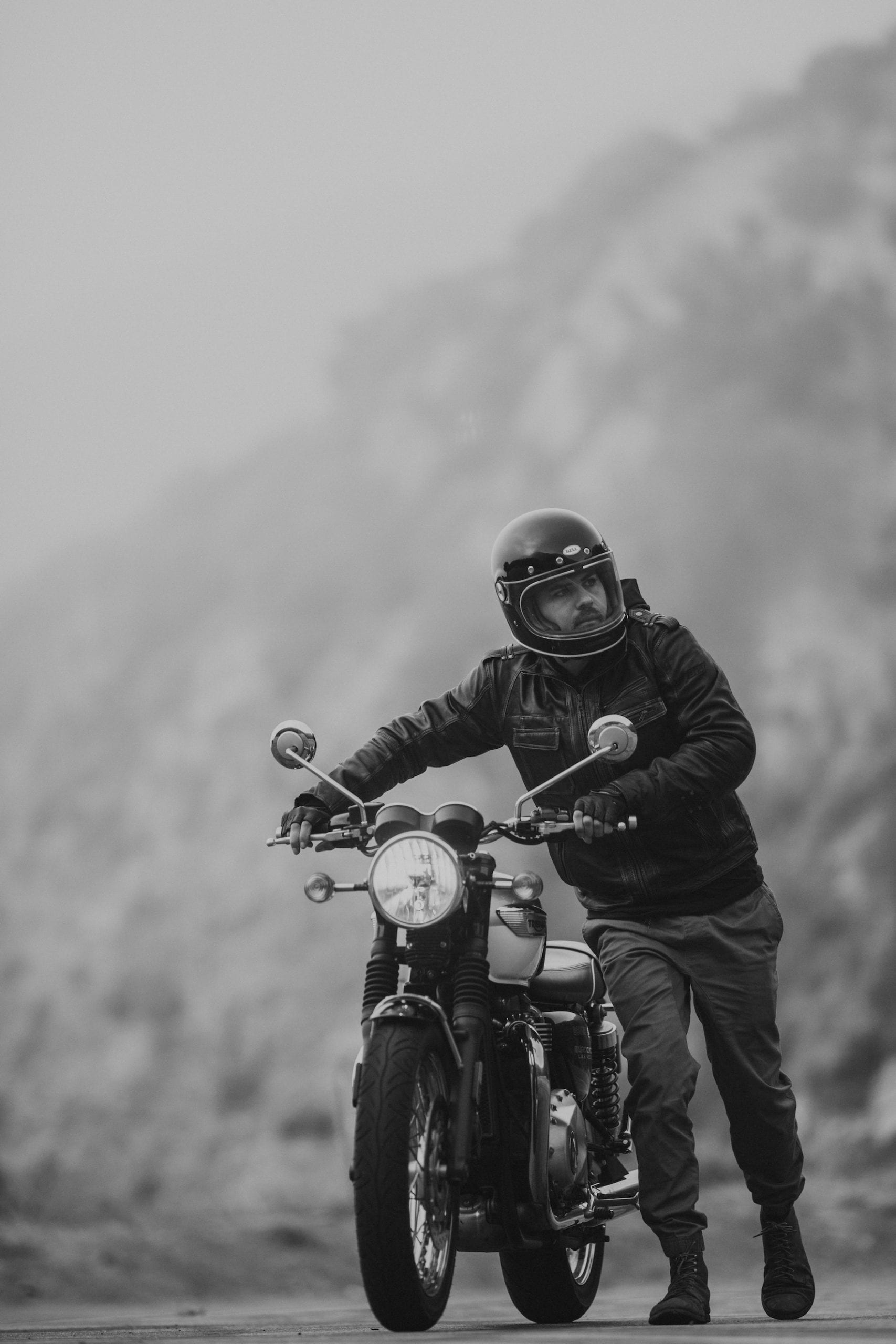
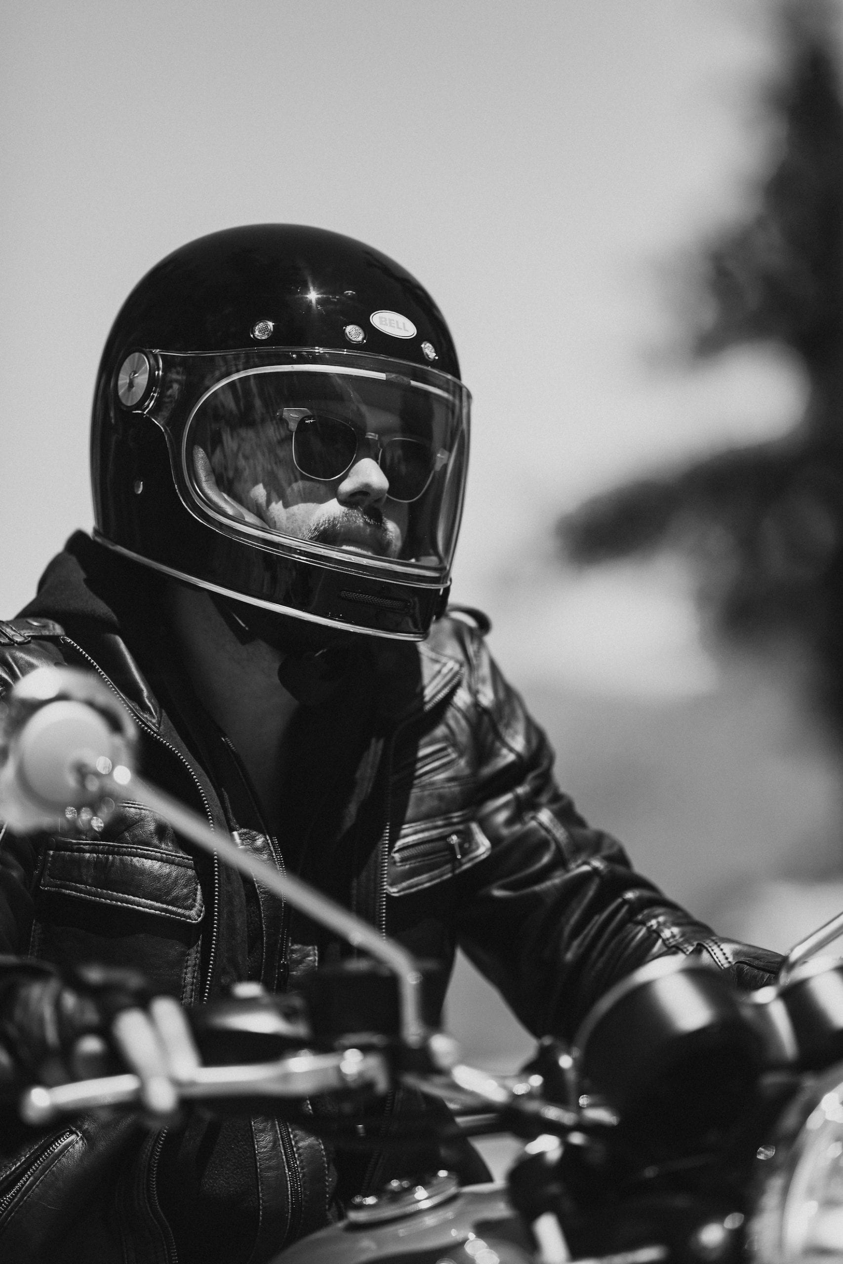
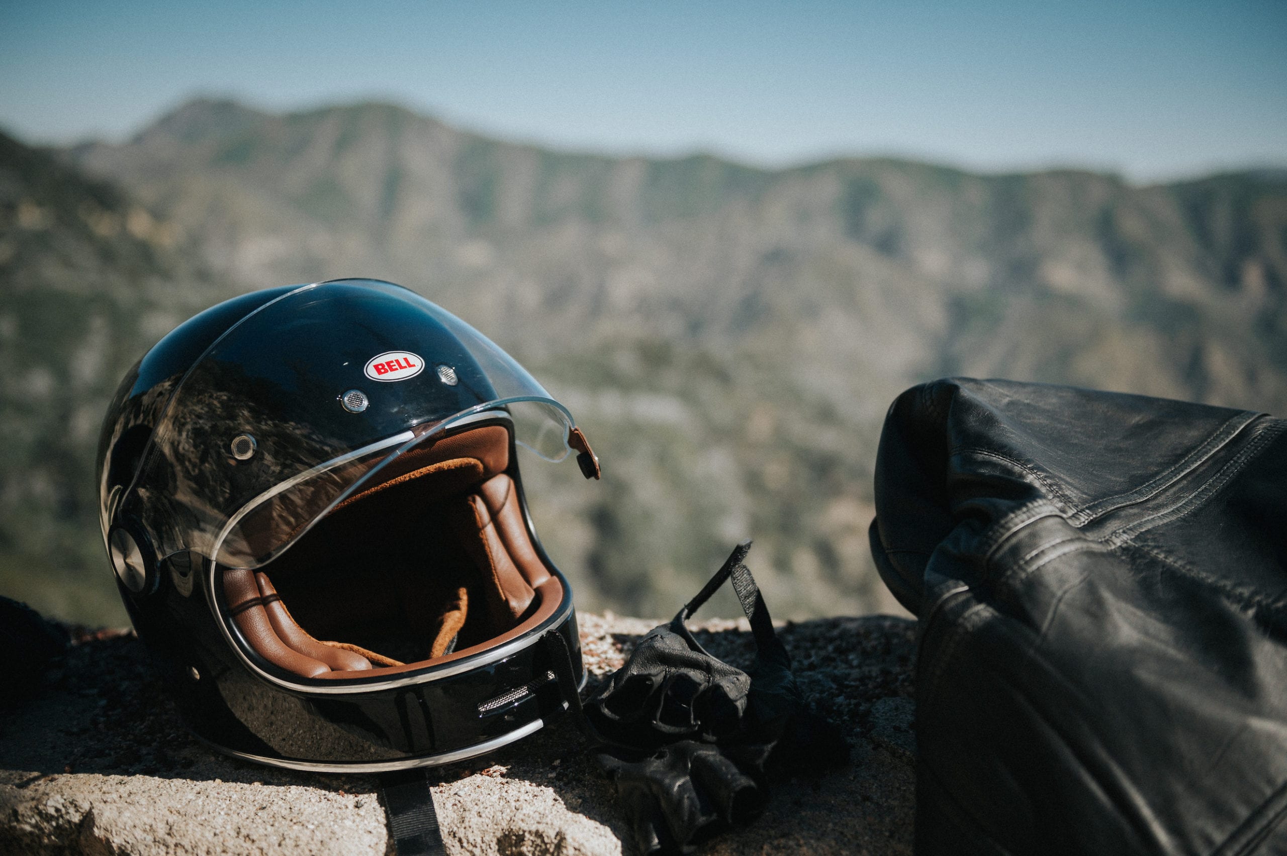
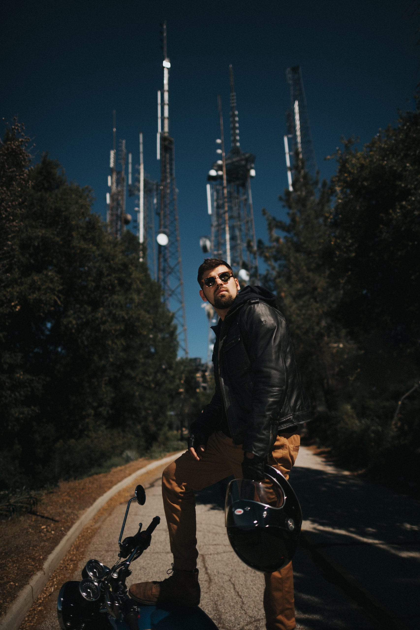
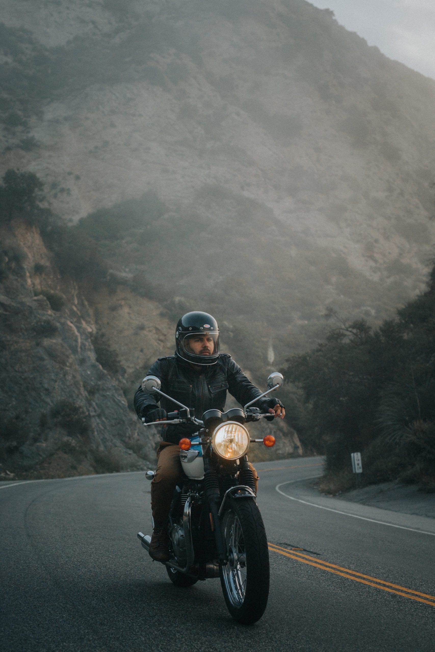
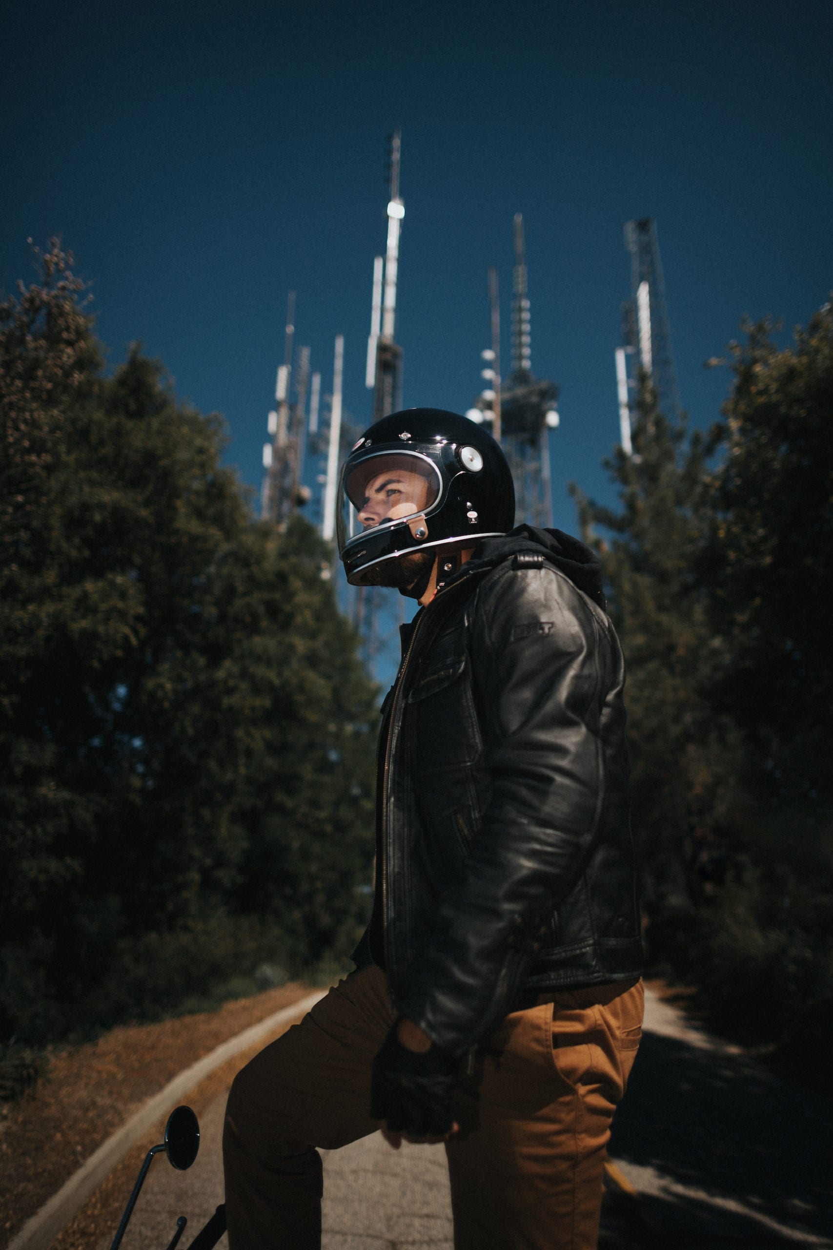
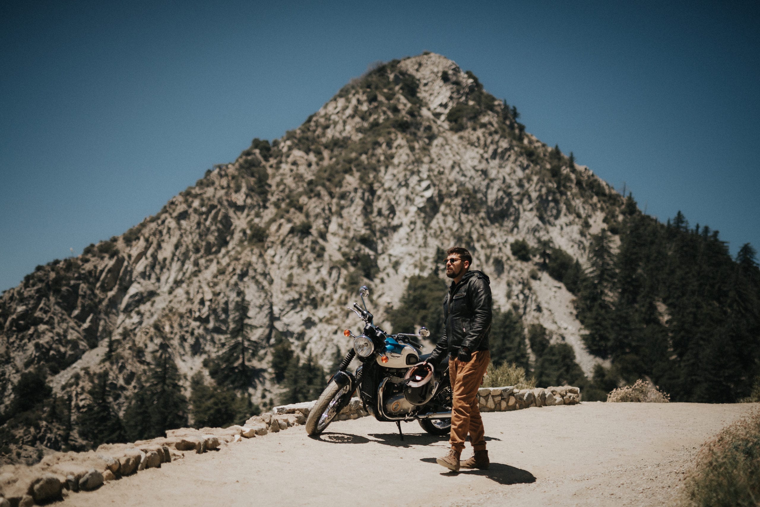
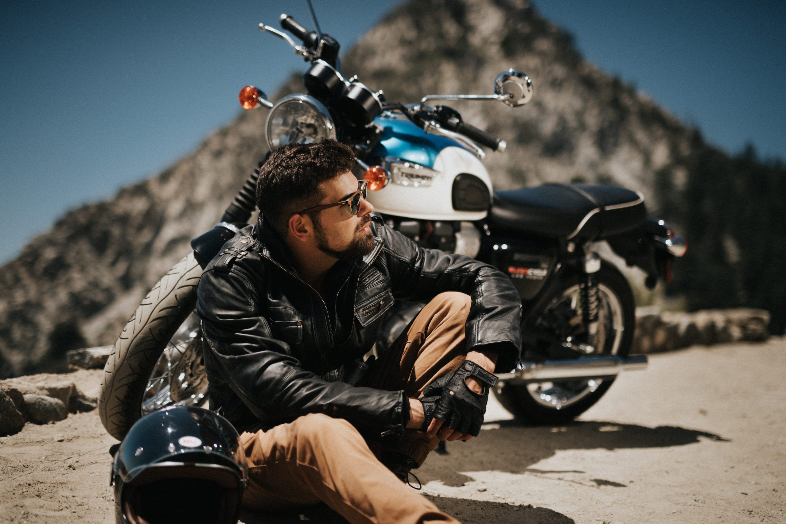
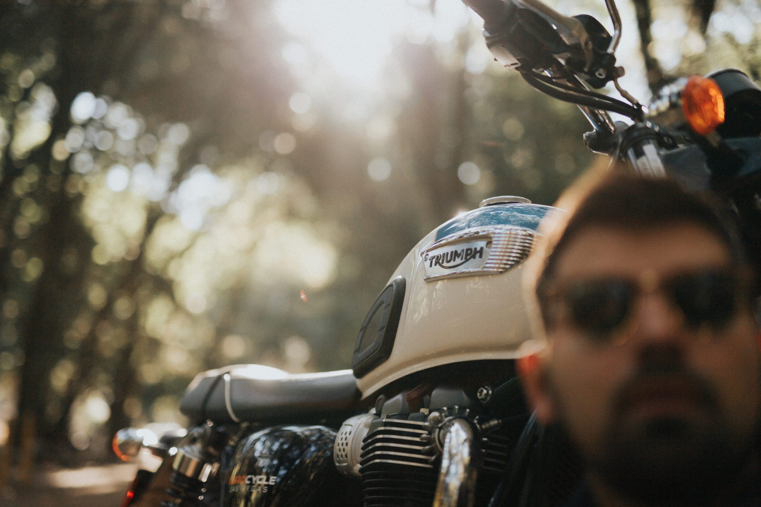
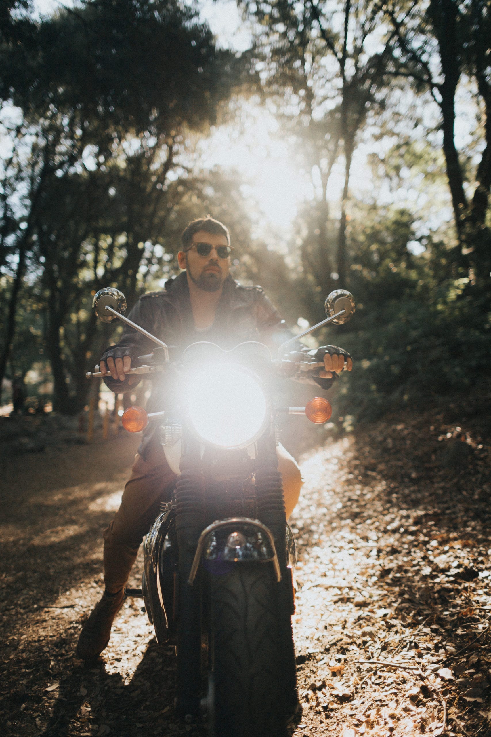
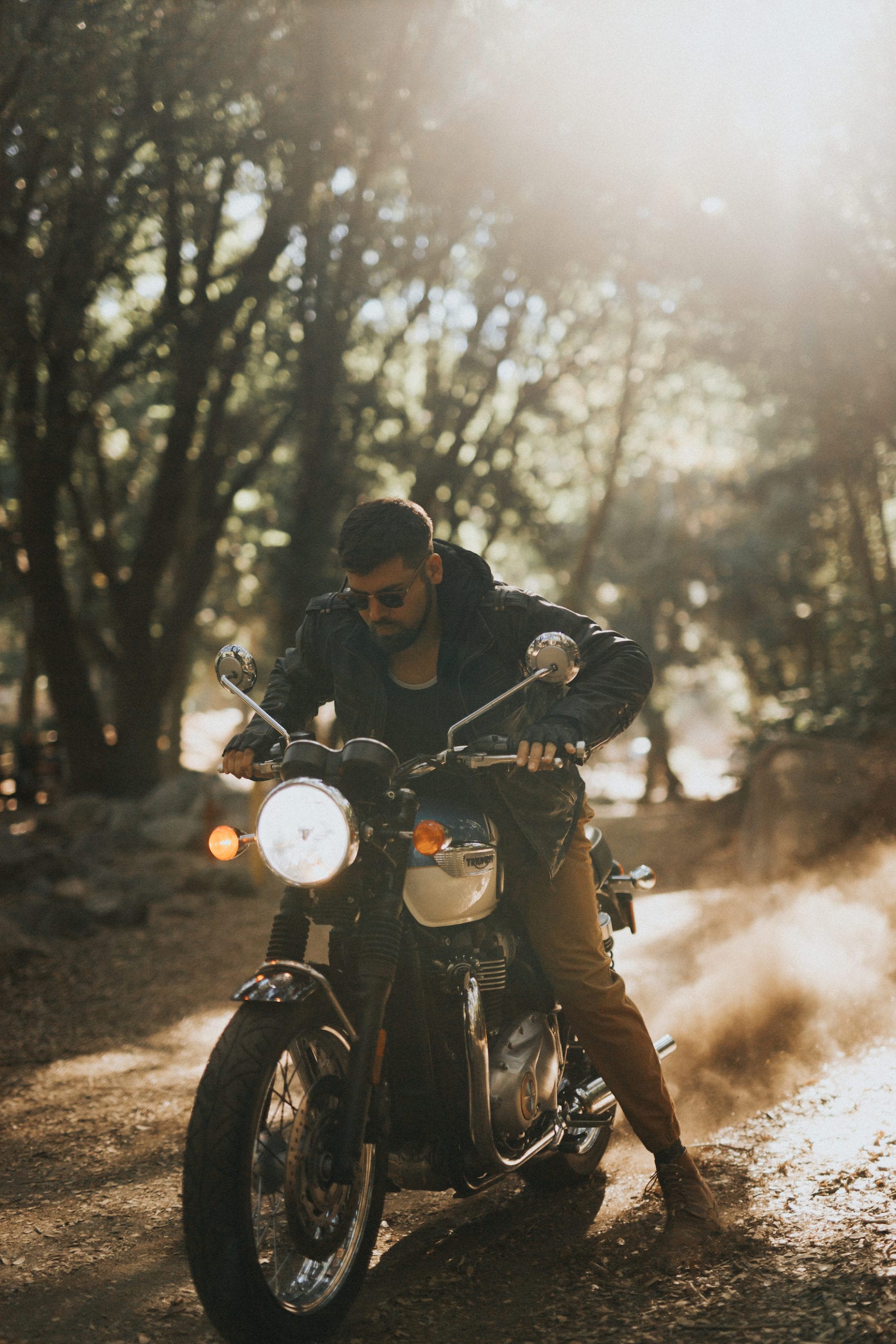
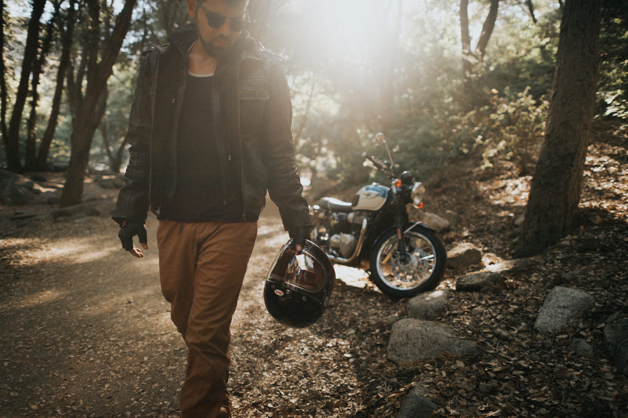
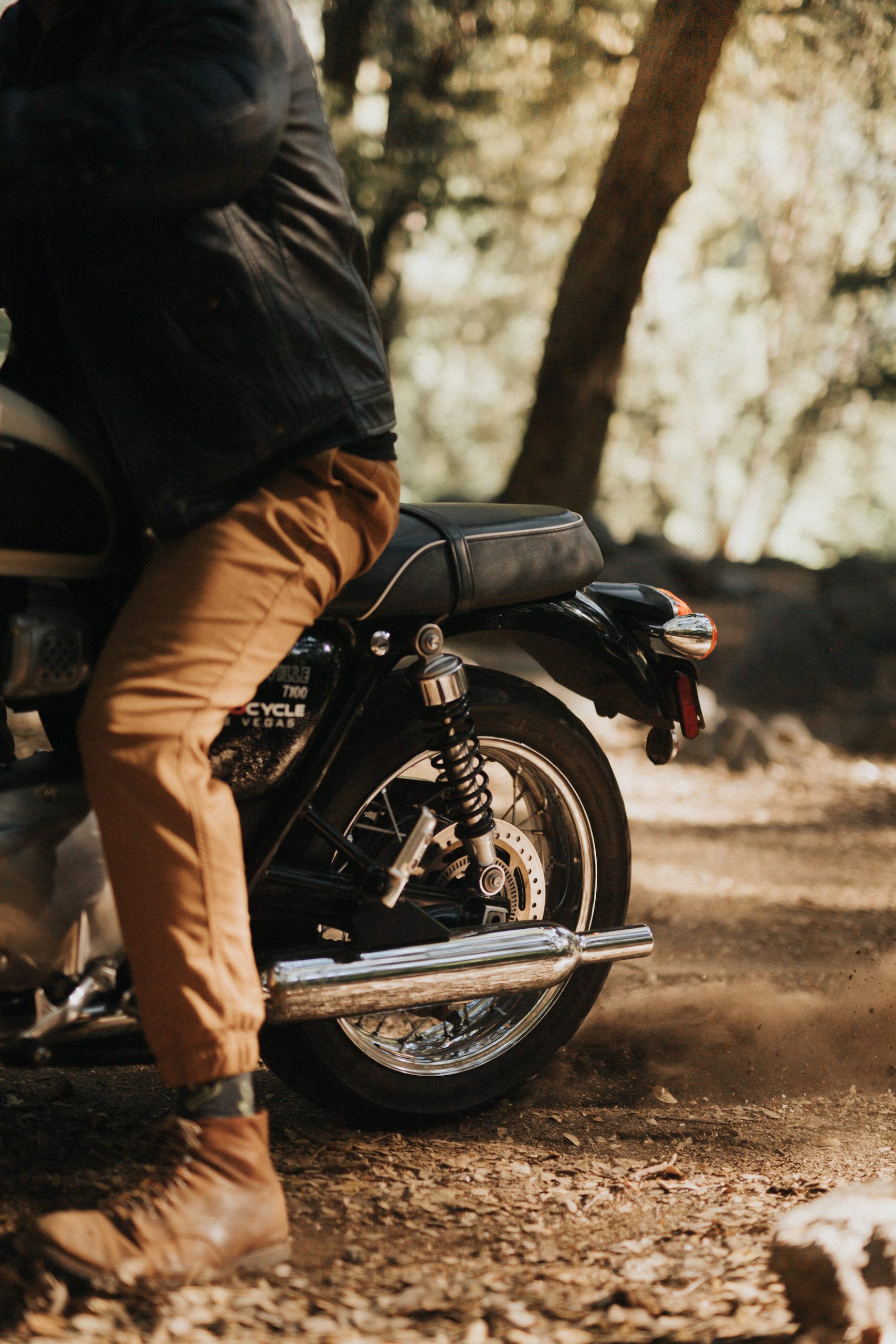
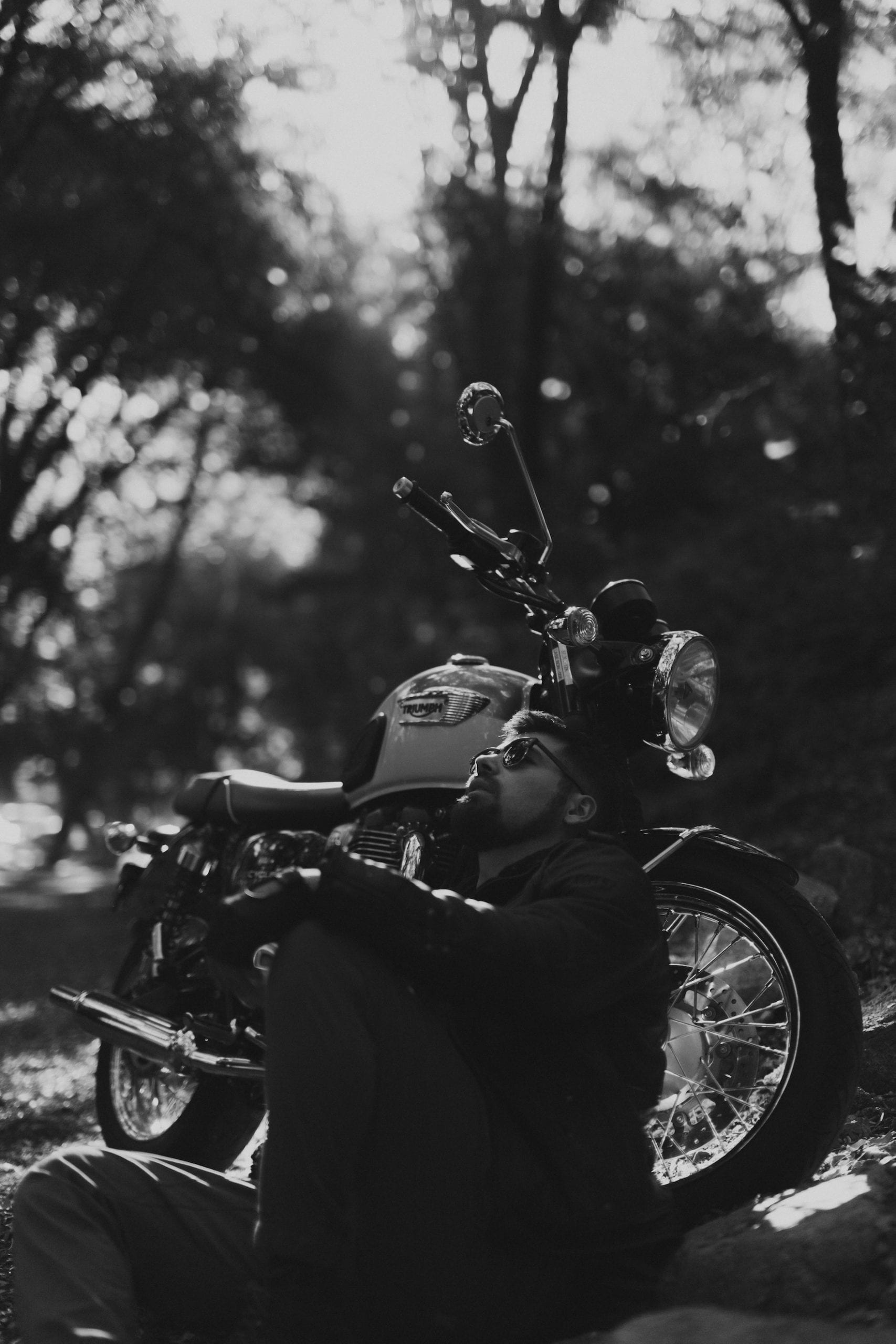
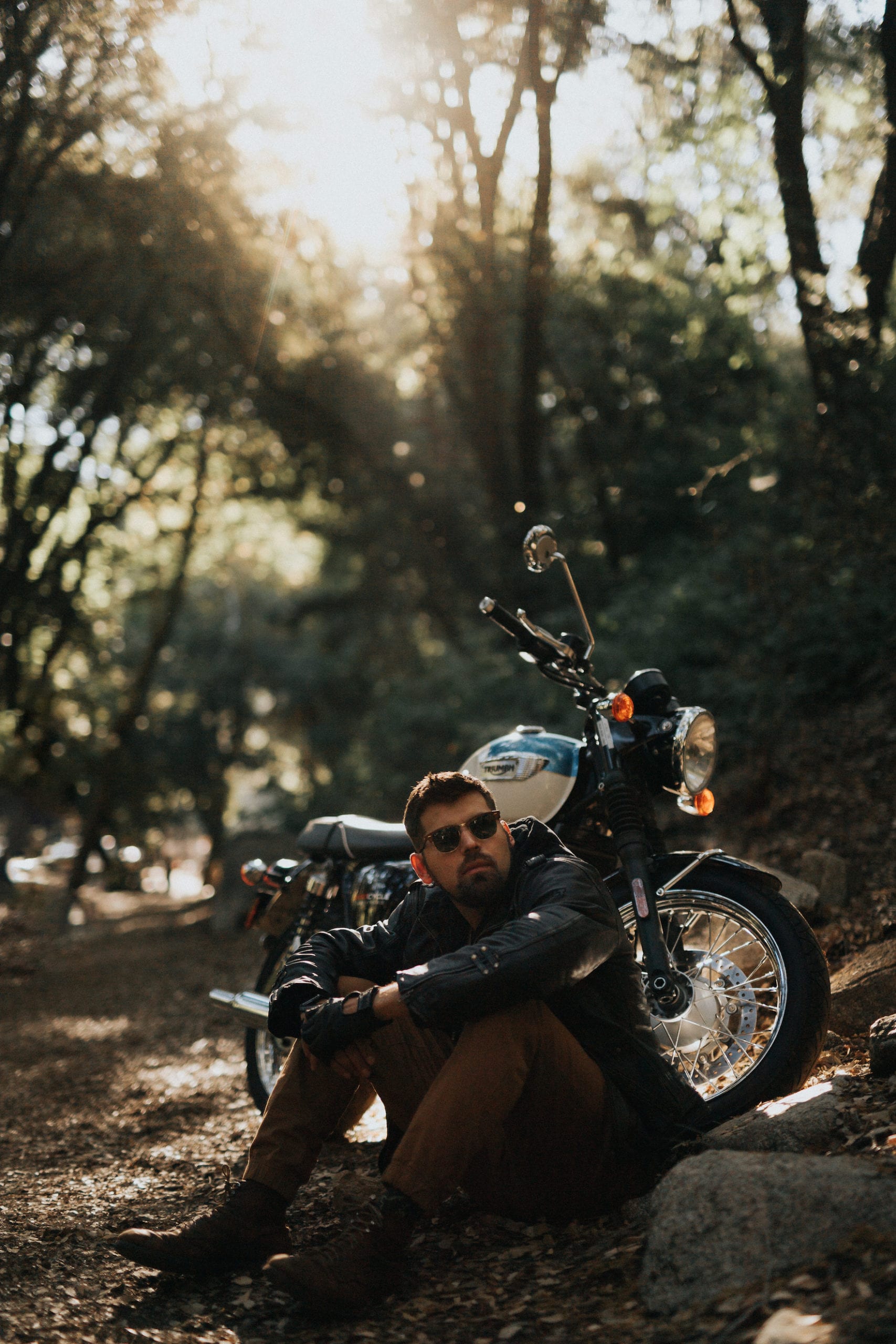
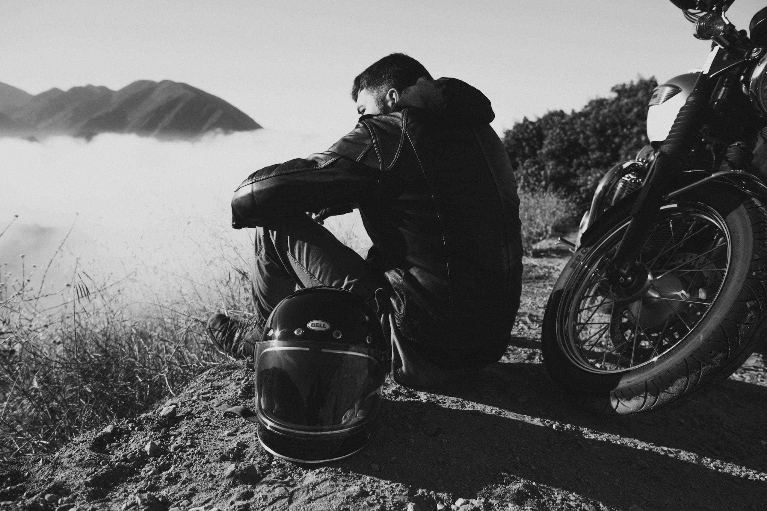
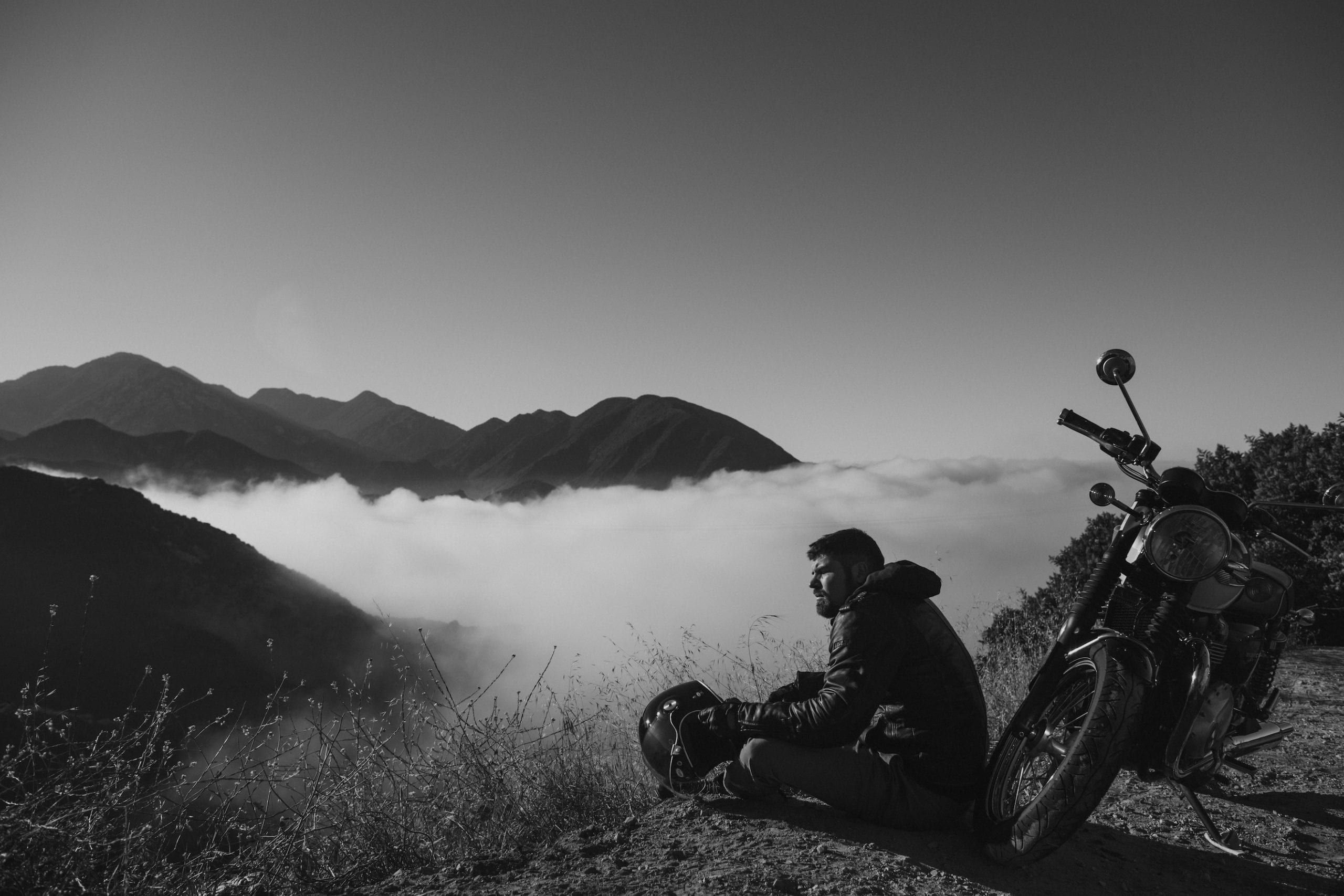
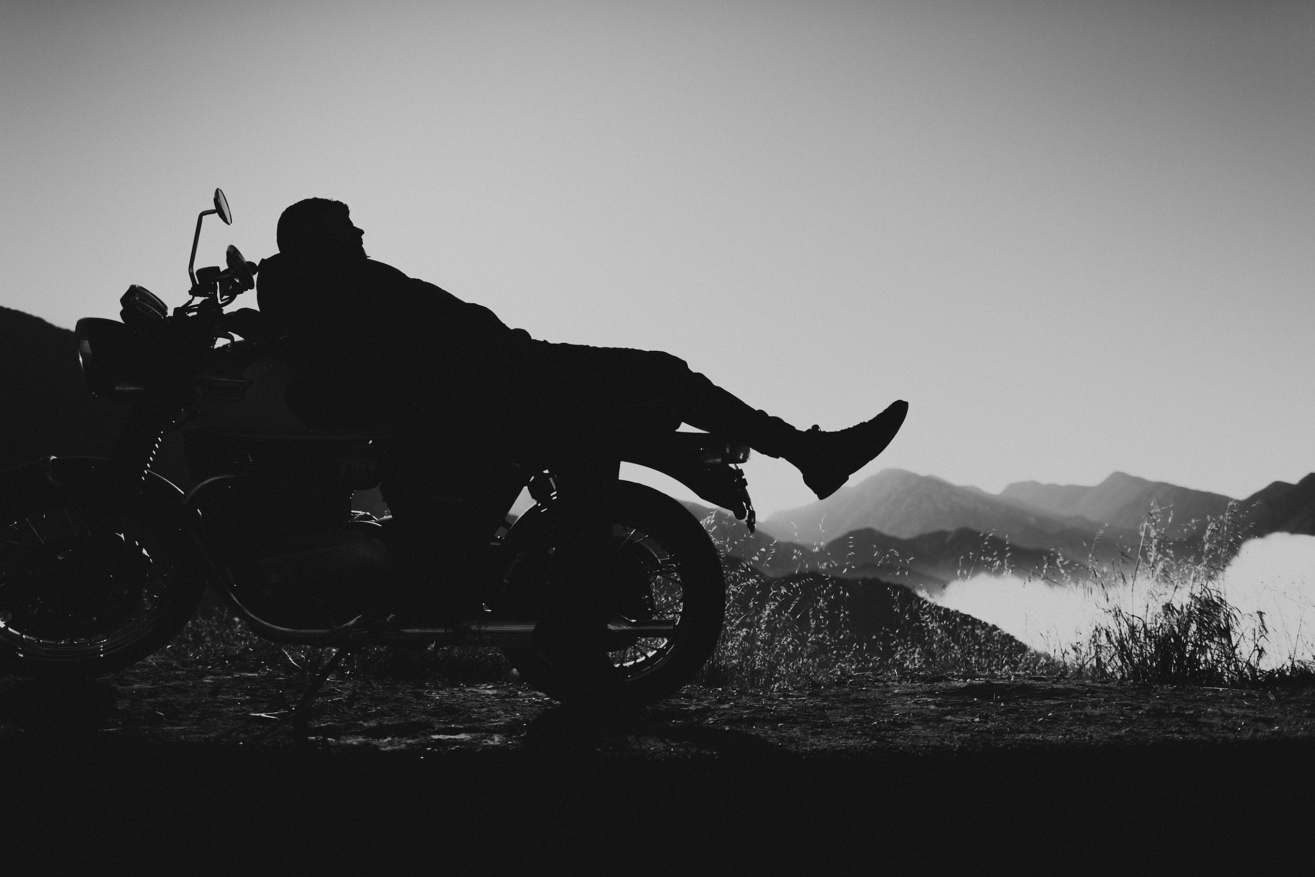
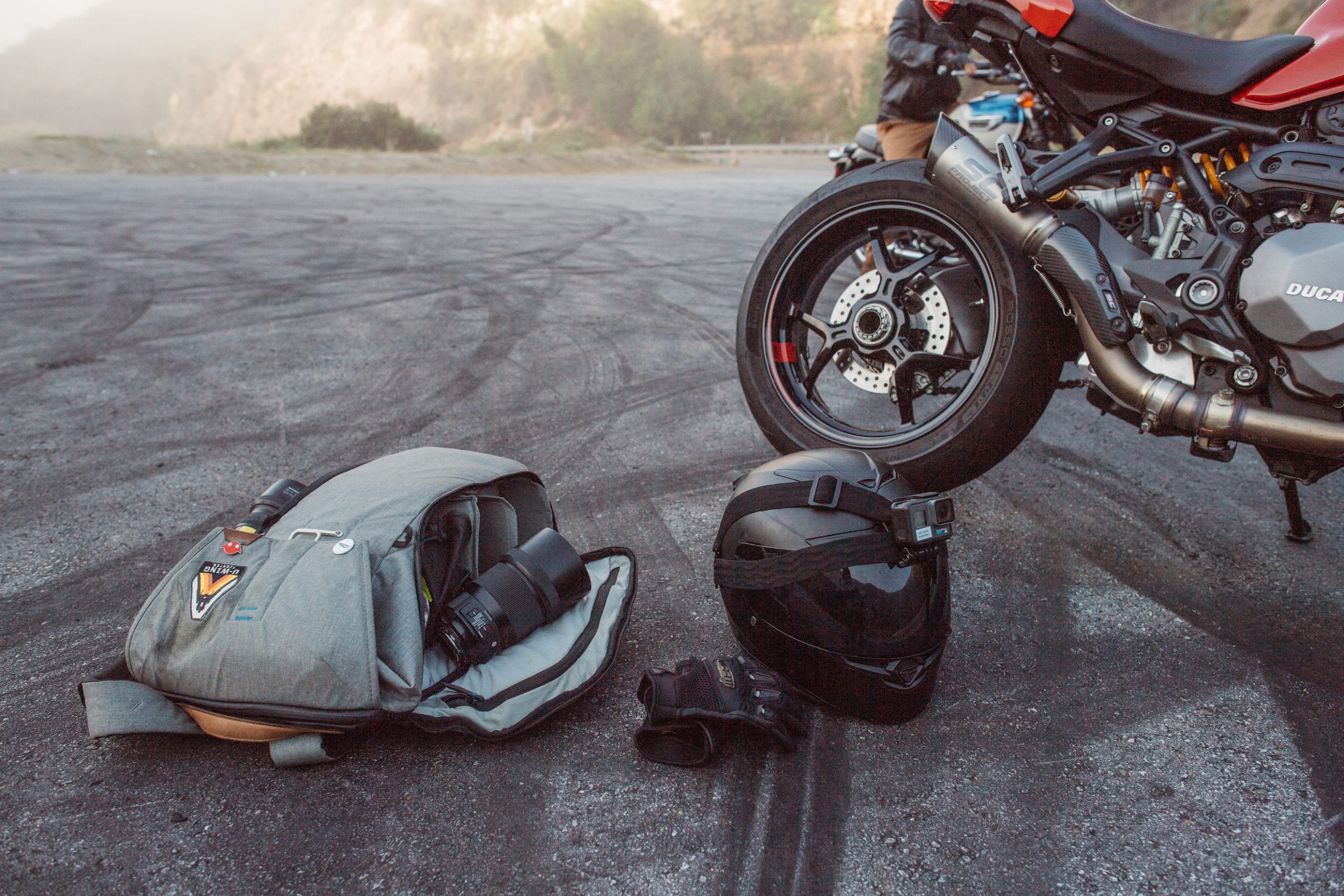
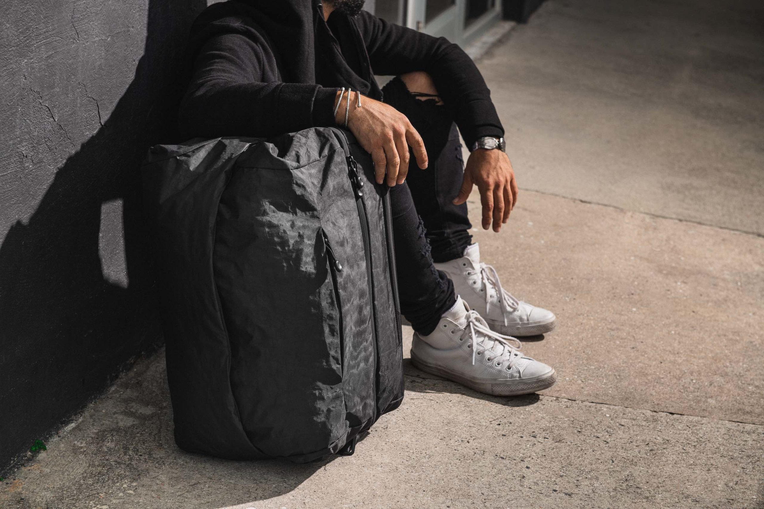
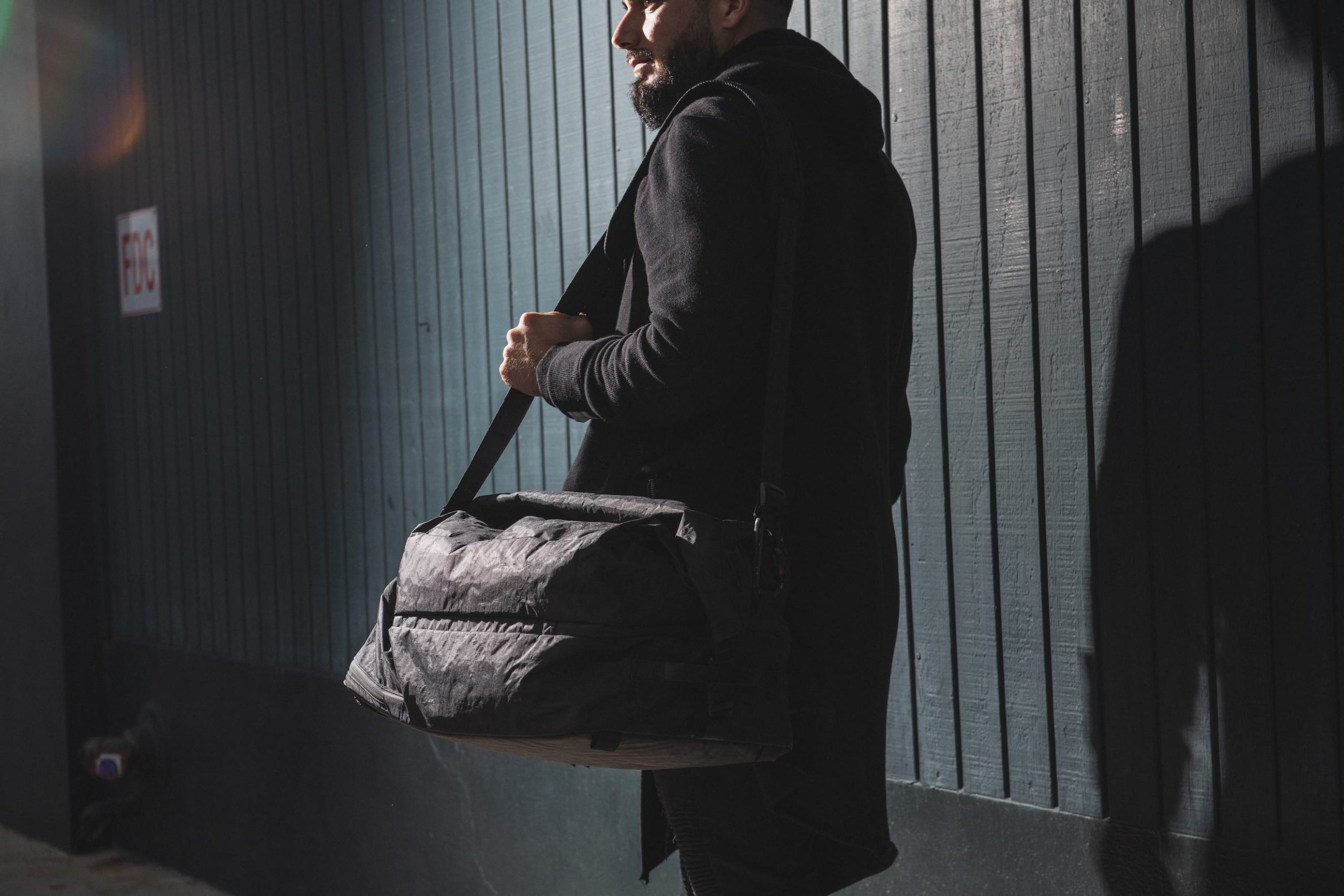
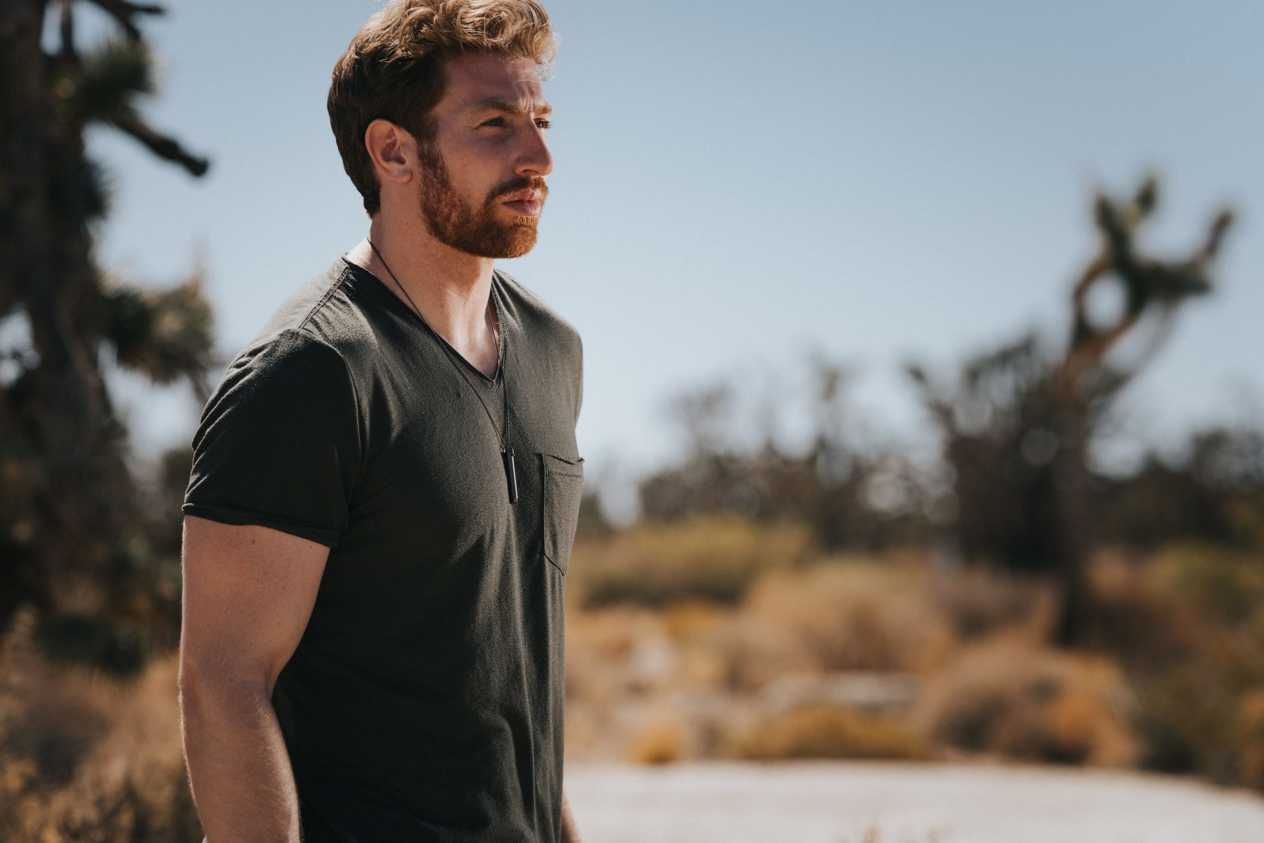
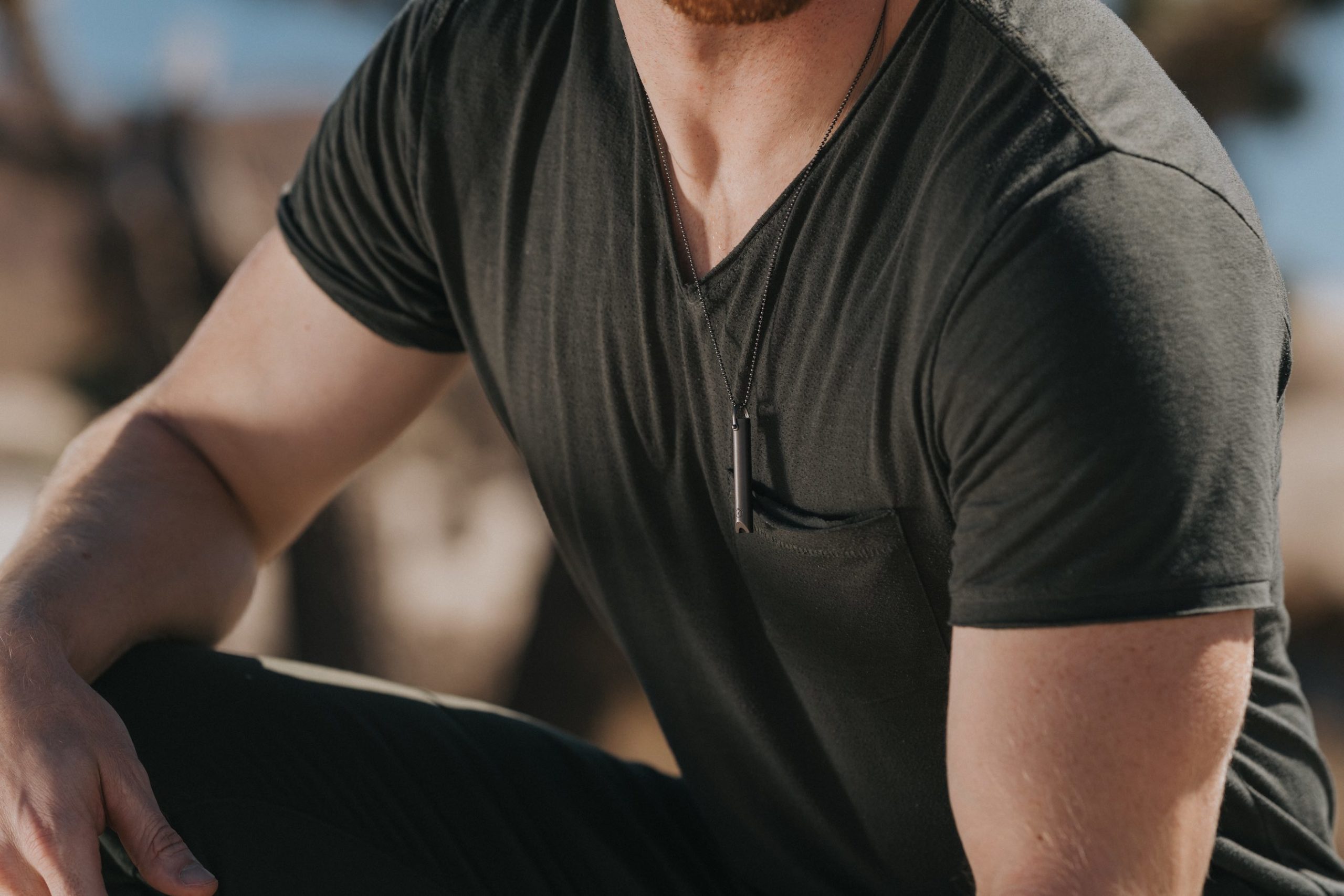
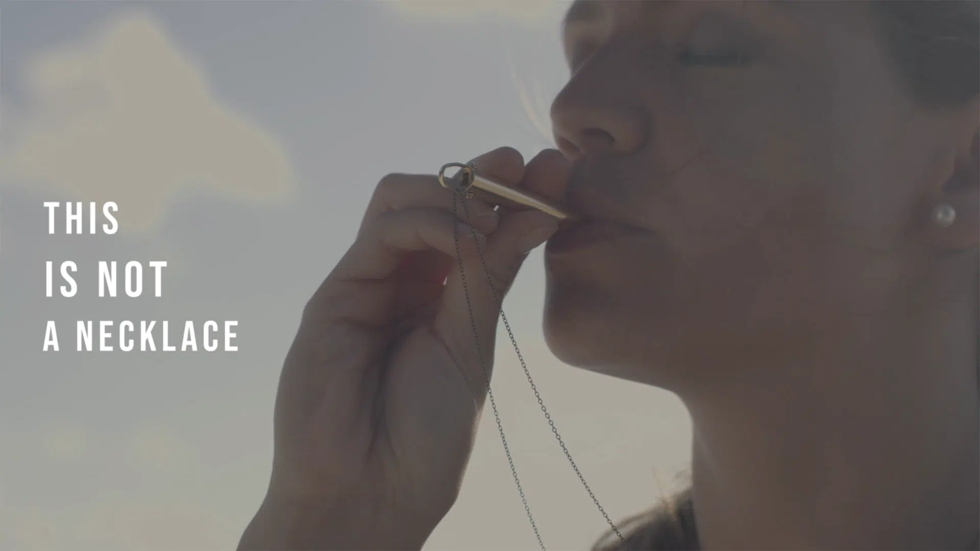
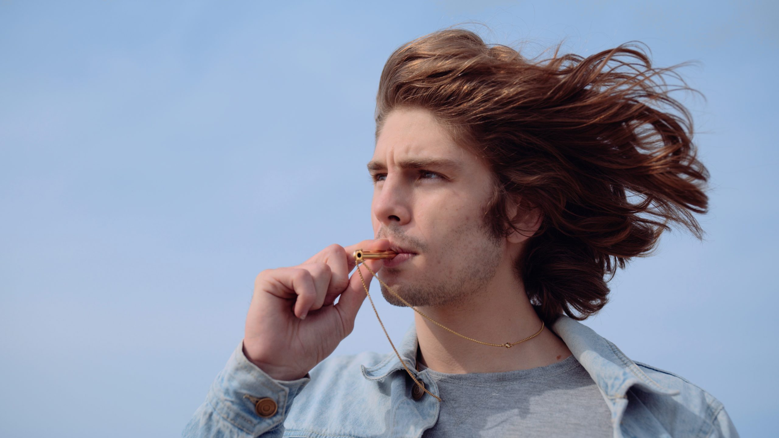
To emphasize the quality, style, and classic vibe of the Bonneville T100 we styled the talent with quality, vintage-style clothing. We chose to play up Triumph’s identity as a luxury and masculine brand by outfitting the model with a Bilt Drago Leather Jacket, Street & Steel Fingerless Gloves, Ray-Ban Clubmaster, and Bell Bullitt Helmet. These accessories played to the strengths of the narrative: a solo road trip through Angeles National Forest with nothing but the atmosphere and the steady rumbling of the Bonneville T100.


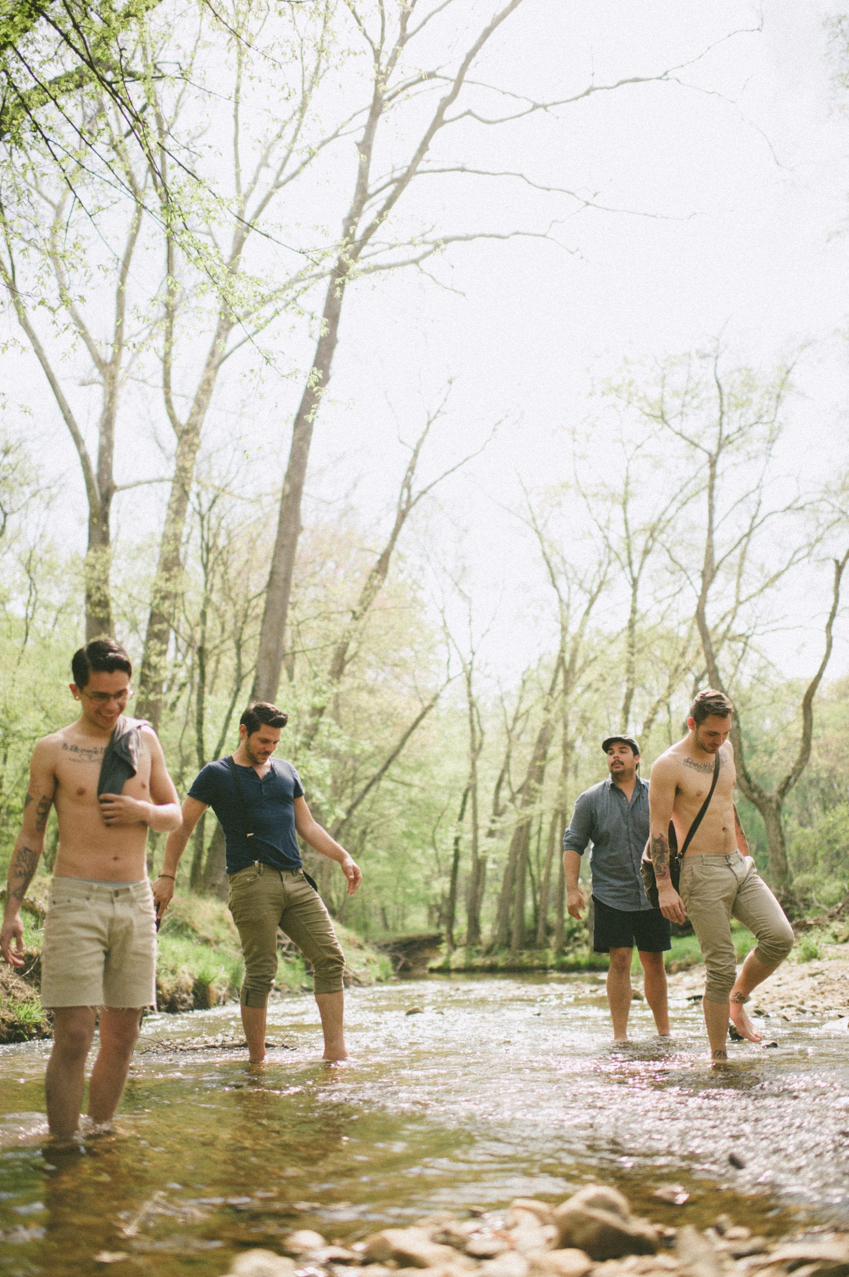
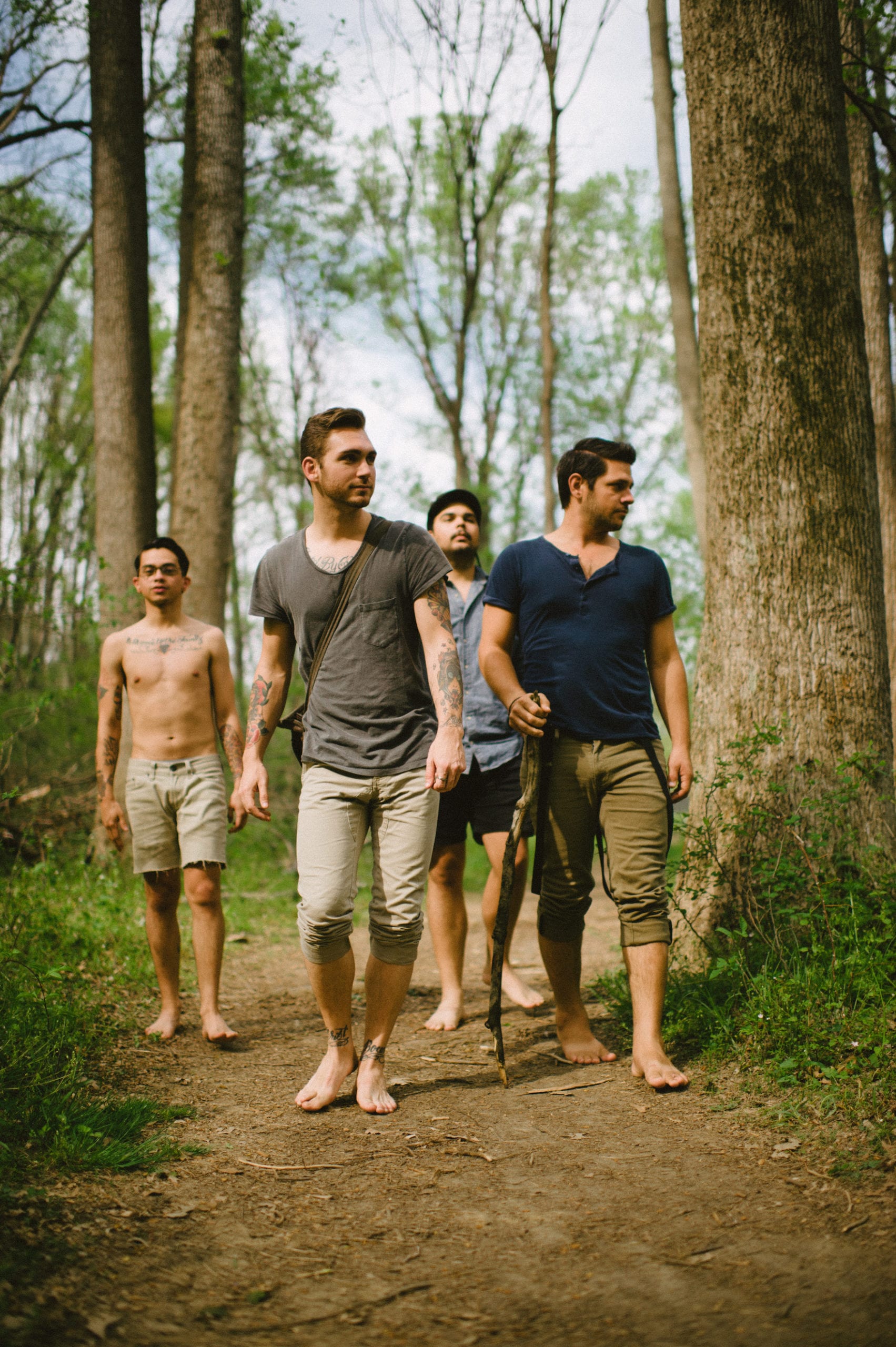
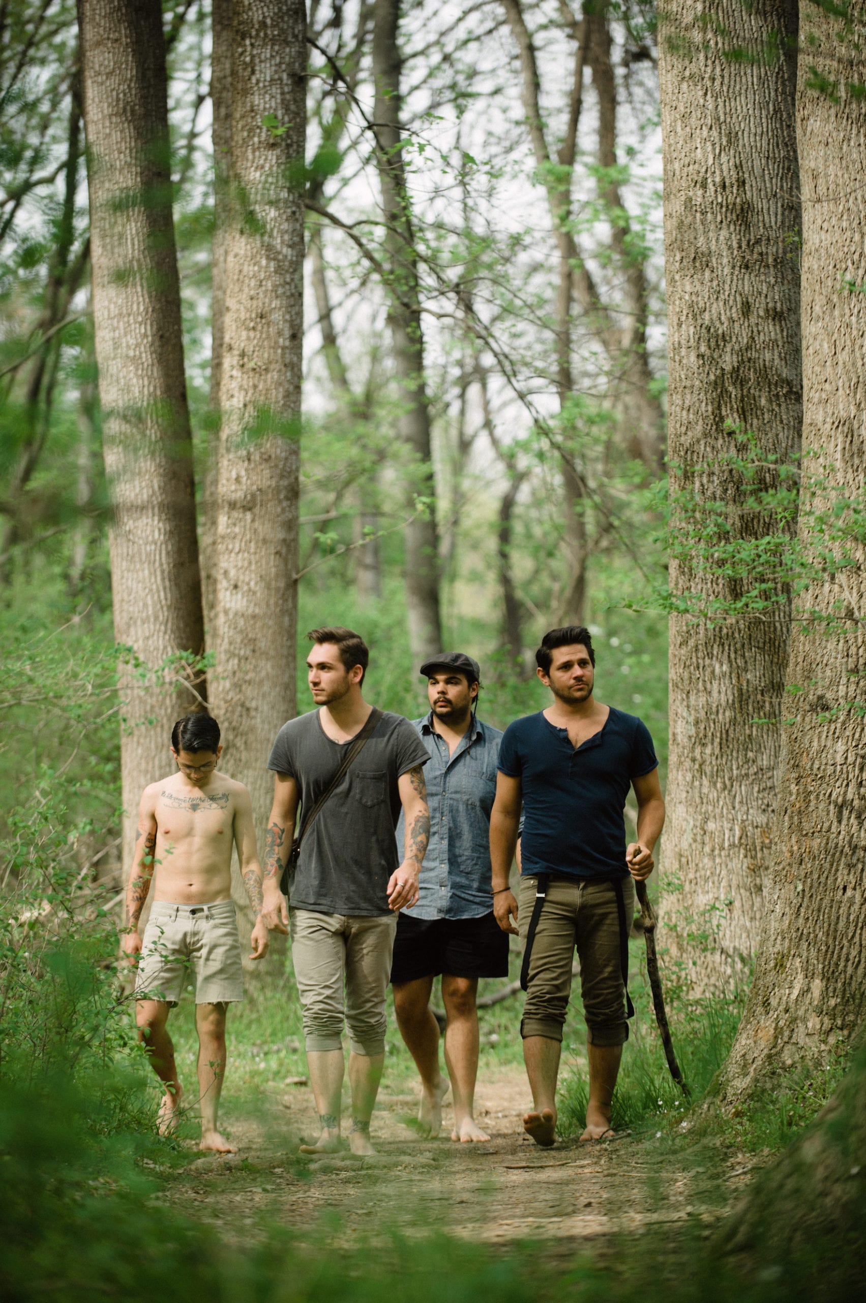
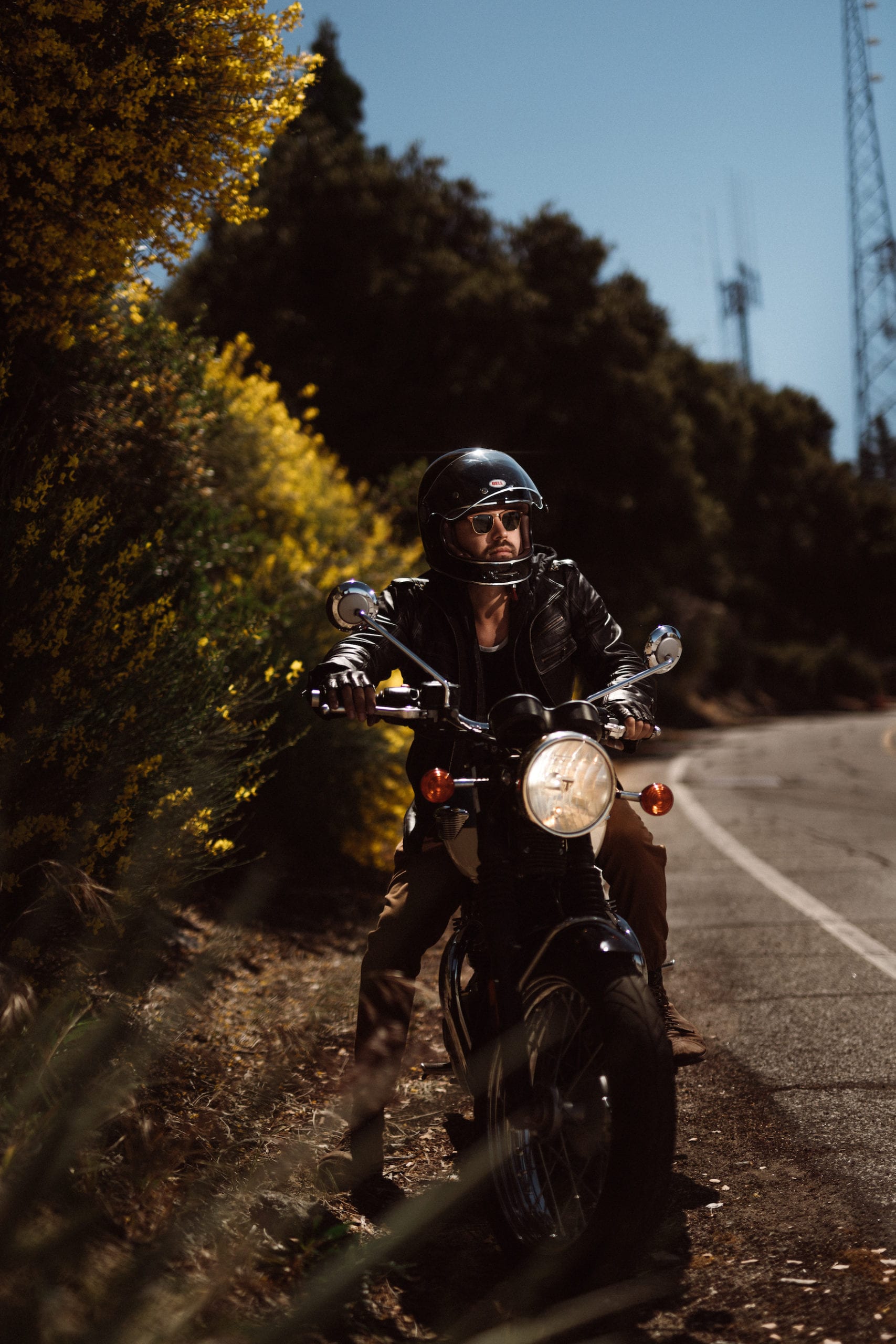
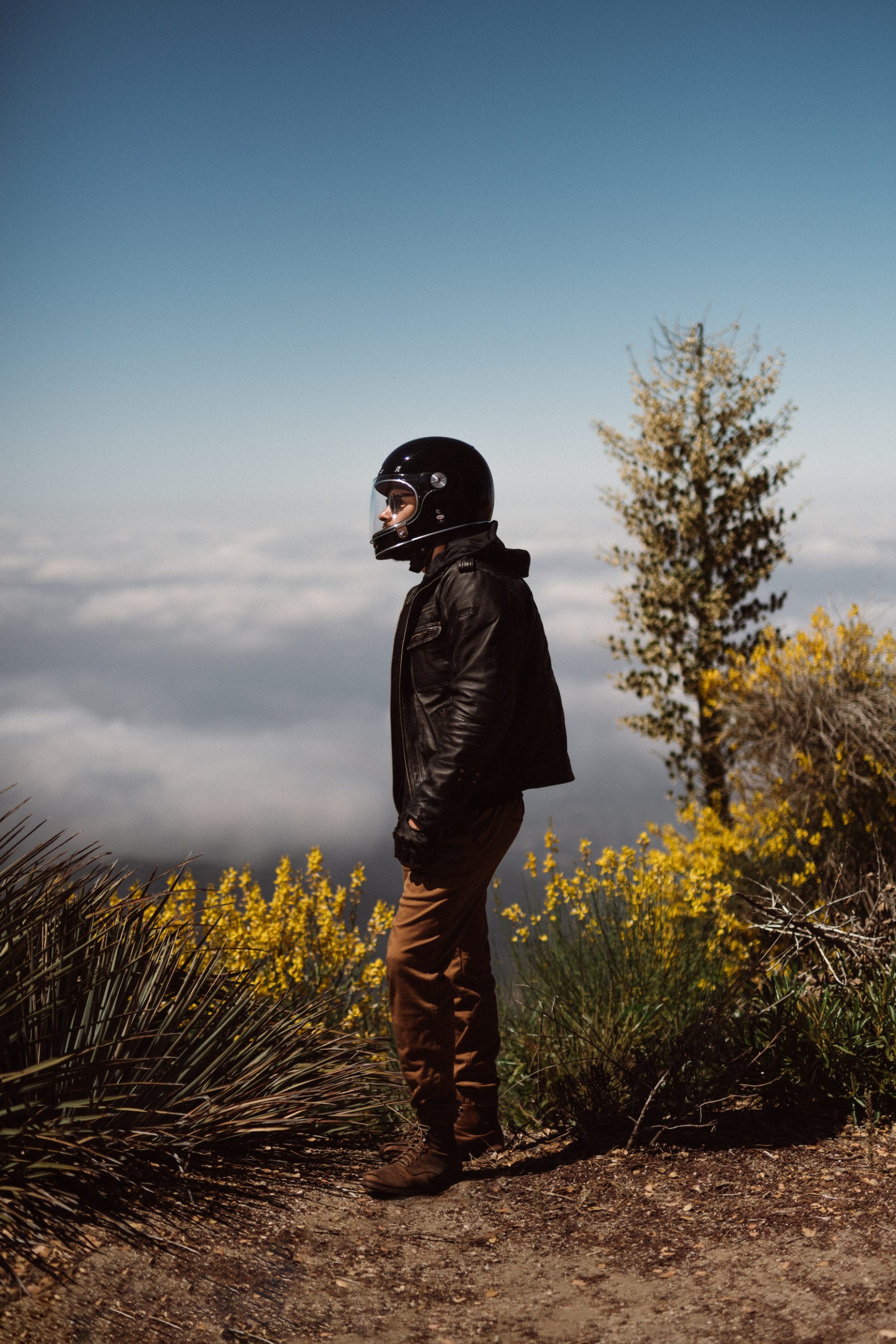
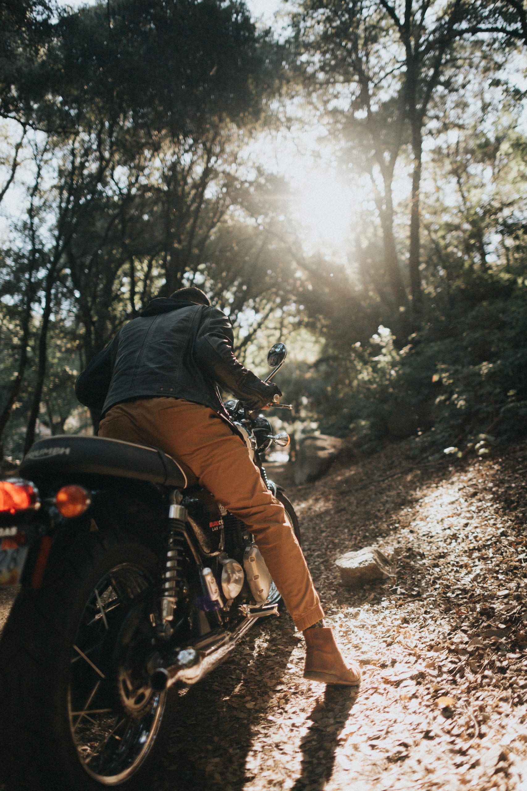
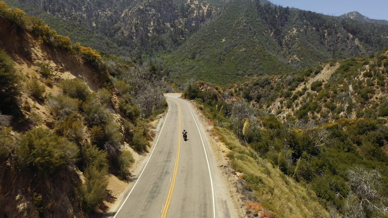
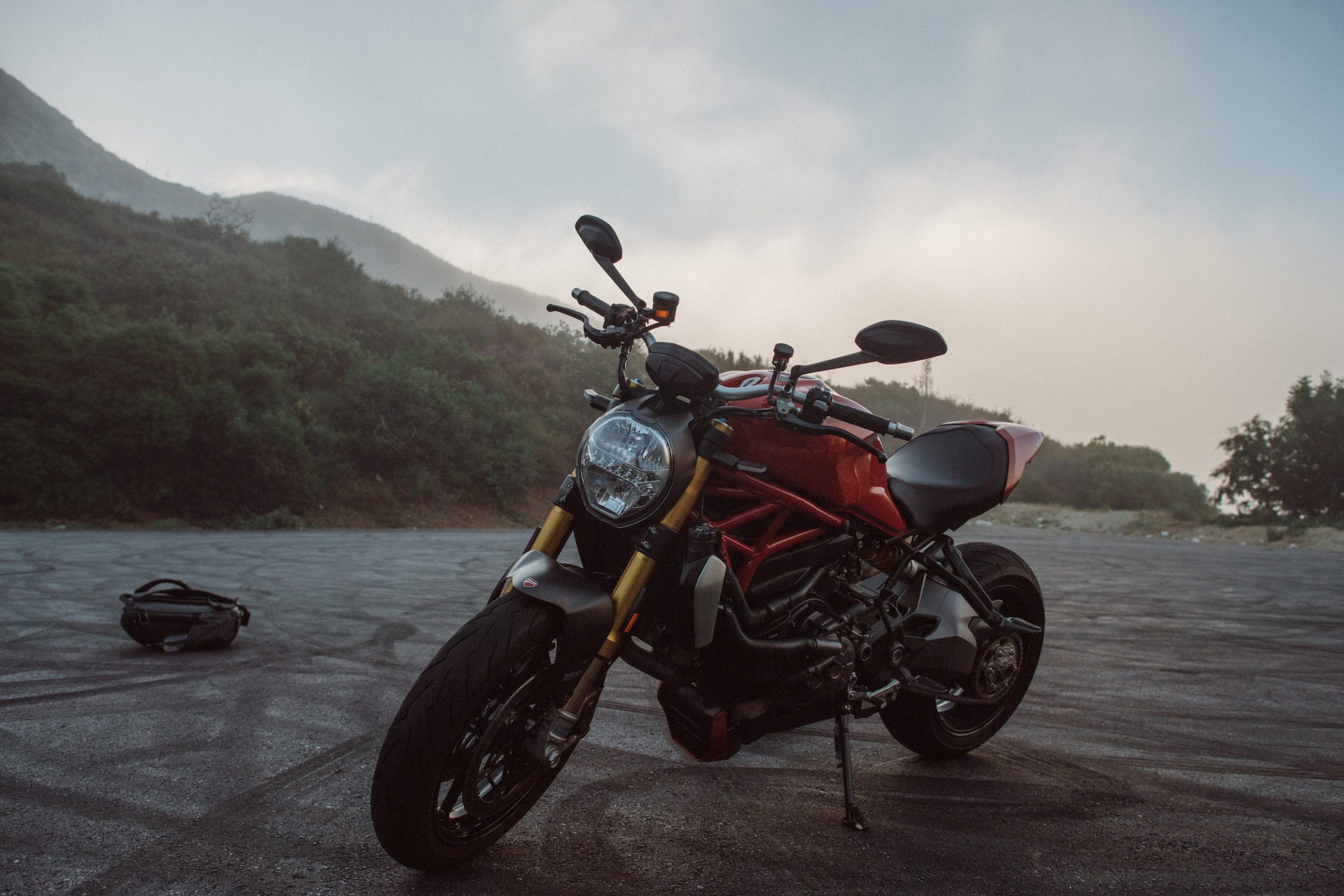
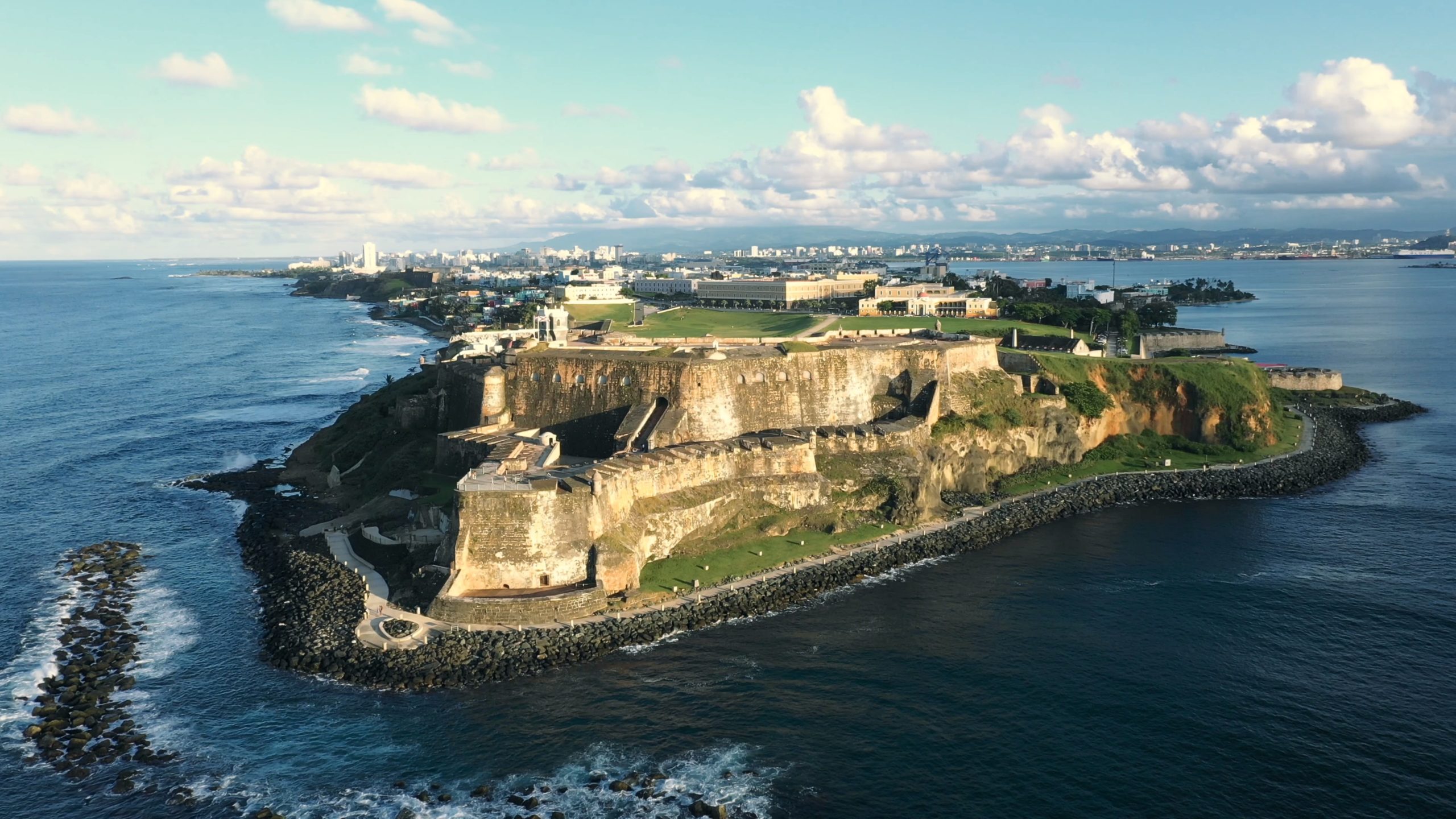
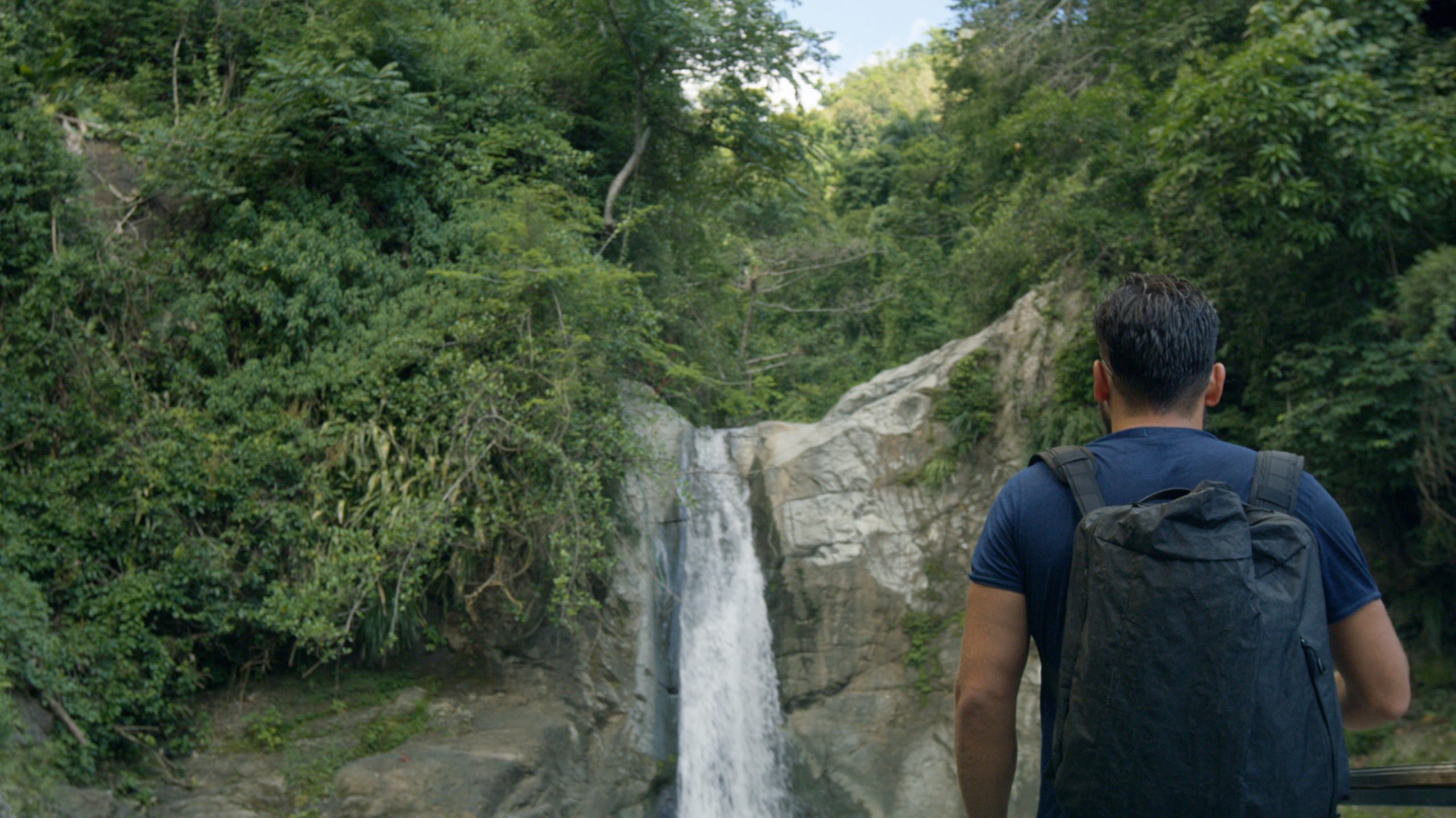
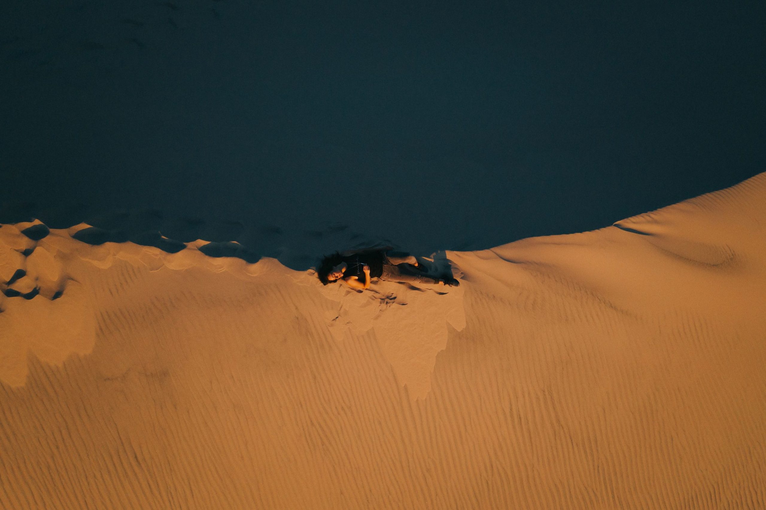
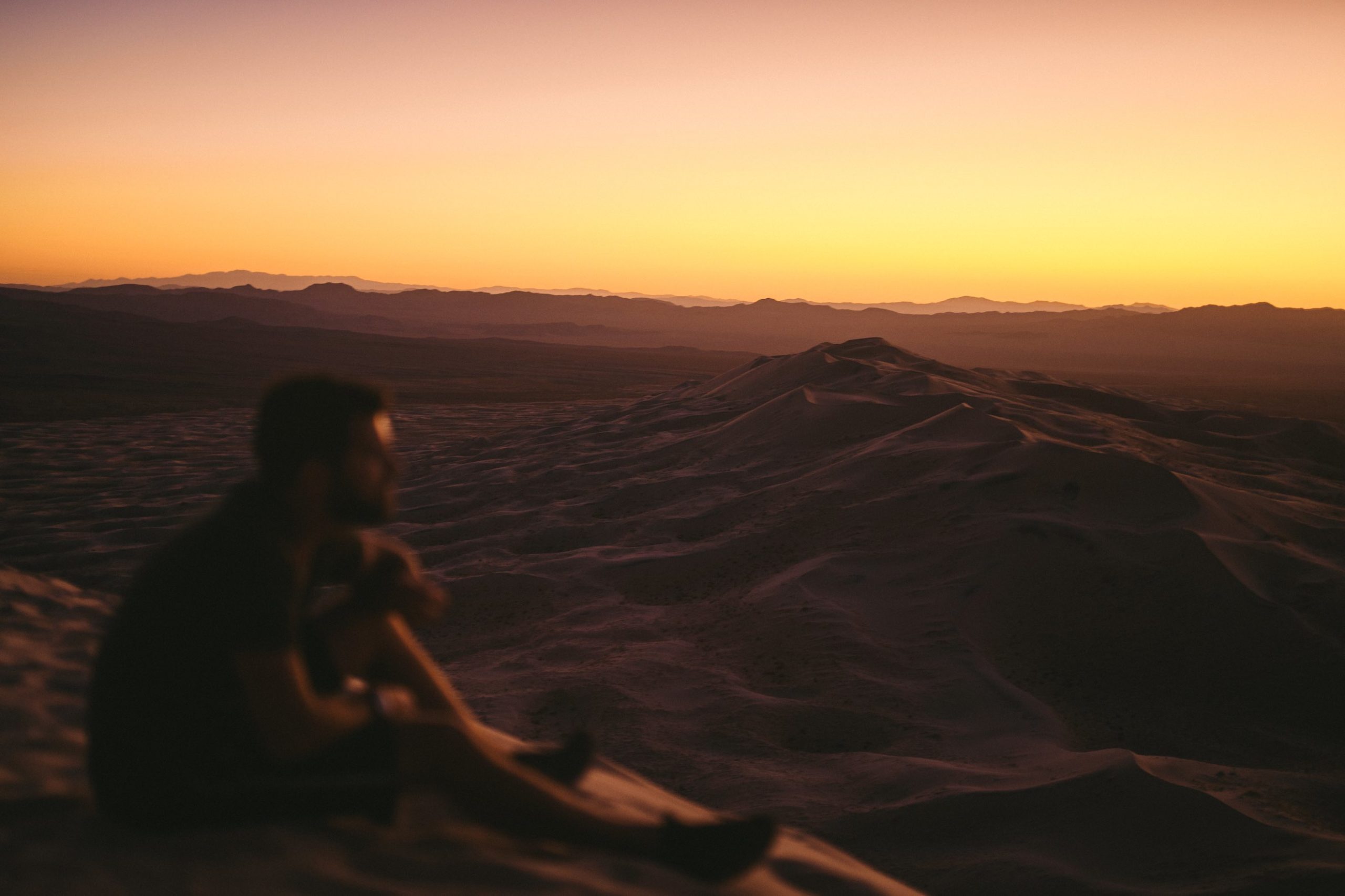
We chose to work in Angeles National Forest because of its dynamic landscape and unique micro-climates. The setting and terrain change regularly, which helped diversify the imagery and create a longer, more adventurous feeling road trip. The changing land also helps the consumer see and understand that this is more than a motorcycle advertisement–that it is a lifestyle awakening.


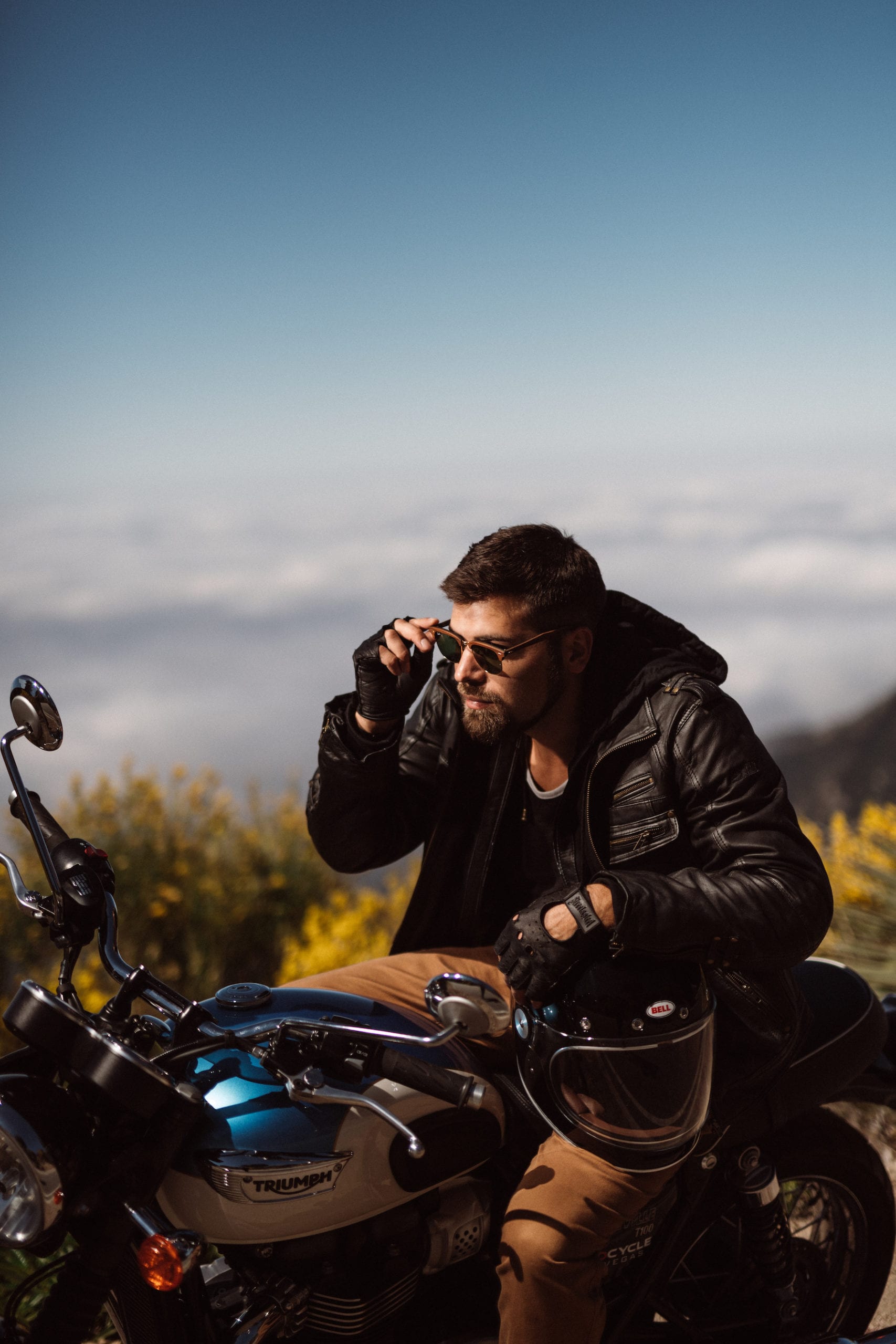
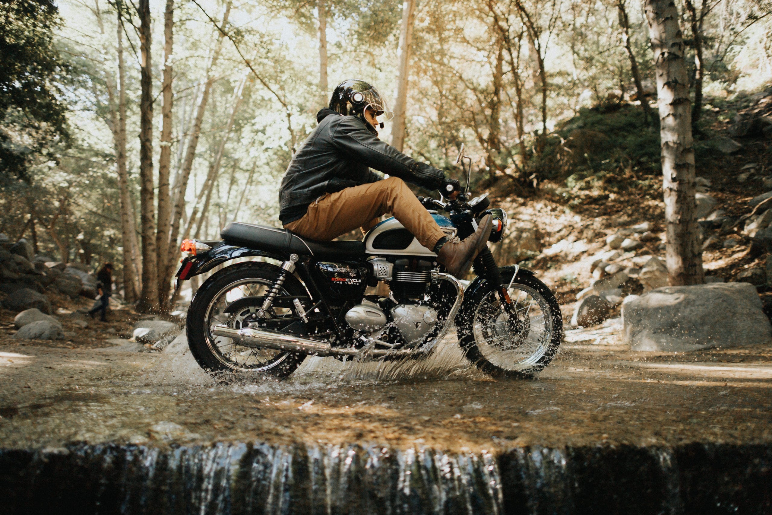
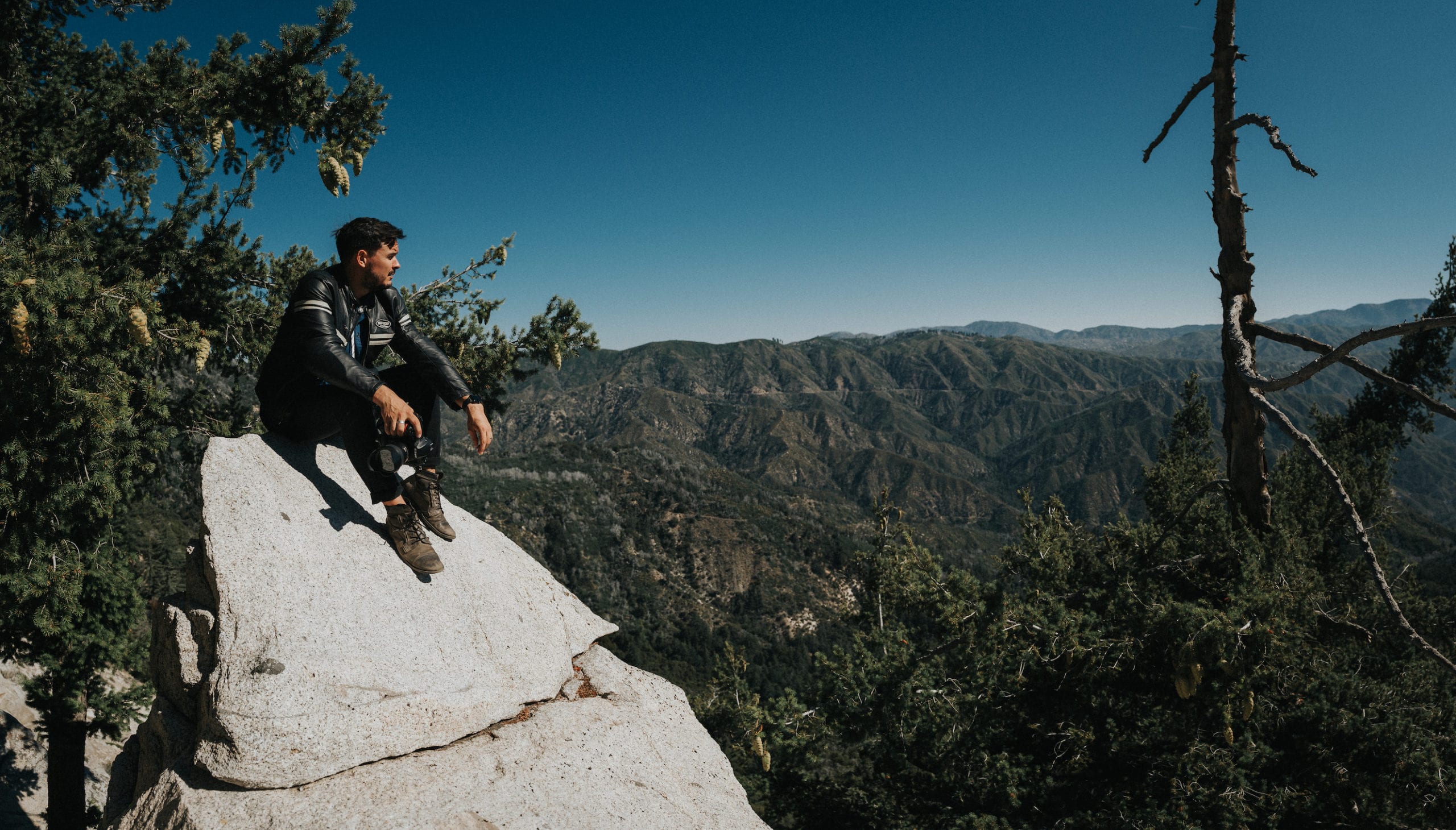
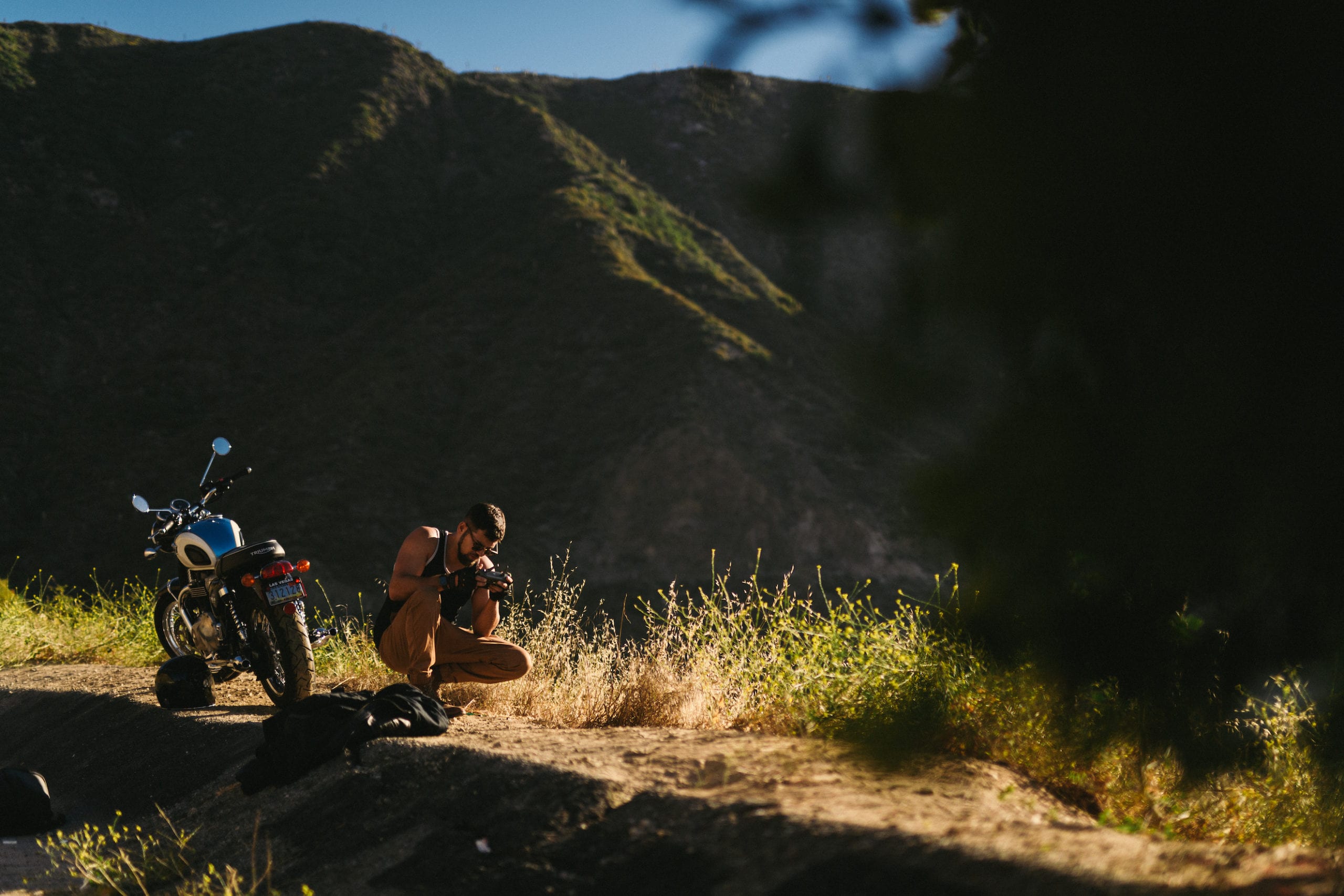
In a few of the photographs, we showcased the application of the product beyond style and into the utility (another area where landscape really came into play). Pairing the products with the setting added a lot of variation to the photoshoot, which helps tell a deeper story. In some photographs, the narrative becomes more about the individual riding the Bonneville T100–his curiosity, demeanor, and passion for adventure. While other photographs (the majority), show why and how the T100 is a centerpiece to his life; how it activates his personality. When viewed as a whole, the gallery shines with a very defined purpose and emotion that would have otherwise been dulled without the character and scenario we invented.


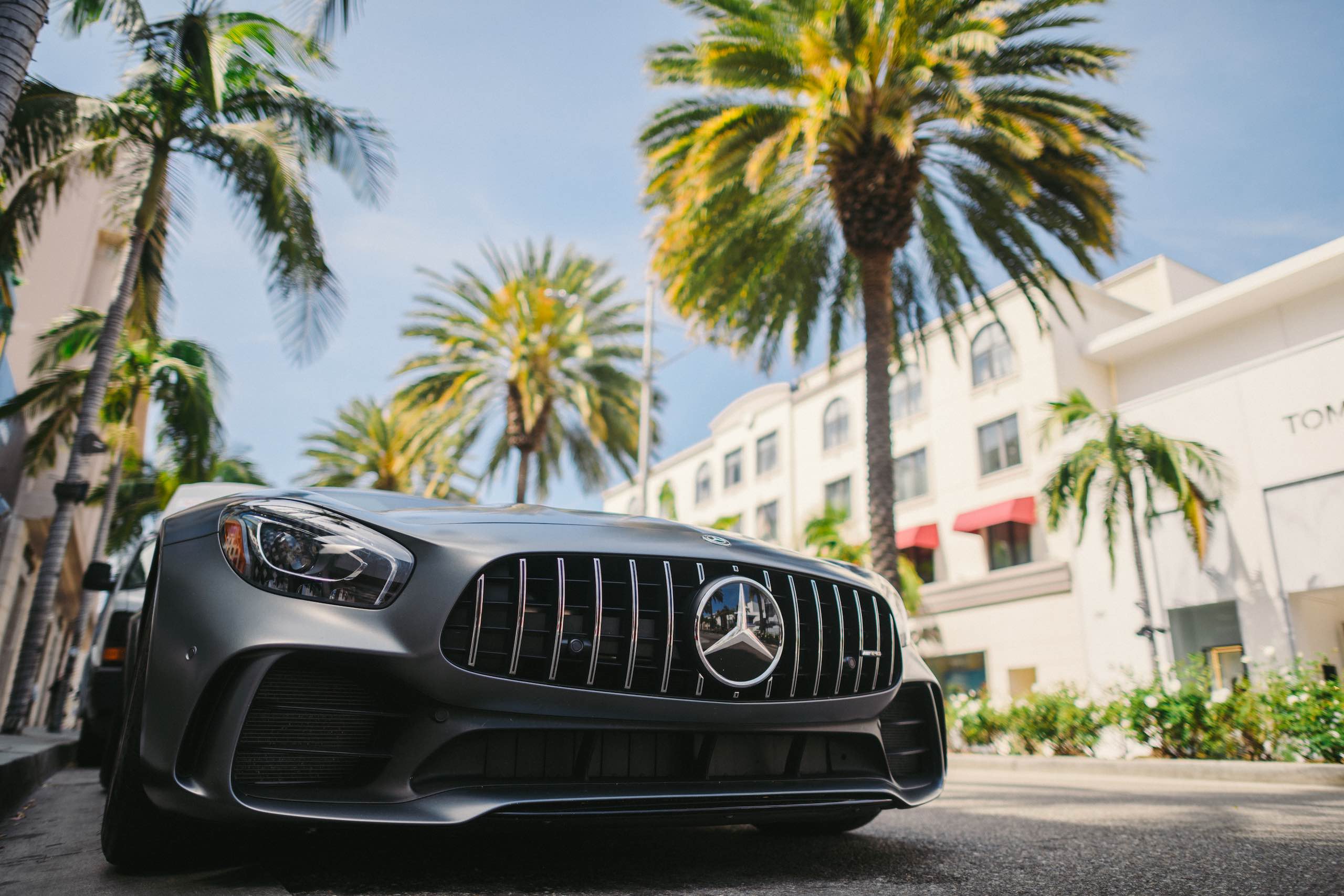
We’d like to give a shout-out to Eaglerider in Los Angeles, where we rented the Triumph Bonneville T100. It was the exact bike we needed for the occasion. The Triumph was a comfortable ride through the city and up the highway to Angeles National Forest. It was a perfect combination between a street bike and destination bike, climbing up the mountains and across unique terrain effortlessly. We love the fact that the T100 is a lighter, sit-up bike with 100cc and a smooth clutch. It was a super comfortable ride. The coolant system, which prevents overheating, was another awesome feature for a long day riding in the mountains. If you plan to visit California and want to enjoy a day riding through the mountains like this, check out Eaglerider in Inglewood. You can also contact us for more information on our exact route.

Motorcycle rider standing on top of the Bonneville T100 with large antennae structure dominating the backdrop.
Motorcycle rider wearing a helmet and motorcycle gear riding up the mountain on a hazy morning.
Motorcycle rider standing on top of the Bonneville T100 with large antennae structure dominating the backdrop.
Motorcycle rider standing in front of a Bonneville T100 motorcycle with mountain peak in the backdrop
Motorcycle rider resting on the pavement in front of the Bonneville T100 motorcycle with his helmet nearby
Motorcycle rider riding through a shallow creek in Angeles National Forest with feet in the air
Closeup of motorcycle with rider in the foreground sitting in front of it wearing shades
Motorcycle rider wearing shades poses in the middle of the forest, pointing a shining headlight towards the camera
Motorcycle rider wearing shades sitting on the motorcycle using the back tire to churn up dirt in Angeles National Forest
View from behind of motorcycle rider sitting on the motorcycle slowly cruising through the forest
Motorcycle rider wearing shades and leather gear poses for the camera in the middle of the forest holding his Bell helmet
Closeup of backside of motorcycle with lower half of man in leather boots along with burnt orange pants and black leather jacket sitting on it
Black and white photo of motorcycle rider wearing shades relaxing sitting near the motorcycle posing for the camera and looking up at the sky
Motorcycle rider relaxes sitting in leaves near the motorcycle posing for the camera and looking off to the side
The motorcycle rider relaxes on the side of the road with his Bell Bullet helmet and motorcycle nearby.
Black and white photo of a motorcycle rider resting above the clouds overlooking a mountain range.
The motorcycle rider relaxes laying on the back of the motorcycle posing for the camera

Behind The Scenes

What a day! What a day!

Our photographer, Justin Mein, road his Ducati Monster 1200 S during the shoot. He and a good friend Curtis Blank captured this really awesome behind the scenes photography.


A little bit about our gear…

Our gear made the transition between micro-climates and scenarios seamless. We packed two Peak Design 45L Travel Backpacks. These camera bags held all of our gear, water, and food. For a lightweight, versatile bag, the Peak Design Travel Backpack was super spacious, so we didn’t need to take more than one bag on each motorcycle. Without them, we wouldn’t have been able to bike through the mountains for 6+ hours comfortably.


We shot the entire gallery on the Nikon D5, rotating between the Nikon 24mm 1.4 and Sigma Art 50mm 1.4. We primarily used the Nikon 24mm lens. In some scenarios, we used two Profoto A1 Wireless Systems with air remote trigger to set the scene.


During the photoshoot we road through a magnitude 5 earthquake! We felt the rumbling but didn’t know how serious it was until we checked our phones and saw the notification. Throughout the rest of the day, we had to be on high alert for debris in the roadway and had to be conscious of unsecured rockfaces when venturing around bends and offroad. Fortunately, we had really awesome gear, expertly crafted motorcycles and some of the best motorcycle helmets on the market. Safety first!

video
play-sharp-fill
Photographer overlooking forest canopy while perched atop a slanted rock face.
View of the back side of the bike along with helmet with camera, backpack and leather gloves on the ground
Red motorcycle on display
Cameraman taking picture of something on the ground near the motorcycle.
Closeup of photographer using camera
Closeup of photographer looking at camera display

Black Mile

White Black Mile Travel Bag logo
video
play-sharp-fill

Black Mile Travel Bag

The best way to introduce the Black Mile Travel Bag to the market was through story-driven media, so that is exactly what we created.

The Black Mile Travel Bag is a compact, space-saving, and versatile travel bag. It was designed by a United States Military Veteran to be lightweight, functional, and fashionable in both adventurous rural settings and bustling urban locales. The Black Mile Travel Bag can be worn as a backpack, used as a suitcase or modified into a carry-on travel bag.


We were tasked with branding the Black Mile Travel Bag to appeal to three types of consumers, which were outlined by the client: the rugged adventurer, the wanderlust, and the creative professional. All three audiences share a respect for nature and travel, however, their personalities are wildly different. We created a concept that would appeal to all three.


Our narrative follows a creative professional on a trip abroad for a client. Upon landing his identity shifts. He is not purely a creative professional. He embodies deep respect and appreciation for the country and the culture he is experiencing — he begins to wander and admire. Similarly, he ventures off the beaten path, which appeals to the rugged adventurer. All three of these archetypes converge yet they do not conflict with one another. This situated the Black Mile Travel Bag as the universal companion for all types of travelers and businessmen.

Closeup side view of man wearing a jean shirt and shorts standing next to a black backpack taking a picture with a camera
Closeup view from behind of a man wearing a jean shirt and black backpack holding a camera looking out of the stone walls
Man wearing a backpack wearing a dark navy tshirt looking at a waterfall
View from behind of a man hiking through a garden wearing a black backpack
Closeup view from behind of a man wearing a black backpack walking down a a street
Closeup view from behind of a man wearing a black backpack taking a picture

Product Photography

Whereas our video addresses the consumers who would benefit and appreciate the Black Mile Travel Bag, our product photography showcases its many features.

The photography reinforces the message articulated in the branding video: that Black Mile Travel Bag is a perfect companion for any type of traveler in any type of situation. Though this is stated in the video, the product deserved additional verification. Our product photography for Black Mile Travel Bag, therefore, showcases the product in its entirety.


We approached our product photography from two angles: full-scope (shooting the entire bag) and granular (shooting close-ups of the features). Not only does this prove the message stated in the video, but it also adds value and appeal to the product.


Regardless of consumer archetype, the photography shows all of the ways this bag benefits those who travel. These photos are proof of its durability, versatility, quality, and style. Nothing is omitted. Every canvas — every layer — is photographed to fully capture the bags function and lack of limitation.


These photos are perfect for online sales, which is the primary medium Black Mile Travel Bag markets to their consumers. Once their website is complete, these photos will become the centerpiece. They will lead online sales and expand their digital marketing to include social media — a resource they have yet to tap into.

View from behind of man wearing a black backpack and a black coat standing by a metal garage door
Small backpack and large black bag on display
Black bag on display
Black backpack on display
Side view of a black backpack
Side view closeup of a black backpack
Closeup view of fasteners on black bag
Black and white display of a backpack
Side view of a black backpack
View from behind of a man walking carrying a black bag on his shoulder
Closeup view of fasteners on black bag
Black purse on display
Laptop bag with iphone in pocket
Closeup view of an opened black purse bag
Side profile of a man wearing white shoes and black jeans with a black bag next to him sitting on the floor
Side profile of a man with a bushy beard walking with a black bag over his shoulder

Komuso Design

White Komuso Logo
video
play-sharp-fill

Komuso Design

Komuso Design provides a simple and natural means of reconnecting with the self. Their product — The Shift — encourages people to slow down, steady their breathing and embrace the present. Their philosophy is backed by ancient wisdom. They embody the Komuso way of life, using teachings from Japan’s Edo period to spread their messaging.


Komuso Design only offers one product to consumers. Yet their brand is rich and vibrant. They invest a lot of time telling their story. And that narrative is what has elevated their company to a global presence. When the owners, Todd and Vanessa, came to us, their company was young and quite unknown. They had a vision for what they wanted to accomplish — the story they needed to share with the world — but weren’t sure how to go about it. That’s where we came in. We immediately connected with their vision. We understood the value their product offered to people and were eager to help share those healing powers with the world.


Our branding mission started with video production. The first video we filmed (below left) was essentially an introduction to the brand, the product, and the modern problem they solve through The Shift. The video to the left is much more impressive. What started as a 2-minute company profile video grew into a massive 6-minute story. It is the truest representation of the Komuso brand and a must-see. The third video we produced (below right) is a tutorial on how to best use The Shift.

video
play-sharp-fill
video
play-sharp-fill

We choose to work with C&I because you evoke a special feeling in everything you touch. The feeling of this piece is off the charts! We sat there after watching it with hearts pumping…tears flowing…and simply awestruck. Dammmmmmmm you guys are good!


Todd & Vanessa Steinberg, Owners & Founders of Komuso Design

video
play-sharp-fill

Photographing The Shift

The Shift is the centerpiece of the Komuso brand. Don’t let its simple appearance fool you. It was developed by a psychotherapist and meditation teacher who used data from over a year of testing to engineer the ideal length, diameter, and quality of metal. Part of The Shift’s charm is its apparent simplicity. It may seem ordinary but it is, in fact, profound. Its design is, in a way, a clever nod to the power of breath, which when harnessed has an immense influence on our bodies and mind.


Given that simplicity is the namesake of The Shift, we chose to keep the aesthetic of their product photography minimal. This was also a stylistic nod to the natural form of The Shift and the philosophy behind the product.


When we took our photography outside of a controlled setting, our methodology and purpose had to change. We needed to connect The Shift to a mindset. After listening to our audience, we realized that many people underestimate the power of breathing. They often take it for granted and that leads them to disregard it as a healing modality. Because of this, people were failing to see The Shift for what it is and what it provides.


We realized that our photography needed to teach our audience about breathing and The Shift’s place therein. So, we chose to place The Shift in magnificent settings around the world, like the Mojave Desert. Our photography associates The Shift with these landscapes, ultimately connecting the tool to nature. The environments we chose are calm, vast, isolated, and ancient. They are timeless and powerful, as is the power of breathing. When the viewer sees these tranquil photos and notices The Shift is the reason the models are so relaxed, they immediately have an epiphany.

Display of silver colored whistle, beige pouch and black box on a wooden table
Closeup of a silver whistle on a green sprig
Closeup of silver colored whistle
Silver whistle on display in a wooden bowl on a pink table
Gold colored whistle in a white with brown specs bowl
Display of a silver, gold, copper and black colored whistles on a wooden table
Display of a silver, gold, copper and black colored whistles on a marble block
Woman with long brown hair wearing a black tank top and gray jeans posing for the camera in a desert
Side profile of a man with short hair and beard wearing a gray t shirt and black shorts posing for the camera with eyes closed with hills in the background
Aerial view of a woman laying on a sand cliff holding a whistle she is wearing around her neck
Blurry image of a bearded man sitting on a sandy cliff
Side profile of a muscular man wearing a black t shirt wearing a silver colored whistle around his neck
Closeup of a muscular man wearing a black t shirt wearing a silver colored whistle around his neck
Side profile of woman looking down at a whistle she is displaying in her hand
Closeup of a woman holding a whistle and looking up and away with her eyes closed
video
play-sharp-fill

Marketing Komuso

We handle all asset creation, strategy, and distribution for social media and email marketing.

Instagram & Pinterest

The imagery above is created with our social media audience in mind. We thoroughly researched their online behavior to create media that we knew would resonate. The imagery and messaging unite the Komuso aesthetic with what they preach. This effective combination has grown their Instagram audience to 27.6k followers and opened avenues for additional marketing on Pinterest and through email.


The ad to the left was created specifically for Pinterest. This is an untapped frontier for Komuso, so our first step was introducing the product and the Komuso philosophy to users on the platform. In less than 15 seconds, we educate this consumer base on the purpose, functionality, and reward of using the Komuso Shift. There are no hard sales. This video conditions our audience for additional programming while encouraging them to be proactive in their search for a quality and proven anxiety treatment method.

Email Marketing

The success of our social media marketing campaign inspired similar programming in email marketing. Our team strategized to develop 5 separate marketing funnels to appeal to consumers at various stages in the conversion process. Some of these flows are evergreen and are automatically triggered when consumers either abandon their cart, sign up for our mailing list, or order a product. These series often push sales and, ultimately, lead to our Nurture Series — an educational sequence that informs on the company culture, the founders, and the science of The Shift.


Whereas the evergreen series encourage sales, the Nurture Series aims to strengthen the consumer-brand relationship. There is virtually no sales language. Instead, they inspire and provide meaningful tips. Though these emails don’t push sales, they have been highly effective at shuttling viewers to Komuso’s e-commerce site. They account for thousands of dollars in sales while deepening the brand story in the process.


Below, is also an example of our Re-engagement Series, which offers promotions on select holidays. These value-based emails subtly push sales, using the context of the holiday to inspire consumers to take action and make a purchase.

Komuso Design Email Analytics stats screenshot

FEBRUARY NURTURE SERIES

(click to enlarge the image)

VALENTINE'S DAY PROMO SERIES

(click to enlarge the image)

Komuso Design Email Marketing with images and ad
Komuso Design Email Marketing with image of silver colored whistle, beige pouch and black box on a wooden table with promo ad
video
play-sharp-fill
video
play-sharp-fill
video
play-sharp-fill
video
play-sharp-fill
Silver colored whistle on display with shadow
Aerial view of silver colored whistle on display on a wooden chessboard
Search
Hide picture